From Scratch Bakery Logo Critique 56
Categories: Critiques Food & Beverages

Kelly, submitted this logo for the From Scratch Bakery. She left the following comment about the logo.
“This logo is for a new bakery in a downtown, upscale neighborhood. I am still working on the colors, but I wanted a simple, clean look. I selected the cupcake because it seems more subtle and I like the way it's on an angle. The bakery is a full service bakery but specializes in cakes and cupcakes.”
The following critique is based on one designer’s opinion and experience. I always appreciate the readers thoughts as well. So, I’ll ask a question of two in the critique, please share your perspective in the comments at the end of this logo design critique.
Design Principals
Upon a quick glance Kelly’s logo does a good job at communicating “bakery” to the viewer. The colors are inviting, modern and cheery
Continue reading this articleLone Turtle Illustration Logo Critique 233
Categories: Critiques Marketing & Design

Ron submitted his logo for Lone Turtle Illustration. He left the following commentary about his logo.
“The image of a turtle howling against the backdrop of a full moon is intended to express the humour that is at the core of what I do. The same is true for the name: Lone Turtle. The font (Wanted LETTS) mimics the stereotypical Wild West typography.”
The following critique is based on one designer’s opinion and experience. I always appreciate the readers thoughts as well. So, I’ll ask a question of two in the critique, please share your perspective in the comments at the end of this logo design critique.
Design Principals
Certainly a turtle howling at moon is comical and hints at your personality and style. As I have written before, a good logo should be a visual expression of the company it represents...
Continue reading this articleAutomagical Logo Design Critique 23
Categories: Critiques Marketing & Design

Jacob submitted this logo for his design portfolio and freelance work website. He left the following comment about the logo.
“Since the web design I do focuses on standards compliant and simple but beautiful designs, I want a logo that represents the kind of work I do. My design philosophy is ‘Less is more’ and I tend to stay away from flashy trends with too many elements. I'm hoping that this logo helps convey some of that. I choose black for that reason, although I may experiment with other color options. The top hat icon was chosen to represent how design can often be a ‘magical process’ (automagical, if you will) with inspiration coming from anywhere. I appreciate any feedback and thank you!”
The following critique is based on one designer’s opinion and experience. I always appreciate the readers thoughts as well. So, I’ll ask a question of two in the critique, please share your perspective in the comments at the end of this logo design critique.
Design Principals
To be honest, I looked at the logo several times before reading Jacob’s commentary and never once saw the top hat.
Continue reading this articleHeadpoint Consulting Logo Design Critique 25
Categories: Critiques Business & Law Services

Jon submitted this logo for Headpoint Consulting. He left the following comment about the logo,
“A new executive coaching consultancy firm... looking to portray an image of competence but remain interesting and dynamic”
The following critique is based on one designer’s opinion and experience. I always appreciate the readers thoughts as well. So, I’ll ask a question of two in the critique, please share your perspective in the comments at the end of this logo design critique.
Design Principals
The logo for Headpoint Consulting has an intriguing start, but lacks cohesion and balance. The logo feels like two different parts. The head shaped oval with the ‘T’ inside doesn’t feel like it belongs with the rest of the mark. There are two main factors contributing to this disjointed appearance. First, the abstracted ‘T’ created by the white space within the oval shape doesn’t fit with the rest of the typography (i.e., weight, color, shape, rotation, etc.). Second, focusing all of the color on the right side within the oval shape also contributes to the disconnection.
Continue reading this articleArchSpace Logo Design Critique 31
Categories: Critiques Home & Construction Website

Vassilis designed this logo for an architect friend that plans to build a website offering free training tools for architects. He submitted a whole page of variations on this logo, but I chose this one to critique because I thought it was working the best out of the bunch. Vassilis left the following comment with his submission,
“The client told me she wants something “design-ey” and not strict, with grey as a dominant colour, and she also decided that probably grey and green will be the main color combination for her ‘company’ identity. I have here the main idea for the logo arranged in many different ways. Its basically a stylish compass (common architect tool) which forms the letter A. The typeface I used is Myriad Pro and I customized it to look a bit more modernish. I've made a whole other lot of concepts and ideas but I think this is my best one. I'd appreciate any thoughts and comments.”
The following critique is based on one designer’s opinion and experience. I always appreciate the readers thoughts as well. So, I’ll ask a question of two in the critique, please share your perspective in the comments at the end of this logo design critique.
Continue reading this articleIdaho Film Project Logo Critique 29

Troy submitted this logo that he has been working on for an Idaho Filmmaking community website. He left the following comment,
“This logo (a work in progress) is for an Idaho Filmmaking community website. Visitors to the site will be able to upload videos and critique them, connect with other filmmakers, buy and sell equipment, access a filmmaking FAQ and more.”
The following critique is based on one designer’s opinion and experience. I always appreciate the readers thoughts as well. So, I’ll ask a question of two in the critique, please share your perspective in the comments at the end of this logo design critique.
Design Principals
I really like the color palette choice. It has an earthy and modern feel. The blue background brings life and contrast.
Continue reading this articleOodles of Doodles Logo Critique 39

Dawn sent a handful of her concepts for the Oodles of Doodles logo. I choose this one to critique because I thought it was the best fit for her company. It’s worth mentioning that Dawn prefers the first concept in the attached concepts. She is starting a home business doing wall murals for children’s rooms.
“My Logo is for children’s wall Murals. I’ll be mostly doing children’s rooms but other things a well. I wanted the logo to give the feeling of fun, color, artistic, childlike, put still professional. I’m not sure that it works on every aspect, but most I hope. I want to use the logo for just about everything, website, business cards, mailings, invoices, signage for the car. Any input would be greatly appreciated.”
The following critique is based on one designer’s opinion and experience. I always appreciate the readers thoughts as well. So, I’ll ask a question or two in the critique, please share your perspective in the comments at the end of this logo design critique.
Design Principals
I chose this version over the other logo that Dawn liked best because I think it does a much better job at representing what she does. This logo for Oodles of Doodles oozes fun and youthfulness, which sounds a lot like what Dawn wanted to achieve with the mark.
Continue reading this articlePricingWire Logo Design Critique 34
Categories: Critiques Business & Law Services

Chris submitted his logo for PricingWire and left the following comment,
“The antennae concept is meant to convey maintaining an up-to-date awareness of how pricing impacts the overall performance and brand value of your business. Communicating the value behind your prices, based on in depth understanding of what customers value and are willing to pay for. I am open to other names, but also believe that a company makes its name relevant by the reputation they build based on the work they do (build a brand, maintain a brand, leverage a brand).”
The following critique is based on one designer’s opinion and experience. I always appreciate the readers thoughts as well. So, I’ll ask a question of two in the critique, please share your perspective in the comments at the end of this logo design critique.
Continue reading this articleLOGO Design, Vol. 2 Book Review 260
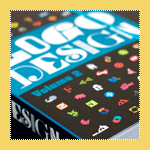
The latest logo design book from TASCHEN, entitled LOGO Design, Vol. 2, just arrived at my office on Tuesday. It is a follow-up to the popular first volume entitled LOGO Design, Vol. 1
. The book contains around 2000 logos and 13 case studies, in 3 languages (English, French and German), on brand identity for companies like Burton, Wrangler and MTV. The featured design firms include Stefan Sagmeister, MetaDesign, Saffron Brand Consultants, BlackbeltMonkey and others. In the foreword Uli Mayer-Johanssen, of MetaDesign, talks about Brands and Identity.
“Brands that communicate an idea, a purpose, and a clear promise together with technical and rational aspects almost always have something in common with the values and attitudes people have” - Uli Mayer-JohanssenContinue reading this article
European Masonry Logo Critique 252
Categories: Critiques Home & Construction
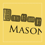
Erik, of Quick Productions, submitted this logo he did for his client, European Masonry. He had this to say about the design,
“This is the first logo design I have ever really been involved with. The client came to me looking for a website, and also mentioned they needed a logo so I thought I would give it a shot.”
“...The company specializes in stone and brick work. The left logo was the first submission which they really liked, but the company had printed brochures and believed it would be too hard to read so they asked for a second version, which is the right logo. For the 2nd logo I went with a really smooth font to try and keep that ‘fancy’ feel but also make it more readable. I chose different size blocks and colors to help represent how stone structures can look, and to also separate it from other logos. A lot of the masonry logos I've seen all have some sort of brick and a trowel which I wanted to steer away from.”
The following critique is based on one designer’s opinion and experience. I always appreciate the readers thoughts as well. So, I’ll ask a question of two in the critique, please share your perspective in the comments at the end of this logo design critique.
Continue reading this articleThe images & logos presented on this blog are copyrighted by their respective owners. The blog itself is copyright Erik Peterson, 2008-2024 All Rights Reserved.


