e happy design 23
Categories: Critiques Marketing & Design
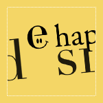
Edu submitted this logo for a personal graphic design company called “e happy design”. Along with the logo, the following description about the company was included,
“The logo tries to describe the company’s identity: a very “happy” company, but also serious. I’ve chosen that typography because I think it’s strong, and reflects what I want, a serious but “happy” company”
The following critique is based on one designers opinion and experience. I will ask a question or two during the critique and would love to hear your thoughts in the comments section.
Design Principals
Even though the “e happy design” logo is only type, excluding the eyes within the letter ‘e’, there is an awful lot to take in and understand. The happy face in the ‘e’ reminds me of Walmart or The Watchmen.
Continue reading this article$99 Music Videos 28
Categories: Critiques Entertainment

Lee submitted this logo for $99 Music Videos, an independent music channel of music videos that have all been made for less than $99 (time not included). He made the following remarks about the company,
“Most musicians and filmmakers are unable to spend thousands of dollars on a music video. But in the age of digital film making, you no longer need those kinds of budgets. In fact, amazing original music videos are being made for the web every day for next to nothing. It was in this spirit that $99 Music Videos was born. We wanted to get back to the basics about what it is to make a music video; so we went with a really basic, yet strong logotype.”
The following critique is based on one designers opinion and experience. I will ask a question or two during the critique and would love to hear your thoughts in the comments section.
Design Principals
The $99 Music Videos logo is simple and bold. The typeface appears to be Helvetica Neue Bold. I don’t understand the upc/barcode graphic below the text. To me, the upc graphic says nothing about music, videos, or cost effective music videos.
Continue reading this articleThe Creative Brief: Questions to Ask Before Designing a Logo 87
Before beginning a logo design, consider gathering the necessary information for the job at hand. Some people call it a discovery process, creative brief, introduction meeting or creative interview. I like to call it a creative brief, but whatever you want to call it, just make sure to do it before you begin designing the logo.
The goal of this logo design creative brief is to grasp the essence of the company. This will be your jumping off point for the logo design concepts. What do you want the viewer of this new logo to walk away with? How should they remember this company?
Continue reading this articleHometown Soccer 22

Scott submitted this logo he did for the Hometown Soccer Club. He included the following commentary along with his submission,
“Hometown Soccer Club is a prospective entry in the Women’s Premier Soccer League, to begin play in Milwaukee, WI in 2010. The tower in the center of the crest is City Hall. The shape of the crest is based on a modification of the FC Barcelona crest and blue and green will be the team’s main colors.”
Design Principals
The logo isn’t terrible by any means, but I think there are some areas for improvement. The inclusion of the city hall tower was a great idea as I’m sure it is an iconic piece of architecture in Milwaukee. However, I think the drawing could be simplified in order to create a more straightforward design.
Continue reading this article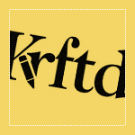
I received this logo from Jeanette over at Krftd, an online magazine. Check it out if you haven’t already. There is some fine inspirational material over there. Anyway, Jeanette offered this bit of insight when submitting this logo,
“Defined as the arbiter of style and taste, Krftd is the clever resource for individuals with a well-dressed mind. Krftd curates the world of design, interior, art, fashion, travel, popular culture and technology through its cosmopolitan lens and celebrates the most inspiring ideas in our pages.”
Jeanette went on to say,
“Considering that Krftd is an alternative spelling to "crafted", the typeface was chosen to make it easy to read. The pencil icon on the Krftd logo adds a casual and slightly playful feel. And also because it sits nicely in a discreet manner. This overall clean and simple logo does not attach to the content and allows it to speak for itself.”
Design Principals
The Krftd logo is tastefully designed and offers a good starting point. Even so, I see some areas for improvement.
Continue reading this articleHarmony Eye Care 25
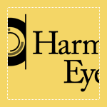
Randy submitted his logo for Harmony Eye Care. He included this message with his submission,
“Harmony EyeCare is a brand new Optometry office opening up in southern Indiana. I wanted convey harmony inside the eye itself. The graphic is meant to be a harmonious iris of an eye. I chose a serif typeface for it’s elegance... Caslon seemed to fit well.”
The following critique is based on one designer’s opinion and experience.
Design Principals
This logo is well put together. The subdued color palette and Caslon typeface give off a soothing impression, which fits well with the company name.
Continue reading this articleLogo Critiques Reader Poll
I setup a quick reader poll. I would like to find out more about you, my readers, and your needs. Most of the info I pretty basic age, gender, design background, etc. It's the last field in the form I'm really the most interested in. What do you think of logocritiques.com? What would you like to see more of or less of and so on. I would really appreciate it if you could a take a quick minute and answer this 8 question poll. Go to the poll.
Continue reading this article10 Great Logo Design, Branding and Identity Books 95
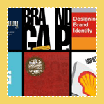
As designers we often look for inspiration for our work, so I’ve compiled a short list of some useful logo design and branding books. The people behind these books have some useful insight and inspiration for their readers. If you don’t already own them, I suggest you consider adding them to your library.
Continue reading this articlePeg Productions 33
Categories: Critiques Computers & Technology Marketing & Design

Pez, from Peg Productions, submitted this logo for critique. When asked to explain the logo, Peg Productions said the following:
“We choose the logo because we felt it has quite a clear and simple theme—a peg. This view of a peg is also very striking, as it is often an angle overlooked by people the majority of the time. This shows customers that here at Peg Productions we think outside of the box and see the world in a different way.”
“Also as the logo is very simple in its fundamental nature it can changed and altered to look very graphically intense, or left very simple—as we do on the website and on our invoices.”
Design Principals
When this logo first arrived in my inbox I was honestly perplexed. I couldn’t figure out how this graphic was, in some way, a peg.
Continue reading this article10 Mistakes Logo Designers Can Make When Designing Logos 90
There are many mistakes we can make when designing logos for our clients or even ourselves. I have compiled a list of 10 common mistakes I’ve seen in mine and others work. This list is merely my view of a Top Ten. Please feel free to add to list or submit your own list via the comments.
Continue reading this articleThe images & logos presented on this blog are copyrighted by their respective owners. The blog itself is copyright Erik Peterson, 2008-2024 All Rights Reserved.


