Jack Tree Thai Cuisine Logo Design Critique 45
Categories: Critiques Food & Beverages
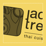
Mario submitted this logo for Jack Tree Thai Cuisine and had this to say about his logo,
“The colours and logo name were already handpicked by the client according to his personal auspicious religious beliefs. These colours denotes growth and energy. The jack tree is a plant which is very common in Sri Lanka. The logo is a stylized Jack Tree and you will be able to make out the tree and a jackfruit. client wanted simple yet strong typo for the logo. I stylized the typo by linking the letter 'j' and 't' I kept the typo separate from the icon, in order to have the freedom to use the icon all by itself.”
The following critique is based on one designer’s opinion and experience. I always appreciate the readers thoughts as well. So, I’ll ask a question of two in the critique, please share your perspective in the comments at the end of this logo design critique.
Design Principals
The first thing I notice when looking at the Jack Tree Thai Cuisine logo is the ‘j’ and ‘t’ ligature. I don’t care for this ligature. A ligature should create rhythm and flow within the type. This one tends to interrupt both and feels forced. Continue reading this article
Sophie’s Tavern Logo Design Critique 73
Categories: Critiques Food & Beverages
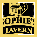
Kevin submitted this logo for Sophie’s Tavern along with the following commentary,
“Sophie’s Tavern is located in the heart of Camden, NJ and has been a cornerstone of the community since 1933. Like the city itself, Sophie’s has recently undergone a major renovation to improve the facilities both inside and out. It was decided that the building itself would be featured as it is such a recognized building in Camden. The main goal was to keep the home town feel of the bar to remind regulars and locals of the history and also introduce the bar as a great place to eat and drink to those who are unfamiliar with Sophie’s. A 3D model was built in SketchUp and then converted to vector art in Illustrator.”
The following critique is based on one designer’s opinion and experience. I always appreciate the readers thoughts as well. So, I’ll ask a question of two in the critique, please share your perspective in the comments at the end of this logo design critique.
Continue reading this articleMichael Austin Designs Logo Design Critique 34
Categories: Critiques Marketing & Design

Mike submitted this logo redesign for his design company. He had the following to say about his new logo,
“This is my revision to my previous logo. I wanted to add more of an an artistic flair to the design. My initials are used to create mountain bringing a strong presence to the logo. The mountains are drawn with a paint brush effect. The font I used is BigNoodleTitling,this font is “firm”, but not overbearing to the overall logo.”
The following critique is based on one designer’s opinion and experience. I always appreciate the readers thoughts as well. So, I’ll ask a question or two in the critique, please share your perspective in the comments at the end of this logo design critique.
Design Principals
The redesigned logo for Mike’s company is certainly an improvement over the old. The old logo felt disjointed and amateur, while the redesign feels more current and balanced.
Continue reading this articleAaron Lindberg Photography Logo Critique 30

Aaron submitted this logo for his work as a photographer. He included the following commentary with his submission,
“I decided to revamp my logo and wanted to get some feedback from the new look. I plan on using the logo with and without the url at the bottom of the page.”
The following critique is based on one designer’s opinion and experience. I always appreciate the readers thoughts as well. So, I’ll ask a question of two in the critique, please share your perspective in the comments at the end of this logo design critique.
Design Principals
I don’t know what the old logo looked like, but I think the new one has depth and perspective. It appears lively and dynamic. Are these traits the same traits you would use to describe yourself or your work as a photographer?
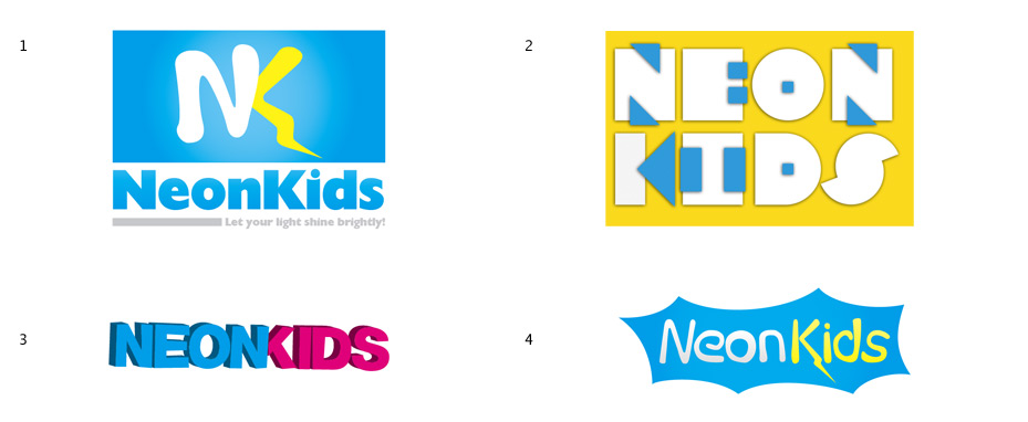
Continue reading this articleNeonKids Logo Concepts Critique 44
I received 4 logo concepts, at various stages of completeness, from Phil. He is working on a logo for a children’s ministry called “NeonKids”. The children in this group are from 3-14 years old. Phil had this to say about his project,
“The ministry is going to be called “NeonKids”, with the tag-line “Let your light shine brightly”. Some of the concepts I’ve played around with electricity, lightning bolts, light bulbs since those are some of the elements that are in the general theme the program is looking for.”
Once again, I won’t be following the normal format for critique that I’ve been using up until now. Instead, I’m going to pick two concepts from the group that I think have the most potential. I will critique them and offer thoughts on some other conceptual directions for Phil to explore.
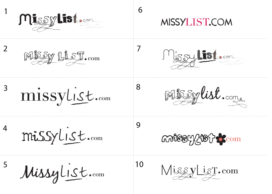
Continue reading this articleMissylist Logo Concepts Critique 34
Categories: Critiques Computers & Technology Services

The folks over at MissyList submitted a whole bunch of logo concepts, 10 to be exact. If you’re interested in seeing them all, here ya go.
I won’t be following the normal format for critique that I’ve been using up until now. Instead, I’m going to pick three concepts from the group that I think have the most potential. I will critique and talk about what’s working and what’s not.
According to the company info I received, the target market for the site is described as: female, 25-40 years old, young professionals, students, mothers, computer savvy, social network savvy, online shoppers. The tone & feel of the site was described as: girly fun, slightly sophisticated, community safe, trendy, second hand, bargain, recession fighter. The company used to be called feminads but is now being rebranded.
Continue reading this articlee happy design 23
Categories: Critiques Marketing & Design

Edu submitted this logo for a personal graphic design company called “e happy design”. Along with the logo, the following description about the company was included,
“The logo tries to describe the company’s identity: a very “happy” company, but also serious. I’ve chosen that typography because I think it’s strong, and reflects what I want, a serious but “happy” company”
The following critique is based on one designers opinion and experience. I will ask a question or two during the critique and would love to hear your thoughts in the comments section.
Design Principals
Even though the “e happy design” logo is only type, excluding the eyes within the letter ‘e’, there is an awful lot to take in and understand. The happy face in the ‘e’ reminds me of Walmart or The Watchmen.
Continue reading this article$99 Music Videos 28
Categories: Critiques Entertainment

Lee submitted this logo for $99 Music Videos, an independent music channel of music videos that have all been made for less than $99 (time not included). He made the following remarks about the company,
“Most musicians and filmmakers are unable to spend thousands of dollars on a music video. But in the age of digital film making, you no longer need those kinds of budgets. In fact, amazing original music videos are being made for the web every day for next to nothing. It was in this spirit that $99 Music Videos was born. We wanted to get back to the basics about what it is to make a music video; so we went with a really basic, yet strong logotype.”
The following critique is based on one designers opinion and experience. I will ask a question or two during the critique and would love to hear your thoughts in the comments section.
Design Principals
The $99 Music Videos logo is simple and bold. The typeface appears to be Helvetica Neue Bold. I don’t understand the upc/barcode graphic below the text. To me, the upc graphic says nothing about music, videos, or cost effective music videos.
Continue reading this articleHometown Soccer 22

Scott submitted this logo he did for the Hometown Soccer Club. He included the following commentary along with his submission,
“Hometown Soccer Club is a prospective entry in the Women’s Premier Soccer League, to begin play in Milwaukee, WI in 2010. The tower in the center of the crest is City Hall. The shape of the crest is based on a modification of the FC Barcelona crest and blue and green will be the team’s main colors.”
Design Principals
The logo isn’t terrible by any means, but I think there are some areas for improvement. The inclusion of the city hall tower was a great idea as I’m sure it is an iconic piece of architecture in Milwaukee. However, I think the drawing could be simplified in order to create a more straightforward design.
Continue reading this article
I received this logo from Jeanette over at Krftd, an online magazine. Check it out if you haven’t already. There is some fine inspirational material over there. Anyway, Jeanette offered this bit of insight when submitting this logo,
“Defined as the arbiter of style and taste, Krftd is the clever resource for individuals with a well-dressed mind. Krftd curates the world of design, interior, art, fashion, travel, popular culture and technology through its cosmopolitan lens and celebrates the most inspiring ideas in our pages.”
Jeanette went on to say,
“Considering that Krftd is an alternative spelling to "crafted", the typeface was chosen to make it easy to read. The pencil icon on the Krftd logo adds a casual and slightly playful feel. And also because it sits nicely in a discreet manner. This overall clean and simple logo does not attach to the content and allows it to speak for itself.”
Design Principals
The Krftd logo is tastefully designed and offers a good starting point. Even so, I see some areas for improvement.
Continue reading this articleThe images & logos presented on this blog are copyrighted by their respective owners. The blog itself is copyright Erik Peterson, 2008-2024 All Rights Reserved.


