88 Gears Creative Logo Critique 281
Categories: Critiques Marketing & Design
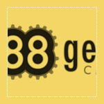
Geri submitted this logo for a web hosting and design agency startup. She left the following commentary about the work.
“The outline around the eights represent gears. I wanted to merge the idea of gears with the number 88. This is a for a web host and design agency. We use gears to design ways to move and advance businesses.”
The following critique is based on one designer’s opinion and experience. I always appreciate the readers thoughts as well. So, I’ll ask a question of two in the critique, please share your perspective in the comments at the end of this logo design critique.
Design Principles
Geri’s logo for 88 Gears Creative has some interesting elements, but could benefit from some further refinement of the design. Overall, a more industrial and powerful look may fit better with the company name. What if the 8’s were made of gears rather than the gears being a background element? The circular nature of the numeral 8 is a natural fit for integrating the gear element right into the typography.
Continue reading this articleIncubox Logo Design Critique 74
Categories: Critiques Marketing & Design

Geoff submitted this logo for incubox, a graphic design and web development company. He left the following commentary about the logo.
“I came up with the name ‘Incubox’ after several days of trying names and seeing what domains were available. I started looking for variations of ‘(something)box’ as I was inspired by a commercial studio in LA called Smashbox... The egg represents the place where the idea derived and was released into the world. I like the egg concept, I'm just not sure THAT egg works. And on a practical level, when I try and make an avatar using the egg it doesn't work - too small. I would love to get some feedback on the logo because, frankly, I'm confused by it. Or rather, I'm not sure how to use it best. I'm frankly not sure if the composition I'm sending you should be considered the logo, or if I should drop the mark or the ‘creative’, etc. The three elements don't seem to tie in together well as one. In summary, I like the name incubox, I like the egg concept, but I'm not sure the logo represents well.”
The following critique is based on one designer’s opinion and experience. I always appreciate the readers thoughts as well. So, I’ll ask a question of two in the critique, please share your perspective in the comments at the end of this logo design critique.
Continue reading this articleLone Turtle Illustration Logo Critique 233
Categories: Critiques Marketing & Design

Ron submitted his logo for Lone Turtle Illustration. He left the following commentary about his logo.
“The image of a turtle howling against the backdrop of a full moon is intended to express the humour that is at the core of what I do. The same is true for the name: Lone Turtle. The font (Wanted LETTS) mimics the stereotypical Wild West typography.”
The following critique is based on one designer’s opinion and experience. I always appreciate the readers thoughts as well. So, I’ll ask a question of two in the critique, please share your perspective in the comments at the end of this logo design critique.
Design Principals
Certainly a turtle howling at moon is comical and hints at your personality and style. As I have written before, a good logo should be a visual expression of the company it represents...
Continue reading this articleAutomagical Logo Design Critique 23
Categories: Critiques Marketing & Design
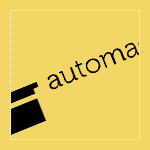
Jacob submitted this logo for his design portfolio and freelance work website. He left the following comment about the logo.
“Since the web design I do focuses on standards compliant and simple but beautiful designs, I want a logo that represents the kind of work I do. My design philosophy is ‘Less is more’ and I tend to stay away from flashy trends with too many elements. I'm hoping that this logo helps convey some of that. I choose black for that reason, although I may experiment with other color options. The top hat icon was chosen to represent how design can often be a ‘magical process’ (automagical, if you will) with inspiration coming from anywhere. I appreciate any feedback and thank you!”
The following critique is based on one designer’s opinion and experience. I always appreciate the readers thoughts as well. So, I’ll ask a question of two in the critique, please share your perspective in the comments at the end of this logo design critique.
Design Principals
To be honest, I looked at the logo several times before reading Jacob’s commentary and never once saw the top hat.
Continue reading this articleJen Blume Logo Design Critique 26
Categories: Critiques Marketing & Design

Jen submitted this her company logo for critique and left the following comment about her goals for the logo design,
“This is a logo for my own design firm. I was going for a very graphic design using playful and creative typography.”
The following critique is based on one designer’s opinion and experience. I always appreciate the readers thoughts as well. So, I’ll ask a question of two in the critique, please share your perspective in the comments at the end of this logo design critique.
Design Principals
I like that Jen is trying to communicate something about herself and possibly her design style through this logo. As I have said in the past, a good logo should make a statement about the company it represents, which is what you’re trying to do here. However, there are some areas that can be improved. In general, I feel like the logo looks more messy than it does playful. In particular, the ‘u’ and ‘e’ appear like they are about to fall to the ground. It also feels very constrained in its bounding box. Is there a reason for the containing rectangle?
Continue reading this articleMichael Austin Designs Logo Design Critique 34
Categories: Critiques Marketing & Design
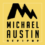
Mike submitted this logo redesign for his design company. He had the following to say about his new logo,
“This is my revision to my previous logo. I wanted to add more of an an artistic flair to the design. My initials are used to create mountain bringing a strong presence to the logo. The mountains are drawn with a paint brush effect. The font I used is BigNoodleTitling,this font is “firm”, but not overbearing to the overall logo.”
The following critique is based on one designer’s opinion and experience. I always appreciate the readers thoughts as well. So, I’ll ask a question or two in the critique, please share your perspective in the comments at the end of this logo design critique.
Design Principals
The redesigned logo for Mike’s company is certainly an improvement over the old. The old logo felt disjointed and amateur, while the redesign feels more current and balanced.
Continue reading this articlee happy design 23
Categories: Critiques Marketing & Design
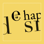
Edu submitted this logo for a personal graphic design company called “e happy design”. Along with the logo, the following description about the company was included,
“The logo tries to describe the company’s identity: a very “happy” company, but also serious. I’ve chosen that typography because I think it’s strong, and reflects what I want, a serious but “happy” company”
The following critique is based on one designers opinion and experience. I will ask a question or two during the critique and would love to hear your thoughts in the comments section.
Design Principals
Even though the “e happy design” logo is only type, excluding the eyes within the letter ‘e’, there is an awful lot to take in and understand. The happy face in the ‘e’ reminds me of Walmart or The Watchmen.
Continue reading this articlePeg Productions 33
Categories: Critiques Computers & Technology Marketing & Design

Pez, from Peg Productions, submitted this logo for critique. When asked to explain the logo, Peg Productions said the following:
“We choose the logo because we felt it has quite a clear and simple theme—a peg. This view of a peg is also very striking, as it is often an angle overlooked by people the majority of the time. This shows customers that here at Peg Productions we think outside of the box and see the world in a different way.”
“Also as the logo is very simple in its fundamental nature it can changed and altered to look very graphically intense, or left very simple—as we do on the website and on our invoices.”
Design Principals
When this logo first arrived in my inbox I was honestly perplexed. I couldn’t figure out how this graphic was, in some way, a peg.
Continue reading this articleThe images & logos presented on this blog are copyrighted by their respective owners. The blog itself is copyright Erik Peterson, 2008-2024 All Rights Reserved.


