88 Gears Creative Logo Critique 301
Categories: CritiquesMarketing & Design
88 Gears Creative Logo Critique
Geri submitted this logo for a web hosting and design agency startup. She left the following commentary about the work.
“The outline around the eights represent gears. I wanted to merge the idea of gears with the number 88. This is a for a web host and design agency. We use gears to design ways to move and advance businesses.”
The following critique is based on one designer’s opinion and experience. I always appreciate the readers thoughts as well. So, I’ll ask a question of two in the critique, please share your perspective in the comments at the end of this logo design critique.
Design Principles
Geri’s logo for 88 Gears Creative has some interesting elements, but could benefit from some further refinement of the design. Overall, a more industrial and powerful look may fit better with the company name. What if the 8’s were made of gears rather than the gears being a background element? The circular nature of the numeral 8 is a natural fit for integrating the gear element right into the typography.
Question for the readers
please respond in the comments below
How do you feel about changing the 8’s so that they are made from gears? Should the mark have a more industrial feel to it?
Functionality / Versatility
The logo is 3-color and should reproduce fairly well. I’m concerned about loosing the gears and the word creative at smaller sizes. I also wonder if the red in the logo is really needed. It’s so similar to the orange that the two visually blend into one color. This isn’t a big deal on screen, but when it comes to print it’s often cheaper to print 2-color vs. 3-color. Which leads me to ask if it’s really worth it?
Does the Logo Work for the Audience?
The concept of gears business and design can work together. Gears have been used in motors and various mechanical devices for a very long time and are somewhat commonplace. I see gears to represent concepts of thinking (i.e., the gears are turning), power/propulsion and rotation. Thinking and idea generation are key to design while moving forward is an important part of business.
Typography
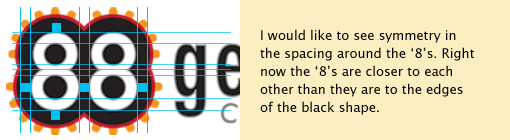
The 8’s bother me from a visual standpoint. They are too close to each other when factoring in the black containing shape.
I also would say the light grey stroke around the word ‘gears’ is probably unnecessary. You really don’t notice it unless you look really close and at small sizes it would just disappear all together. If anything it makes your type look soft and slightly blurry, neither of which contribute positive attributes for your logo. The letterspacing of ‘gears’ is cumbersome. So much air between a compressed/condensed letterform doesn’t work well visually. This is especially visible between the ‘g’ and ‘e’.
Question for the readers
please respond in the comments below
How do you feel the typography could be improved in this logo?
Possible Improvements
Designing a logo for yourself or own business is one of the hardest logo designs you’ll ever work on. So what is the best way to improve the logo? Well I think have made some comments above that can certainly offer some direction. Here’s a list of actionable items.
- Correct the spacing surrounding the 8’s in ‘88’. In this case I think having consistent space on all sides would look best to the eye.
- Consider creating the 8’s out of gears rather then leaving them as background to the type. Perhaps all 4 gears that make up the 8’s could all be interacting with each other.
- Choose a new typeface for ‘gears’ or close down the letterspacing.
- Decide if 3 colors are really necessary for your logo. Maybe you could accomplish the same basic effect with just 2 colors.
Overall, I think you have a good start on the logo design. And with some refinement you can definitely improve it. Please know that my intention in critiquing your work is not to hurt feelings, but to offer constructive feedback. I hope it was helpful. Best of luck, to you!
I appreciate and welcome your comments, and look forward to hearing from you soon. I purposely don’t cover every possible improvement that can be made to this logo, so go for it if you think I missed anything. All I ask is that you keep your comments clean and appropriate.
Like what you read here? Subscribe to the Logo Critiques News Feed.
Enjoy this post? Share it with others.


The images & logos presented on this blog are copyrighted by their respective owners. The blog itself is copyright Erik Peterson, 2008-2026 All Rights Reserved.


We enjoy your comments
301 Comments so far. Keep 'em Coming.
#1
By Andrew Brynjulson
09.25.2009 at 01:32 PM
I can agree on all fronts. Cannot stress the value of some level of simplicity in logo design. Simplicity does not mean boring. Even a one color logo can have dimension. I think you can achieve more visual depth by combining the 8’s and the gears and dropping a color.
#2
By Monika Leigh
09.25.2009 at 02:17 PM
I completely agree. I too thought “Why not make the 8s gears?”
This is a good preliminary design, but it needs more work.
#3
By Geri Arnold
09.25.2009 at 08:01 PM
Thank you! You guys are wonderful to take the time to help. I can’t tell you how much this means. I will work on the logo more.
Geri
#4
By neha
09.25.2009 at 08:11 PM
Totally agree on all the points mentioned but i would like to add a few things.
I feel the logo right now has 3 different elements - ‘88’ ‘gears’ and ‘creative’. One of the most important aspect of logo design is to create a unified form.
Making ‘88’ with different sizes of gears interacting with each other will definitely add dynamism, but along with that the typography should also integrated with the form.
Cheers!
#5
By maflewdesigns
09.25.2009 at 08:31 PM
The typography in this logo, should be improved by round letter. For example, the “g” to be made by 2 circles like the 88 and the other letters, the same, to be rounded. The typography should be in the same style as the logo, you can`t make a rounded logo and put a squary typo. The second word, “creative” should be smaller, without space between letters, not italic and positioned right after the “g” tail.
#6
By ewadowsky
09.28.2009 at 04:00 AM
I agree…upon first looking at the design I thought it was clever…but then I started to get a little bit of a ‘playful’ feel from it, something that wouldn’t be the way you would want to go with such a design.
One little thing I would do, other than the mentioned changes would be to slide the word ‘creative’ over to the left just a bit to line up with the left side of the ‘e’ in ‘gears’
Some things, like alignment and spacing, are so hard to spot when it is your own project; that’s why it’s so great to have a forum like this!
#7
By imac
10.03.2009 at 04:25 AM
This is a good logo design. thanks!
#8
By Malik
05.26.2010 at 05:48 PM
You could vertically staggery the 8s and get the full meshing of the gear effect. Taht would look killaah
#9
By Jules
08.03.2010 at 07:57 PM
I would remove the gear effect off the outline and add them to the figure 8 but have them turning as gears interlock using flash. Stay with the black and white, as this reminds me of the 8 ball (winner) and add one more color for the gears. After three colors, printing starts to get expensive. I also agree with a previous comment. The “g” is gear needs to look like the 8.
#10
By Logo Design Impressions
04.02.2012 at 07:07 PM
Hello there.
This logo made me laugh, so I wrote the review for this logo design from my perspective.
#11
By eMedicine
05.25.2012 at 10:51 AM
How deep you work on 88 gear logo, amazing. Frankly speaking don’t like this logo, especially color scheme, why use red with orange? also your point is right about apacing around 8’s. good review really.
#12
By Ranam
11.27.2012 at 07:29 PM
I wanted to thank for this great read!I really enjoyed reading. One of the more impressive blogs Ive seen. Thanks so much.
#13
By Paul
06.29.2013 at 10:21 AM
What if both circles in an 8 would be small gears that are connected to eachother, as if both (or maybe even all four) gears are actually ‘working’. Then you can even do this with only 2 colors.
Now the ‘teeth’ around the composition look a little bit like small LED lights, or even police-car flashlights. They don’t look like mechanical elements to me at least.
#14
By div
03.09.2017 at 04:35 AM
Nice post.worth reading.Achieving a well designed logo requires really hard work and being up to date with the latest trends in design.
#15
By divyap
05.15.2017 at 04:48 AM
Thanks for sharing brief info..impressive blog..
#16
By ankshita
09.19.2017 at 05:17 AM
Critiques will also help you broaden your communication skills as a designer, ... A good critique can involve both positive and negative feedback
#17
By Wickey Dcrouze
07.30.2018 at 01:46 AM
Add here great post. Get Snagit Coupons is the best offer on softwares to get discount.
#18
By Sally John
01.22.2019 at 02:22 AM
I constantly preferred to configuration stuff a couple of years back and need to lift it up again and perhaps receive some cash in return as independent on the off chance that I am fortunate to do as such. In spite of the fact that I truly experience difficulty to concoct something identified with my epithet as a logo. DoMyAssignmentForMe
#19
By Glenn
02.11.2019 at 03:46 PM
Thank you for this lovely post שביל ישראל! it is really nice read and very interesting.
#20
By ashleykoree
02.16.2019 at 03:59 AM
I love this article because i get great tips from this article to create a good logo. This article was helpful for me to create a good logo for my project.
Are you looking creative research papers topic, then you should go on pay for research paper for receive it.
#21
By Jonathon Coleman
02.25.2019 at 08:06 AM
I actually love this logo. Though it’s simple, it’s captivating in the eyes!
Jon | www.concretecontractorsbirmingham.com
#22
By Justin Ruark
02.26.2019 at 02:28 AM
It is a nice post. clash of magic
clash royale
8 ball pool
#23
By Victoria Carson
03.07.2019 at 04:52 AM
There are lots of individual who each day post after writing on various challenge but few writers
who create its cost whenever paintings on any challenge.
for more detail visit my site
#24
By Johnny
03.10.2019 at 12:11 PM
Thanks, real cool post לונלי פלנט הודולונלי פלנט נפאל
#25
By Tonia W. Hawker
03.15.2019 at 03:40 AM
The tips which you have mentioned are very useful for logo designers.I am also working in visit this page writing services as a logo designer. So far i have designed almost 15 logos for different companies. The constraints which you have mentioned are very useful.
#26
By logo
04.05.2019 at 02:14 AM
Find great deals on eBay for hookah for sale. Shop with confidence. Skip to main content. wholesale hookahs cheap Logo: ... BLACK COAL new sale hookah water glass vase for shisha narguile pipes smoking See more like this. CLEARANCE SALE! Meduim hookah for college students. Brand New. $42.21. Buy It Now.
#27
By Choor Choor
05.06.2019 at 05:15 AM
zoomgroups
zoomgroups
zoomgroups
oups
#28
By Dillon Burns
06.03.2019 at 10:02 AM
Really great stuff here, love the professional insight and ideas.
Dillon - https://www.treeservicebrandonmb.com
#29
By Daniel Perez
06.18.2019 at 08:20 AM
You have a nice output! Keep it up!209 urgent care
#30
By Zach Duncan
07.11.2019 at 11:21 AM
I like the logo because it has a technical at the same time and industrial feel.
https://thesoutherninstitute.com/travel-merchant-account/
#31
By Dominic Roshe
08.02.2019 at 10:35 AM
I actually love the design of this logo. It’s a 5/5 for me. | www.columbiahaulingservice.com
#32
By Camille
08.29.2019 at 11:34 PM
Making logos are very hard most especially of the logo you are making has lots of dimensions and colors. Thank you for this information.dustless floor refinishing marietta ga
#33
By Allen
10.07.2019 at 07:39 AM
The 8’s bother me from a visual standpoint. They are too close to each other when factoring in the black containing shape. HPE2-T35 dumps
#34
By Becky Spencer
10.16.2019 at 02:58 AM
Whenever you sign up for a service, there are security measures in place usually in the form of verification codes and one-time passwords. Businesses can use a SMS Gateway to connect their software applications or websites with a texting service for 2-factor authentication.
#35
By Allen
10.21.2019 at 03:41 AM
The circular nature of the numeral 8 is a natural fit for integrating the gear element right into the typography. SPLK-2002 exam questions
#36
By Megan Shore
11.25.2019 at 09:47 PM
Love this log. It reminds me of Vegas with the lights. Now I’m wondering where highway 88 is haha.
This was my critique.
Much love from Odessa
https://appliancerepairodessa.com/
#37
By Jess CH
11.28.2019 at 04:50 AM
Thanks for sharing amazing post.
Are you looking for Door hardware,here is the blog you get detailed information on door hardware make sure you can check it out and keep on visiting and please share our blog.
If Won Wheel of fortune game then you must visit. <a >.. </a>
#38
By billy levy
01.13.2020 at 04:56 AM
Bulk Cheap Ammo is the search engine to find in-stock ammunition, guns, magazines and reloading components at competitive prices. We do provide Ammunition listing for sale from various online ammo retailers. Bulk Cheap Ammo is your one-stop directory to find the best ammo deals.
#39
By David Brad
01.28.2020 at 04:30 AM
Not on the grounds that you were doing anything incorrectly, but since Illustrator handles what you were attempting to accomplish so inadequately, while different apparatuses available would have improved employment. I never again use CorelDRAW, yet I do miss it’s essential vector altering instruments. They’re quite a lot more progressed than Illustrators.Assignment Writing Service UK
#40
By osama shk
01.28.2020 at 08:03 AM
Wonderful illustrated information. I thank you about that. No doubt it will be very useful for my future projects. Would like to see some other posts on the same subject!
go here
#41
By osama shaikh
01.30.2020 at 10:30 AM
Thanks for your post. I’ve been thinking about writing a very comparable post over the last couple of weeks, I’ll probably keep it short and sweet and link to this instead if thats cool. Thanks.
https://sportstv.io/en/watch-live/all-sports/upcoming
#42
By Laura Bowman
02.05.2020 at 05:57 PM
I would try to bling the 88 a little more so that it doesn’t blend with the surroundings.
#43
By A&H Heating and Air Conditioning, Inc.
02.06.2020 at 09:07 AM
Our Mission is to “Bring comfort to those you love” by providing affordable services and products that we stand behind. Keep your cool with our HVAC service including installation, replacement and repairs. Don’t break a sweat; we can repair any make or model.
#44
By osama shk
02.11.2020 at 12:12 PM
The best dentist information you have posted is very useful. The sites you have referred was good. Thanks for sharing…
Kopp Dental Dentist In Elmhurst
#45
By Sehun Kim
02.18.2020 at 12:37 AM
The critical ops hack. c-ops pc owner was inspired by this logo.
#46
By Dave
02.20.2020 at 05:12 PM
Looks great.I might need a business logo done soon.
#47
By Lydia Roberts
03.03.2020 at 04:45 PM
I love how this logo can be used for multiple industries including “ home gardening ” as well.
#48
By Southeast Staging
03.12.2020 at 07:59 AM
1400 Meredith Park Dr, McDonough, GA 30253
(770) 506-0323
As one of the country’s largest Stage Right rental houses’ Southeast Staging has been providing production services for over 20 years, with over 90 years of combined experience! We’re number one because we make you number one! We do it 100% right the first time, every time. Our friendly, knowledgeable and professional staff will help to inspire, educate and bring to life the vision you have created. Whether it’s a small round stage or a six figure multi fascinated production we are here to meet your goals.
#49
By American Foot and Leg Specialists
03.12.2020 at 01:41 PM
American Foot and Leg Specialists
4877 Bill Gardner Pkwy, Locust Grove, GA 30248
(404) 363-9944
https://americanfoot.com/
M-F 8am-5pm
The podiatrists at American Foot & Leg Specialists have been leaders in the field of podiatric medicine and surgery for over 45 years and work hard to prevent, detect, and treat any foot and ankle problems. From routine checkups to athletic or work-related injuries, as well as, special treatments and surgery, our podiatric physicians are experts on all foot and ankle needs. They can help with diabetic foot care, corns, flat feet, nail and skin conditions, bunions, nerve testing, lower extremity wound care, pediatric care, and disability ratings.
#50
By Lydia
03.15.2020 at 08:30 PM
Thanks for this post I also recommend you orange juicer reviews
#51
By Saad Khan
03.18.2020 at 08:55 AM
Thanks for this amazing article it will help the designers to take help from these ideas and portray it. I am Also a Logo designer at logowizpro which is a Free Logo Maker Online Tool where you can design your own logo for free and make great logos with hundreds of templates.
#52
By Hilary Brown
03.19.2020 at 01:36 AM
Choosing the right color for your logo is like going for hill climb
since you still have other colors to consider too.
#53
By imran
04.11.2020 at 08:18 AM
Many thanks for spending some time to talk about this, I feel strongly about it and love learning more about this topic. If at all, while you gain expertise, can you mind updating your website with extra information? It’s very great for me.france travel advisory
#54
By jacky
04.19.2020 at 07:05 AM
nice gutter cleaning newcastle
roof repair chula vista ca
#55
By jacky
04.19.2020 at 07:07 AM
helpful roofers in escondido ca
#56
By Nate
04.21.2020 at 10:39 PM
11 years later and it still looks good! Nice work from this Boulder fence contractor
#57
By Uman
04.21.2020 at 11:21 PM
We like this one! drywall company
#58
By mario
04.28.2020 at 04:57 PM
Call the experienced electrician queens ny trusts.
#59
By AHLAM
05.04.2020 at 12:58 PM
As Jacob points out, my best logo book for reference and inspiration is ‘Logo’, simple a tremendous book and well presented. Bit tattered now as it goes everywhere with me. Here’s hoping to a download volume 2 soon.
#60
By Ed Bod
05.07.2020 at 08:02 PM
Thank you! Your post is helpful. From your local Carpet Cleaning Winston-Salem NC
#61
By Keith H
05.07.2020 at 08:57 PM
Number 1. Rated cleaning system 10 years in a row. - Your local Heaven’s Best Carpet Cleaning Jacksonville FL
#62
By services seta learnerships
05.15.2020 at 04:21 AM
I like your tips . Thanks a lot.
#63
By melissa
05.15.2020 at 04:23 AM
Finally found a good article to read. services seta learnerships
#64
By Dale
05.15.2020 at 04:34 AM
No offense but at first glance, I thought those orange parts of the logo are lights. Also, I totally agree with the Author’s critique. Anyway, thanks for sharing this context and please visit Brightondeckandfence if you’re looking for the most reliable deck and fence company to handle your decking and fencing projects in Brighton, CO.
#65
By outdoor living dfw
05.19.2020 at 06:02 AM
It is an outstanding message—significant clear and easy to understand. I am also asserting the sharks too that made me laugh.
#66
By johnnie doran
05.21.2020 at 08:32 AM
Take part in the latest logo design challenge.
https://chesterfieldmopainters.com/index.html
#67
By Joseph Landman
05.22.2020 at 05:42 AM
This is truly great work. Thanks for sharing such a great and useful information right here in the blog for pupils.
siesta key home builders
#68
By donald nelson
05.23.2020 at 06:16 AM
i wish my teachers would teach like you. Sometimes i’m thinking i just wasted my time. https://www.gadsdentreeservice.com
#69
By darla
05.28.2020 at 11:28 PM
good critique
emergency plumber
#70
By sandy
05.28.2020 at 11:30 PM
awesome this is a good read
geyser installation George
#71
By casandra
05.28.2020 at 11:31 PM
bookmarked for later read .
emergency plumber
#72
By missy
05.29.2020 at 01:00 AM
Thanks for this update, its worth reading.
leak detection
#73
By sam
05.29.2020 at 01:02 AM
this is awesome
geyser installation
#74
By jancel
05.29.2020 at 01:11 AM
great post.
geyser repair
#75
By camille tapales
06.01.2020 at 09:00 AM
Thanks for sharing! reliable snow plowing
https://www.snowremovalstjohn.ca/
#76
By mark heath
06.04.2020 at 06:33 AM
That first point you made is the fundament of being good at design. Click Here
#77
By Helga
06.04.2020 at 09:21 AM
HomeWorkForMe offers professional academic help for various academic levels, from high school to PhD. Its homepage will tell you more. At HomeWorkForMe, prices for papers start at $11. Click here to see how much your order would cost. I’m getting lots of search results for “college homework helper” but don’t know which ones I can trust. Any advice?
#78
By ryan campbell
06.08.2020 at 02:23 AM
I had the best possible experience with critiques from her while I was in design school back in Cuba.
https://dipcoatings.com/
#79
By donal devans
06.20.2020 at 02:04 AM
very helpful for graphic designers who are studying on finding logo designs ideas. https://www.concretecontractorsbaltimorepro.com/concrete-driveway
#80
By Hanna Grey
06.25.2020 at 03:02 AM
The typography should be in the same style as the logo, you can`t make a rounded logo and put a squary typo
#81
By Hanna Grey
06.25.2020 at 03:03 AM
The typography should be in the same style as the logo, you can`t make a rounded logo and put a squary typo
http://www.accoladepainting.com
#82
By Hanna Grey
06.25.2020 at 03:06 AM
The typography should be in the same style as the logo, you can`t make a rounded logo and put a squary typo Hotel Painting
#83
By Cleo
06.26.2020 at 12:50 PM
Wonderful! electricians northern va
#84
By David Gates
10.21.2020 at 06:42 PM
Creating a visually appealing logo is very important. Since customers will assume this as your branding.Copper roofing in Baltimore emphasizes it’s quality service that will me you satisfied with it’s outcome. Appreciating what you paid for.
#85
By Sara Fritz
11.19.2020 at 03:13 AM
Fantastic points altogether, you simply received a logo new reader. What could you recommend in regards to your post that you simply made some days ago? handymanpittsburghultd.com
#86
By Scott Heflin
12.02.2020 at 05:48 AM
Thank you very much for providing important information to me. linked here
#87
By Jane
12.08.2020 at 10:24 PM
[url=“https://hotketokitchen.com/harnessing-natures-elegance-with-reliable-landscaping-services/”]Harnessing Nature’s Elegance with Reliable Landscaping Services
[/url]
Obtaining a prim and proper lawn through lawn care near me encapsulates the overarching desire that makes us truly human – the desire for charming aesthetics.
#88
By Jane
12.08.2020 at 10:29 PM
Click Here
#89
By Jane
12.08.2020 at 10:31 PM
[url=“https://letsbeefriendshoney.com/landscaping-near-me-from-dull-to-talk-of-the-town/”]Landscaping Near Me: From Dull to Talk of the Town
[/url]
#90
By Jane
12.08.2020 at 10:35 PM
How Landscaping Services Affect the Hydrologic Cycle
#91
By Jane
12.08.2020 at 10:41 PM
Land Mowing Service
#92
By Jane
12.08.2020 at 10:42 PM
Landscaping Near Me as Stewards of the Planet
#93
By Jane
12.08.2020 at 10:45 PM
Millennium Development Goals- Should Landscaping Services Care?
#94
By Jane
12.08.2020 at 10:48 PM
Ecological Limiting Factors: Should Lawn Mowing Services be Alerted?
#95
By Jane
12.08.2020 at 10:51 PM
Agenda 2030- Does it Have to do with Landscaping Near Me?
#96
By Jane
12.08.2020 at 11:03 PM
Symbiosis- A Goal for Lawn Mowing Services
#97
By Jane
12.08.2020 at 11:11 PM
Lawn Care Near Me- Your Ecologists in the Block
#98
By Jane
12.08.2020 at 11:27 PM
Landscaping Near Me
#99
By Jane
12.08.2020 at 11:54 PM
Get to Access with Latest Technologies with Outsource Bookkeeping
#100
By Jane
12.08.2020 at 11:56 PM
Grasp Professional Carpet Cleaners Latest and Unique Technology
#101
By Jane
12.08.2020 at 11:58 PM
Boost Your Curb Appeal with the Services of Lawn Care near Me
#102
By Jane
12.08.2020 at 11:59 PM
Prefab Steel Building Is the Most Reliable Solution for Agricultural Buildings
#103
By Jane
12.09.2020 at 12:15 AM
Prefab Steel Building is the New Trend of Building Construction
#104
By Jane
12.09.2020 at 12:20 AM
Protect Your RV’s from Elements with a Prefab Steel RV Garage
#105
By Jane
12.09.2020 at 12:21 AM
Prefab steel Warehouses Are Great Option for Large Commercial Storage Space
#106
By Jane
12.09.2020 at 12:25 AM
Reap the Benefits of Prefab Steel Construction
#107
By Jane
12.09.2020 at 12:28 AM
The Versatility of Prefab Steel Building
#108
By Jane
12.09.2020 at 12:30 AM
Prefab Steel Building is Sustainable Alternative to Conventional Structures
#109
By lea
12.14.2020 at 03:31 AM
The typography should be in the same style as the logo, you can`t make a rounded logo and put a squary typo. The second word, “creative” should be smaller, without space between letters, not italic and positioned right after the “g” tail.timber window replacement sydney
#110
By hakizh
12.14.2020 at 04:02 AM
I can agree on all fronts. Cannot stress the value of some level of simplicity in logo design. Simplicity does not mean boring. Even a one color logo can have dimension. I think you can achieve more visual depth by combining the 8’s and the gears and dropping a color. painters northern beaches nsw
#111
By online shop
12.23.2020 at 03:40 AM
Useful information. Fortunate me I found your website by chance,
and I’m shocked why this coincidence did not happened earlier!
I bookmarked it.
#112
By samuelddarden
12.24.2020 at 06:24 PM
Thanks for this
#113
By Hayden
12.26.2020 at 02:33 AM
I like this logo. One of my favourites on the site. Well done 88 Gears! Nice work! Hayden from www.buderimfence.com.au/
#114
By sidney
01.07.2021 at 10:39 AM
planos de saúde niterói
thank you for the blog, very good
#115
By alexpogi
01.12.2021 at 07:21 AM
nice site
#116
By Priscilla Warren
01.21.2021 at 11:46 AM
I love how this logo can be used for multiple industries including “ Girl Scouting ” as well.
#117
By Read More
01.22.2021 at 02:00 AM
Wow what a Great Information about Prayer will make things right its very nice informative post. thanks for the post. Read More painters north shore
#118
By jessa lin
01.23.2021 at 08:21 AM
Your web log isn’t only useful but it is additionally really creative too click here
#119
By jessa lin
01.23.2021 at 08:25 AM
replace windows sydney Thank you a bunch for sharing this with all of us you actually realize what you are talking about! Bookmarked. Please also seek advice from my site. We could have a hyperlink change contract between us!sydney glass replacement
#120
By lias
01.23.2021 at 08:26 AM
Wow! Another great blog of information. strata window replacement sydney
#121
By joe
01.23.2021 at 11:39 AM
This is a great post for me. It’s my first visit to your blog and I’m impressed, Please keep up Visit Here
#122
By aidin
01.24.2021 at 11:41 AM
Thank you a bunch for sharing this with all of us you actually realize what you are talking about
#123
By Tilly Racker
01.25.2021 at 07:09 AM
Acaba de encontrar un sitio un pudieran relacionarse con https://guitarlessonsportlandor.com
#124
By Gigi Smith
01.25.2021 at 07:17 AM
Me gusta el contenido https://financialadvisorfresno.com
#125
By lias
01.26.2021 at 03:48 AM
Your web log isn’t only useful but it is additionally really creative too click here
#126
By aidin hosseini
01.31.2021 at 07:52 AM
While much of Morton’s argument makes complete sense and is tough to dispute, his reference to the possibility of people empathizing with those who commit acts of atrocity because of unrelated experiences is questionable.
#127
By Kennedy
02.01.2021 at 08:24 AM
Is search engine optimization only for big companies, or can we also apply it to our small local business in New York?
#128
By Chris Webber
02.01.2021 at 10:02 AM
I am sure you’d get more OSRS memberships soon with this article. Don’t you think so?
#129
By concrete contractors
02.09.2021 at 02:32 AM
Thank you for this wonderful article much appreciate it I really enjoy reading your article I have a lot of information to know about your article thank you.
#130
By Noel Chan
02.22.2021 at 10:58 AM
Very informative!
#131
By William Newell
02.22.2021 at 10:13 PM
Whoah this blog is wonderful i really like studying your articles. Stay up the great work. By the way, we offer free quote if you want a new fences.
#132
By Rommy
03.16.2021 at 02:18 AM
We love these suggestions! We also do logos at Lost & Found Elopements and Weddings if you want to have a look at our photos as well
#133
By Chad
03.16.2021 at 02:19 AM
These are some great tips. If you ever need some tree removed dont hesitate to contact us here at Blacktown Tree Services
#134
By Greg
03.16.2021 at 02:21 AM
Wow this is a cool logo. If you need paint services dont be afraid to contact us at Sydney Painting Services
#135
By SFF
03.16.2021 at 02:22 AM
If you are looking for a fashion photographer in Sydney, hit us up here at Sydney Photographer
#136
By Dan Sun
03.16.2021 at 02:23 AM
Thank you for sharing this logo, looks great. We offer design and interior services at dFORM Project
#137
By ALAN
03.16.2021 at 02:38 AM
We offer concrete contractirng services at Sydney Concrete Contractors if you need a new pavement or something!
#138
By Seth
03.18.2021 at 08:37 AM
Nice read just awesome I want to jump for joy
#139
By Harry Vinston
03.18.2021 at 08:42 PM
Totally agree with your point in this article. Always go simplistic. Let us know if you ever need HVAC Services
#140
By ivana
03.23.2021 at 01:46 AM
Whoah this blog is wonderful i really like studying your articles. Stay up the great work click here
#141
By apt 084249
03.24.2021 at 01:20 AM
Many thanks for spending some time to talk about this, I feel strongly about it and love learning more about this topic. click here
#142
By Ayanna
03.30.2021 at 07:29 AM
This blog post is truly amazing. Cheap yacht rental Florida
#143
By Ned Ng
04.13.2021 at 08:36 AM
Redondo Beach Concrete would love to see more of your articles about logos.
#144
By Jessa Lin
04.19.2021 at 09:59 PM
Really great stuff here, love the professional insight and ideas. Read Here
#145
By Jessa Lin
04.22.2021 at 10:59 PM
Thank you! You guys are wonderful to take the time to help. I can’t tell you how much this means. I will work on the logo more. Click Here
#146
By James
04.27.2021 at 08:45 PM
Whoah this blog is wonderful i really like studying your articles. I really enjoy reading your article
#147
By apt 084249
04.27.2021 at 09:40 PM
Useful information. Fortunate me I found your website by chance, and I’m shocked why this coincidence did not happened earlier! click here
#148
By James Myers
04.30.2021 at 12:18 AM
Landscape architecture and urban forestry[2][3] also set high demands on professional tree care.
Saskatoon tree cutting service
#149
By Business Listings
05.01.2021 at 03:57 AM
Nice tips in 8s. I am not good at graphics and I appreciate and respect all the suggestions of the professionals. Business Listings
#150
By Bill Connely
05.02.2021 at 11:37 AM
Thank you for sharing. Very eye opening material. concrete finishing in Las Vegas
#151
By Mary
05.12.2021 at 02:03 AM
It’s great that you have a site for creative logo critique. It may be a good idea to have my Quality Preferred Painting be critique.
#152
By Tile Contractors Arvada
05.15.2021 at 02:21 AM
I may be wrong, I am on the bottom of the learning curve myself, but I believe that it means your pinion shaft will rotate 4.88 times for every 1 revolution of the ring gear, hence the higher the number, the lower the gears and the slower you go
#153
By good boy
05.25.2021 at 11:16 AM
best nail salon
#154
By bobob
05.25.2021 at 05:37 PM
This is wonderful! I will definitely share it with all my friends. thank you!
Bobob | <a >bathroom remodel</a>
#155
By bobob
05.25.2021 at 05:41 PM
This is wonderful! I will definitely share it with all my friends. thank you!
Bobob | bathroom remodel
#156
By good boy
05.26.2021 at 01:43 AM
pool service LA
#157
By Ane Ak
05.27.2021 at 12:54 PM
At Super Auto Dent Body collision repair, we take what we do very personally and know how nerve wrecking an accident can be. website
#158
By Carlos
06.05.2021 at 08:00 AM
I like how honest this website when it comes to giving critique to those who wish to have their logos reviewed. Anyway, we don’t have any logo yet for this website but certainly we will come up to create one soon.
#159
By John
06.08.2021 at 09:24 AM
Thank you for this great list of logos! Painters Athens GA
#160
By John
06.08.2021 at 09:26 AM
We at grass cutting service singapore are really grateful for your article!
#161
By John
06.08.2021 at 09:33 AM
The team at movers bethesda md and plumbing davis ca are thankful for this article!
#162
By James
06.08.2021 at 09:35 AM
From both of us at couples massage gainesville and roofing maple grove mn, we would like to thank the author for his great contribution.
#163
By good boy
06.10.2021 at 02:51 AM
production company los angeles
#164
By Shirley
06.23.2021 at 06:04 AM
Thank you for bringing that up. Are you looking for Hot Tub removal Elgin IL? my website is the best choice for your needs.
#165
By Noel Chan
06.24.2021 at 07:05 AM
Thank you! Fredericton pest Control
#166
By Ryan Co
06.24.2021 at 07:26 AM
nice tips! toronto driveway repair
#167
By Lesley
06.24.2021 at 08:06 AM
Very informative exterior painting
#168
By Anna
06.24.2021 at 09:45 AM
Thanks for sharing! concrete slab finishing
#169
By Red
06.24.2021 at 11:08 AM
Great post! stamped concrete greensboro
#170
By Josh Ten
06.24.2021 at 11:25 AM
loving this! asphalt repair
#171
By Andrew
06.24.2021 at 12:24 PM
Asphalt Contractor Elk Grove
#172
By Concrete Boulder Co
06.29.2021 at 04:32 AM
I agree. Simple logos are often easily recognized, incredibly memorable and the most effective in conveying the requirements of the client.
#173
By Mark G.
07.07.2021 at 08:56 AM
I totally agree with Concrete Boulder Co. I just hope we can create a nice logo for tileandgroutcleaningprosphoenix.com that can be memorable and effective somehow.
#174
By Robert Harris
07.07.2021 at 08:40 PM
The 88 logo is fine, not bad.
Regards,
Robert H.
Contractor Tree Removal
https://www.hayes-tree-service.com/
#175
By Mark
07.08.2021 at 05:20 AM
So far, this is one of the best critiques I read from this website. I just hope we can create a logo for Airanddryerventcleaningtempe.com and hopefully submit it here for critique. Is that still possible?
#176
By west austin
07.09.2021 at 05:32 AM
austin tree specialist
#177
By Dann Lee
07.16.2021 at 11:41 AM
facebook ads agency ho chi minh
#178
By Shirley
07.19.2021 at 01:51 AM
Amazing piece! I’ll bookmark this and will share it to a friend. Fast Asbestos Removal Sydney
#179
By Steve James
07.22.2021 at 04:52 AM
I really enjoyed the critique on the logo, your comments and feedback seemed like they would be very valuable to the creator.
Steve | www.bendigoblinds.com
#180
By Henry
07.22.2021 at 01:10 PM
top pool cleaning companies in Dallas TX
#181
By Ronnel
08.03.2021 at 12:17 AM
Great logo critique! Thank you so much for sharing! Please visit our sites also: water heater ann arbor, wedding photography ann arbor, appliance repair canton
#182
By shehryar khan
08.18.2021 at 01:28 PM
1031 exchange replacement property company
#183
By Shirley
08.22.2021 at 08:51 AM
Amazing piece! I’ll bookmark this and will share it to a friend. [url=“https://gpcpest.com/”]general yard pest control
[/url]
#184
By Cole J Eckenstein
08.24.2021 at 08:57 AM
Using all caps would compliment the bold 88 element.
#185
By Marlie
08.27.2021 at 09:32 AM
This blogsite has got lots of really helpful information on it! Cheers for informing me! | Residential Glass Repair
#186
By Jimmy
08.30.2021 at 04:29 PM
I couldn’t take this critique seriously. You lost me when I read the word “loosing” used instead of “losing”. It is 2021. How do can someone write a critique and not have a grasp of the English language?
#187
By alfsavage10
08.31.2021 at 05:03 AM
Hello, This is a good post, it teaches me many things. Thank you for your share! | Pro Tree Removal Columbia SC
#188
By Mr Shingles
09.03.2021 at 02:19 AM
ISO 45001 is currently the new standard in the world for the occupational health and safety industry. The most important thing is to know whether it is worth your business to invest in this ISO standard. Proper investment in ISO 45001 should refine how you work. The certification should make your workplace safer and happier and hence your brand will become more attractive to prospective employees and customers.iso 45001 san luis az
#189
By chrisgay2531
09.15.2021 at 11:59 PM
The Premier Pool Leak Detection & Repair Expert In Los Angeles. pool leak los angeles
#190
By iso 9001 pennsylvania
10.11.2021 at 01:48 PM
International Organization for Standardization, also known as the ISO is a type of organization that develops standards.
#191
By Gippy Hills
10.13.2021 at 09:42 AM
NICE POST. iso 9001 indiana
#192
By anny
10.30.2021 at 01:08 PM
Before we talk about these benefits, we want to introduce you to a new way of getting your organization certified faster and cheaper.as9100 certification miami fl
#193
By anny
10.31.2021 at 11:47 AM
That is not very important, the most important thing about the process, the most essential thing about the process is how the procedure is carried outinternal auditing puerto rico
#194
By Jane C.
11.11.2021 at 03:14 AM
Wow the article you give us is amazing, no wonder many people want to read this. iv at home
#195
By Laurence R.
12.01.2021 at 11:33 PM
Very informative post. I really do hope and pray this stuff works! Visit here for more info.
- Laurence
#196
By HemoCue America
12.06.2021 at 02:40 AM
Really helpful and great Information. Hemoglobin Test
#197
By Selia N.
12.09.2021 at 11:18 PM
I really love the way information is presented in your post. I have added you to my social bookmark…and I am waiting for your next post. Thanks for that important information, it’s really helpful.Burnaby Window Services
#198
By Marivic
12.10.2021 at 03:50 AM
very well-written article I appreciate your post.
Drywall Services
#199
By Anand
12.13.2021 at 01:38 PM
Thanks for sharing. - electrical contractor peterborough
#200
By Abigail Shi
12.13.2021 at 01:41 PM
Nice logo post.
electrical contractors