ArchSpace Logo Design Critique 50
Categories: Critiques Home & Construction Website

Vassilis designed this logo for an architect friend that plans to build a website offering free training tools for architects. He submitted a whole page of variations on this logo, but I chose this one to critique because I thought it was working the best out of the bunch. Vassilis left the following comment with his submission,
“The client told me she wants something “design-ey” and not strict, with grey as a dominant colour, and she also decided that probably grey and green will be the main color combination for her ‘company’ identity. I have here the main idea for the logo arranged in many different ways. Its basically a stylish compass (common architect tool) which forms the letter A. The typeface I used is Myriad Pro and I customized it to look a bit more modernish. I've made a whole other lot of concepts and ideas but I think this is my best one. I'd appreciate any thoughts and comments.”
The following critique is based on one designer’s opinion and experience. I always appreciate the readers thoughts as well. So, I’ll ask a question of two in the critique, please share your perspective in the comments at the end of this logo design critique.
Continue reading this articleEuropean Masonry Logo Critique 306
Categories: Critiques Home & Construction

Erik, of Quick Productions, submitted this logo he did for his client, European Masonry. He had this to say about the design,
“This is the first logo design I have ever really been involved with. The client came to me looking for a website, and also mentioned they needed a logo so I thought I would give it a shot.”
“...The company specializes in stone and brick work. The left logo was the first submission which they really liked, but the company had printed brochures and believed it would be too hard to read so they asked for a second version, which is the right logo. For the 2nd logo I went with a really smooth font to try and keep that ‘fancy’ feel but also make it more readable. I chose different size blocks and colors to help represent how stone structures can look, and to also separate it from other logos. A lot of the masonry logos I've seen all have some sort of brick and a trowel which I wanted to steer away from.”
The following critique is based on one designer’s opinion and experience. I always appreciate the readers thoughts as well. So, I’ll ask a question of two in the critique, please share your perspective in the comments at the end of this logo design critique.
Continue reading this articleBay View Builders 48
Categories: Critiques Home & Construction
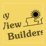
Bay View Builders allowed us to critique their logo. The following critique is based on one designer's opinions and experience.
Let me start by saying, I'm sure the original designer had good intentions. The logo, while needing some work, does at least communicate that Bay View Builders does most likely build residential homes.
Design Principals
Let's start by talking about the overall design of the logo. Visually, the logo appears ready to tip over to the left. The stair stepped typography and the open white space in the lower left contribute to this problem. One way to help solve this might be to put the type all on one line beneath the illustration.
Continue reading this articleThe images & logos presented on this blog are copyrighted by their respective owners. The blog itself is copyright Erik Peterson, 2008-2026 All Rights Reserved.


