Oodles of Doodles Logo Critique 228

Dawn sent a handful of her concepts for the Oodles of Doodles logo. I choose this one to critique because I thought it was the best fit for her company. It’s worth mentioning that Dawn prefers the first concept in the attached concepts. She is starting a home business doing wall murals for children’s rooms.
“My Logo is for children’s wall Murals. I’ll be mostly doing children’s rooms but other things a well. I wanted the logo to give the feeling of fun, color, artistic, childlike, put still professional. I’m not sure that it works on every aspect, but most I hope. I want to use the logo for just about everything, website, business cards, mailings, invoices, signage for the car. Any input would be greatly appreciated.”
The following critique is based on one designer’s opinion and experience. I always appreciate the readers thoughts as well. So, I’ll ask a question or two in the critique, please share your perspective in the comments at the end of this logo design critique.
Design Principals
I chose this version over the other logo that Dawn liked best because I think it does a much better job at representing what she does. This logo for Oodles of Doodles oozes fun and youthfulness, which sounds a lot like what Dawn wanted to achieve with the mark.
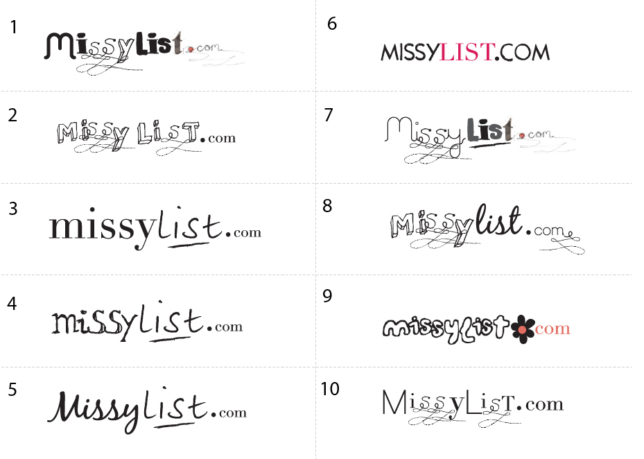
Continue reading this articleMissylist Logo Concepts Critique 50
Categories: Critiques Computers & Technology Services

The folks over at MissyList submitted a whole bunch of logo concepts, 10 to be exact. If you’re interested in seeing them all, here ya go.
I won’t be following the normal format for critique that I’ve been using up until now. Instead, I’m going to pick three concepts from the group that I think have the most potential. I will critique and talk about what’s working and what’s not.
According to the company info I received, the target market for the site is described as: female, 25-40 years old, young professionals, students, mothers, computer savvy, social network savvy, online shoppers. The tone & feel of the site was described as: girly fun, slightly sophisticated, community safe, trendy, second hand, bargain, recession fighter. The company used to be called feminads but is now being rebranded.
Continue reading this articleThe images & logos presented on this blog are copyrighted by their respective owners. The blog itself is copyright Erik Peterson, 2008-2026 All Rights Reserved.


