Johnny’s Pizza Logo Design Critique 360
Categories: Critiques Food & Beverages

Eric submitted his logo for Johnny’s Pizza and left the following comment.
“This logo is for a pizza company, based in Pittsburgh, PA. Because of this, I used a silhouette of the Pittsburgh skyline in the logo. It is a small, one location, pizza shop.”
The following critique is based on one designer’s opinion and experience. I always appreciate the readers thoughts as well. So, I’ll ask a question of two in the critique, please share your perspective in the comments at the end of this logo design critique.
Design Principles
I see a couple execution problems in this logo right away. First, the red bar that holds the word ‘Pizza’ doesn’t follow the established curve formed by the pizza graphic below.
Continue reading this articleFrom Scratch Bakery Logo Critique 80
Categories: Critiques Food & Beverages

Kelly, submitted this logo for the From Scratch Bakery. She left the following comment about the logo.
“This logo is for a new bakery in a downtown, upscale neighborhood. I am still working on the colors, but I wanted a simple, clean look. I selected the cupcake because it seems more subtle and I like the way it's on an angle. The bakery is a full service bakery but specializes in cakes and cupcakes.”
The following critique is based on one designer’s opinion and experience. I always appreciate the readers thoughts as well. So, I’ll ask a question of two in the critique, please share your perspective in the comments at the end of this logo design critique.
Design Principals
Upon a quick glance Kelly’s logo does a good job at communicating “bakery” to the viewer. The colors are inviting, modern and cheery
Continue reading this articleJack Tree Thai Cuisine Logo Design Critique 50
Categories: Critiques Food & Beverages

Mario submitted this logo for Jack Tree Thai Cuisine and had this to say about his logo,
“The colours and logo name were already handpicked by the client according to his personal auspicious religious beliefs. These colours denotes growth and energy. The jack tree is a plant which is very common in Sri Lanka. The logo is a stylized Jack Tree and you will be able to make out the tree and a jackfruit. client wanted simple yet strong typo for the logo. I stylized the typo by linking the letter 'j' and 't' I kept the typo separate from the icon, in order to have the freedom to use the icon all by itself.”
The following critique is based on one designer’s opinion and experience. I always appreciate the readers thoughts as well. So, I’ll ask a question of two in the critique, please share your perspective in the comments at the end of this logo design critique.
Design Principals
The first thing I notice when looking at the Jack Tree Thai Cuisine logo is the ‘j’ and ‘t’ ligature. I don’t care for this ligature. A ligature should create rhythm and flow within the type. This one tends to interrupt both and feels forced. Continue reading this article
Sophie’s Tavern Logo Design Critique 91
Categories: Critiques Food & Beverages
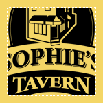
Kevin submitted this logo for Sophie’s Tavern along with the following commentary,
“Sophie’s Tavern is located in the heart of Camden, NJ and has been a cornerstone of the community since 1933. Like the city itself, Sophie’s has recently undergone a major renovation to improve the facilities both inside and out. It was decided that the building itself would be featured as it is such a recognized building in Camden. The main goal was to keep the home town feel of the bar to remind regulars and locals of the history and also introduce the bar as a great place to eat and drink to those who are unfamiliar with Sophie’s. A 3D model was built in SketchUp and then converted to vector art in Illustrator.”
The following critique is based on one designer’s opinion and experience. I always appreciate the readers thoughts as well. So, I’ll ask a question of two in the critique, please share your perspective in the comments at the end of this logo design critique.
Continue reading this articleThe images & logos presented on this blog are copyrighted by their respective owners. The blog itself is copyright Erik Peterson, 2008-2026 All Rights Reserved.


