Missylist Logo Concepts Critique 50
Categories: Critiques Computers & Technology Services

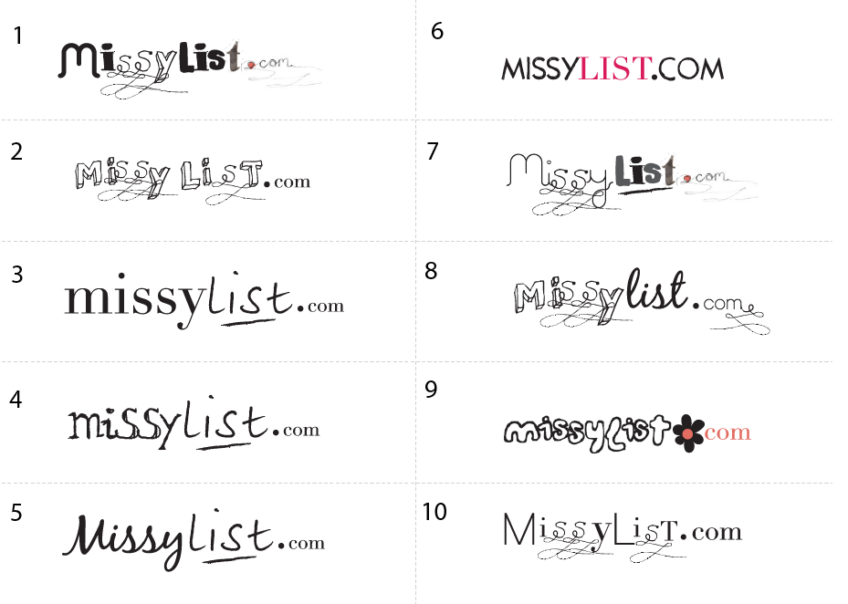
The folks over at MissyList submitted a whole bunch of logo concepts, 10 to be exact. If you’re interested in seeing them all, here ya go.
I won’t be following the normal format for critique that I’ve been using up until now. Instead, I’m going to pick three concepts from the group that I think have the most potential. I will critique and talk about what’s working and what’s not.
According to the company info I received, the target market for the site is described as: female, 25-40 years old, young professionals, students, mothers, computer savvy, social network savvy, online shoppers. The tone & feel of the site was described as: girly fun, slightly sophisticated, community safe, trendy, second hand, bargain, recession fighter. The company used to be called feminads but is now being rebranded.
Continue reading this articlePeg Productions 43
Categories: Critiques Computers & Technology Marketing & Design

Pez, from Peg Productions, submitted this logo for critique. When asked to explain the logo, Peg Productions said the following:
“We choose the logo because we felt it has quite a clear and simple theme—a peg. This view of a peg is also very striking, as it is often an angle overlooked by people the majority of the time. This shows customers that here at Peg Productions we think outside of the box and see the world in a different way.”
“Also as the logo is very simple in its fundamental nature it can changed and altered to look very graphically intense, or left very simple—as we do on the website and on our invoices.”
Design Principals
When this logo first arrived in my inbox I was honestly perplexed. I couldn’t figure out how this graphic was, in some way, a peg.
Continue reading this articleThe images & logos presented on this blog are copyrighted by their respective owners. The blog itself is copyright Erik Peterson, 2008-2026 All Rights Reserved.


