$99 Music Videos 43
Categories: Critiques Entertainment

Lee submitted this logo for $99 Music Videos, an independent music channel of music videos that have all been made for less than $99 (time not included). He made the following remarks about the company,
“Most musicians and filmmakers are unable to spend thousands of dollars on a music video. But in the age of digital film making, you no longer need those kinds of budgets. In fact, amazing original music videos are being made for the web every day for next to nothing. It was in this spirit that $99 Music Videos was born. We wanted to get back to the basics about what it is to make a music video; so we went with a really basic, yet strong logotype.”
The following critique is based on one designers opinion and experience. I will ask a question or two during the critique and would love to hear your thoughts in the comments section.
Design Principals
The $99 Music Videos logo is simple and bold. The typeface appears to be Helvetica Neue Bold. I don’t understand the upc/barcode graphic below the text. To me, the upc graphic says nothing about music, videos, or cost effective music videos.
Continue reading this articleLike No Other Productions 98
Categories: Critiques Entertainment
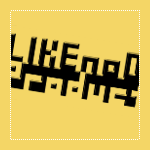
Andrew from Like No Other Productions submitted this logo for critique. Along with his submission, he mentioned that his company
“...will be making showreels, trailers, commercials, and other misc editing jobs, as well as making my own short films and creative endeavors.”
Andrew went on to say,
“I was drawn to pixel art because it has the interesting property of being able to be scaled to virtually any size without losing its shape; this fits with the sort of work we will be doing; anything for anyone in any medium.”
It's always nice to get some perspective on the designers thoughts before beginning a critique. So without further ado, the following critique is based on one designer's opinions and experience.
Design Principals
The first thing that strikes me when I see this logo is that is hard to read. It really does take a second to make out the word ‘Productions’.
Continue reading this articleThe images & logos presented on this blog are copyrighted by their respective owners. The blog itself is copyright Erik Peterson, 2008-2026 All Rights Reserved.


