What Makes a Great Logo Design? 250
A logo, trademark, emblem, brand, logotype, symbol, identity, mark, insignia represents a company to consumers. It gets its meaning from the company it represents, not the other way around. It’s effectiveness can help to sell a product or service to the public. It’s the identifier that consumers sometimes attach themselves to and become loyal to. It’s a visual expression of a company, product or service. The role of the logo is to point or designate in the simplest form possible.
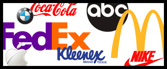
There are five elements that you can find in great and successful logo designs. Most of the logos you know and love will meet all these criteria. When you think of a great logo what brands come to mind? Remember the logos for those brands as you read through this article and see if they meet the five criteria.
- Distinctive
- Useable
- Timeless
- Effective without color
- Memorable
Consumers need to be able to recognize a logo. Therefore, a great logo must be distinct, easy to read and understand. The logo should be unique enough to avoid confusion with other companies’ logos. The logo needs to represent the company it stands for so that consumers may associate it with the business each time they see it.
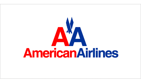
The American Airlines logo, designed by Vignelli Associates in 1967, meets all of the criteria we’ll be discussing in this article. The AA logo is instantly recognizable with it’s AA monogram and eagle icon.
Did you know? The redesign of the AA monogram in the 1960’s didn’t include the eagle. After the employees protested, the designer reluctantly added the stylized eagle that we know today as part of the AA monogram.
Since, a logo is used across many different mediums, from letterhead and business cards to websites and sales materials to pens and clothing. A good logo must be flexible enough to work in any situation/medium required. In order to meet these demands, a logo should work well in black and white and in color. From a size standpoint, a logo should be simple enough to look good on a business card, yet intriguing enough to work on a large poster or even billboard.
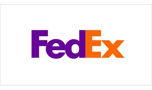
The FedEx logo was designed by Lindon Leader, in 1994 working as a Senior Design Director at Landor Associates. The logo is bold, scales well and works in all mediums.
Did you know? Many people don’t notice the clever arrow within the negative space of the ‘e’ and ‘x’ at first glance.
To be effective, a logo should stay with the business as it grows. The belief that a new or redesigned logo will somehow transform a business, isn’t uncommon. But a business shouldn't go around changing their logo on a whim. This can weaken the company brand after all of the work a company has put into it. A well-designed logo will persevere for years to come.
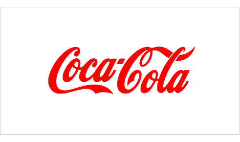
The Coca-Cola logo, designed by Frank Robinson in 1886, is a prime example of a great and timeless logo.
Did you know? Coca-Cola has one the best recognized logos in the world today, and is recognized in over 200 countries around the world.
A good logo not only needs to work in black and white, but it should also still be effective. If color is needed to communicate the message then perhaps too much emphasis has been place on it.
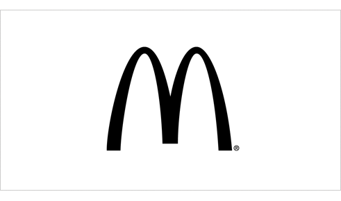
The McDonald’s logo was created by Jim Schindler in 1962. Even though it’s commonly referred to as “The Golden Arches” the logo works very well without the gold color.
Did you know? The idea of the arches was inspired by the arch shaped signs on either side of the ‘walk-up hamburger stand’. From an angle, the arches looked like the letter “M”. The “McDonald’s” name was later added to the McDonald’s logo in 1968.
Your logo should make a statement about your company. It should be engrained in the consumers brain when think of your industry. Therefore, the next time a consumer needs your kind of product or service, you’ll be the fist to come to mind just because of brand recognition.
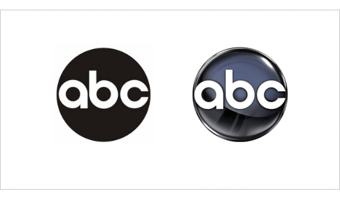
The American Broadcasting Company logo designed by Paul Rand in 1962 simplified the logo to a circle with the letters ‘abc’ inside. This achieved a memorable and unique image. This logo is still in use today, though it has been mostly replaced with a glossy version of the original designed by Rand.
In his 1991 article, Logos, Flags, and Escutcheons Paul Rand said,
“Design, good or bad, is a vehicle of memory. Good design adds value of some kind and, incidentally, could be sheer pleasure; it respects the viewer-his sensibilities-and rewards the entrepreneur. It is easier to remember a well designed image than one that is muddled. A well design logo, in the end, is a reflection of the business it symbolizes. It connotes a thoughtful and purposeful enterprise, and mirrors the quality of its products and services.”
The bottom line is that creating a logo requires a lot of planning, time, thought and often times, money. The meaning behind the design should embrace the mission and image of the company, not the other way around. The effectiveness of these marks are such a key part of brands today’s fast paced world. Ultimately, the role of the logo is to point or identify to the consumer in the simplest form possible.
Like what you read here? Subscribe to the Logo Critiques News Feed.
Enjoy this post? Share it with others.


The images & logos presented on this blog are copyrighted by their respective owners. The blog itself is copyright Erik Peterson, 2008-2026 All Rights Reserved.


We enjoy your comments
250 Comments so far. Keep 'em Coming.
#1
By Fabian
05.01.2009 at 01:03 AM
All great logos must create a emotional response.A simple icon or wordmark that compels you to buy,sell or discuss.
#2
By Tutorial City
05.01.2009 at 05:27 AM
Very cool topic. I think it’s important not to follow trends, ‘cause they simply disappear as the times goes.
#3
By Selvin Ortiz
05.01.2009 at 10:57 AM
@Fabian: I’m with you all the way!
#4
By chris green
05.03.2009 at 07:14 PM
They don’t come along very often, but they’re great when they do. I also think a great logo is one that you cant simplify any more than it is.
#5
By Joshua Davis
05.03.2009 at 07:46 PM
I couldn’t agree more. The article was right on and the examples were excellent.
#6
By Tim Schmidt
05.04.2009 at 11:25 PM
A great logo is simple, with a good story behind it.
#7
By Some Points
05.16.2009 at 04:33 PM
was creating logo for my site, I was thinking about designing my logo and after reading your article, it help me to think about a particular theme and I made it, you can see on my site somepoints.com, would like to say you thank you very much
#8
By ana paula
06.11.2009 at 12:35 PM
Toda empresa precisa de uma logo que funcione, que tenha historia, que seja simples!!!
#9
By mina
06.12.2009 at 09:40 AM
“The Coca-Cola logo, designed by Frank Robinson in 1886, is a prime example of a great and timeless logo.”
look at the logo over the years and you notice it changes.
coca cola change their logo all the time. the changes are so small sometimes that people do not notice it.
#10
By Stephen Hill
06.16.2009 at 08:04 AM
it’s mazing just how much an impact a logo design has, for me the use of bold colours is what makes them so appealing
#11
By Dhamphy's Online Journal
08.10.2009 at 06:28 PM
Good points you have there. It’s another learning article for me. Thanks.
#12
By Don
08.27.2009 at 02:06 PM
Some interpretations…well,very strange.
Don
#13
By Elisa Kuipers
09.15.2009 at 06:57 PM
A good logo is a logo that you can feel
#14
By james
09.25.2009 at 03:50 AM
That’s really nice logo designs.
#15
By Logo Design
12.08.2009 at 11:21 AM
james you are right these logo design are one of the best designs.
#16
By Attitude Design | Graphic Design Portfolio
01.12.2010 at 11:01 AM
Thanks for this post. I think that the most successful and recognizable logos are the simplest.
#17
By Reannan
05.12.2010 at 08:16 PM
Consumers need to be able to recognize a logo. Therefore, a great logo must be distinct, easy to read and understand. The logo should be unique enough to avoid confusion with other companies logos. The Rondo Guitars logo needs to represent the company it stands for so that consumers may associate it with the business each time they see it.
#18
By test
06.06.2010 at 08:48 AM
Thanks for this post. I think that the most successful and recognizable logos are the simplest.
#19
By Nabeel | Create Your First Website
06.12.2010 at 09:00 AM
Hi,
Great Article!
But I didn’t get the “Many people don�t notice the clever arrow within the negative space of the �e� and �x� at first glance.”
I still cannot see any arrow in the FedEx logo!
Please help
Nabeel
#20
By Gill
09.17.2010 at 01:41 AM
Thanks for the tips but I am still new to this one, and would like to learn more. One question here, do you have here not just for logo but for a webpage?
#21
By paul
12.01.2010 at 07:31 PM
very good, just been to a branding seminar recently and found that brands are emotional where people build that kind of relationship with their brand, and a logo is a small part of it! but good read. im still working on my brand for a new venture that i have, so lots of reading at the moment!
#22
By blogger
12.15.2010 at 04:10 AM
Then you use the tools on the left-hand side of your screen to edit these pixels and to design the icon. If you cannot design your own icon, use an image that has to either be copied or pasted on the icon canvas or by pasting your image from a file.
windows icons
#23
By Logosafari
12.22.2010 at 07:59 PM
This is a great article! Thanks!
#24
By Inventika Solutions
07.06.2011 at 06:10 PM
This is our logo - simple, beautiful and memorable.
http://www.flickr.com/photos/inventikasolutions/5909179587/in/photostream
#25
By Alan
07.16.2012 at 05:44 AM
awesome collection you made here.
#26
By best custom essay writing services
11.21.2012 at 12:11 PM
Recently been to a marketing workshop not too long ago and located which brand names tend to be emotive where men and women create that type involving connection using brand, plus a emblem is a small portion of it! yet good examine. internet marketing still working on my own manufacturer to get a medical which i get, therefore a lot of studying at the moment!
#27
By research paper writing services
11.23.2012 at 05:25 AM
Then you certainly make use of the equipment about the left-hand side of your screen in order to modify these p and layout the particular symbol. If you can’t design your very own star, use an image that has got to either be duplicated as well as pasted about the symbol canvas or even through pasting your graphic from a file.
#28
By Buy Ritalin UK
02.14.2013 at 06:13 AM
I have no words to express how useful your blog was to me in completing my job work successful. Thanks a lot.
#29
By Open PAMM Account SW FX
02.19.2013 at 11:26 AM
I agree with the writer and want to appreciate him for sharing such a nice post with us
#30
By Karah Parks
09.26.2013 at 03:46 AM
Hello and thanks for this useful article. I’ve made mention of it in my blog, listed above, as my students recently did some logo design for our marketing class. A great resource!
#31
By current revision
12.17.2013 at 07:12 PM
I wanted to thank you for this unique read. I definitely savoured all bits and pieces of it including all the comments and I have added you to my bookmark list to check out new articles you post.
#32
By instant loans
04.10.2014 at 12:45 PM
I’ve learn several excellent stuff here. Definitely price bookmarking for revisiting. I wonder how much effort you place to make any such magnificent.
#33
By visit website
04.18.2014 at 05:50 AM
This can be amazing. Both of us watch this idea peace of mind when we are shocked. We’re fascinated by one of these pieces. Solitary appreciate your particular suggestion, and significance the effort inside this. Please keep enhancing. These are reall…
#34
By kik software free download for pc, kik messenger f
09.06.2014 at 04:10 AM
Just want to say your article is as surprising. The clarity in your post is
simply nice and i can assume you are an expert on this subject.
Well with your permission let me to grab your RSS feed to keep updated with forthcoming
post. Thanks a million and please carry
on the gratifying work.
#35
By Jasmin
09.27.2014 at 10:43 AM
Excellent way of describing, and fastidious article to geet data concerning my
presentation subject matter, which i am going to deliver in university.
#36
By jeune cochonne
12.06.2014 at 02:36 PM
Less articles sont clairement attractifs
#37
By
12.12.2014 at 10:01 AM
Une fois de plus un excellent poste, j’esp�re en discuter dans la soir�e avec mes coll�gues
#38
By salope chaude
01.23.2015 at 07:06 PM
J’ai gu�re termin� dee regarder cependant je
repasse ce soir
#39
By valentine's day gift in singapore
02.01.2015 at 07:58 PM
This is such a sweet gift, I would be very happy to receive this on Valentine’s
Day!
#40
By film de sexe hardcore
02.04.2015 at 02:16 PM
Tr�s attrayant, mon petit doigt me dit que ce post devrait int�resser ma pote
#41
By Mira
04.23.2015 at 01:59 PM
By helping the characters in the lessons reach their goals, learners will gain relevant skills in a safe and supportive environment.
Many zebra crossings are placed within metres of the junction. You
will soon get relegated into the dreaded friend zone, which I
must tell you is almost impossible to escape from.
#42
By Kelly
02.09.2017 at 02:16 AM
Nice design, indeed. it looks cute and simple. Wonderful article and I really like the design.
#43
By divp
03.16.2017 at 05:20 AM
A great logo is simple, with a good story behind it.good one keep it up
#44
By frank
08.01.2017 at 08:09 AM
I read Your post you have awsome info i love the way you write i
also got awsome info on circus.be please check
#45
By j4jacket
08.09.2017 at 04:23 AM
That is very inspirational blog.Its mean a lot to us,Thanks for sharing such a informative blog.keep updating with more beneficial blogs.Here we have one special thing that will give a dashing personality and a great outfit.There is a lot of collection of leather jackets for man and woman.Must visit and avail good packages.
Visit,<a href=“https://www.j4jacket.com/”>j4jacket<a>
#46
By distressed leather jacket
08.16.2017 at 04:42 AM
Nice to know about such a useful information keep update us with more informative blog.Here i am going to introduce such a great brand just click the link below to check the unique design of leather jackets,cotton coats and many more.So don’t waste your time just click and avail the opportunity.
distressed leather jacket
#47
By imagiacian
08.17.2017 at 12:43 PM
Great information keep sharing with us great blog like this.we are providing you a great offer to make your websites in ideal cost with professional work.So don’t waste your time just click the link below to avail the great offer!
Visit,imagiacian
#48
By buy winter leather jackets
08.29.2017 at 12:41 AM
Of course, logotype designs can include starting numbers from day to day social networks starting from design and starting to activation points in social networks, but the logo or brand remains. The basis of many branding schemes.
#49
By Shahab
08.29.2017 at 01:47 AM
The role of the logo is to point or designate in the simplest form possible.
Owner of Ecommerce Web design companies
#50
By hotel rooms reservations in makkah
08.30.2017 at 01:38 AM
The effectiveness of these marks are such a key part of brands today’s fast paced world…
#51
By J4jacket
09.06.2017 at 01:50 AM
A great logo must be distinct, easy to read and understand…those who wan’t to buy quilted leather jackets vist here…
#52
By Meher
09.06.2017 at 02:34 AM
5 star hotels in makkah
#53
By Meher
09.06.2017 at 07:21 AM
Ecommerce Website development companies
#54
By johnwan
09.15.2017 at 05:04 AM
This is great design.
modafinil
#55
By Hotel Booking in Makkah
09.26.2017 at 08:46 AM
Just want to say your article is as amazing. The clarity in your post is just great and i can assume you are an expert on this subject. Thanks a million and please keep up the enjoyable work.
#56
By the walking dead negan leather jacket
10.02.2017 at 05:35 AM
This article was an outstanding piece shared by writer on this topic
#57
By Negan jacket
11.15.2017 at 02:43 AM
In my eyes it is a valuable informative piece and I understand it in completely
#58
By David
03.15.2018 at 12:15 AM
I am also the field of logo designing and this website contains a lot of stuff related to my field. The topic of this post is very informative which is about what makes a great logo design. You have shared your knowledge and experience with us on this website.
Castor wheels for sale online
#59
By henrys
03.17.2018 at 01:01 AM
An intriguing discussion is worth comment. I think that you ought to publish more on this subject matter, it might not be a taboo matter but generally people don’t discuss these issues. To the next! Kind regards!!
Continue reading
#60
By Sammy
03.17.2018 at 03:38 AM
Your post is really very good and I appreciate it. It’s hard to sort the good from the bad sometimes.Thanks a lot for this nice sharing post. E Liquid Packaging
#61
By davel
04.05.2018 at 06:02 AM
Great logo designs helps us to make our business more popular and powerful. I am agree with your material and must want to say this is unique way to help others.
click here
#62
By Athar
04.06.2018 at 02:11 AM
Simplicity is the best. Thanks for sharing this blog post.
#63
By Wilson
04.06.2018 at 06:16 AM
I am just trying to seeking logo making and now I have found your website which is the interesting and such type of inspirational for me. Thanks for sharing useful stuff with us.
dallas water damage services
#64
By theamericanfashion.com
05.28.2018 at 01:55 AM
I randomly visit this page and I found many relevant and impressive points from this single post
#65
By Promoocodes
06.21.2018 at 04:36 AM
Nice designs of a logo, But I always like to Amazon logo because it gives a message to us.Get pink queen promo codes
on promoocodes official site through that could get a great discount on women’s designer clothes.
#66
By Sanam
07.09.2018 at 03:16 AM
A great logo comes with simplicity in my opinion…it should be clear to read and understand and should be simple… if you are looking for some discount coupons then click here Couponseye.com you can get some latest shopping discount coupons.
#67
By Dhgate Discount Codes
07.30.2018 at 01:11 AM
I found a lot of interesting information here. A really good post, very thankful and hopeful that you will write many more posts like this one.
#68
By Dinesh Kumar
08.13.2018 at 05:30 AM
Thanks for sharing this post. I found a very interesting information here. Visit once web development company in vijayawada
#69
By new year 2019
08.25.2018 at 01:45 PM
Very Informative article, Amazing article. I am so impressed.
Happy New Year 2019
If you interested about upcoming new year 2019 then
download free
#70
By jordan sons
09.05.2018 at 06:44 AM
I just am to a shocking degree restoring because of this site. It’s an edifying point. lorex technology Coupons It urges me especially to greatly help a barely any issues.
#71
By swapnali
09.15.2018 at 02:56 AM
Wonderful blog post. This is absolute magic from you! I have never seen a more wonderful post than this one. You’ve really made my day today with this. I hope you keep this up!
#72
By AOL support number
10.06.2018 at 06:03 AM
Hi, this is nice articale…
Looking for AOL support number, visit on:
AOL support number
#73
By dadu online
10.08.2018 at 07:49 PM
I was suggested this blog through my cousin. I’m not certain whether or not this submit is written through him as no one else recognise such designated approximately my problem.
You’re amazing! Thank you!
#74
By dadu online
10.08.2018 at 07:49 PM
I was suggested this blog through my cousin. I’m not certain whether or
not this submit is written through him as no one else recognise such designated approximately my problem.
You’re amazing! Thank you!
#75
By expression Tees Coupons
10.19.2018 at 02:22 AM
You have enhanced some than typical fixations there. I kept an eye out for the web to expression tees coupon discover more about the issue and found a large number of individuals will oblige your perspectives on this website
#76
By website designing company in india
10.22.2018 at 04:33 AM
for more information visit here
#77
By Logo Champ
11.24.2018 at 03:43 AM
Logo Design Cost UK is quite affordable. You can get well designed professional logos which exhibit your brand identity very well. One of which is very popular. Try it, it’s known as “Logo Champ”
#78
By asd
12.27.2018 at 11:04 AM
google
#79
By logo victoria
03.25.2019 at 03:14 AM
Good content. this is very informative for logo design cost uk because in the United Kingdom there are so many companies which have a different rate for logo design cost so everybody should check this list before using any packages.
#80
By Kaitlyn John
03.29.2019 at 07:14 AM
Logo Critics is an excellent site. The aim of the site is to help logo designers to create powerful logos by the opinion of the browsers. flats for sale in ernakulam In this article, they sharing the concept of what makes a logo design?
#81
By henrysmiths
06.28.2019 at 05:19 AM
Hi admin! I agree with your writing style and must want to say that you are doing awesome then others.The article you have shared is much interesting for me.
best cereal boxes online
#82
By kalyan babu
07.05.2019 at 06:03 AM
I would like to express my sincere gratitude to this blog. kratom stores in Oklahoma city
#83
By Kalyan Developers
09.05.2019 at 01:37 AM
Were you in the lookout for a home in Trivandrum, built with the trust of perfection? Though your search may have begun anywhere, it shall cease at Kalyan Sapphire, apartments for sale by Kalyan Developers at Peroorkada, Thiruvananthapuram.
We don’t just build buildings of mortar and cement, we believe in building everlasting relationships with trust as our cornerstone. With every facet radiating quality, aesthetics and peace of mind, these luxury apartments at Peroorkada are crafted with the passion to deliver indulgence and tranquility to the dwellers.
Step into your abode of joy, whether it’s a spacious 3BHK apartment or a cozy 2BHK flat. With a property that hosts international standard amenities, we would not leave any tick box in your checklist unchecked!
#84
By Kalyan Developers
09.05.2019 at 02:05 AM
https://www.kalyandevelopers.com
#85
By Gold
10.01.2019 at 03:50 AM
Good post
Thanks for sharing!
#86
By Best Colleges In Bangalore
10.22.2019 at 05:50 AM
Optometry in its uniqueness is one of the most demanded healthcare professions of recent times. The study essentially involves an advanced learning of the clinical skills involved in measuring eyesight, vision-measurement, prescribing corrective and fitting lenses, and detecting and treating various eye diseases to improve an individual’s vision.BSc Optometry Colleges In Bangalore
#87
By Randy Whitlock
10.25.2019 at 06:45 AM
I need some good ideas for a new logo design for my business Towing Near Me.. this article is helping a lot.
#88
By Mazhar
10.28.2019 at 12:24 AM
BBA with Aviation is the Management course at undergraduate level which regardless of the specialization, along with study of Travel and Tourism and additional certification IATA course. IATA – International Air Transport Association was founded in 1945 and is the trade association of more than 240 airlines, including the world’s largest. IATA serves the International Aviation and Travel & Tourism industries by providing training in the fields of travel and tourism, airlines, airports, cargo and civil aviation.
Visit BBA Aviation Colleges in Bangalore
#89
By Flats in Kochi
11.08.2019 at 03:21 AM
Hey what do you think of the logo of this website: https://www.dreamflower.in/
#90
By Dreamflower media
11.08.2019 at 03:23 AM
https://www.dreamflower.in
#91
By Dreamflower media
11.08.2019 at 03:26 AM
flats in Kochi
#92
By Mazhar
11.19.2019 at 11:07 PM
Here is the services provided by myself. I’m providing the list of best colleges in India. If you are looking to study in Bangalore, here are the two list of best colleges.
BBA Aviation colleges in Bangalore
Physiotherapy colleges in Bangalore
#93
By Sophie Miller
12.06.2019 at 06:42 AM
I would like to read about it anymore. Prompt, what literature to study? <a >192.168. 1.1</a>
#94
By k2 appliances
01.10.2020 at 06:08 AM
We reveal the actual worth of the Water Heater Brands and convey an ideology of buying a perfect deal.
#95
By Swati Sharma
01.15.2020 at 02:09 AM
This blog is highly knowledgeable in providing excellent knowledge Thank you for sharing the collection.check out this informative blog. Enhance your kitchen essential by grasping new updates from the blog, about how to buy Best best induction cooktop in India & get a viable solution for your query.
#96
By Mazhar
02.07.2020 at 03:34 AM
Here is the details of B.Sc Optometry colleges in Bangalore. If you are looking to study BSc Optometry in Bangalore, the below will help you to find the best Optometry colleges in Bangalore.
BSc Optometry Colleges in Bangalore | Optometry Colleges in Bangalore |
#97
By osama shk
02.12.2020 at 11:18 AM
Superbly written article, if only all bloggers offered the same content as you, the internet would be a far better place..
read the article
#98
By asdsad
02.13.2020 at 07:16 AM
This is actually the kind of information I have been trying to find. Thank you for writing this information.
is it safe to travel to taiwan now
#99
By Grand Master
02.18.2020 at 12:44 AM
cattle feed manufacturers
#100
By Ads and Url
02.19.2020 at 07:03 AM
In one word, a fantastic blog. But, I was also expecting something result-oriented along with a step-by-step guide. I am keen to read the next blog.
Top Web development company in India
#101
By we buy
03.03.2020 at 06:18 AM
Thanks for your valuable content. I read this post and got it very wonderful helping topics
We Buy Vacant Land
#102
By Saad Khan
03.10.2020 at 08:02 AM
Thanks for this amazing article it will help the designers to take help from these ideas and portray it. I am Also a Logo designer at logowizpro which is a website where you can design your own logo for free and make stunning logos with hundreds of templates.
#103
By texas colleges and universities
03.11.2020 at 12:47 PM
Thanks for the useful information! You helped me with advice!
#104
By osama shk
03.19.2020 at 11:44 AM
Thank you again for all the knowledge you distribute,Good post. I was very interested in the article, it’s quite inspiring I should admit. I like visiting you site since I always come across interesting articles like this one.Great Job, I greatly appreciate that.Do Keep sharing! Regards,
婚約指輪 福岡
#105
By osama shk
03.22.2020 at 02:48 PM
I read a article under the same title some time ago, but this articles quality is much, much better. How you do this..
結婚指輪 手作り
#106
By osama shk
04.02.2020 at 05:02 AM
Just admiring your work and wondering how you managed this blog so well. It’s so remarkable that I can’t afford to not go through this valuable information whenever I surf the internet!
kak da otslabna burzo
#107
By Arti Rathor
04.23.2020 at 04:40 AM
This blog is full of valuable knowledge. Thank you for sharing it.
You can enhance your kitchen area with brilliant home appliances and get updates from our blogs like Best Kitchen chimneys in India .
The blogs will help you to know about the appliances you are going to buy.
#108
By Heather
04.28.2020 at 10:14 AM
Our electrician midland tx is available to fix your wiring issues.
#109
By John
04.28.2020 at 10:23 AM
Our tallahassee electricians is here to resolve your lighting needs.
#110
By Abe
04.28.2020 at 10:25 AM
Call the experienced manhattan electricians trusts.
#111
By Arti Rathor
05.14.2020 at 07:49 AM
We are here with Best 10 Mattress in India for 2020
#112
By asa
05.19.2020 at 01:00 AM
good one
#113
By damian
05.19.2020 at 01:04 AM
These are good characteristics that should be considered. I like your post. Thank you. I should be using this on my next
bee consulting projects.
#114
By miranda
05.25.2020 at 07:54 AM
your tips are really awesome. carport
#115
By shereen
05.25.2020 at 07:55 AM
I find this very helpful for me specially that im starting out in this industry. Plumber near me
#116
By alicia
05.25.2020 at 07:56 AM
I certainly love to read this. I will have this bookmarked. leak detection
#117
By candy
05.25.2020 at 07:58 AM
Perfect. blocked drain
#118
By window washers overland park
05.26.2020 at 07:28 AM
Have a nice day!
Overland Park Window Washing
#119
By Website
05.26.2020 at 06:51 PM
I need a logo for my website that designs and builds custom closets
#120
By Tayeeb Khan
05.27.2020 at 01:52 PM
Here is a list of best bba aviation colleges in bangalore for those of you who wish to study Aviation in India.
#121
By Tayeeb Khan
05.27.2020 at 01:55 PM
Design is an important aspect of Logo Design, Having the knowledge of Psychology of colors and creativity in designing aspect are crucial for a good Logo. Getting a Diploma in Fashion Design might help you get that knowledge of Colors and improve your creative provess.
#122
By commercial painting
06.01.2020 at 09:50 AM
Have a nice day!
<a >Catalyst Painting</a>
#123
By Kushveer Sandilya
06.21.2020 at 10:09 AM
A good blog always comes-up with new and exciting information and while reading this article, I do get a vibe that this blog really have all those qualities.
Wanna know more about us visit : Visit Educationhub
#124
By sam johnson
07.01.2020 at 09:23 PM
Thank you for sharing!! These logo designs are great.
Deck Builders Monroe LA
#125
By Himanshi Singh
10.15.2020 at 07:11 AM
Perfect article. I love reading a great article. Thank you very much! Keep Posting. Compare the Best Online Discount Brokers in India. Get Free Quotes.
#126
By pretty gaming
11.14.2020 at 04:17 AM
Interesting topic for a blog. I have been searching the Internet for fun and came upon your website. Fabulous post. Thanks a ton for sharing your knowledge! It is great to see that some people still put in an effort into managing their websites. I’ll be sure to check back again real soon.
#127
By best demat accounts in india
12.01.2020 at 06:41 AM
Looking for the best Demat account for Stock Trading? Worry not, Here is list of 10 Best Demat accounts in India for beginners to experts.
#128
By Best Demat account
12.02.2020 at 12:55 AM
amazing article !! how to choose the best Demat account in India and compare the best Demat account and choose the best stock brokers in India.
#129
By Sushant Thakur
12.13.2020 at 10:25 AM
Check out the best home and kitchen appliances Best refrigerator under 15000
Best refrigerator under 30000
Best refrigerator under 25000
Best refrigerator under 20000
Best double door refrigerator
Best single door refrigerator
Best side by side refrigerator
Best refrigerator In India
#130
By Washingmachine Authority
12.17.2020 at 07:55 AM
We bring you list of best washing machines in India. Choosing washing machine that suite your needs is not easy. We understand this. Therefore our experts, with over 30 years of experience in the industry, have created this list of top washing machines based on several criteria so that you get information on the top washing machine models for your home. Choose best-fit washing machine for your home based on salient features, weight, capacity, cleaning efficiency, pros and cons. Washing machines can be divided into front load, top load automatic and top load semi automatic. Therefore we give you top washing machines in each category. for more info visit here
https://washingmachineauthority.com/
https://washingmachineauthority.com/best-top-load-washing-machines-india/
https://washingmachineauthority.com/best-top-load-washing-machines-india/
https://washingmachineauthority.com/best-semi-automatic-washing-machines-india/
#131
By lipfiller
12.25.2020 at 12:36 PM
Only aspire to mention ones content can be as incredible. This clarity with your post is superb and that i may think you’re a guru for this issue. High-quality along with your concur permit me to to seize your current give to keep modified by using approaching blog post. Thanks a lot hundreds of along with you should go on the pleasurable get the job done.
#132
By window washing ks
02.03.2021 at 04:23 AM
“Overland Park Window Washing provides professional and affordable window cleaning, gutter cleaning and pressure washing. Check out their site to see what they do! Here is a link <a >window washing in overland park</a>
”
#133
By best water softeners
02.19.2021 at 01:07 AM
Is Drinking impure water creating problems for you? Read best water softener systems review on offer singh.
best water softeners
#134
By Best Amazon products
02.26.2021 at 05:48 AM
Nice blog! good job.Can you also write something about Auricolari wireless
Nice blog! good job.Can you also write something about Potente mini aspirapolvere senza fili ricaricabile
Nice blog! good job.Can you also write something about USB Hub 3.0
Nice blog! good job.Can you also write something about Ricarica Mangiapannolini Bimbi
Nice blog! good job.Can you also write something about Abito Principessa Cenerentola
#135
By Daniel Cerritos
03.02.2021 at 07:29 PM
I will be doing a logo for my business and this article is a great help. Thanks for sharing.
Daniel of Cerritos Pro Concrete
#136
By SMS BUILDERS
03.08.2021 at 02:03 AM
Nice blog with great details.. Keep Up the Good Work..
For Budget & Luxury Apartments in Kochi, Kerala click here.
#137
By Best demat in India
03.10.2021 at 07:30 AM
Thanks for informative post. Selecting best demat account is one of the first thing a trader have to do. Some demat are best for investors and some are best for traders
#138
By Alex Honnold
03.12.2021 at 10:16 AM
Wow great This is the exact thing that I was looking for, and i found this amazing thanks!
We also do have something worth mentioning : terranovaadventure
#139
By Franky
03.29.2021 at 04:19 AM
I get a lot of information that can use everyday. Cheers from mobile cat grooming denver
#140
By Sudheesh
04.06.2021 at 12:11 AM
Good Article.
A good logo can make a great impact…..
#141
By SMS Builders Cochin
04.06.2021 at 12:15 AM
Good Article.
A good logo is the most important thing if you are starting a business. A Good Logo can do so good.
For Budget Apartments in Kochi, Kerala
#142
By Peter Kriss
04.13.2021 at 07:52 AM
Great article, this is so informative. This will help me on creating a logo for Manteca Towing Pros.
#143
By Zyra Alissa
04.21.2021 at 05:38 AM
a href=“https://www.realjamescharles.com/”>Makeup</a> Help You Sustain Your Youth
One of the greatest benefits of wearing makeup is that it helps you look younger. Makeup can help you conceal wrinkles, aging spots, and other blemishes. With the right makeup artist touch, you will never have to worry about your age showing. In fact, you will look younger than you’ve ever looked.
#144
By Ganga
05.11.2021 at 02:52 AM
This post is very helpful to creating the logo of my new website KEM Builders.
#145
By VINEET PAL
05.11.2021 at 09:43 AM
Businesshelp4u.com is a website that provides you authentic information about
#146
By Jane Hill
05.18.2021 at 02:34 PM
Thank you for sharing great tips, visit us at https://www.laconcretepros.com
#147
By Jane Hill
05.18.2021 at 02:38 PM
Thank you for sharing great tips, visit us at LA Concrete Pros
#148
By Joseph
05.18.2021 at 07:17 PM
I would probably be basing the logo creation of a website for carpet cleaners Avondale AZ based on the criteria provided on your post. Thank you so much for sharing!
#149
By Taylor
05.22.2021 at 05:04 AM
Now, I’m getting the whole picture. I think these things you mentioned are elements to consider in making a logo. We will probably consider these once we decided to have a redesign for the logo of this website: https://www.concretingservicescanberra.com.au/
#150
By Daniel Copeland
05.27.2021 at 04:21 AM
Thanks for the interesting read. I often think that for the logos always referred to as ‘great designs’; are these truly an exceptional design that ticks all of the boxes above, or is it that because the company/logo is so well known, is that what makes it great? I think there are much better logo designs than the examples above which leads me to believe that probably logo design isn’t really that important. Great article, however. Thank you.
Daniel at The Tiler Mackay
#151
By istanbul anadolu eskort
05.30.2021 at 05:53 AM
This is my first time i visit here and I found so many interesting stuff in your blog especially it’s discussion, thank you.
#152
By Taylor
06.08.2021 at 06:59 AM
You really delivered a good content here. I’m glad that I have visited your site. At least now, we can create a checklist on what to consider when it comes to creating a logo that really speaks about a brand. Thank you and please feel free to visit one of our websites: https://bendigoconcrete.com.au/ that offers the best concreting services in Bendigo, VIC.
#153
By Fumigation Services
06.09.2021 at 05:06 AM
Fumigation Services in Karachi
fumigation in karachi fumigation karachi fumigation fumigation services in karachi fumigation services karachi fumigation services pest control services in karachi pest control in karachi pest control karachi pest control services water tank cleaning fumigation services pest control services in karachi fumigation in karachi fumigation services in north nazimabad fumigation services in dha karachi termite control services bed bugs fumigation in karachi water tank cleaning services in karachi
#154
By Kenz
06.14.2021 at 02:38 PM
I have some thinking to do about our logo…
<a >Minneapolis Acupuncture</a>
#155
By Kenz
06.14.2021 at 02:40 PM
try that again… https://www.mpls-acupuncture.com
#156
By Anthony
06.18.2021 at 09:37 PM
This is a good share. This can serve as a guide on what logo we should create for this website: airanddryerventcleaningchandler.com.
#157
By Website Strategy
06.22.2021 at 10:05 AM
Interesting about the colors
<a >“website logos</a>
#158
By Website Strategy
06.22.2021 at 10:09 AM
(url=https://www.web-site-strategy.com)[logo](/url)
#159
By Shawn
06.23.2021 at 09:24 AM
These are excellent tips and out of it, we can surely create a checklist that would help us create logos for our clients that speak about their brands. Thank you and more power to this website.
Regards,
Shawn | Digital Marketer at https://www.nolimitbusinesssolutions.com
#160
By Thomas
06.25.2021 at 01:46 AM
All of these are important tips to ponder when thinking of creating a great logo. Anyway, I might suggest this to my team at airanddryerventcleaninggilbert.com/, that way we can collaborate in making the best logo for our website.
#161
By Edward
06.30.2021 at 07:22 PM
This information you have here is extremely helpful for us since we haven’t had created a logo yet for this cleaning services Scottsdale company.
#162
By Charles
07.06.2021 at 07:32 AM
Great explanation. Thank you for this contribution, now I know what to consider in making a great logo. Anyway, please see here; discover the best tile and grout steam cleaners in Mesa, AZ.
#163
By Sushant Thakur
07.14.2021 at 01:07 AM
Nic eone
https://www.hindustantimes.com/brand-post/benefits-of-drinking-purified-water-and-the-importance-of-water-purifiers-101625051345125-amp.html
https://www.mid-day.com/lifestyle/infotainment/article/choose-the-best-home-appliances-from-top-home-appliances-23181778
#164
By Shubam
07.17.2021 at 04:52 AM
बढ़ते इंटरनेट के प्रभाव से इंडिया में बहोतसी इंडस्ट्रियों को बूस्ट मिला है इसमें गेमिंग, डिजिटल मार्केटिंग और ऑनलाइन बिज़नेस ऐसी बोहोत्सि इंडस्ट्री तेजी से ग्रो कर रही है. ऐसे में एक अच्छा खासा पावरफुल लैपटॉप होना हर किसी की जरूरत बन गया है.
[url=“https://hindimereview.net/best-laptop-under-60000-review/
“]5 Best Laptop Under 60000 इन हिंदी[/url]
#165
By Shubam
07.17.2021 at 04:53 AM
बढ़ते इंटरनेट के प्रभाव से इंडिया में बहोतसी इंडस्ट्रियों को बूस्ट मिला है इसमें गेमिंग, डिजिटल मार्केटिंग और ऑनलाइन बिज़नेस ऐसी बोहोत्सि इंडस्ट्री तेजी से ग्रो कर रही है. ऐसे में एक अच्छा खासा पावरफुल लैपटॉप होना हर किसी की जरूरत बन गया है.
5 Best Laptop Under 60000 इन हिंदी
#166
By James
07.26.2021 at 05:28 AM
You make this information interesting and engaging. You give readers a lot to think about and I appreciate that kind of writing. lpg endermologie
#167
By Julian
08.10.2021 at 04:14 AM
I’m really glad that you have shared these tips. Now, we know what to consider in making a great logo design for this website.
#168
By title loan
08.12.2021 at 06:29 AM
Informative blog…..........
#169
By William
08.19.2021 at 06:51 AM
These are amazing tips. For sure this can help us create excellent logos for our websites. Anyway, if you’re looking for quality tree removal please refer it to https://www.treeremovalservicechandler.com/ if you’re from Chandler, AZ.
#170
By Lennor
08.30.2021 at 09:41 PM
Great article about what makes a great logo design! Thanks for sharing this! Please visit our sites also: ann arbor water heaters : ann arbor wedding photography : canton appliance repair
#171
By Lennor
08.30.2021 at 09:42 PM
Great article about what makes a great logo design! Thanks for sharing this! Please visit our sites also: canton carpet cleaning : canton concrete : canton handyman
#172
By flats in kochi
09.14.2021 at 04:09 AM
good blog Apartments in Kochi
#173
By Best Sub Broker
10.08.2021 at 05:43 AM
Amazing and informative post as usual!
#174
By Darra Mowel
10.28.2021 at 06:42 AM
Thanks for a very interesting blog. Emergency Towing Service Brockton
#175
By alex
10.31.2021 at 09:21 AM
THE BEST WAY FOR WRITTING digital citizenship and online safety articles
#176
By Zilaine
11.03.2021 at 05:01 AM
It’s excellent site, I was looking for something like this.
https://www.lonestarhomeremodelingpros.com/
#177
By EFY
11.07.2021 at 10:40 AM
This is an extremely well-written article. I will make sure to bookmark it and return it to read more of your useful info. Thanks for the post. I’ll definitely come back.
Job Search Engine
#178
By Allen N.
11.12.2021 at 04:25 AM
Your blogs are great! website
#179
By tomduffy1983
11.18.2021 at 09:34 PM
Really its a great thought. Thanks for sharing this information. I really like your way of expressing the opinions and sharing the information. It is good to move as chance bring new things in life, paves the way for advancement, Allfreedumps//MS-100//350-601
#180
By SIEI
11.21.2021 at 05:46 AM
One of the things I enjoy regarding reading websites such as this, is that there aren’t any spelling or lexical errors! Causes it to be tough about the readers sometimes. Very good work upon that and also the subject of this website. Many thanks!
Movie Database
#181
By thesharebrokers
11.22.2021 at 11:50 AM
best article !!
#182
By NetraClos NetraClos
11.27.2021 at 05:58 AM
Web Application Frameworks are sets of program libraries, parts and apparatuses coordinated in a design framework permitting engineers to assemble and keep up with complex web application projects utilizing a quick and effective methodology Web application development.
Web Application Frameworks are intended to smooth out programming and advance code reuse by presenting organizer association and design, documentation, rules and libraries (reusable codes for normal capacities and classes).
#183
By ucssingapore
11.29.2021 at 05:52 AM
We are specialized in Hard disk Destroy, Computers, Laptops and Server Sale and repair.
LCD & LED Screen Replacement & Repairs
#184
By Facca
12.14.2021 at 04:54 AM
Just wow! Beautiful way to organize things neatly. Thank you so much. shipping broker
#185
By Mara C.
12.17.2021 at 09:49 AM
Great article and comments all around. Peerless site. Well Stated. Eaves Services
#186
By Aamaze Homes
12.20.2021 at 04:42 AM
Very good and informative article.
#187
By Nanie R.
12.22.2021 at 04:06 AM
This was a well-structured post and I appreciate you for choosing a unique writing style here. https://www.sidingcoquitlambc.com/
#188
By Indianvillage
12.23.2021 at 05:09 AM
This article is very helpful to create a logo for our website Indian village restaurant
#189
By Billy Sean
12.29.2021 at 04:26 AM
Very informative post. I really do hope and pray this stuff works! Visit here for more info. check site
#190
By Ma Ni
01.06.2022 at 07:08 PM
how much is a dumpster rental near me does any know this?
#191
By Clark
01.10.2022 at 03:26 PM
I love this blog!local chimney sweep worcester ma
#192
By MARY LANADA
01.11.2022 at 09:23 PM
Nice article, Thanks for describing that how to convert video to multiple format. https://btclod.com/
#193
By Asia Thomas
01.13.2022 at 02:11 AM
I learn new information from your article, You are doing a great job. Keep it up. To increase your clicking speed check this article which is about Clicks per second checker. CPS test is a online test to fastly increase your clicking speed. its helpful for me a lot. https://431255.8b.io/
#194
By Asia Thomas
01.13.2022 at 02:13 AM
I learn new information from your article, You are doing a great job. Keep it up. To increase your clicking speed check this article which is about Clicks per second checker. CPS test is a online test to fastly increase your clicking speed. its helpful for me a lot. https://431255.8b.io/
#195
By flats in Aluva
01.14.2022 at 06:23 AM
nice logo. keep it up
#196
By Anne Ferbs
01.24.2022 at 03:40 AM
This blog is so nice to me. I will keep on coming here again and again. Thanks! concrete slab foundations san antonio tx
#197
By Lanny
01.30.2022 at 07:09 AM
Always learning something new. construction handyman northern virginia
#198
By SYSCORPINC
01.31.2022 at 06:30 AM
create your business’s online presence on google with Best Digital Marketing Company in Delhi
#199
By Anonymous
02.07.2022 at 05:11 AM
You are doing a great job. Keep it up. personal trainer boston ma
#200
By Richa Dubey
02.17.2022 at 03:21 AM
Check out the best headphones.
Own The Music
Best Headphones Under 1000
Best Earphones Under 500
Best Wireless Headphones Under 2000
Best Headphones Under 5000
Best Gaming Headphones Under 2000