Go Green Fishing Lights Logo Design Critique 346

Shane submitted this logo for Go Green Fishing Lights and left the following commentary.
“The logo is for a new company developing underwater lighting for docks, river ways, and deep sea fishing. The lights attract big game fish. The client wanted a simplistic logo with clean lines and somewhat contemporary feel to it. They wanted a marlin or swordfish to represent the brand because it is a big game fish with a fair amount of symbolism behind it. The lights employ a specially designed gas that attracts fish and burns brightly using electronic ballasts (opposed to the common magnetic ballasts). This is a market I have never worked for, so it’s very different for me. There are two major competitors with a color scheme of black and neon green (both of which the client wanted). The competition’s logos are also relatively abstract. So far they like the marlin/swordfish coming from the right moving to the left. I prefer it on the left moving over the type towards the right... the flow feels better, but, hey, it’s their choice!”
The following critique is based on one designer’s opinion and experience. I always appreciate the readers thoughts as well. So, I’ll ask a question of two in the critique, please share your perspective in the comments at the end of this logo design critique.
Design Principles
I wanted to start off this critique by showing the logo of the competition that Shane was kind enough to provide. As you can see, the combination green and black is popular in this industry.
Continue reading this articleFox Valley Voice Logo Critique 424

Jamie submitted this logo for the Fox Valley Voice and left the following comment about the work.
“This is the logo for my local information website in the western suburbs of Chicago. The area is known as the Fox Valley due to its location on the Fox River. I'd like to be able to use this logo on several different types of materials, including print, apparel, promotional stuff, etc. Let me know if I'm heading in the right direction.”
The following critique is based on one designer’s opinion and experience. I always appreciate the readers thoughts as well. So, I’ll ask a question of two in the critique, please share your perspective in the comments at the end of this logo design critique.
Design Principles
Let me start by saying this logo is visually complex. There’s an awful lot for the viewer to take in. One way to help simplify the logo would be to reduce the size of the tagline or remove it completely.
Continue reading this article88 Gears Creative Logo Critique 284
Categories: Critiques Marketing & Design
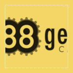
Geri submitted this logo for a web hosting and design agency startup. She left the following commentary about the work.
“The outline around the eights represent gears. I wanted to merge the idea of gears with the number 88. This is a for a web host and design agency. We use gears to design ways to move and advance businesses.”
The following critique is based on one designer’s opinion and experience. I always appreciate the readers thoughts as well. So, I’ll ask a question of two in the critique, please share your perspective in the comments at the end of this logo design critique.
Design Principles
Geri’s logo for 88 Gears Creative has some interesting elements, but could benefit from some further refinement of the design. Overall, a more industrial and powerful look may fit better with the company name. What if the 8’s were made of gears rather than the gears being a background element? The circular nature of the numeral 8 is a natural fit for integrating the gear element right into the typography.
Continue reading this articleHow to Write a Logo Rationale 415
When presenting logo concepts to a client it is often productive to have written rationales to accompany each concept. This can help you, the designer, clarify your thoughts before getting the concepts in front of your client. The rationales will help your client to better understand the concepts from your point of view (especially if you are not there in person to present the concepts to your client). In turn, this will help your client make an educated decision when picking their final logo. All that effort will also help you to better defend and explain concerns and questions that may arise during the logo revision process.
Continue reading this articleNeonKids Logo Design Revisited 139

Back in April I critiqued a logo for a kids group called Neon Kids. Phil (the designer) got in touch with me recently to let me know he had made some changes to his original concepts based the critique here and feedback from the commenters.
From the Designer (Phil)
First off, thanks to all the great Logo Critiques readers who commented on the review of the Neon Kids logo! It has been about three months since the critique was posted. Since then we’ve done quite a bit of work on the logo — including a ton of research, incorporating some very informative user feedback, and of course, we spent lots of time in Adobe Illustrator CS4.
Brutal Logo Design Critique 126

Rui submitted this logo for Brutal, an auto performance and aesthetics shop. He left the following comment about the logo.
“The client’s business is the preparation of sports cars with one of 3 focuses: performance, aesthetics and personalization. Soluo: The type was created specifically for the brand’s name, trying to combine the speed and aggressiveness of auto-sports and the fluidity and sobriety of the designs that the client produces. The coloured accents reflect the 3 focuses of preparation that the client offers.”
The following critique is based on one designer’s opinion and experience. I always appreciate the readers thoughts as well. So, I’ll ask a question of two in the critique, please share your perspective in the comments at the end of this logo design critique.
Design Principals
I like the idea that Rui has created a custom typeface for this logo, however I don’t feel it communicates the characteristics he describes all that well.
Continue reading this articleJohnny’s Pizza Logo Design Critique 184
Categories: Critiques Food & Beverages

Eric submitted his logo for Johnny’s Pizza and left the following comment.
“This logo is for a pizza company, based in Pittsburgh, PA. Because of this, I used a silhouette of the Pittsburgh skyline in the logo. It is a small, one location, pizza shop.”
The following critique is based on one designer’s opinion and experience. I always appreciate the readers thoughts as well. So, I’ll ask a question of two in the critique, please share your perspective in the comments at the end of this logo design critique.
Design Principles
I see a couple execution problems in this logo right away. First, the red bar that holds the word ‘Pizza’ doesn’t follow the established curve formed by the pizza graphic below.
Continue reading this articleIncubox Logo Design Critique 78
Categories: Critiques Marketing & Design

Geoff submitted this logo for incubox, a graphic design and web development company. He left the following commentary about the logo.
“I came up with the name ‘Incubox’ after several days of trying names and seeing what domains were available. I started looking for variations of ‘(something)box’ as I was inspired by a commercial studio in LA called Smashbox... The egg represents the place where the idea derived and was released into the world. I like the egg concept, I'm just not sure THAT egg works. And on a practical level, when I try and make an avatar using the egg it doesn't work - too small. I would love to get some feedback on the logo because, frankly, I'm confused by it. Or rather, I'm not sure how to use it best. I'm frankly not sure if the composition I'm sending you should be considered the logo, or if I should drop the mark or the ‘creative’, etc. The three elements don't seem to tie in together well as one. In summary, I like the name incubox, I like the egg concept, but I'm not sure the logo represents well.”
The following critique is based on one designer’s opinion and experience. I always appreciate the readers thoughts as well. So, I’ll ask a question of two in the critique, please share your perspective in the comments at the end of this logo design critique.
Continue reading this articleSalon HQ Logo Design Critique 112
Categories: Critiques Health & Beauty

Zoran submitted this logo for Salon HQ and left the following comment.
“Salon HQ is a new, worlds first, patented business building tool for aspirational Hair & Beauty businesses. It provides benchmarking and business comparison analytics for Hair salons and Beauty spas. Should be appropriately professional and original, but still slightly cool and a bit edgy.”
The following critique is based on one designer’s opinion and experience. I always appreciate the readers thoughts as well. So, I’ll ask a question of two in the critique, please share your perspective in the comments at the end of this logo design critique.
Design Principles
I like the boldness of the Salon HQ logo. The combination of red and grey evoke feelings of action and authority. I don’t understand the reason for ‘HQ’ running vertically and find it visually distracting.
Continue reading this articleEyeCare Specialties Logo Critique 196

Nic submitted this logo for EyeCare Specialties. He left the following comment about his work.
“This logo design is part of a larger re-branding of the company including its website (soon to come). We are limited to using the current logo’s ‘shape’ (see website). Overall we would like the mark to have a liquid - or - soft feel. Thusly, we have been working with watercolor as the basis of the new mark.”
The following critique is based on one designer’s opinion and experience. I always appreciate the readers thoughts as well. So, I’ll ask a question of two in the critique, please share your perspective in the comments at the end of this logo design critique.
Design Principals
This logo is a vast improvement over the previous logo. The mark has a fresh and soft feel to it which fits the look Nic was trying to achieve. The color choice is revitalizing and spa-like. Overall the mark is off to great start. Still, there are some alignment issues that could benefit from some slight adjustment.
Continue reading this articleThe images & logos presented on this blog are copyrighted by their respective owners. The blog itself is copyright Erik Peterson, 2008-2024 All Rights Reserved.


