EyeCare Specialties Logo Critique 215

EyeCare Specialties Logo Critique
Nic submitted this logo for EyeCare Specialties. He left the following comment about his work.
“This logo design is part of a larger re-branding of the company including its website (soon to come). We are limited to using the current logo’s ‘shape’ (see website). Overall we would like the mark to have a liquid - or - soft feel. Thusly, we have been working with watercolor as the basis of the new mark.”
The following critique is based on one designer’s opinion and experience. I always appreciate the readers thoughts as well. So, I’ll ask a question of two in the critique, please share your perspective in the comments at the end of this logo design critique.
Design Principals
This logo is a vast improvement over the previous logo. The mark has a fresh and soft feel to it which fits the look Nic was trying to achieve. The color choice is revitalizing and spa-like. Overall the mark is off to great start. Still, there are some alignment issues that could benefit from some slight adjustment.
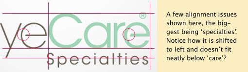
After shifting ‘specialties’ slightly back to the right, the vertical alinement should be addressed. Try aligning vertically to the bottom of the ‘y’. I would likely choose to align the top of the x-height to the bottom of the descender on the ‘y’, which means you’d only have to shift it slightly downward. The placement of the registered mark is awkward. It should be placed inside the grid of the letterforms or outside. I circled the opaque shapes hiding the ‘e’ crossbars as well. Those definitely need to be fixed.
Functionality / Versatility
There are some areas of the mark that get particularly light in color. The circular shape representing the iris of the eye is a good example. Perhaps a slightly darker hue will improve its visibility.
Does the Logo Work for the Audience?
The logo expresses the concept of eye care plainly to the audience. It’s immediately obvious to the viewer that the company deals in the eye care industry. The type is clear and legible. I wouldn’t say the logo is particularly memorable or unique, but it does have a certain fluidity or softness about it that is visually pleasing.
Question for the readers
please respond in the comments below
Is the mark a good solution for this business? How do you feel about the color selection?
Uniqueness
This logo isn’t incredibly unique, but that’s probably okay. The use of the eye icon is pretty common among eye care logos, as you might imagine, but it also very recognizable to the viewer.
Typography
The type is very clean and modern feeling. I like the treatment on the crossbars of the large lowercase ‘e’ within ‘Eye’ and ‘Care’. Opening the crossbar creates an openness within the letterforms that ties in well the rest of the logo. I did notice the you have only covered the letterforms with a opaque shape at this point. Make sure you convert your type into outlines in Adobe Illustrator and adjust the crossbars when making the final version.
Question for the readers
please respond in the comments below
Do you see any other issues that Nic may need to address?
Possible Improvements
Designing a logo for yourself or own business is one of the hardest logo designs you’ll ever work on. So what is the best way to improve the logo? Well I think have made some comments above that can certainly offer some direction. Here’s a list of actionable items.
- Address the various issues in the alignment of the typography.
- Consider darkening the iris of the eye to make more visible.
- Clean up the letterforms by actually removing the piece of the ‘e’ crossbar rather than covering it with an opaque shape.
Overall, I think you have a good start on the logo design. And with some refinement you can definitely improve it. Please know that my intention in critiquing your work is not to hurt feelings, but to offer constructive feedback. I hope it was helpful. Best of luck, to you!
I appreciate and welcome your comments, and look forward to hearing from you soon. I purposely don’t cover every possible improvement that can be made to this logo, so go for it if you think I missed anything. All I ask is that you keep your comments clean and appropriate.
Like what you read here? Subscribe to the Logo Critiques News Feed.
Enjoy this post? Share it with others.


The images & logos presented on this blog are copyrighted by their respective owners. The blog itself is copyright Erik Peterson, 2008-2026 All Rights Reserved.


We enjoy your comments
215 Comments so far. Keep 'em Coming.
#1
By Struktur
07.27.2009 at 11:35 PM
My critiques (this is a good start by the way but needs obvious improvements)
the human eye / eyeball shape: why not a little more prominent in contrast to everything else? Visually I’d say the eyeball should hold the most weight in this logo.
the typeface chosen to me is not heavy enough, doesn’t have enough visual weight to contrast against the eyeball motif, or the white/silver gradient background.
overall more contrast needed… and perhaps a more traditional rounded typeface with more defined strokes. The positive kerning on the word “Specialties” is definitely too much. should be a little bit more dense for readability, in my humble opinion.
#2
By Live Longer
06.16.2010 at 06:08 PM
I like the choice of color scheme and eye design.
#3
By Stephanie
11.12.2010 at 10:48 AM
Very Informative post. Thanks for the information.
#4
By thomas sabo
12.08.2010 at 03:12 AM
overall more contrast needed�� and perhaps a more traditional rounded typeface with more defined strokes. The positive kerning on the word ��Specialties�� is definitely too much. should be a little bit more dense for readability, in my humble opinion.
#5
By Bytesland
03.23.2011 at 12:58 PM
Design is the organized arrangement of one or more elements and principles for a purpose.The principles of design are as varied as attitudes regarding modern design. They differ both between the schools of thought that influence design, and between individual practicing designers.Design elements are the basic units of a visual image. These elements include:The 3 F’s,Space,Line,Color,Shape,Texture,Form.I think that at least some of these principles were included here!
#6
By UTSAV EYE CLINIC
02.20.2014 at 07:17 AM
Great post ! We are presently working on our own eye clinic logo and this information was exactly what we needed. Very detailed and comprehensive analysis of the logo design !
#7
By Jeanette
09.20.2014 at 05:35 PM
This excellent website really has all the info I wanted concerning this subject and
didn’t know who to ask.
#8
By divp
12.13.2016 at 05:23 AM
Nice post.worth reading.Achieving a well designed logo requires really hard work and being up to date with the latest trends in design.thanks for sharing..!!!!
#9
By divp
12.14.2016 at 01:27 AM
Logo design is all around us. To the general public, logos serve as an instant reminder of a company or a product; to the client they’re the point of recognition on which their branding hangs; and to us designers they represent the challenge of incorporating our clients’ ideologies into one single graphic.Great post…
#10
By divcygnet
12.20.2016 at 12:14 AM
A good logo is distinctive, appropriate, practical, graphic and simple in form, and it conveys the owner’s intended message. A concept or “meaning” is usually behind an effective logo, and it communicates the intended message. A logo should be able to be printed at any size and, in most cases, be effective without color. A great logo essentially boils down to two things: great concept and great execution.good work…thanks for sharing
#11
By a
03.23.2017 at 03:50 PM
a
#12
By Elijah Marsh
09.26.2018 at 08:30 AM
Eye was much sensitive part of the body so you need to take good care of this doctor also tell us this thing. I want to check my eyes so I want to make eye specialist appointment that I got from www.assignmentgeek.com.au this has data about all the doctors’ details and biography on it. velit
#13
By Do My Assignment For Me
11.29.2018 at 04:46 AM
A decent logo is unmistakable, suitable, down to earth, realistic and straightforward in shape, and it passes on the proprietor’s proposed message. An idea or “signifying” is for the most part behind a successful logo, and it imparts the proposed message.
#14
By juddymorry
11.29.2018 at 04:49 AM
To the overall population, logos fill in as a moment notice of an organization or an item; to the customer they’re the Do My Assignment purpose of acknowledgment on which their marking hangs; and to us creators they speak to the test of fusing our customers.
#15
By Garry Adams
12.04.2018 at 03:15 AM
Wow! Such an amazing and helpful post this is. I really really love it. It’s so good and so awesome. I am just amazed. I hope that you continue to do your work like this in the future also. Garry Adams
#16
By broken lease apartments dallas
12.05.2018 at 02:14 PM
wow… what a great blog, this writter who wrote this article it’s realy a great blogger, this article so inspiring me to be a better person broken lease apartments dallas
#17
By shzzc
12.06.2018 at 08:13 AM
Great Article it its really informative and innovative keep us posted with new updates. its was really valuable. thanks a lot. แปลภาษาเอกสาร
#18
By yoga
12.07.2018 at 01:50 AM
Great post i must say and thanks for the information. Education is definitely a sticky subject. However, is still among the leading topics of our time. I appreciate your post and look forward to more. yoga
#19
By connect with professionals
12.09.2018 at 02:17 AM
New site is solid. A debt of gratitude is in order for the colossal exertion. connect with professionals
#20
By Lk21
12.09.2018 at 06:30 AM
Start early before you’re movie is even finished. That way when you begin contacting movie distributors you’re movie will already have more appeal because people are talking about it. Lk21
#21
By blaire
03.10.2019 at 12:18 PM
I am looking for a logo for my Buy a Compass initiative, do you have some resources I could use? thanks!!!
#22
By Sophie Miller
06.19.2019 at 03:35 AM
Ich danke Ihnen für die Information! Ich war auf der Suche nach und konnte nicht finden. Du hast mir geholfen! dgcustomerfirst com
#23
By oppo battery replacement
08.14.2019 at 07:00 AM
Very good article. I am experiencing some of these issues as well..
oppo battery replacement
#24
By LG battery replacement
08.14.2019 at 07:05 AM
Excellent site you have here.. It’s difficult to find high-quality writing like yours these days. I really appreciate people like you! Take care!!
oneplus battery replacement
#25
By MATLAB solutions
09.06.2019 at 07:57 AM
It’s good to share information with others. I am also sharing something very important for students seeking MATLAB Assignment Help. Visit MatlabSolutions and get best assistance in your MATLAB, Simulink Assignments and Projects.
You can also get CDR Report Engineers Australia if you look to immigrate to Australia.
#26
By Allen
10.07.2019 at 07:39 AM
The following critique is based on one designer’s opinion and experience. I always appreciate the readers thoughts as well. So, I’ll ask a question of two in the critique, please share your perspective in the comments at the end of this logo design critique. 1z0-932 dumps
#27
By wilstone
10.26.2019 at 11:01 AM
wow! nice article. thanks for the information. Smith
#28
By Larcy
10.30.2019 at 11:56 PM
Nice logo design. I appreciate your work. Thank you for sharing! carmichaelwaterheater.com
#29
By Jasmine
11.25.2019 at 08:44 AM
Verry nice Logo. It’s simple and nice.
Jasmine |https://random-ize.com/
#30
By bilawalkhan32
12.03.2019 at 01:48 PM
This is sounds good one for us. site
#31
By rhainne
12.03.2019 at 10:38 PM
I remember so much during my childhood days how this logo attracted me concrete retaining wall Seattle
#32
By worldvaping
12.05.2019 at 10:36 PM
Getting the most effective DNA boards is not a stroll in the park. However, Evolv has attempted to make the procedure simpler. worldvaping
#33
By Essays-Writers.com
12.13.2019 at 01:35 PM
Excellent information you have shared, thanks for taking the time to share and a great idea.No matter if you are working on a literature review for your law, psychology, or economics class, you will need to follow the same pattern – writing a literature review for a dissertation is a tedious task. Visit https://essays-writers.com/write-my-literature-review.html
#34
By Free Magazine
12.31.2019 at 04:37 AM
I create this is an informative and motivating blog so I think so it is very useful and well-informed. I would like to thank you for the efforts you have made in script this blog.
#35
By Free Magazine
12.31.2019 at 04:39 AM
I found this is an informative and interesting blog so I think so it is very useful and knowledgeable. I would like to thank you for the efforts you have made in writing this blog. https://www.dawateislami.net/magazine/en
#36
By Ice111 acea
01.08.2020 at 03:59 AM
Portable Nebulizer Machine for Sale
portable nebulizer is a kind of drug delivery device, which is used to convert liquid drugs into
mist, so that they can be immediately absorbed by the respiratory system, and relieve asthma
and other diseases. The portable nebulizer can be used for adult and child applications.
The portable nebulizer uses oxygen or compressed air to evaporate the solution into tiny
droplets. Aerosol droplet is a mixture of gas and liquid particles.
The patient inhales the droplets into the nostrils or through the mouth. Fine mist is more
easily absorbed by the human body, so the portable nebulizer can immediately relieve many
breathing conditions.yuwell Portable Nebulizer Machine
#37
By Anonie
03.24.2020 at 10:34 PM
There are some areas of the mark that get particularly light in color. vivienne westwood outlet uk
#38
By Yanrefitness
04.10.2020 at 10:00 PM
Thank you for your share, it very useful for me.
#39
By Ice111
04.11.2020 at 03:20 AM
Hanfu, with the name oriented from the Chinese meaning ‘Han people’s garments’, encompassing all kinds as well as styles of traditional apparel worn by the Han Chinese.
The Han Chinese trace an usual origins to the Huaxia, a name for the preliminary confederation of farming tribes living along the Yellow River. The term Huaxia represents the cumulative Neolithic confederation of farming people Hua and Xia that settled along the Central Plains around the center and lower reaches of the Yellow River in northern China.
Hanfu, as its definitions, birthed at the start of the background of Han ethic. Consequently, it has the longest background among all conventional Chinese apparel.
Background of Hanfu
Hanfu has a history of greater than 3 millennia. From the start of its background, Hanfu was indivisible from silk, supposedly discovered by the Yellow Emperor’s consort, Leizu.
Hanfu controlled the Chinese style world from the reign of the Yellow Emperor (2969 BC-2598 BC) to the end of the Ming Empire (1368—1644).
The Most Traditional 5 Categories of Chines Trditional Gown & Clothes. chinese fashion
#40
By jamie Anderson
04.15.2020 at 03:08 AM
Thanks for taking the time to share with us such a great article. I really appreciate your work. It’s difficult to find excellent writing like yours nowadays. Usually I visit your blogs and get updated through the information you include.
online sap assignment help -
best sas assignment help
#41
By jacky
04.19.2020 at 08:18 AM
nice
York carpet cleaning curtain cleaning cambridge
#42
By larry
04.21.2020 at 10:49 PM
Beautiful logo! painter in Great Falls
#43
By Ken
04.28.2020 at 05:28 PM
We promise that your electrical issue will be given top priority and fixed promptly by our electrician Rochester ny, while providing fast emergency service
#44
By Tim
06.29.2020 at 01:48 PM
This logo is a vast improvement over the previous logo electricians midland tx
#45
By Ice111
10.30.2020 at 10:30 PM
Nursing Pumping Bra By Momcozy
Momcozy Hands-Free Pumping Bra
The hands-free breast pump bra provides you the most comfort and therefore the freedom to figure on tasks or simply relax whereas pumping. The hands-free breast pump bra comes with a convenient four adjustable back panel to make sure a comfortable match as your body undergoes natural changes whereas breastfeeding.
To overcome these difficulties, we provide you a nursing pumping bra with an adjustable strap design, in order to improve the comfort when drawing it.
As with all aspects of breastfeeding, mastering a hands-free breast pump bra takes a bit of time.
#46
By Islamic courses app
11.06.2020 at 07:05 AM
I comparable your posts and I like a post you are greatest information and This is certainly great work. https://www.dawateislami.net/downloads/islamic-apps/quran-teacher
#47
By Mark Miller
11.13.2020 at 03:59 AM
This is such an amazing useful resource that you’re providing and you give it away for free. View more: https://www.residencestyle.com/emondage-boucherville-services-why-you-should-get-professionals-to-trim-your-trees/
#48
By Ice111
11.18.2020 at 11:03 PM
เอฟเวอร์ตัน
เจ้าบ้าน เอฟเวอร์ตัน ของกุนซือ คาร์โล อันเชล็อตติ เพิ่งจะออกไปแพ้ เซาแธมป์ตัน 2-0 และ นิวคาสเซิล ยูไนเต็ด 2-1 ก่อนหน้าก็เสมอ ลิเวอร์พูล 2-2 อยู่อันดับที่ 4 ของตารางตอนนี้ เหตุที่ฟอร์มทีมแย่ลงเพราะนักเตะตัวหลัก ได้รับอาการบาดเจ็บ และ โดนโทษแบน ฟอร์มเลยออกมาย่ำแย่ จากที่รั้งจ่าฝูง ตกลงมาอันดับ 4 อย่างที่เห็น
แมนเชสเตอร์ ยูไนเต็ด
#49
By Ice111
12.14.2020 at 10:17 PM
5G RUGGED SMARTPHONE
5g rugged smartphone
#50
By Tilly Racker
01.25.2021 at 07:10 AM
Este es el único sitio al que me ayudó https://guitarlessonsnashvilletennessee.com
#51
By Gigi Smith
01.25.2021 at 07:15 AM
Whoa! No puedo creer que me encontré con este sitio https://financialadvisortoledo.com
#52
By Bernice Leanard
01.29.2021 at 07:02 AM
Claims cover costs that are eligible for reimbursement under the program as per established fee guides. You may also submit reimbursement requests yourself.
house cleaners Saskatoon
#53
By Zyra Alissa
02.16.2021 at 03:26 AM
Neleus Gym Wear Has a Great Airflow
It regulates and controls body temperature
“An intense session at the gym will leave you thankful that you didn’t wear that old cotton top, as cotton absorbs sweat easily and retains moisture, leaving you feeling damp and heavy. You should opt for light, breathable and sweat-wicking fabrics which will draw moisture away from the body, leaving you feeling dry and comfortable. Intelligent fabrics like XT Air, or XT Air ICE will also help to regulate and maintain your body temperature to ensure you can perform at your best, in the ultimate comfort.”
Visit Us and Shop Now at https://neleus.com/
#54
By Zyra Alissa
02.16.2021 at 03:39 AM
The Best Gym Wear will Provide Neleus for You
It can motivate you
“Nothing motivates you to go the gym more than new kit. Not only will you feel good, but you’ll look good, and that’s something you want when surrounded by mirrors in the gym. Unfortunately, buying new gym clothes every time you go through a workout slump can be expensive. To combat this, we’ve created a new, quarterly subscription box service which will help users to curate a collection of luxurious, highly technical fitness clothing from HPE Activewear . This new service will also offer customers significant savings on our best-selling products and fabric technologies, with the ‘build your own box’ option allowing you to choose from a wide range of colour and designs to suit your chosen exercise and lifestyle.”
Visit Us and Shop Now at https://neleus.com/
#55
By Alissa Zyra
02.22.2021 at 11:05 PM
Makeup is so ubiquitous in our society that for a woman to go without it has become, in some cases, a statement – the “no makeup selfie” being a case in point. Female celebrities feature on the Daily Mail’s sidebar of shame beneath headlines such as “Jennifer Lopez, 46, dares to bare her naked face”. Boybands, meanwhile, cynically tap into the anxiety young women feel by claiming that they love you just as you are, a trend expertly satirised in the Amy Schumer sketch “Girl you don’t need makeup”.
#56
By Alissa Zyra
02.22.2021 at 11:15 PM
Wear Makeup at Any Age.
Mary’s letter to me gave some perfect examples of what happens to a face as it ages. She found that her features were less noticeable and her face lacked shape and definition, some of which had been supplied by her glasses. Older eyes, lips, cheeks and skin become paler and paler as the melanin in the body declines. That’s what ages our looks - far more than wrinkles. I rarely talk about trying to look younger, because I feel passionately that we need to resist that ageist pressure, but makeup is an instant fix for all that ‘fading’ of our features and it’s cheap and easy to achieve. In my view it’s also far more effective than fillers and facelifts if you would like to look younger.
#57
By Michael Rose
04.09.2021 at 06:04 AM
Wow, this is sick! Do you mind creating one for my local roofing services?
#58
By Knight Shift
04.15.2021 at 09:47 PM
So happy I found this blog. So much inaccurate information out there. Thank you guys for spending the time to put out quality content. Click here
#59
By Jack payne
04.19.2021 at 01:22 AM
I recently came across your blog and have been reading along. I thought I would leave my first comment <a >Hawkeye Vest</a>
#60
By Jack payne
04.19.2021 at 01:22 AM
Keep up the Good Work Thanks for always sharing.
Hawkeye Vest
#61
By Hola
05.03.2021 at 10:25 PM
Bathroom Design Tacoma renovate homes to meet the specific needs of each household.
#62
By Anonymous
05.05.2021 at 01:13 AM
Bathroom remodel Gainesville can expertly put to reality your unique preference, taste, and vision.
#63
By Moly
05.05.2021 at 03:52 PM
Home Remodel Design Santa Clara is the largest full-service kitchen remodeling company in California.
#64
By Worm
05.05.2021 at 03:57 PM
Home Addition Columbia will provide you with an instant makeover or a full renovation for your kitchen.
#65
By Hola
05.06.2021 at 10:08 AM
Home Addition Simi Valley services have been a pioneer of home construction and kitchen remodeling contractors for many years.
#66
By Moly
05.06.2021 at 10:12 AM
Kitchen remodel New Haven is here to help you navigate the renovation phase and see the home remodeling dream through to completion.
#67
By Anonymous
05.08.2021 at 02:55 AM
Your desire is our priority when you choose Kitchen remodel Pearland.
#68
By Anonymous
05.10.2021 at 04:47 AM
kitchenremodelcharleston.com even the design and structure of the walls.
#69
By Anonymous
05.10.2021 at 04:53 AM
kitchenremodelhartford.com will assist you in remodeling your home to make it more appropriate for your lifestyle.
#70
By Michael Parkinson
05.11.2021 at 12:23 AM
Nice logo. Kodus! wollongongwindowcleaning.com.au/
#71
By Elaine West
05.11.2021 at 06:01 AM
Done follow! Thanks Please read: ABOUT US
#72
By Anonymous
05.11.2021 at 12:35 PM
Kitchen remodel Allentown project can be a big endeavor.
#73
By Hola
05.14.2021 at 09:14 PM
Home Remodel Providence is always ready to assist, whether your kitchen, bathroom, or home needs repair or you just want to modify the look.
#74
By Moly
05.14.2021 at 09:19 PM
Home Remodel Chattanooga is the perfect option when it refers to all of your remodeling necessities.
#75
By Worm
05.14.2021 at 09:24 PM
Home Remodel Ontario changing the fixtures, the flooring, and possibly even the design and structure of the walls.
#76
By amz cosmetic
07.05.2021 at 04:37 AM
AMZ cosmetic manufacturer is a leading personal care and cosmetic contract manufacturer. We offer formulation, compounding, filling, packaging and quality assurance services for personal care & color cosmetic products.
If someone wants to own a cosmetics brand, cosmetic manufacturers with 11 years of professional experience can help you build the cosmetic brand, and only need to spend a low cost budget.
#77
By Shirley
07.15.2021 at 07:50 AM
I appreciate how you explain your points in here. Much thanks!http://www.logocritiques.com/critiques/eyecare_specialties_logo_critique/
#78
By Pash
07.18.2021 at 03:30 PM
Kitchen remodel is more than just a stunning backsplash and gorgeous cabinets.
#79
By Que
07.21.2021 at 03:55 AM
All of our workers are committed to meeting your needs, and we have been through training programs over the years that have enhanced the tremendous amount of experience that we already have. Kitchen Remodel The services that we offer are going to meet all of your needs, and we are going to use the best products to ensure that the work is completed properly as well.
#80
By Wex
07.22.2021 at 10:35 AM
Whether you want help with a yard design, Landscaping Companies Port St Lucie or whether there is a hardscape design that you want to develop, you can count on our team.
#81
By Exort
07.22.2021 at 12:05 PM
Whether you are working on a simple home decluttering or construction project, Dumpster Rental Augusta GA we are here to help you.
#82
By York
07.23.2021 at 10:35 AM
No matter what your plans are for your bathroom, Stamford Bathroom Remodel or if you don’t have any plans at all yet, we are here to help.
#83
By Ukol
07.23.2021 at 10:48 AM
We’ll carefully cover the entirety of the structure, Roofer Stamford CT ensuring nothing goes unnoticed.
#84
By Ikog
07.23.2021 at 11:48 AM
Whether it’s concrete repair or installation, www.knoxvilleconcretecontractorsco.com you can be confident that we do the job right the first time.
#85
By Crossdress Store
09.23.2021 at 02:42 AM
Thanks for sharing this useful news.
https://crossdressstore.com
#86
By Marygal
10.18.2021 at 04:53 PM
This logo is indeed a vast improvement over the previous logo. It’s really a positive upgrade keep it up. My Site
#87
By dollypal
10.19.2021 at 09:13 AM
I think the logo is a good mark for the business and the colour selection is top-notch, good improvement really. https://www.lutonplumbing.co.uk/plumbing-services.html
#88
By Elle Equip
11.03.2021 at 03:06 AM
This is awsome thanks for sharing
#89
By Hola
12.22.2021 at 04:37 PM
Your home is the single most important location in your life. Bathroom Design Fremont
#90
By peter shawn
12.29.2021 at 04:09 AM
Extremely go through article. I have never seen such beautiful article. Learn many things from this I hope you continue to have high-quality articles like this to share with everyone! The Matrix 4 Trench Coat
https://www.nyjacket.com/product/the-matrix-resurrections-neo-trench-coat/
#91
By Hola
01.14.2022 at 03:52 AM
It is all about creating a masterpiece in your yard or garden. commercial property maintenance gold coast
#92
By DUANE MORISON
01.23.2022 at 11:44 PM
This Blog is very informative for us. Thanks for writing about it. In this article, some examples help me in applying in daily life. amazing You have explained each and everything very well in detail. I hope you will write more pieces which help us in our daily routines. squid game outfits
#93
By Micheal Murray
02.08.2022 at 01:32 PM
You have helped me more than you know, I appreciate all the valuable information here. Handyman near me
#94
By Hola
03.06.2022 at 05:10 AM
We handle installation of new toilets or their repair. here
#95
By greek
03.23.2022 at 08:16 AM
hey there I have been reading your blogs for a long as your site print size is not good enough you should need a good image editor Image resolution is the detail an image holds. The term applies to digital images, film images, and other types of images.
#96
By samual
03.23.2022 at 08:19 AM
As we are using the vpn for changing our location I have found a best VPN for gaming as well as serving restricted sites
#97
By maddy
03.23.2022 at 08:22 AM
hey, there I am also a blogger I have been written a blog on the topic of Internet Safety as there are so many hacking threats are happening on the internet. Internet safety is the act of staying safer online. This includes being aware of the risks associated with your online activity and employing a few strategies to prevent or avoid these risks.
#98
By Hola
04.07.2022 at 01:01 AM
Home Remodel design is going to fit your needs perfectly when you have a team working for you that is committed and invested in your home. Home Addition Stockton
#99
By Hola
04.07.2022 at 02:31 AM
Plumbing leaks and occur in various parts of your home or commercial plumbing and may be caused by various factors. Plumber San Carlos
#100
By Rigid Industries
04.08.2022 at 04:47 AM
I’m exceptionally appreciated for this blog. Its an educational subject. It help me particularly to take care of certain issues. Its chance are so phenomenal and working style so quick . | Rigid Industries
#101
By Hola
04.09.2022 at 12:29 AM
You want to live in the space that is perfect for you. Kitchen Design san mateo
#102
By Hola
04.09.2022 at 12:41 AM
If you already own a property, you’re well aware that there’s always space for improvement. Bathroom remodel Elk Grove
#103
By Wex
04.09.2022 at 05:48 AM
When your bathroom starts showing signs of wear and tear, it will become less fashionable and also cost you a lot of money on repairs. bathroom remodel san jose ca
#104
By Quax
04.10.2022 at 07:35 PM
Business Housekeeping has to do with maintaining the neatness and orderliness of a workplace. Carpet Cleaning San Mateo
#105
By Rolls
04.10.2022 at 10:34 PM
That is why stamped concrete has become so popular for people to use in many different projects. Stamped Concrete Fresno
#106
By Rolls
04.10.2022 at 10:41 PM
In the simplest of terms, we are a dumpster rental company. Dumpster Rental San Mateo
#107
By Wex
04.12.2022 at 09:46 AM
Homes need to be cleaned, even on the outside! Residental Pressure washing
#108
By Hola
04.12.2022 at 11:25 PM
Your deck and patio undertake huge amounts of strain all year round. powerwashingsanjose.net
#109
By Soup
04.15.2022 at 07:05 AM
There’s still some venture which needs to be fixed, and just as you think you’ve done it, it’s necessary to start over. Home Addition Peoria
#110
By Soup
04.15.2022 at 07:11 AM
Our bathroom contractors can assist you at any point, from the preparation process to the final electrical and plumbing installation. Home Addition Alexandria
#111
By Sauce
04.15.2022 at 07:18 AM
You’ve decided it is time for a change. Home Remodel Lakewood
#112
By Worm
04.17.2022 at 08:02 AM
Are you planning on a specific concept? Bathroom remodel Denton
#113
By Wex
04.20.2022 at 01:13 AM
Would you like to update your kitchen with new cabinets, countertops, fixtures, lighting, and flooring? Kitchen Design Spokane
#114
By Spank
04.20.2022 at 05:54 AM
Do you have a strong desire for new flooring, lighting, appliances, countertops, and cabinets? kitchenremodelaurora.com
#115
By Wex
04.22.2022 at 01:12 AM
Love grew at home, it is also where memories are made, where friends and relatives are always welcome, and happiness never stops. Bathroom Design Pasadena
#116
By Hola
05.03.2022 at 06:42 AM
If you would like to learn more about our products, give our team a call today. Concrete Driveway Paving
#117
By Hola
05.09.2022 at 02:13 AM
We offer clean and efficient services, helping save on options that matter most. here
#118
By Geneva
05.25.2022 at 07:36 AM
Great logo you got there! I wonder how you make it!
If I am the client I will be delighted.
Hope you could check this Washer Repair Cambridge
#119
By Alyssa Marites
05.25.2022 at 02:16 PM
The logo you created was great!
I just passed by this site and I would say it is worth the time- concrete driveway Arlington TX
#120
By Andy
06.10.2022 at 09:26 PM
Such an extraordinary review. If it’s not too much trouble, make and accomplish more from now on. This one is so astonishing and exceptionally educational. Feel free to check pet turf installer if you need som pet turf assistance.
#121
By John
06.15.2022 at 03:49 AM
Thank you for sharing; I discovered a lot of useful stuff here. A fantastic article that is both appreciative and useful.
Concrete Retaining Wall Maitland
#122
By jennifer
06.24.2022 at 08:49 AM
Store For all of your Superhero Outfit, Celerity Jackets And Leather Jackets! - online
Yellowstone Biker Fight
#123
By Hola
07.15.2022 at 09:08 PM
Do you want to turn your outdoor spaces into a relaxing haven? plant installation
#124
By Hola
07.15.2022 at 09:13 PM
If your property has been flooded common causes of water damage
#125
By Worm
07.15.2022 at 09:19 PM
A new sunroom is an excellent choice for creating the ideal sun-filled space for relaxation. solarium sunroom
#126
By SuodunFitness
08.17.2022 at 04:59 AM
Commercial spin bikes for sale
#127
By Reese
08.25.2022 at 09:40 PM
this article is very informative thanks for sharing
#128
By abweb006
09.01.2022 at 12:30 AM
Amazing article. Concrete Contractors Maitland
#129
By Jay
09.20.2022 at 06:53 AM
Thank you for sharing
#130
By kristy florio
09.28.2022 at 12:48 AM
Thanks for sharing this type of information with us. But I also saw an informative site about PuTTY for windows. Putty supports multiple variations on the secure remote terminal, and provides its users with the control over the SSH encryption key and protocol version. PuTTY is a free software package that helps you connect to a Unix-like computer from the Windows operating system.
#131
By kinguin promo
10.10.2022 at 06:44 AM
kinguin promo
#132
By Ultimo Fashions UK
10.23.2022 at 11:54 PM
Very interesting, I really liked it. Great respect for the author. Best of luck for the future
#133
By Gia K.
11.14.2022 at 09:45 PM
Good job!
Gia of Roof Restoration Sydney
#134
By Dara Hanes
01.24.2023 at 04:13 PM
Indeed..
Dara@interior stylist sydney
#135
By Kaye S.
01.26.2023 at 08:41 AM
Wow.. Good job!
Kaye (Sydney Dance School)
#136
By builder16
02.21.2023 at 03:58 PM
Nice article! thanks for sharing the post!
Tree Service Owensboro
#137
By marry james
03.07.2023 at 10:19 PM
Game online run 3
#138
By Adam Dy
03.22.2023 at 08:50 PM
tips..
Adam ‘decking sydney’
#139
By Linda
03.23.2023 at 01:09 AM
Thank you for sharing! Visit this website
#140
By Nena M.
04.05.2023 at 05:58 AM
Seems ok for me, because everything is visible and clear to be seen by everyone…
I am Nena M., Painters Parramatta
#141
By hua
04.12.2023 at 04:53 AM
Where can there be custom handbags? In addition to the platform, you can also go to <a href = “https://www.bnbhandbag.com/”>B&B Handbag</a> website for handbag manufacturing. B&B Handbag aims to manufacturing elegant and affordable women’s boutique bags online. B&B Handbag serves more than 300 brander in the United States, Europe and other 100 countries/regions around the world.
#142
By Donna Tala
04.20.2023 at 07:54 PM
Wow!
Ms. Tala, southern highlands bathroom renovations
#143
By Maria Joy
05.04.2023 at 04:33 AM
keep going, mate..
Maria / Sydney food truck
#144
By Linda
05.15.2023 at 09:38 PM
One of the coolest websites I’ve ever seen is this one. The papers published on this website mapquest directions are of the highest caliber and contain a wealth of knowledge in a variety of subjects.
#145
By charlie ave
06.09.2023 at 04:56 AM
In need of top-quality Online Business Law Assignment Help ? Look no further than our comprehensive range of professional services! We specialize in providing expert assistance to students and professionals in need of help with this complex field of study. Our team of experienced writers and legal experts are committed to delivering the highest quality work, with careful attention to detail and a focus on meeting all of your specific needs. Whether you’re looking for assistance with a specific project or need ongoing support throughout your coursework, we’ve got you covered. With years of experience and a proven track record of success, our team is committed to helping you succeed in your academic and professional pursuits. So why wait? Contact us today to learn more about our Top Australian Writing services and start achieving your goals!
#146
By foundation contractor
06.09.2023 at 10:47 PM
Good work
#147
By builder16
06.22.2023 at 09:57 AM
Amazing read, thanks for sharing.
https://littlerockplasticsurgery.net
#148
By boL16
06.26.2023 at 05:18 PM
“Great site with an awesome post. Thanks for sharing.
<a >https://santafetreeservices.com</a>”
#149
By boL16
06.26.2023 at 05:18 PM
Great site with an awesome post. Thanks for sharing.
https://santafetreeservices.com
#150
By willam son
07.05.2023 at 10:03 AM
Battle ropes have become increasingly popular in recent years as a versatile and effective training tool for building strength, endurance, and cardiovascular fitness. With a variety of brands and options available on the market, it can be challenging to determine which battle ropes are the best.bradgym.com
#151
By https://posts.gle/7oHQZwqYQux6hVwn9
07.28.2023 at 09:28 AM
Your article is absolutely fantastic, with valuable information. Thank you for generously sharing it!
#152
By John
07.28.2023 at 09:31 AM
Thanks a lot for providing individuals with a very pleasant possibility to discover important info from this site. https://posts.gle/7oHQZwqYQux6hVwn9
#153
By boL16
08.03.2023 at 10:30 AM
“Excellent blog post, keep up the great work
https://reddeerelectrician.ca
#154
By boL16
08.03.2023 at 10:31 AM
Excellent blog post, keep up the great work
https://reddeerelectrician.ca
#155
By builder16
08.03.2023 at 10:32 AM
Excellent blog post, keep up the great work
Electrician Red Deer
#156
By www.premierpoolfenceorlando.com
08.03.2023 at 08:15 PM
Premier Pool Fence Orlando are committed to providing top-notch, high-quality pool safety fence, safety gates and safety nets in and around the suburb of Orlando meeting all the defined pool barriers state codes. www.premierpoolfenceorlando.com
#157
By JC
08.10.2023 at 09:38 AM
I love this blog. I really appreciate this so much and its info is great! Thank you so much from https://posts.gle/aptW37MQ1tXpeW6D8
#158
By iwjo
08.24.2023 at 01:26 AM
>, shot blasting machine for marble, shot peening machine, shot blasting machine for foundry,
shot blasting machine for forge,
Customized shot blasting machine,
shot blasting machine for aluminum die casting, shot blasting machine for gas cylinder, shot blasting machine for plates,
#159
By Johnlead
08.25.2023 at 06:53 AM
Thanks a lot for letting me sign your guestbook, you have a lot of interesting things in here! I would like to recommend my favorite https://posts.gle/RkY9w68ZbdiXMkSN9 , be sure to check them out!
#160
By builder16
09.21.2023 at 10:05 AM
“Such a well-researched and informative piece.
<a >Sherwood Park Accountants</a>”
#161
By builder16
09.21.2023 at 10:08 AM
Such a well-researched and informative piece.
Sherwood Park Accountants
#162
By Ibby
10.05.2023 at 05:28 PM
Great logo critique! When it comes to making improvements, just like how a professional painter Parramatta can transform a room, a skilled designer can enhance a logo.
#163
By CiVault
10.09.2023 at 01:16 AM
Let’s be honest, we are likely to forget the business names but not the logo. It doesn’t have to be hard to make a professional image. Give us some information about your business, and we’ll make a logo for your brand.
Business listings
#164
By Elsa Palma
10.23.2023 at 04:18 AM
The logo not only boasts an appealing and simple design but also effectively conveys the brand’s commitment to sustainability, with its earthy color palette and a leafy motif that symbolizes freshness and eco-friendliness
Miss E.
-penrith renovations
#165
By builder16
10.25.2023 at 04:52 PM
I really loved it and thank you very much for sharing this with us.Great site with an awesome post. Thanks for sharing.
Fencing Little Rock
#166
By builder16
10.27.2023 at 10:53 AM
“I really loved it and thank you very much for sharing this with us.Great site with an awesome post. Thanks for sharing.
<a >El Paso Fencing</a>”
#167
By boL16
10.27.2023 at 10:54 AM
I really loved it and thank you very much for sharing this with us.Great site with an awesome post. Thanks for sharing.
El Paso Fencing
#168
By Nicole Gregor
11.09.2023 at 11:12 AM
The use of vibrant colors and the subtle play with negative space is genius. It reflects a commitment to bright, healthy eyes. A logo that leaves a lasting impression!
Mrs. Gregor (bio: Solar installers)
#169
By builder16
11.16.2023 at 04:22 PM
Glad to see this post.
Plastic Surgery Plano
#170
By builder16
11.17.2023 at 02:46 PM
Glad to see this post.
Winnipeg Accounting Firm
#171
By builder16
12.13.2023 at 10:29 AM
Great blog! Thanks for the share.
Movers in Red Deer
#172
By builder16
12.14.2023 at 01:24 PM
Great blog! Thanks for the share.
Plastic Surgery Sacramento CA
#173
By Luther F Thomas
12.26.2023 at 01:22 AM
Your consistency is admirable, keep it going. Coreball game is an absolute game-changer, the excitement it brings is unmatched.
#174
By BETFLIXSUPERVIP
01.10.2024 at 10:01 AM
Thanks , I have just been looking for information about this topic for ages and yours is the best I have came upon till now. betflix vip
#175
By Bengaru
01.12.2024 at 07:16 AM
bengaru
#176
By Menica
01.12.2024 at 11:03 AM
You read about some news that will benefit you Internet and telecom
itel vision 1 pro price
original vidmate app
Money earning app
#177
By Sneha
01.12.2024 at 11:06 AM
Think about the good of the society and learn something in your preferred language Kolkata fatafat tips
free lottery khele taka income
daily 500 taka income
dine 500 taka income
medicines for getting healthy
#178
By Painters Parramatta
01.14.2024 at 10:59 PM
Thanks for sharing the post
#179
By Dental Marketing Australia
01.18.2024 at 06:52 PM
great article post. Thanks for the sharing information.
#180
By builder16
02.09.2024 at 07:57 AM
Very helpful blog tips. Thank you so much for sharing
Concrete In Red Deer
#181
By Mary J Myers
02.20.2024 at 06:59 AM
Su blog ofrece constantemente nuevas perspectivas; estoy agradecido por las ideas. ¿Quieres saber cuántos clics estás recibiendo? ¡Haga Contador De Clicks puede ayudar!
#182
By Coby Brian
02.20.2024 at 11:42 PM
Nic’s approach to the EyeCare Specialties logo redesign shows thoughtful consideration of brand continuity while infusing a fresh, soft aesthetic. The use of watercolor lends a fluidity and warmth, resonating well with the idea of care and comfort associated with eye health. However, ensuring scalability and versatility across platforms will be crucial. It’s also important to gauge audience response to ensure the new design effectively communicates the brand’s values. How does the softness align with the company’s desired image?
Traveling with Incontinence: Travel Tips for more Confidence
#183
By Jarred Golf
02.20.2024 at 11:44 PM
Nic’s approach to incorporating watercolor into EyeCare Specialties’ rebranding is innovative and aligns well with the desired soft aesthetic. However, while maintaining the current logo’s shape provides continuity, it might limit creativity. Exploring variations within that shape could yield fresh perspectives. Additionally, ensuring scalability and legibility across different mediums is crucial. Overall, Nic’s emphasis on a liquid-like feel sets an engaging tone, but experimenting with the boundaries of the current shape could elevate the design further. It’s like playing a new game with familiar rules – there’s room for exploration within established parameters.
#184
By builder16
02.26.2024 at 12:01 PM
Thanks for this!
Landscaping Sherwood Park
#185
By Dentist Adelaide
02.28.2024 at 12:33 AM
Nice post..
#186
By Joseph A Matos
02.28.2024 at 07:45 AM
Tu blog se ha convertido en mi guía de confianza, gracias por compartir tu sabiduría. Mejore su experiencia de hacer clic con Contador De Clicks: ¡no pierda nunca el ritmo!
#187
By Aye Mbree
02.29.2024 at 09:18 PM
I’m thrilled with the logo design created..
Aye - breakfast food truck
#188
By Ashley
03.15.2024 at 03:12 PM
The eye care logo is amazing and I love the way you are sharing your work here for the people who want to hire a graphic designer for making their logo. When people will see tipper truck they will see what you have made for other projects they will definitely hire you.
#189
By Margaret J Covarrubias
04.15.2024 at 04:23 AM
Il tuo blog offre sempre nuove prospettive, lo apprezzo. Competi contro te stesso e gli altri su Click Speed Test! Vedi se riesci a raggiungere la vetta della classifica con la velocità di clic.
#190
By Dentist Leederville
04.17.2024 at 02:12 AM
Top-notch dental care in Leederville! Experienced team, welcoming atmosphere, and advanced treatments available. Trustworthy and reliable for maintaining your oral health. Highly recommended dental practice!
#191
By Dentist Leederville
04.17.2024 at 02:14 AM
Top-notch dental care in Leederville! Experienced team, welcoming atmosphere, and advanced treatments available. Trustworthy and reliable for maintaining your oral health. Highly recommended dental practice!
#192
By Melody D Urquhart
05.02.2024 at 02:39 AM
Vos articles de blog me laissent toujours inspiré et motivé ! Test CPS : le test ultime de rapidité et de précision !
#193
By Rain Fuente
05.22.2024 at 05:04 PM
The font choice could be more modern to enhance readability and appeal. Additionally, the layout feels slightly crowded; adding more spacing between elements could improve clarity and balance.
Rain (excavator sydney)
#194
By koni167
07.10.2024 at 04:39 AM
Your knowledge and consideration are invaluable, and I will always be grateful. You have and will continue to be a major source of inspiration for me.
driving directions
#195
By Adam
08.29.2024 at 03:13 AM
Slope has very easy to understand rules, just control the ball to avoid obstacles. However, to achieve high scores and pass the levels is not a small challenge.
#196
By Sofia Chamber
08.30.2024 at 02:12 PM
Great Post! after so long I have spent time on any post, but you deserve it.
#197
By Avanzarleather
03.12.2025 at 09:17 AM
Thanks for sharing great information. It’s very helpful for me.
<a > Aviator Jacket Women </a>
#198
By Builder16
03.17.2025 at 08:59 AM
Great blog! Thanks for the share.
Accountants
#199
By Hire Matlab Developers
04.07.2025 at 02:14 AM
Interesting design breakdown! Just like thoughtful branding matters, getting expert help matters too—whether for logos or code. If you’re tackling complex projects, it’s smart to hire MATLAB developers.
#200
By Hire Matlab Developers
04.07.2025 at 02:15 AM
Interesting design breakdown! Just like thoughtful branding matters, getting expert help matters too—whether for logos or code. If you’re tackling complex projects, it’s smart to hire MATLAB developers.