Go Green Fishing Lights Logo Design Critique 354

Shane submitted this logo for Go Green Fishing Lights and left the following commentary.
“The logo is for a new company developing underwater lighting for docks, river ways, and deep sea fishing. The lights attract big game fish. The client wanted a simplistic logo with clean lines and somewhat contemporary feel to it. They wanted a marlin or swordfish to represent the brand because it is a big game fish with a fair amount of symbolism behind it. The lights employ a specially designed gas that attracts fish and burns brightly using electronic ballasts (opposed to the common magnetic ballasts). This is a market I have never worked for, so it’s very different for me. There are two major competitors with a color scheme of black and neon green (both of which the client wanted). The competition’s logos are also relatively abstract. So far they like the marlin/swordfish coming from the right moving to the left. I prefer it on the left moving over the type towards the right... the flow feels better, but, hey, it’s their choice!”
The following critique is based on one designer’s opinion and experience. I always appreciate the readers thoughts as well. So, I’ll ask a question of two in the critique, please share your perspective in the comments at the end of this logo design critique.
Design Principles
I wanted to start off this critique by showing the logo of the competition that Shane was kind enough to provide. As you can see, the combination green and black is popular in this industry.
Continue reading this articleBrutal Logo Design Critique 144
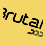
Rui submitted this logo for Brutal, an auto performance and aesthetics shop. He left the following comment about the logo.
“The client’s business is the preparation of sports cars with one of 3 focuses: performance, aesthetics and personalization. Soluo: The type was created specifically for the brand’s name, trying to combine the speed and aggressiveness of auto-sports and the fluidity and sobriety of the designs that the client produces. The coloured accents reflect the 3 focuses of preparation that the client offers.”
The following critique is based on one designer’s opinion and experience. I always appreciate the readers thoughts as well. So, I’ll ask a question of two in the critique, please share your perspective in the comments at the end of this logo design critique.
Design Principals
I like the idea that Rui has created a custom typeface for this logo, however I don’t feel it communicates the characteristics he describes all that well.
Continue reading this articleIdaho Film Project Logo Critique 42

Troy submitted this logo that he has been working on for an Idaho Filmmaking community website. He left the following comment,
“This logo (a work in progress) is for an Idaho Filmmaking community website. Visitors to the site will be able to upload videos and critique them, connect with other filmmakers, buy and sell equipment, access a filmmaking FAQ and more.”
The following critique is based on one designer’s opinion and experience. I always appreciate the readers thoughts as well. So, I’ll ask a question of two in the critique, please share your perspective in the comments at the end of this logo design critique.
Design Principals
I really like the color palette choice. It has an earthy and modern feel. The blue background brings life and contrast.
Continue reading this articleRandom Photography Logo Design Critique 63
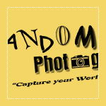
Denny at Random Photography sent in this logo for his photography business. He included the following information about his company and logo,
“In my photography business, I photograph nearly all kinds of assignments, from aerial, corporate, commercial, advertising...etc. So I wanted my logo to say “Random” when you look at it. It’s very simple, but I think says that. Yes, it does use a camera in it but hopefully that’s small enough so as to not overpower, but just give the suggestion. I don’t always use the logo with the url and line below it, usually just the logo and tag phrase.”
The following critique is based on one designer’s opinion and experience. I always appreciate the readers thoughts as well. So, I’ll ask a question of two in the critique, please share your perspective in the comments at the end of this logo design critique.
Design Principals
Unfortunately, the random letters and fonts that make up the word ‘random’ remind me more of ransom note than something random. I mean I get the ‘randomness’ but upon first view my mind goes to ransom note instead. To avoid that visual confusion maybe there’s another way to show the concept of ‘random’. One idea to explore might be something as simple as using the same typeface for all of the letters in the word ‘random’ but alter the size and placement to create a random feel.
Continue reading this articleAaron Lindberg Photography Logo Critique 45

Aaron submitted this logo for his work as a photographer. He included the following commentary with his submission,
“I decided to revamp my logo and wanted to get some feedback from the new look. I plan on using the logo with and without the url at the bottom of the page.”
The following critique is based on one designer’s opinion and experience. I always appreciate the readers thoughts as well. So, I’ll ask a question of two in the critique, please share your perspective in the comments at the end of this logo design critique.
Design Principals
I don’t know what the old logo looked like, but I think the new one has depth and perspective. It appears lively and dynamic. Are these traits the same traits you would use to describe yourself or your work as a photographer?
Continue reading this article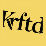
I received this logo from Jeanette over at Krftd, an online magazine. Check it out if you haven’t already. There is some fine inspirational material over there. Anyway, Jeanette offered this bit of insight when submitting this logo,
“Defined as the arbiter of style and taste, Krftd is the clever resource for individuals with a well-dressed mind. Krftd curates the world of design, interior, art, fashion, travel, popular culture and technology through its cosmopolitan lens and celebrates the most inspiring ideas in our pages.”
Jeanette went on to say,
“Considering that Krftd is an alternative spelling to "crafted", the typeface was chosen to make it easy to read. The pencil icon on the Krftd logo adds a casual and slightly playful feel. And also because it sits nicely in a discreet manner. This overall clean and simple logo does not attach to the content and allows it to speak for itself.”
Design Principals
The Krftd logo is tastefully designed and offers a good starting point. Even so, I see some areas for improvement.
Continue reading this articleThe images & logos presented on this blog are copyrighted by their respective owners. The blog itself is copyright Erik Peterson, 2008-2026 All Rights Reserved.


