Aaron Lindberg Photography Logo Critique 45
Aaron Lindberg Photography Logo Critique
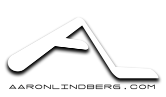
Aaron submitted this logo for his work as a photographer. He included the following commentary with his submission,
“I decided to revamp my logo and wanted to get some feedback from the new look. I plan on using the logo with and without the url at the bottom of the page.”
The following critique is based on one designer’s opinion and experience. I always appreciate the readers thoughts as well. So, I’ll ask a question or two in the critique, please share your perspective in the comments at the end of this logo design critique.
Design Principals
I don’t know what the old logo looked like, but I think the new one has depth and perspective. It appears lively and dynamic. Are these traits the same traits you would use to describe yourself or your work as a photographer? If not, how do you see yourself and how do you want your clients to see you and your work? You may want to consider representing come of those traits in your logo.
The logo doesn’t say anything about you being a photographer, not even in your URL. Being that you’re using a monogram for your logo, it may be important to give some sort of visual cue as to what you do. Also the stroke thickness of the monogram inconsistent and doesn’t support the spacial perspective that you seem to be trying to create (specifically the bottom of the ‘L’). The choice to use all caps in conjunction with the typeface selection for your URL at the bottom of the logo make it hard to read, in my opinion.
Functionality / Versatility
The monogram style of the logo makes it versatile especially when the shadow is removed as I saw in one of your blog posts. However, using the monogram on it’s own could cause some recognition problems when not supported with text.
Does the Logo Work for the Audience?
You didn’t offer any information as to who you audience is or what type of clients you have/want. From what I could see on your website it looks like you do mainly lifestyle and fashion photography. I don’t think your logo is right for that audience, especially when considering fashion or high fashion. The logo appears dated already, and out of style. I get a little Star Trek feel from it. Often photographers use a camera or related equipment as icons in their logos. I’m not saying you have to do that, but I will say, it could help to clarify what you do right off the bat. This could make your logo more identifiable and therefore memorable.
Question for the readers
please respond in the comments below
Do you feel it’s important for Aaron’s logo to, in some way, represent the kind of work he does or wants to do?
Typography
The idea of a monogram could still work for your audience, but maybe a more luxurious typeface and perhaps a different monogram layout. Look at some of the well known and classic fashion brands out there. Use them for inspiration. Take note of the typefaces they use and what impression you get from them. Check out fashion brands like Louis Vutton, Hermes, Armani, etc if fashion is your main audience. Another direction to explore might be a more trendy look since fashion is all about trends. A handwritten or modern sans serif typeface may be good choice for a more trendy look.
Question for the readers
please respond in the comments below
What would you recommend? How could the logo do a better job at fitting the kind of work Aaron does? (Aaron’s work)
Possible Improvements
Designing a logo for yourself or own business is one of the hardest logo designs you’ll ever work on. So what is the best way to improve the logo? Well I think have made some comments above that can certainly offer some direction. Here’s a list of actionable items.
- Contemplate taking a step back and honestly assessing yourself and your business. If you haven't already, take some time to fill out a creative brief for your logo. This will help you to get your thoughts down on paper. From there you can take another look at your logo and see if it meets the key points you wrote down in the creative brief.
- If you decide to keep the logo as is, at least consider a more legible typeface for the URL.
- As another point of inspiration, check out this recent logo design process article by Jacob Cass for Butterfield Photography.
Overall, I think you have a good start on the logo design. And with some refinement you can definitely improve it. Please know that my intention in critiquing your work is not to hurt feelings, but to offer constructive feedback. I hope it was helpful. Best of luck, to you!
I appreciate and welcome your comments, and look forward to hearing from you soon. I purposely don’t cover every possible improvement that can be made to this logo, so go for it if you think I missed anything. All I ask is that you keep your comments clean and appropriate.
Like what you read here? Subscribe to the Logo Critiques News Feed.
Enjoy this post? Share it with others.


The images & logos presented on this blog are copyrighted by their respective owners. The blog itself is copyright Erik Peterson, 2008-2026 All Rights Reserved.


We enjoy your comments
45 Comments so far. Keep 'em Coming.
#1
By Jim
05.05.2009 at 11:09 AM
Any business card I get from a Photographer that has a camera as part of the logo would go straight to the trash. How incredibly mundane and expected. This is the same as a dentist with a toothbrush (or a tooth) as part of the logo - it’s just painfully overdone. It would really have to be stylized in some way that wasn’t so “clip-arty.”
I agree about the typeface and the “StarTrek” appearance. I’m not sure this is the best concept for a photographer - especially one in fashion.
The photographer should “trade” some photography work with a local designer to get a really nice identity package put together.
#2
By Randy
05.05.2009 at 03:32 PM
I am currently working on a logo for a photographer who has made it clear he wants some sort of aperture. I realize how clich� this sounds but with the right talent, and a ton of market research, some great fresh ideas can come out of this. I do however like the idea of a monogram. Perhaps a monogram with the word photography somewhere to accompany it.
#3
By Mike Erickson
05.05.2009 at 11:06 PM
When I first look at this monogram, I instantly relate to Hockey. The Right side L looks like a Hockey stick.
#4
By Michelle Kinney
05.05.2009 at 11:20 PM
The spot under the logo where the website resides would be a great spot for the word Photographer or something similar. While the idea of a camera or whatnot is overdone, its important to have some cue in case the logo is seen out of context by a possible client (i.e. on letterhead or an invoice as opposed to at the head of a portfolio). If someone can’t tell what it is you do, you’ve lost any chance that they’ll inquire about your services.
The design feels futuristic while the words I’d use to describe Aaron’s work would be more along the lines of edgy and urban. However, its still a great monogram and feels professional.
#5
By Aaron Lindberg
05.06.2009 at 07:20 PM
Thanks everyone for the feedback on my logo. I will reassess it and see what comes out of it. Thanks for looking over this.
#6
By Gary H
05.08.2009 at 12:41 PM
This logo is not strong, it sends the wrong message. It does look futuristic and forced.
Do a quick logo search via Google Images and you’ll see a plethora of overused clich� camera logos. I feel that every photographer has their own unique style. A good way to project this is to use your handwriting, provided you have decent writing.
#7
By Tim Schmidt
05.11.2009 at 11:04 PM
But the looks of your site, I would not even use a symbol or icon. Just use an elegant font.
You’re NOT a motorcycle or a golf ball. You’re a person.
Examples:
http://www.ryanphillips.com/
http://www.ericpowellphoto.com/
http://www.shanenon.com/
If your business name was not your personal name…icons are ok:
http://zstudios.com/
Hope this helps!
#8
By Allen
01.22.2020 at 02:30 AM
The choice to use all caps in conjunction with the typeface selection for your URL at the bottom of the logo make it hard to read, in my opinion.
#9
By osama shk
04.12.2020 at 04:10 PM
I really enjoyed reading this post, big fan. Keep up the good work and please tell me when can you publish more articles or where can I read more on the subject?
<a >windows 10 startup folder location</a>
#10
By Carrie
04.21.2020 at 11:06 PM
Interesting logo from a fencer in Ogden
#11
By MateoJ
11.13.2020 at 02:21 PM
Every time something new and to the point! Thanks for the blog .
#12
By Jeff Stevens
04.12.2021 at 07:39 AM
It looks so simple yet elegant! Just like how Folsom Tree Services would love their own logo to look like.
#13
By Paul Richard
04.13.2021 at 08:43 AM
This looks great, I enjoyed reading the thread while waiting for the fence installation to be done.
#14
By Alfred Sempten
06.26.2021 at 10:38 AM
As a devoted camper, I know the true value of a high-quality, durable, safe, easy-to-install, lightweight, and waterproof car roof top tent. Fortunately, I have occasionally come across the Alu Cab tent, the item I have always been looking for. I have already had three trips with this specific item and am 100% satisfied with its quality.
#15
By Donna Fisher
06.21.2022 at 03:10 AM
I have to admit that the UI is a little clunky and sometimes difficult to use, but I really like the ability to annotate my drawings and diagrams, as well as being able to export them in PDF or DXF format. It’s also great that you can work with any version of AutoCAD (including 64-bit). Visit https://masterbundles.com/templates/presentations/powerpoint/ecology/ source to get free templates. I think that AutoCAD is still one of the best CAD programs available today, but I think Autodesk may be trying to move away from its core business by making it more accessible than ever before.
#16
By Arjun Clark
06.22.2022 at 12:59 PM
In my opinion, there is no one metaphor for the brilliant work done in here by the photographer, there just isn’t. Also then, there isn’t only one source to get sites that write essays for you either. I would always advise people to keep their options as open as possible.
#17
By Robinson Ruby
06.27.2022 at 08:05 AM
If you would like to know more data on how often do students write essays on abortion, this post is definitely for you. Brief and simple tips and facts that will come in handy.
#18
By saas
11.24.2022 at 04:45 AM
I need to get over my akwardness in this subject Technology Blog Post
#19
By GEXTON LLC
01.16.2023 at 05:37 AM
You need to indulge in a contest first of the finest blogs on the internet. I will recommend this website! graphic designing services
#20
By Hanz Zimmermann
02.10.2023 at 07:01 PM
I only found this list of positive words that start with S with adjectives, verbs, and nouns. Check it out.
#21
By Angels
03.06.2023 at 04:13 PM
I always wondered what the 585 angel number means spiritually. I am convinced and strongly believe that 565 angel number means success rather than failure.
#22
By Saturn
05.24.2023 at 05:52 AM
Your logo doesn’t seem appropriate for that demographic, especially when it comes to high fashion or fashion in general. The logo already seems antiquated and out of date. See: www.saturnphotography.com/maternity-photographers-austin
#23
By jonas999
06.13.2023 at 05:34 AM
Very nice robux free article for me.
#24
By Kisydu
07.04.2023 at 01:46 AM
Drift Boss gets harder because the tiles are smaller and a jump ramp or bottom pit spawns sporadically along the zigzag course. This raises the level of difficulty.
#25
By jesse99
08.14.2023 at 11:22 PM
Your logo is truly captivating, blending creativity and elegance seamlessly to represent your wordle unlimited brand’s identity in a striking and memorable way.
#26
By Roy
08.20.2023 at 04:27 PM
Great post, interesting points raised. Thanks for sharing.
Eladó cégek tulajdonosai számára nélkülözhetetlen a cégeladás és cégvásárlás tanácsadás igénybe vétele.
#27
By Emmitt Harper
09.04.2023 at 08:16 AM
Are you looking for niche relevant do-follow links? Then you are at right place!
Yes! its Niche Related Niche blog comments on actual Do-follow pages.
#28
By เล่นเกมได้เงิน
09.18.2023 at 08:48 AM
it is certainly wonderful along with meanful. it is certainly neat web site. Backlinks is incredibly valuable issue. you’ve got genuinely made it easier for some people whom pay a visit to web site and still provide these people usefull data. เล่นเกมได้เงิน
#29
By James V Hatcher
12.14.2023 at 01:08 AM
This article is a gem, thanks for sharing such valuable insights. Thisreaction time test is addictively fun, and I can already see improvements.
#30
By Jo C Hostetler
01.04.2024 at 12:56 AM
Меня постоянно вдохновляет ваш талант. Я никогда не думал, что кликать может быть настолько увлекательно и увлекательно, пока не открыл для себя этот кпс тест!
#31
By Seraphina
06.17.2025 at 03:32 AM
Step up to the plate in Baseball Bros IO, where timing is everything and every swing could launch the ball into orbit in this addictively fun arcade game!
#32
By jame2000
07.03.2025 at 09:35 AM
What I love about your writing is how easy it is to understand, yet it still carries depth speed stars. It’s not often that I come across content that is both informative and enjoyable to read. Please continue writing—I’ll be following closely.
#33
By Lily
08.05.2025 at 10:28 AM
Maybe a slight tweak referencing cameras could work, but I get the versatility he’s going for. This monogram thing is tricky!
#34
By Mary
08.05.2025 at 10:32 AM
It’s interesting to think about how a logo can really represent your work, especially in a field like DoodleBaseball.
#35
By jenny
12.16.2025 at 02:55 AM
Nice work overall! The concept shows personality, maybe just refine spacing and contrast for better legibility. retro bowl perfectly combines classic graphics with deep tactical gameplay
#36
By sloperun
12.18.2025 at 02:56 AM
A fantastic interview. It conveys clear, precise information regarding the scope, patterns, advancements, background, and future possibilities of ragdoll playground.
#37
By sloperun
12.18.2025 at 02:58 AM
A excellent interview. It gives clear, precise information regarding the scope, henry stickmin patterns, advancements, background, and future possibilities of Slope Run.
#38
By Daniel
12.18.2025 at 03:14 AM
Interesting critique! I agree that the logo, while visually appealing, doesn’t immediately scream “photographer.” The perspective is cool, but maybe a bit too abstract. It’s a good point about showing personality – my logo needs to reflect my style. Speaking of focus, sometimes I feel like my brain needs a logo revamp too! I find doing a quick sudoku puzzle helps clear my head and recenter before a shoot. It’s like a mental warm-up.
#39
By geometry dash
01.06.2026 at 03:01 AM
Players can begin with any of the three levels in geometry dash subzero. To get acquainted with the controls and timing of the game, it is advised that they begin in order of increasing difficulty for the greatest experience.
#40
By Nano Banana
02.17.2026 at 04:41 AM
The critique about the monogram not hinting at photography really hit home. I mean, seeing the all caps and inconsistent stroke thickness made me think, wow
#41
By emma
03.03.2026 at 11:05 PM
BASEBALL 9 is a realistic and exciting sports game about baseball, where players can become the manager of a professional baseball team.
#42
By enma
03.03.2026 at 11:06 PM
baseball 9 is a realistic and exciting sports game about baseball, where players can become the manager of a professional baseball team.
#43
By earn to die
03.04.2026 at 04:57 AM
I love the insights you provided on Aaron Lindberg’s logo! red ball The emphasis on simplicity really stands out—it’s amazing how a clean design can convey professionalism. Have you considered exploring color psychology in logo creation? That could enhance your critiques even further!earn to die
#44
By cookie clicker
04.28.2026 at 02:55 AM
cookie clicker is a legend, more than just a game. Are you prepared to play one of the most popular idle clickers? Play today, expand your cookie bakery empire, and celebrate your achievement.
#45
By ragdoll hit
05.20.2026 at 08:41 PM
Dealing with picky photography clients can feel like a brutal Ragdoll Hit sometimes. These practical logo tips are a lifesaver!