Go Green Fishing Lights Logo Design Critique 354
Go Green Fishing Lights Logo Design Critique
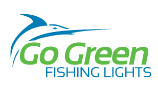
Shane submitted this logo for Go Green Fishing Lights and left the following commentary.
“The logo is for a new company developing underwater lighting for docks, river ways, and deep sea fishing. The lights attract big game fish. The client wanted a simplistic logo with clean lines and somewhat contemporary feel to it. They wanted a marlin or swordfish to represent the brand because it is a big game fish with a fair amount of symbolism behind it. The lights employ a specially designed gas that attracts fish and burns brightly using electronic ballasts (opposed to the common magnetic ballasts). This is a market I have never worked for, so it’s very different for me. There are two major competitors with a color scheme of black and neon green (both of which the client wanted). The competition’s logos are also relatively abstract. So far they like the marlin/swordfish coming from the right moving to the left. I prefer it on the left moving over the type towards the right... the flow feels better, but, hey, it’s their choice!”
The following critique is based on one designer’s opinion and experience. I always appreciate the readers thoughts as well. So, I’ll ask a question of two in the critique, please share your perspective in the comments at the end of this logo design critique.
Design Principles
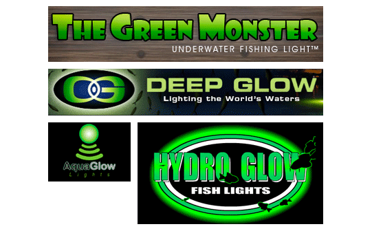
I wanted to start off this critique by showing the logo of the competition that Shane was kind enough to provide. As you can see, the combination green and black is popular in this industry.
I also wanted to show a couple of the variations on the Go Green Fishing LIghts logo that Shane has shared with me.
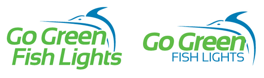
I prefer the version at the top of this critique with the swordfish starting on the left and pointing to the right. Visually the eye flows over it better. When the fish is on the right, it goes against the grain (right to left) while the viewer reads left to right. In terms of typography, I prefer the contrasting fonts, color and size of the version at the beginning of the critique.
Question for the readers
please respond in the comments below
What do you think of the Go Green Fishing LIghts logo in comparison to the competitors logos? What version of the Go Green works best in your opinion?
Functionality / Versatility
Shane’s logo is clean and bold. It will work well as one or two color and in many applications. The same cannot be said for most of the competition logos shown above. I noticed the original version at the top of this critique actually has a mouth and slightly thicker line before the transition into the sword. While the mouth is a small detail that may cause some problems in certain applications, it seems to add more character and life to the swordfish. Maybe there’s a way to slightly rework the fish and maintain the general feel of the original.
Does the Logo Work for the Audience?
The logo communicates the concepts of big game fish and fishing well. However, nothing communicates the concept of light from a visual perspective which makes me wonder about the size relationship between ‘Go Green’ and ‘Fishing Lights’. If ‘fishing lights’ had more prominence than ‘Go Green’ it might be more immediately apparent to the viewer that this company makes fishing lights as opposed to offering some kind of eco friendly service or product. I’m guessing there is nothing eco friendly about the product since Shane hadn’t mentioned it.
Uniqueness
To be truly unique among the competition I think the Go Green Fishing Lights logo would have to abandon the green color that appears to be the industry norm. Unfortunately, it sounds like the client has made this a requirement in your design. Perhaps, experimenting with other shades of green that are further away from the competition’s color palettes could be an option.
Question for the readers
please respond in the comments below
How would you try and differentiate this color palette from the competition? Would you abandon green altogether or just find other means of differentiation?
Typography
I’m not sure if it is intentional or not, but the ‘s’ in ‘lights’ extends beyond the right edge of the text above. I would suggest pulling the text back into alignment with the right edge of the text above.
Possible Improvements
Designing a logo for yourself or own business is one of the hardest logo designs you’ll ever work on. So what is the best way to improve the logo? Well I think have made some comments above that can certainly offer some direction. Here’s a list of actionable items.
- Refine the fish a little more. It appears as though you may have been moving away from the version with the mouth, possibly for simplification purposes, but I think you have lost some of the character of the original fish in the process.
- Continue to work with the color palette. Explore other shades of green (perhaps less saturated) as well as other secondary colors. I would also work on some options that don’t include the color green to see if it works and then present them to your client.
- Adjust the alignment of the ‘fishing lights’ text so that it is inline with the text above.
- The company name presents a tough situation where viewers may perceive the company as a ‘green’ or eco friendly company. It’s not a bad thing by any means, but if it doesn’t apply to the product or company it may confuse some people.
Overall, I think you have a good start on the logo design. And with some refinement you can definitely improve it. Please know that my intention in critiquing your work is not to hurt feelings, but to offer constructive feedback. I hope it was helpful. Best of luck, to you!
I appreciate and welcome your comments, and look forward to hearing from you soon. I purposely don’t cover every possible improvement that can be made to this logo, so go for it if you think I missed anything. All I ask is that you keep your comments clean and appropriate.
Like what you read here? Subscribe to the Logo Critiques News Feed.
Enjoy this post? Share it with others.


The images & logos presented on this blog are copyrighted by their respective owners. The blog itself is copyright Erik Peterson, 2008-2026 All Rights Reserved.


We enjoy your comments
354 Comments so far. Keep 'em Coming.
#1
By Dave Gilligan
10.20.2009 at 01:42 PM
I know that has nothing to do with Shane but I think the company name is quite unfortunate, I think point 4 above is very important
“The company name presents a tough situation where viewers may perceive the company as a �green� or eco friendly company”
I have been reading about ‘The 7 Sins of Greenwashing’ (http://tr.im/Cq7H) because I’m currently designing a logo for an eco-friendly company but I think this company would be committing sin number 2 “Sin of No Proof” and sin number 3 “Sin of Vagueness”.
Consumers maybe mislead into thinking Go Green is the environmentally conscious alternative.
Apart from that I like the logo but I prefer it without the mouth detail as a feel if flows better.
#2
By shane =)
10.20.2009 at 03:45 PM
The Green in the name is because of a specially designed gas that the company has developed for inside the lightbulbs.
This specific type of gas burns brighter and attracts more fish given it’s color temperature.
My initial comps I had been working on some eco-friendly ideas, and then had to re-clarify with the clients on the brief whether or not it was eco-friendly.
The only eco-friendly aspect is that they use digital ballasts which use less power and have better construction =)
thanks for the critique~!
#3
By Dave Gilligan
10.20.2009 at 05:19 PM
Hi Shane,
I think it’s more their issue, Go Green is more like a slogan for an environmental campaign. Apart from that I don’t have any big issues with the logo it’s so much better than the competition.
#4
By shane!~ =)
10.20.2009 at 06:14 PM
That was something I had mentioned to them, and struggled with in the design.
I had some great concepts of merging fish and lights, and other “green product” strategies, but I had to constantly remind myself that it was the specially developed gas that influenced the name. . .
thanks for your compliments, I love critique! It’s one of my favorite parts!
enjoy
shane
#5
By Davis Streker
10.20.2009 at 08:01 PM
The very top logo is the best for sure, minus the little mouth detail. The mouth is distracting and actually makes me feel as if though it is more of a dolphin (porpoise) mouth. It isn’t a very unique design, but the “big game fish” concept is achieved. The contrasted type is much more effective. I do agree that since it is underwater lighting, that there should be a hint of the underwater concept touched upon visually. The trick is to keep this “lighting” concept 100% vector art, no glows or rasterized effects. This could probably be done by applying or suggesting a water surface between the “Go Green” text and the “fishing lights” text. The Go Green name is too trendy for me too. But, I know how that goes sometimes.
Overall, its a great start.
#6
By shane!~ =)
10.20.2009 at 09:46 PM
thanks for the comment Davis! I appreciate it!
I know it isn’t entirely original, but I thought it would appeal to their market as it looks kind of sporty. . . I don’t even fish, so getting my head inside theirs was an interesting experience. .
I also agree about simulating or emphasizing the lighting aspect of the business now as it is understated. and of course doing that without raster is key - i liked the idea about the water level and had tried that in initial comps but it didn’t work right. . .
so maybe ill give it another go and see how it works!
thanks again!
#7
By Michelle
11.03.2009 at 10:37 PM
No matter how bad the competitor’s logos are, I think they do a good job of communicating one of the most important aspects of this product: it is a green light that attracts fish.
I would not recommend abandoning green for this reason. In your current execution, the idea of big game fish comes across. But for all I know, these lights could be on the boat where I am fishing from. There needs to be a stronger tie to underwater, lights and attracting fish. The smaller logo example, Aqua Glow comes close to fusing all of that.
Besides creating a clean logo, you are also creating a product communication on shelf or online. And I’m not understanding the product benefit as you have it.
Good luck. You’ve got a tough one there.
#8
By Custom essays
12.01.2009 at 06:38 PM
I like the logo.. It does makes sense ..
#9
By Erik
12.30.2009 at 04:06 AM
The first one definitely looks more professional, I think the designer did a real good job. It’s not easy making a good looking logo, this one is simplistic but they good looking.
#10
By Andrew Winebarger
01.26.2010 at 02:44 AM
I like the logo I just have a problem with the “G” in Go Green. It intrudes into the belly of your fish. It becomes even more of a problem for me when you place the fish going from right to left. I do like the mark very nice job couple minor tweaks and you’ve made an awesome logo.
#11
By Jack
02.11.2010 at 06:52 AM
Yup that’s great, i like it.
#12
By buycanoneosrebelt2i
03.11.2010 at 05:01 PM
I like the logo. they good clean.
#13
By web design Los Angeles
04.14.2010 at 12:23 PM
I came across your blog and I had a great time. keep blogging!
#14
By Glauber Ramos
06.01.2010 at 09:31 PM
Why this blog is stopped? This blog should return! I love the posts and the comments on logo.
Thanks,
Glauber
#15
By Red Wine Benefits
06.16.2010 at 06:07 PM
Very thorough critique.
#16
By Keratosis
08.27.2010 at 01:38 AM
Hi,
Nice design.Fish oil is good for skin.Skin is just like the rest of our body. It needs good polyunsaturated fats just like our heart does, and it responds to an increase in good fats and a decrease in bad fats in our diet by getting more and more healthy and looking better.
#17
By Ezmelts
09.02.2010 at 11:14 PM
I prefer the fish pointing to the left.
#18
By VOB to MP4 Converter
01.05.2011 at 03:18 AM
With this ISO Burner mac, you can combine your video files into video slideshows, and edit your video clips by videotrimming and video resizing.
#19
By canndy girl
04.06.2011 at 08:10 AM
Great post. You seem to have a good understanding that how to design a professional logo. When I entering your blog, I felt this. Come on and keep writing your blog will be more attractive. To Your Success!
#20
By Free Movies Downloads
10.02.2011 at 10:52 AM
great desings there!
#21
By page flip
10.05.2011 at 07:32 AM
About this logo , Green fishing is looking really impressive..it’s really amazing…........
#22
By HGH
11.22.2011 at 05:52 AM
A great logo design should not be expensive or time-consuming process. By using our services, you can create your company logo design online. Our do-it-yourself program offers the tools needed to develop professional, eye-catching product that will stick with potential customers and help your company logo.
#23
By logodesignloot
05.27.2013 at 06:44 AM
I like the logo design here.But if you are using light blue in place of green color it may be create more sense to the description.
#24
By avdcosta
12.26.2016 at 02:05 AM
great one i like your logo..designing a new logo can be a confusing process for business owners. There are many options to consider – colors, font selection, images, size, shape, etc. In this post, here it explain very nice way to make your business logo design successful.keep blogging…thanks
#25
By Term Paper
01.08.2017 at 12:17 AM
It’s difficult to find experienced people about this
subject, however, you seem like you know what you’re talking about!
Thanks
#26
By renu yadav
02.27.2017 at 02:37 AM
Your article about logo design it is too good
Explain about your idea very effectively I like it.
for more about logo design visit here
http://www.anrdoezrs.net/click-4184687-12576743
#27
By geoff
01.07.2018 at 04:41 PM
this remind me of the time I was travelling the Israel National Trail and sew this green light sign in the desert! very bold and attract your attention
#28
By godaddy 1 dollar domain
09.24.2018 at 07:57 AM
Logo designing profession is also a big earning. You can good money if you work well.
#29
By Mickey James
09.24.2018 at 07:58 AM
Get the best logo for their website and take domain 1$ service at budget amount.
#30
By Arianna
12.11.2018 at 06:00 AM
My uncle will like this stuff surely so will share with him as he will back form his <a >yosemite vacation packages</a>.
#31
By djcluv
01.30.2019 at 12:45 AM
nice design..
thanks for this blog!! deer hunting games
#32
By Andy
02.11.2019 at 03:44 PM
this post remind me the little symbols on a Topographic Map
#33
By ハイチェアの情報はこちら
02.19.2019 at 11:33 PM
ハイチェアの不意な探知とは。お役立ち立地です。ハイチェアの喜んではこちら。可愛いサイトを目指します。
#34
By Sophie Miller
03.13.2019 at 03:34 AM
Je vous remercie de l’information! Je cherchais et ne pouvait pas trouver. Vous me aidé! 192.168.0.1
#35
By Sara Taylor
09.17.2019 at 10:22 AM
it is very important to get the very best mattress for stomach sleepers that one can find. Stomach sleepers need a mattress that is just the right mix of firmness and softness. regards
best mattress for stomach sleepers
#36
By caia domino
10.11.2019 at 05:43 AM
The logo design looks good. The color combination matches well with their website. But the font of the logo could have been changed. real time music collaborationIt doesn’t look attractive and people will not have any interest to look at this logo. Try to make some changes over it.
#37
By Allen
10.21.2019 at 03:42 AM
I prefer the version at the top of this critique with the swordfish starting on the left and pointing to the right. Visually the eye flows over it better. When the fish is on the right, it goes against the grain (right to left) while the viewer reads left to right. In terms of typography, I prefer the contrasting fonts, color and size of the version at the beginning of the critique. 5V0-33.19 exam questions
#38
By Lora
11.11.2019 at 06:58 PM
This is because obese people tend to be regularly absent in their workplace. This leads to loses to the employer in terms of working days lost. Also, even when present they tend to perform below average due to physical limitations.urgent assignment help
#39
By George
11.13.2019 at 01:42 PM
Great to know that there is a website like this.
Spokane junk removales
#40
By Sophie Miller
11.15.2019 at 11:13 AM
Je voudrais lire à ce sujet plus. Prompt, ce que la littérature pour étudier? <a >192.168.10.1</a>
#41
By Sophie Miller
11.15.2019 at 11:14 AM
192.168.10.1
#42
By Richard M
11.26.2019 at 01:14 PM
Great logo design! Very practical. Bristol limo hiring Cardiff limo hiring
#43
By Debrah
11.30.2019 at 03:42 AM
Chinese exports contribute by 19.57% and the USA contributes by 11.89 % of total GDP [Fig: 6]. Even China exports to USA market amounted $477 billion and USA exports to Chinese market amounted $133 billion [Fig: 7]. freelance writer for hire
#44
By Rhys\
12.05.2019 at 05:49 AM
Wow, excellent article. I’d like to draft like this too - taking time and real hard work to make a great article. This post has encouraged me to write some posts that I am going to write soon.
192.168.l.l
192.168 l 254
#45
By jhon wick
12.06.2019 at 06:41 AM
We are at NSE4_FGT-6.0 Questions believe that there is no shortcut to success and to attain success, hard work, dedication, and commitment must be present. The best exam site.
#46
By Omega Maxx Keto
12.08.2019 at 02:12 AM
I like this site because so much useful stuff on here :D.
#47
By heather carter
12.24.2019 at 08:57 AM
Synthetic grass warehouse The contribution by other readers is a clear indication of the impact the blog has. Keep it up.
#48
By albert1234
01.10.2020 at 06:17 AM
hi
https://americanmdcenter.com/
#49
By albert1234
01.10.2020 at 06:19 AM
Best Dental clinic in dubai
#50
By andshar
01.18.2020 at 06:26 AM
Best gynecologist in sharjah
#51
By andshar
01.25.2020 at 03:40 AM
nice post
pregnancy symptoms
#52
By osama shk
01.29.2020 at 06:14 AM
This is very educational content and written well for a change. It’s nice to see that some people still understand how to write a quality post!
go here
#53
By Andrew
02.05.2020 at 11:00 PM
The logo is very nice, neat, and I think it is excellent preferably if the background is white. In comparison with the competition logo, this would stand out. Anyway, kindly visit this website and let me know what you think about its logo. Thanks!
#54
By Danrie
02.06.2020 at 03:34 AM
I am just beginning to make logos for my company and your critiques give me a wide range of insight into what logos I should make. Thank you for expressing your thoughts. There is no doubt that you are a very creative person. Keep sharing your critiques. If you have time, please visit my website
for stump grinding services.
#55
By Mikel
02.06.2020 at 05:25 AM
Nice logos. I am wondering what software did Shane used to create these amazing logos? Can someone recommend a good, user friendly software to use in creating amazing logos like this. On the other hand, please visit this website for professional concrete services.
#56
By JARRET Miller
02.06.2020 at 08:16 AM
I think the logo is the one at the top. Logo design is very tricky I am working one for my <a >Louisiana Bowfishing</a> site. But Nice Logo
#57
By JARRET Miller
02.06.2020 at 08:18 AM
I think the logo is the one at the top. Logo design is very tricky I am working one for my
http://www.BlackKatsDesign.blogspot.com site
#58
By JARRET Miller
02.06.2020 at 08:20 AM
I think the logo is the one at the top. Logo design is very tricky I am working one for my
http://www.nola-bowfishing.com
#59
By Window Cleaner
02.06.2020 at 10:23 AM
I really enjoyed this informative article. You shared some great tips and I will be implementing a few of these beauties into my own work. Much thanks!
<a href=“http://bit.ly/384M4g5”>hamiltonwindowcleaner<a>
#60
By Larry
02.07.2020 at 05:41 AM
The Go Green Fishing Lights logos created by Shane are way better in comparison to the competition logos. For me, those competition logos look like banners not logos. On the other hand, click here to find out the most recommended epoxy flooring company in Colorado Springs, CO.
#61
By Deannie
02.10.2020 at 06:24 AM
Your critiques are very constructive. I would sure love to pick your brain. Please visit patio covers & awnings and let us know what you think of our logos. Thank you for your time.
#62
By Santana
02.13.2020 at 07:51 AM
I like your comments and insights towards the logos. You have a pretty good point. Visit us if you want to check out my website and Read More..
#63
By Jack Jacbob
02.13.2020 at 04:18 PM
I love the logo like I love fishing. It is attractive and well done.
Jack CEO of
Asphalt paving Service Dayton Ohio
Demolition Service in Dayton
Parma Towing Ohio
Bin Rentals Dayton
Duct Cleaners Cincinnati
Septic tank cleaning Cincinnati Ohio
Septic tank cleaning South Bend Indiana
Excavation Sterling Heights Mi
Mold Removal Dayton OH
Porta Potty Rentals Dayton
water well dayton ohio
#64
By Michele F. Kelly
02.19.2020 at 06:40 AM
You put really very helpful information. Keep it up. Limo Service Wichita KS
#65
By Ian Pundt
02.20.2020 at 12:57 AM
I really enjoyed this informative article. You shared some great tips and I will be implementing a few of these beauties into my own work. Much thanks!
<a >https://www.borchersagsupply.com/</a>
#66
By Ian Pundt
02.20.2020 at 12:58 AM
I really enjoyed this informative article. You shared some great tips and I will be implementing a few of these beauties into my own work. Much thanks!
https://www.borchersagsupply.com/
#67
By https://www.borchersagsupply.com/
02.20.2020 at 12:58 AM
I really enjoyed this informative article. You shared some great tips and I will be implementing a few of these beauties into my own work. Much thanks!
#68
By Caroline Herzog
02.20.2020 at 12:59 AM
The Go Green Fishing Lights logos created by Shane are way better in comparison to the competition logos. For me, those competition logos look like banners not logos.
https://www.borchersagsupply.com/
#69
By SantanaBritt
02.20.2020 at 11:12 AM
Shane is bold in making a logo that is different from the competitors and that makes her work unique. I like your comment about making the dolphin start from left to right. It is easy for the viewers to appreciate.
If you are interested in giving my logo a critique Click Here
#70
By Michael Generoso
02.21.2020 at 12:21 AM
I love the logo like I love fishing. It is attractive and well done.
https://australianautomation.com.au/boom-gates-melbourne/
#71
By Michael Generoso
02.21.2020 at 12:22 AM
I love the logo like I love fishing. It is attractive and well done.
https://australianautomation.com.au/boom-gates-melbourne/
#72
By Michael Generoso
02.21.2020 at 12:24 AM
Great post. You seem to have a good understanding that how to design a professional logo. When I entering your blog, I felt this. Come on and keep writing your blog will be more attractive. To Your Success!
Automatic doors melbourne
#73
By Roque
02.25.2020 at 10:52 AM
I think the logo stands out from the rest. The green glowy effect from the competitors is so mainstream. She did a great job on this one. http://auroradeckandfence.com/
#74
By Cliff Vaugh
02.26.2020 at 01:35 AM
You help me feel more joy in life. https://lacrossetreeservice.com/
#75
By Amar Martinez
02.26.2020 at 02:27 AM
You were cool way before hipsters were cool. https://bloomingtontreeservice.com/
#76
By Boyd Hawkins
02.26.2020 at 03:06 AM
When you’re not afraid to be yourself is when you’re most incredible. https://buenaparkplumbingco.com/
#77
By George Harris
02.26.2020 at 03:28 AM
You’re wonderful. https://roundrockplumbing.co/plumber-cedar-park
#78
By Dean Sharper
02.26.2020 at 03:59 AM
That thing you don’t like about yourself is what makes you so interesting. https://flowermoundtreeservice.com/
#79
By Pear Sonemilio
02.26.2020 at 04:36 AM
this is very informative and intersting for those who are interested in blogging field. https://salemtreeservicepros.com/
#80
By Roque
03.03.2020 at 08:35 AM
I like Shane’s logo better than the competitors. It is unique and the Green and Black color is so mainstream. Nothing new anymore. Great work, Shane! lovelandstumpgrinding.com
#81
By Emily
03.07.2020 at 10:46 AM
Love the start of this. I wish the letters were right aligned, and the LIGHTS didn’t extend our further than GREEN. The fish design is great and has wonderful motion, I think it could be a little stronger and connected with the wordmark a bit more.
plumber
electrician oak park il
tree removal
concrete contractor
sump pump
#82
By Dale
03.10.2020 at 04:20 AM
Hi Shane, could you recommend a free software to use that could provide a magnificent logo output? Anyway, thanks for sharing some tips in creating a logo.Like you, I also prefer the one at the very top. Anyway, feel free to visit http://littletonfenceanddeck.com/ and see what you can say about the website’s logo. Thanks!
#83
By Mark
03.10.2020 at 04:31 AM
I really like how Shane created the logo there. It stands out comparing to the logos of the competitors. The color combination matches and it is pleasing to the my eyes. Thanks for having me share my own critique. Also, feel free to visit westminsterepoxyflooring.com and check out our logo as well. Thanks!
#84
By Jamieorris
03.11.2020 at 03:17 AM
I want to know who invented the internet
#85
By Fispatrice
03.11.2020 at 03:21 AM
I think she did a greater job compared to the rest. Her designs are unique and fresh. The green and black glow in the dark is mainstream. It is good to have a new set of unique designs. https://fortcollinsstumpgrinding.com/
#86
By American Foot and Leg Specialists
03.12.2020 at 09:54 AM
American Foot and Leg Specialists
425 Forest Pkwy, Forest Park, GA 30297
(404) 363-9944
https://americanfoot.com/
M-F 8am-5pm
The podiatrists at American Foot & Leg Specialists have been leaders in the field of podiatric medicine and surgery for over 45 years and work hard to prevent, detect, and treat any foot and ankle problems. From routine checkups to athletic or work-related injuries, as well as, special treatments and surgery, our podiatric physicians are experts on all foot and ankle needs. They can help with diabetic foot care, corns, flat feet, nail and skin conditions, bunions, nerve testing, lower extremity wound care, pediatric care, and disability ratings.
#87
By Rianne Knox
03.12.2020 at 10:38 PM
I do agree that since it is underwater lighting, that there should be a hint of the underwater concept touched upon visually. More info
#88
By Siding
03.18.2020 at 06:31 AM
It’s a nice logo for me! When you need roof repair or maintenance services, call the experienced roofing team at C.H.I. for residential or commercial roofing projects. Contact us now (513) 731-7663 or visit our website C.H.I Roofing
#89
By MDMRK
03.18.2020 at 10:02 AM
I think everyone’s design is amazing. She just made it her own. Like she stepped out of the usual green and black glow in the dark theme. Cheers from https://www.lovelandconcretecontractor.com
#90
By Fast Action Remodeling
03.18.2020 at 10:09 PM
Great post, I actually like several of the logos. Similar to a few I made for kitchen remodel dallas a while back.
#91
By Anonim
03.24.2020 at 10:45 PM
I wanted to start off this critique by showing the logo of the competition that Shane was kind enough to provide. https://www.yesextoys.com
#92
By rokinov
03.26.2020 at 07:34 AM
Your logo is much better compared to others. It is more unique and it will surely stand out. http://auroraepoxyflooring.com/
#93
By Belota
04.02.2020 at 01:34 PM
All of the designs are amazing. Shane’s designs also stands out since it is unique and not like the mainstream glow in the dark and green theme. I hope everything works out for the best.
Please check out our website and view our logo too.
#94
By Adalia
04.10.2020 at 04:04 AM
I agree with the author of this content. I prefer the design where the dolphin or fish starts from the left and pointing to the right. It is easier for audiences to appreciate it. Please also check out our logo here http://castlerockdeckandfence.com/
#95
By Pittsburgh DJ Services
04.13.2020 at 07:54 PM
This is great, your logo is fantastic, I really like it! Thank you for sharing!
https://www.djservicespgh.com/
https://www.djservicespgh.com/dj-services.html
#96
By custome metal roofs
04.15.2020 at 06:44 AM
Very informative. I like the logo though, its very catchy
#97
By asama shk
04.15.2020 at 03:31 PM
Excellent information on your blog, thank you for taking the time to share with us. Amazing insight you have on this, it’s nice to find a website that details so much information about different artists.
<a >http://sanskritijewelsbygeetika.com/</a>
#98
By Professor
04.17.2020 at 08:33 AM
I like the dolphin pointing to the right too. Easier to read and comfortable to the eyes. Cheers from flowermoundfenceanddeck.com
#99
By jacky
04.19.2020 at 06:38 AM
nice funeral directors Barnsley
#100
By jacky
04.19.2020 at 06:53 AM
immigration lawyer in dublin ireland
#101
By jacky
04.19.2020 at 06:54 AM
helpful tier 1 visa UK
#102
By Henry
04.21.2020 at 10:34 PM
Simple, elegant. I like it! Reminds me of a drywall installer logo I did once.
#103
By Hello
04.28.2020 at 04:39 PM
Our electrician midland tx is available to fix your wiring issues.
#104
By Iglesias
04.28.2020 at 04:43 PM
Our electrical contractors tallahassee is here to resolve your lighting needs
#105
By Billy
04.28.2020 at 04:45 PM
Call the experienced bronx electrician trusts.
#106
By WillyG
04.30.2020 at 04:04 PM
I really like the green and black logos, those are rad. Thinking about getting off of city water and drilling a new well? Well Drilling Mobile can drill a new water well in South Alabama for you. We can repair existing wells, drill new wells, install water filtration systems, service any type of tank, and replace old worn out pumps. Water Well Drilling Mobile, AL
#107
By Dee Hay
05.05.2020 at 07:05 PM
This is great information. Great insight on picking logos and determining what to look for. We have one for our painting company as well. It took a while, but now we know better! Thank you!
<a >Conwaypainters</a>
#108
By Dee Hay
05.05.2020 at 07:11 PM
<a >Conway, AR</a>
This is great information. Great insight on picking logos and determining what to look for. Very informative. I like the logo though, its extremely catchy
#109
By Derek Haight
05.05.2020 at 07:21 PM
Great information. Thank you. I’m sure I can remember some of this for the next time I want to change our carpet logo! Thank you
<a >Carpet</a> Installation
#110
By Joshua S
05.07.2020 at 07:45 PM
Good article about choosing logos and what to look for. Thanks from Carpet Cleaning Ft Collins Loveland CO
#111
By Cory M
05.07.2020 at 09:54 PM
Good article sir! From Carpet Cleaning Burley ID
#112
By Jeff
05.07.2020 at 10:13 PM
Thanks for sharing this information. Your post caught my interest - home cleaning services
#113
By Alex
05.11.2020 at 04:15 AM
I think the message “Go Green” makes it eco-friendly. And if I am to choose, I would go for the original logo. It stands out in comparison to its competitors. Anyway, do you have any tips on what software to use in creating logos like this? We are planning of improving the logos of these websites: http://westminsterlandscapingservice.com/ (landscape architects) and http://westminsterdeckandfence.com/ (deck and fence builders).
Looking forward to your advice. Thanks!
#114
By Music Giants
05.11.2020 at 07:06 AM
WOnderful article, looking forward for more!!
#115
By Music Giants
05.11.2020 at 07:07 AM
Great article. Also visit my site https://www.musicgiants.com.
#116
By Mikael
05.12.2020 at 05:50 AM
Creating a logo is not as simple as typing a text. It also needs better judgement which I like about the article posted. At least the author was asking for opinion. Anyway, for me, I’ll go for the original logo. Also, we need your opinion regarding our partner’s logo which you can find here http://boulderdecorativeconcrete.com/ (providers of quality concrete services in Boulder, CO).
#117
By Peter
05.12.2020 at 07:18 AM
The original logo is stunning and it stands out in comparison to the logos of the competitors. Keep it up. Anyway, do you have any advice or tips on how to create stunning logos? I’d appreciate if you can share. Also, check out my friend’s logo at http://allendeckandfence.com/.
#118
By Brian Gathers
05.12.2020 at 10:10 PM
i appreciate your work on logo finally i found sommeone who explains with an extirdinary idea. thank u
concretecontractorssaltlakecity.com
#119
By Mike Santos
05.13.2020 at 12:05 AM
Wow! this is awesome, thanks for this https://meettheanimals.com.au/
#120
By Daniela
05.14.2020 at 07:16 AM
I like the concept of the posted article. At least, before putting the logo live, the author asks for opinions if it stands out. For me, like most of the commenters, I would go for the original logo to where the fish faces the right side. Anyway, thank you, and please click here if you’re looking for an affordable, high-quality commercial fencing service in McAllen, TX.
#121
By Adrian
05.14.2020 at 07:38 AM
I think the original logo is just perfect. Anyway, thank you for sharing your opinion and please click this if you’re looking for the most reliable tree trimming services in McKinney, Texas.
#122
By Justin Baker
05.15.2020 at 07:39 AM
Reading to this process is going to be super helpful for new logo designers. kcdeckbuilder.com
#123
By Eric
05.18.2020 at 07:05 AM
I think the green color is a little bright but the fish design is solid. I need a logo for my well repair rochester mi company soon.
#124
By sandy
05.18.2020 at 07:11 AM
I like your article. I can use it for future projects on
learnerships .
#125
By Lawn Mowing
05.20.2020 at 07:36 AM
Thank you for the amazing post. I will share this with my friends so that they can also benefit. Lawn Mowing
#126
By Fabiola
05.22.2020 at 11:26 AM
thanks for sharing such an interesting post. I just finished designing my new logo:
www.uñasencasa-marbella.es
#127
By Shelby Naughton
05.24.2020 at 06:40 PM
Oooo I love the green logos! They look great. Thanks so much for taking the time to inform us about this topic.
www.masonrydavis.com/
#128
By Shelby Naughton
05.24.2020 at 06:42 PM
Oooo I love the green logos! They look great. Thanks so much for taking the time to inform us about this topic.
Masonry Davis
#129
By Mike Lopez
05.25.2020 at 12:27 AM
The logo looks great! and an amazing article indeed.
solar panels perth
#130
By House Cleaner
05.25.2020 at 01:53 AM
We like this logo. We could use something similar for our business.
#131
By House Cleaner
05.25.2020 at 01:54 AM
We like this logo. We could use something similar for our house cleaning business.
#132
By Mike Lopez
05.27.2020 at 12:26 AM
This logo looks great! party booths hire
#133
By Emma Lemione
05.29.2020 at 12:05 AM
Well made logo! i like it.
perth photo booth hire
#134
By osdasdasama shk
05.31.2020 at 03:56 AM
Thanks for every other informative site. The place else may just I get that kind of information written in such an ideal means? I have a venture that I’m just now operating on, and I have been on the look out for such information.
click now
#135
By john
06.05.2020 at 11:54 AM
thanks for sharing. i think it needs to have lights in the logo. it is in the name and i think it should be in the logo also
Fencing company
#136
By Sam
06.18.2020 at 09:46 PM
Wow. Now I have references on how to have a good and nice-looking logo for my business. - home renovation
#137
By Carmelo Flagg
06.18.2020 at 10:02 PM
Nice job on posting this article. I love the logo. I love the artisity. Thanks a lot. I will consider this for my business. affordable towing services
#138
By Hanna Grey
06.19.2020 at 12:54 AM
Logo looks perfect. Looking to create one for our website
#139
By Sarah Collins
06.20.2020 at 02:43 AM
.I’m and so blessed to own found out the following site. People essentially claimed all of us simply just what exactly When i opted to help pay attention to help in addition to afterward a lot of. Amazing publishing in addition to regards yet again intended for performing this particular not any fee!Tulsaareafencing.com
#140
By Carly Dwayne
06.20.2020 at 02:45 AM
Many thanks approving towards the great data. Purely nondiscriminatory wen upwards!Tulsaareaconcreteservices.com
#141
By Karla Lennon
06.23.2020 at 07:56 AM
Care to share some to our site
#142
By sam johnson
06.30.2020 at 10:29 PM
This is such a great post. Thanks for sharing! Tree Removal Summerville SC
#143
By Electrician Ventura County
10.25.2020 at 09:10 PM
As people mentioned before, green seems more environmental, if there is an environmental side to it then great. Our company just branded into a new Electrician logo. We used an electrical panel and wiring attached to our name. See what you think.
#144
By Xin
10.25.2020 at 09:32 PM
The first version is more pleasing to the eye. We are looking to rebrand our logo as well for our Electrician , found good ideas here. Thinking of using a light fixture and electrical wiring to represent our most popular services just like you did.
#145
By Electrician Livermore and Pleasanton
10.29.2020 at 04:07 AM
I also like the first logo better. More pleasing to the eye. Curious which one you ended up with. The logo for our Electrician company in Livermore and Pleasanton, CA is much simpler. Cheers
#146
By Danny Myers
11.01.2020 at 09:09 PM
These guidelines are mind blowing when it comes to creating the perfect logo, amazing! Maybe you can help us out at our Tree Removal Service San Jose business!
#147
By John
11.01.2020 at 10:44 PM
Great guidelines on how to create the perfect logo! This is our website Rubbish Removal Staten Island hopefully we can get a good logo going on for it!
#148
By dan
11.03.2020 at 11:04 PM
Hey! hopefully you can help us out on our website!
#149
By Electrician Santa Barbara CA
11.05.2020 at 11:45 PM
Love these ideas! Check out our Electrician services and logo too!
#150
By Thomas
11.06.2020 at 09:32 PM
I like the logo and its way better compared to its competitors. Thank you for sharing your thoughts about such a logo and hope we can also submit soon our logo for your perusal. Anyway, if you have any tree removal needs in Longmont, please reach out and we’re glad to help.
#151
By Lorem Dela Cruz
11.15.2020 at 09:52 PM
I like the new design. Her logo is unique and would stand out from the usual green and black design. Also, for tree services, you can Click Here
#152
By Patrice Roque
11.18.2020 at 09:36 AM
I like the new logo she created. It is out of the blue and not the usual glow in the dark logos. You did great and unique work on this one. If you need carpet cleaning, you can Read More..
#153
By Lorem Dela Cruz
11.24.2020 at 04:46 PM
I admire her logo. I would need your critics as well. Please check the logo of our website
#154
By Dillon Fitzgerald
11.29.2020 at 11:02 PM
Instead of differentiating from the color green I think they should keep some type of green color, because it is typically associated with being environmentally friendly like my car detailing friend’s business and his logo. They like to be as green and eco-friendly as possible when it comes to their work.
#155
By Ivana Loonyo
12.05.2020 at 08:21 AM
I like all the logos. It just depends on the company if what they would choose. Can you also check out the logo of our website?
#156
By Bome Italy
12.09.2020 at 02:20 PM
Shane did a wonderful design for this logo. It is unique and not like the others. Please also check and critique our website logo
#157
By Noah Van Goh
12.21.2020 at 03:02 AM
I like all the designs. They are all unique. The new design is not the usual green and black glow in the dark style. It is refreshing. For more nice logos, please Click Here
#158
By Noel
01.10.2021 at 08:29 PM
This is a good critique. It’s interesting to hear how designers think about logos. My website could use a critique as well to improve the branding.
#159
By thea
01.12.2021 at 07:18 AM
thanks for this site
#160
By Lucas Abbe
01.13.2021 at 02:44 AM
The one with the blue font “Fish Lights” is good but it looks like a “tag line” instead of the name of the website.
flashlocalcitations.com
#161
By Aeron
01.19.2021 at 07:16 AM
Hello there!Beautiful post, I absolutely LOVED IT!!!Visit my website
#162
By Tilly Racker
01.25.2021 at 07:09 AM
Gracias a Dios me encontré con esta página! https://guitarlessonsatlantaga.com
#163
By Gigi Smith
01.25.2021 at 07:18 AM
Me preguntaba ... https://financialadvisorsantarosaca.com
#164
By Jenny
02.20.2021 at 04:00 AM
It’s not that big of a deal for our site: www.treeremovalalbany.com
I am hoping that is a good thing for us.
#165
By Pete
02.23.2021 at 09:13 AM
Thank you very much for sharing this article! Well done!
https://www.arboristcoloradosprings.com
https://www.arvadafencingpros.com
https://www.roofingprosboulder.com
https://www.grandjunctiontowingpros.com
#166
By Leni
02.23.2021 at 09:14 AM
All of my question in my mind were answered. Thank you!
Tree Service Colorado Springs
Fence Companies Arvada
Roof Repair Boulder
Grand Junction Locksmith
#167
By Duditha
02.23.2021 at 09:17 AM
Very informative for me. Awesome!
Tree Service Denver
Firewood Boulder
Fence Repair Colorado Springs
Roofing Companies Grand Junction
#168
By Sean
02.23.2021 at 09:20 AM
Well written and easy to read. Great work!
Roofing Companies Parker
Fence Contractors Lakewood
Tile Installers Thornton
Colorado Springs Concrete
#169
By Pittsburgh DJ Services
03.05.2021 at 12:22 PM
this is great
http://www.djservicespgh.com/
http://www.pghcleaners.com/
#170
By Katara
03.09.2021 at 04:40 AM
This is a very informative article! Keep up the good work!
Towing Grand Junction
#171
By Lin
03.09.2021 at 04:41 AM
Awesome article! Very educative Concrete Contractors Colorado Springs
#172
By Yu
03.09.2021 at 04:42 AM
Very Informative article! Thank you Roofing Companies Aurora
#173
By Xin
03.09.2021 at 04:44 AM
Your Writing skills are superb! Roofing Companies Fort Collins
#174
By Rick
03.09.2021 at 04:45 AM
This is why i love reading your articles, Keep up the good work! Roofing Companies Parker
#175
By Riley
03.09.2021 at 04:46 AM
Well written article keep up the good work! Roofing Companies Parker
#176
By Esmeralda
03.09.2021 at 04:47 AM
This is a very helpful article! Good job! Roofing Companies Grand Junction
#177
By Hanzo
03.09.2021 at 04:49 AM
This article is very informative! Keep it up! Roofers Boulder
#178
By Changu
03.09.2021 at 04:51 AM
Great information i enjoy reading this! Loveland Roofers
#179
By Harley
03.09.2021 at 04:52 AM
A nice and good article! I recommend this! Roofing Companies Westminster
#180
By Morty
03.09.2021 at 04:55 AM
I like this article very much! Lakewood Roofers
#181
By Stelle
03.09.2021 at 04:56 AM
I love reading your articles, keep up the good work! Tree Removal Boulder
#182
By Kevin
03.13.2021 at 04:37 PM
I like this logo…
Broken Arrow Pest Control
#183
By Tree Service Mundelein
03.15.2021 at 03:09 PM
I like the logo, simple yet very thought out. I’m sure your client was happy with your work. Tree Removal
#184
By Bob Sallice
03.23.2021 at 09:07 PM
The first logo is my favorite, unfortunately, I’m just a simple carpet cleaner maybe one day!
#185
By Chad
03.26.2021 at 12:06 AM
Fantastic post, keep it up everyone!
painting companies troy | painting companies west bloomfield
#186
By Ichigo
03.26.2021 at 12:08 AM
Thanks for the great post. I greatly enjoyed reading about this with my father in law.
roofers royal oak
#187
By Wang Yo
03.26.2021 at 12:11 AM
Thanks for sharing the info about the critique!
tree removal southfield
tree removal taylor
tree removal west bloomfield
#188
By Holly So
04.02.2021 at 03:52 PM
This approved most effective Septic Tank Cleaning Elkhart Indiana and
Home inspections Dayton Ohio
#189
By Tom
04.09.2021 at 02:31 AM
thanks for this great information. <a >plumber near me</a>
#190
By Tom
04.09.2021 at 02:32 AM
thanks for this great information. plumber near me
#191
By John
04.09.2021 at 02:34 AM
great post. durbanville plumbers
#192
By Angelo Thompson
04.12.2021 at 07:43 AM
The logo is nice with the green font color! Love it.
Hayward Concrete and Masonry
#193
By Ike Rahimi
04.13.2021 at 08:50 AM
This is a lot of work but it pays off once the logo is completed! Just like how I manage to create for a concrete patio logo.
#194
By seattle carpenter contractor
04.15.2021 at 10:48 AM
If you need a seattle carpenter contractor, check us out!
#195
By HarryJane
04.16.2021 at 08:48 PM
I think his design compare to the competitor is good. it’s simple but sharp
-Harry | palm tree service
#196
By Sebastian Cook
04.20.2021 at 12:19 AM
The first logo above is the best versus the variations on the Go Green Fishing Lights logo. Shane is a good logo designer.
What do you think is the best logo for our Vestavia Lawn Services
#197
By Bremerton Insulation
04.20.2021 at 02:54 AM
Please do hit us up over at Bremerton Insulation if you need experts on insulation!
#198
By andy
04.25.2021 at 11:17 PM
the logo is the symbol of every company or business, I have a partner who knows to do a logo but it’s hard to create a design I think he lacks a creative mind. learnerships
#199
By sanya
04.25.2021 at 11:19 PM
This creative logo design is easy for the professional artist. proplumbercapetown.co.za/
#200
By trixie
04.25.2021 at 11:21 PM
keep practicing to create a logo to makes perfect. that’s my motto in myself. proplumbersdurban.co.za