Fox Valley Voice Logo Critique 431
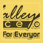
Jamie submitted this logo for the Fox Valley Voice and left the following comment about the work.
“This is the logo for my local information website in the western suburbs of Chicago. The area is known as the Fox Valley due to its location on the Fox River. I'd like to be able to use this logo on several different types of materials, including print, apparel, promotional stuff, etc. Let me know if I'm heading in the right direction.”
The following critique is based on one designer’s opinion and experience. I always appreciate the readers thoughts as well. So, I’ll ask a question of two in the critique, please share your perspective in the comments at the end of this logo design critique.
Design Principles
Let me start by saying this logo is visually complex. There’s an awful lot for the viewer to take in. One way to help simplify the logo would be to reduce the size of the tagline or remove it completely.
Continue reading this articleArchSpace Logo Design Critique 50
Categories: Critiques Home & Construction Website

Vassilis designed this logo for an architect friend that plans to build a website offering free training tools for architects. He submitted a whole page of variations on this logo, but I chose this one to critique because I thought it was working the best out of the bunch. Vassilis left the following comment with his submission,
“The client told me she wants something “design-ey” and not strict, with grey as a dominant colour, and she also decided that probably grey and green will be the main color combination for her ‘company’ identity. I have here the main idea for the logo arranged in many different ways. Its basically a stylish compass (common architect tool) which forms the letter A. The typeface I used is Myriad Pro and I customized it to look a bit more modernish. I've made a whole other lot of concepts and ideas but I think this is my best one. I'd appreciate any thoughts and comments.”
The following critique is based on one designer’s opinion and experience. I always appreciate the readers thoughts as well. So, I’ll ask a question of two in the critique, please share your perspective in the comments at the end of this logo design critique.
Continue reading this articleIdaho Film Project Logo Critique 43

Troy submitted this logo that he has been working on for an Idaho Filmmaking community website. He left the following comment,
“This logo (a work in progress) is for an Idaho Filmmaking community website. Visitors to the site will be able to upload videos and critique them, connect with other filmmakers, buy and sell equipment, access a filmmaking FAQ and more.”
The following critique is based on one designer’s opinion and experience. I always appreciate the readers thoughts as well. So, I’ll ask a question of two in the critique, please share your perspective in the comments at the end of this logo design critique.
Design Principals
I really like the color palette choice. It has an earthy and modern feel. The blue background brings life and contrast.
Continue reading this articleThe images & logos presented on this blog are copyrighted by their respective owners. The blog itself is copyright Erik Peterson, 2008-2026 All Rights Reserved.


