ArchSpace Logo Design Critique 50
Categories: CritiquesHome & ConstructionWebsite
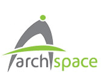
ArchSpace Logo Design Critique
Vassilis designed this logo for an architect friend that plans to build a website offering free training tools for architects. He submitted a whole page of variations on this logo, but I chose this one to critique because I thought it was working the best out of the bunch. Vassilis left the following comment with his submission,
“The client told me she wants something “design-ey” and not strict, with grey as a dominant colour, and she also decided that probably grey and green will be the main color combination for her ‘company’ identity. I have here the main idea for the logo arranged in many different ways. Its basically a stylish compass (common architect tool) which forms the letter A. The typeface I used is Myriad Pro and I customized it to look a bit more modernish. I've made a whole other lot of concepts and ideas but I think this is my best one. I'd appreciate any thoughts and comments.”
The following critique is based on one designer’s opinion and experience. I always appreciate the readers thoughts as well. So, I’ll ask a question of two in the critique, please share your perspective in the comments at the end of this logo design critique.
Design Principals
I have two big problems with this logo. First, I keep reading the first part of the name as ‘arch’, “a typically curved structural member spanning an opening and serving as a support (as for the wall or other weight above the opening)” (source). I believe it is supposed to be read as ‘arc’ as in ‘architecture’. Now for the second issue, because I read the first part of the name as ‘arch’, the supposed compass looks like an arch to me. Which in isn’t a huge problem, I suppose. I mean arches are used in architecture all the time, but then I’m left wondering about the meaning of the green dot and crossing line. In the end, the problem comes from the name of the company/website in conjunction with an arch like icon. The two pieces make the perception problem bigger because one perpetuates the other. I believe many people will read the name just as I did before reading your description about the mark.
Question for the readers
please respond in the comments below
Forgetting the explanation of the logo and iconography, did you see the compass? How did you read the company name (arc vs. arch)?
Functionality / Versatility
The logo is well put together from a functional standpoint. It will reduce well and also will work fine as one color. The mark will work well in most mediums (print, textile, web, etc.).
Does the Logo Work for the Audience?
The logo portrays movement and forward thinking with the skewed compass/arch and active crossing line. I think the green is good color choice for the audience. It feels fresh and conveys the eco-friendly theme which is becoming more and more important in modern architecture. As I stated before, there may be a problem with how the name is read and in turn how the ‘A’ icon is received by the viewer. There’s always a chance that the interpretation will differ by culture. I believe Vassilis is not from the U.S., like I am, and therefore I may interpret the mark and language differently.
Question for the readers
please respond in the comments below
Do you think the interpretation of the words and icon in this particular logo are affected by culture?
Typography
As you suggested, the type does have a modern feel to it. I’m not totally sold it on it though. It seems a little weighty in my opinion. I would prefer to see lighter weight letterforms, to reflect the modernity, refinement and structure that is often a part of architecture (type more like version 15). I think you need to adjust your kerning though. In particular, the ‘a’ and ‘r’ seem a little open. Same goes for the ‘s’ and ‘p’. Also pay attention to the spacing surrounding your icon. The ‘h’ is a little close to it. Some minor adjustments will resolve these kerning issues.
Possible Improvements
Designing a logo for yourself or own business is one of the hardest logo designs you’ll ever work on. So what is the best way to improve the logo? Well I think have made some comments above that can certainly offer some direction. Here’s a list of actionable items.
- Consider rethinking the name of the company or figure out a way to make it read more like ‘arc’. Maybe just drop the ‘h’.
- Experiment with the iconography. Perhaps the concept of an arch is a better icon than the abstracted compass.
- Take another look at the kerning. There are a couple of inconsistent gaps between the letterforms.
Overall, I think you have a good start on the logo design. And with some refinement you can definitely improve it. Please know that my intention in critiquing your work is not to hurt feelings, but to offer constructive feedback. I hope it was helpful. Best of luck, to you!
I appreciate and welcome your comments, and look forward to hearing from you soon. I purposely don’t cover every possible improvement that can be made to this logo, so go for it if you think I missed anything. All I ask is that you keep your comments clean and appropriate.
Like what you read here? Subscribe to the Logo Critiques News Feed.
Enjoy this post? Share it with others.


The images & logos presented on this blog are copyrighted by their respective owners. The blog itself is copyright Erik Peterson, 2008-2026 All Rights Reserved.


We enjoy your comments
50 Comments so far. Keep 'em Coming.
#1
By Vassilis Mastorostergios
07.01.2009 at 02:41 PM
Erik thank you very much for the review.
The name was also one of my biggest worries (it should be read arch like in “architecture” but for English native speakers it is read arch as in “Archbishop”.
I forgot to mention that I made the compass that way exactly to remind an Arch as well as a compass (more weight put on the compass of course).
“I believe Vassilis is not from the U.S., like I am, and therefore I may interpret the mark and language differently.”
Indeed I am from Greece and the company is established and will work here, every Greek read “arch” as in “architecture” so the pronunciation will not be a big problem here.
Again thanks alot for the feedback, the kerning is already fixed.
#2
By Joshua Davis
07.01.2009 at 07:57 PM
I visualized the mark as a space capsule leaving earth’s atmosphere. The green being the atmosphere, and the gray the after trail from launch. Maybe I just have an active imagination.
I agree with the critique that it is a solid design with some minor kerning issues. I’m not a fan of the colors, because I feel they are overused. I also think it works well with the symbol above or to the left side of the brand name.
Good job!
#3
By maflew
07.02.2009 at 05:24 PM
First when I saw the logo I said that is an arcade. At the first look I didn`t realized that is for an architecture company. It looks a bit too cartoony and the font is not in touch with the design. I also read “arch” than “arc”
Nice critique.
#4
By Lavonne
04.19.2010 at 02:54 PM
My first impression was of the uniform communicator worn by the crew in Star Trek. The word ‘space’ backed this up. I didn’t see the compass until after reading the description. I also read it as ‘arch’. Yes, I think culture played a part in my seeing something from a sci-fi movie in this logo. Maybe the target clientele wouldn’t be Treckies…
#5
By Danny
09.30.2017 at 04:26 AM
Thanks, great post
#6
By John
09.30.2017 at 04:27 AM
Thanks, Great post
#7
By Gos
07.22.2019 at 04:49 AM
The goal of the society is to create professionally well skilled students To achieve the said goal, arrangements have been made with the pioneers and front runners both in India and abroad.
cbse school in dehradun
The Health system is created in a proficient way of expanding the network in the multispecialty services. With the ever-growing population, the hospital has announced many ambitious plans that have ultimately lead to the excellence.
maternity Hospital in hisar
#8
By Allen
10.21.2019 at 03:39 AM
The following critique is based on one designer’s opinion and experience. I always appreciate the readers thoughts as well. So, I’ll ask a question of two in the critique, please share your perspective in the comments at the end of this logo design critique. AD0-E301 exam questions
#9
By Ken
04.21.2020 at 10:55 PM
This logo could definitely use some work. I’m a roofer in Kennewick by trade but I have a keen eye for these.
#10
By tj52
01.13.2021 at 06:23 AM
In times of pandemic, useful information is especially valuable. when you sit at home on self-isolation, there is especially a lack of communication. It’s good that there is resume services near me to help you stay connected with the rest of the world. there is a pleasant feeling that nothing has changed
#11
By Larry Lopez
04.13.2021 at 07:58 AM
This logo has potential. As a concrete contractor, my eyes are keen when it comes to design.
#12
By marc saint
07.12.2021 at 01:24 PM
fix a pothole in your parking lot can spring up in your parking garage and cause gives that are best kept away from. Peruse on to comprehend why a prompt fix is important.
#13
By Skybird aviation
11.25.2021 at 05:49 AM
Skybird Aviation is one of the best Aviation Academy for Air Hostess Training, BBA & MBA in Aviation, Airport Ground Handling Training, and Pilot Training.
#14
By Jerome
12.29.2021 at 06:14 AM
Thank you for a well-written article, a very interesting idea, we have a desire to make such interesting and very exciting ceilings. They make the room seem brighter. https://openceilings.nl/
#15
By suzi
12.29.2021 at 06:16 AM
Have a nice day, Thank you for a well-written article, a very interesting idea, we have a desire to make such interesting and very exciting ceilings. They make the room seem brighter. https://openceilings.nl/
#16
By trantongray
05.17.2022 at 04:47 PM
wireless headphones are the best because they do not have those bulky wires` suit for men wedding
#17
By Stephanie Pink
08.22.2022 at 03:00 AM
Somewhere in the range of 1891 and 1896, the William Morris Kelmscott Press distributed probably the main realistic items Arts and Crafts Movement Arts and Crafts, and laid out a worthwhile business in view of the vehicle wraps Hamilton plan of books of extraordinary elaborate refinement and offering them to the privileged societies as extravagance things.
#18
By Lola Bendrodt
08.22.2022 at 03:03 AM
With changing business situation, requests and assumptions for individuals have additionally expanded. Today, ExchangeOnline workers need substantially more than simply sending and getting messages.
#19
By Reine_Y
09.20.2022 at 07:20 AM
This is absolutely stunning! Its creativity is at its finest! It is also good to see some good points when I Click here
#20
By Everywhere
09.23.2022 at 04:20 AM
Just play, practice your skills from your experience. This is my advice to become a pro in playing geometry dash unblocked.
#21
By jason bevis
02.08.2023 at 11:30 PM
That shows up to be super vampire survivors however I am still not also certain that I like it. At any price will certainly look far a lot more right into it and also choose directly!
#22
By Mira Sherronm
02.24.2023 at 02:58 AM
Best work, modern designs, on time work done, fnf best designer.
#23
By James
03.30.2023 at 09:15 PM
We have found that our logo at Gold Coast Tiling is simple and plain but it captures attention and is easily remembered by our clients on the Gold Coast of Australia.
#24
By Mandurah Concreter
04.19.2023 at 07:14 PM
We have built a professional concreting business that all stems from our logo which is the face of our business to customers. It has allowed us to excel in concrete driveways Mandurah and build an excellent client base in the surrounding areas.
#25
By Geoff
05.02.2023 at 04:04 PM
We love the positive feedback on this post. We had our logo designed to increase our client’s trust for Tree Removal Joondalup and it has worked making us Joondalups trusted Tree removal company. Thanks for the article!
#26
By Ryan Gower
05.26.2023 at 08:57 AM
I concur that the design is sound, notwithstanding a few small kerning concerns. The colors don’t appeal to me since I think they are overused. | new braunfels foundation repair company
#27
By Grace P.
08.05.2023 at 11:38 PM
I think the green is good color choice for the audience. It feels fresh and conveys the eco-friendly theme which is becoming more and more important in modern architecture. Contact us.
#28
By Rosa
08.07.2023 at 02:32 AM
Designing a logo for yourself or own business is one of the hardest logo designs you’ll ever work on. drywall finishers near me Benbrook
#29
By rechel mike
10.18.2023 at 11:51 AM
hi i amNoah
#30
By Bobby R McDaniel
12.20.2023 at 05:21 AM
Your blog is a testament to the idea that writing is not just a skill but an art form, and you are a true artist. Thanks for being the pit stop for wordsmiths, where your blog fuels the race to improve words per minute with precision and skill.
#31
By Thomas103
02.28.2024 at 05:50 AM
I always enjoy your blogs; you put in impressive effort!
concrete contractors New Braunfels tx
#32
By samgfg aliyu
05.18.2024 at 12:14 AM
good.
لعبة بادل
#33
By Harry Dane
06.20.2024 at 08:06 AM
Kudos to you for addressing such an important topic.
visit our site
#34
By timothyferriss
11.13.2024 at 01:57 AM
I think your suggestions retro bowl are very constructive
#35
By bitualguidelin
11.14.2024 at 02:17 AM
My first thought was of dordle the standardized communicator used by the crew in Star Trek. The term ‘space’ corroborated this assertion. I did not see the compass till after reading the description.
#36
By sulo fa
12.24.2024 at 05:29 AM
five nights at freddy’s is a series of survival horror games developed by Scott Cawthon. The first game was released on August 8, 2014 and quickly became a phenomenon thanks to its unique gameplay and engaging storyline.
#37
By DaviesW
05.03.2025 at 08:50 AM
The compass forming an “A” is clever, but I agree the arch/arc confusion can disrupt the message. Clear design is like good electrical installation services - function must meet form. Maybe a sharper angle would have helped?
#38
By Yoo Roee
06.17.2025 at 02:56 AM
You might want to use a different font or style for the first part of the name to make it easier to say “arc.” The building idea might come across better with a style that is more modern or sleek papa’s pizzeria. You could incorporate a visual element (like a subtle underline or different color) to distinguish “arc” from the rest of the name, making it clear that it relates to architecture.
#39
By speed stars
06.19.2025 at 09:27 AM
What a brilliant racing game! speed stars combines skill, timing, and adrenaline so well. The way the character accelerates feels incredibly satisfying when you get into the flow!
#40
By subway surfers
06.19.2025 at 09:29 AM
subway surfers is perfect for training quick decision-making, jump, roll, dodge! It keeps your brain active nonstop.
#41
By speedrunner
08.20.2025 at 02:38 AM
The coolest part of speed stars is how it combines quick reactions with racing excitement, giving you that rush of adrenaline as you push forward.
#42
By Anna Spark
09.29.2025 at 11:08 PM
The ArchSpace logo has a clean and modern vibe, much like the timeless style of aviator damen brillen—simple yet impactful.
#43
By speedstars
10.28.2025 at 10:16 AM
That 8.8/10 rating is totally well-deserved – ever dreamed of being a sprint star? Nail the rhythm with arrow keys in the 60m dash, and you’ll leave opponents in the dust if your hand speed keeps up! Craving a skill challenge? Nail precise jumps in the hurdles, team up for smooth relays, or go head-to-head with your own “ghost record” in Free Mode. Whether you’re crushing noobs or chasing new highs, it’s all up to you!
Whether you’re sneaking in 5 minutes of fun at work or killing time in your downtime, nailing the timing to win the gold medal feels so satisfying you’ll want to yell “I’m the champion!” Beginners can pick it up in seconds – go for it!
#44
By speedstars
10.28.2025 at 10:17 AM
That 8.8/10 rating is totally well-deserved – ever dreamed of being a sprint star? Nail the rhythm with arrow keys in the 60m dash, and you’ll leave opponents in the dust if your hand speed keeps up! Craving a skill challenge? Nail precise jumps in the hurdles, team up for smooth relays, or go head-to-head with your own “ghost record” in Free Mode. Whether you’re crushing noobs or chasing new highs, it’s all up to you!
Whether you’re sneaking in 5 minutes of fun at work or killing time in your downtime, nailing the timing to win the gold medal feels so satisfying you’ll want to yell “I’m the champion!” Beginners can pick it up in seconds – go for it!speedstars
#45
By lsm999
12.19.2025 at 02:13 PM
I got this site from my buddy who informed lsm999 me regarding this web site and now this time I am browsing this web site and reading very informative articles at this time.
#46
By James Rogers
01.27.2026 at 01:07 AM
This is a great concept! I really like the subtle “A” formed by the compass. The grey and green palette is a solid choice for an architectural brand, feeling both professional and modern. It reminds me of playing Snow Rider 3D in its color scheme, but a lot more serious! My only suggestion would be to explore other fonts to see if you can find something even more unique that complements the compass design better. What do you guys think?
#47
By drift boss
04.06.2026 at 02:29 AM
Welcome to the drift boss game! When you play this game, you can take on any of its many tasks. You will be surprised and drawn to this fun game because it makes you feel good. Do you like driving? We often feel thrill and joy when we play driving games. It’s the same car game. In the Drift Boss game, you can show off how good you are at driving. In this game, not everyone can get through the tough roads. Players who are brave and persistent are the only ones who can do great things. Do you have the skills of these great players?
#48
By Drift Boss
05.14.2026 at 11:21 PM
Great critique! Analyzing the balance and precision in logo design is always fascinating. It’s almost as challenging as trying to maintain perfect control in Drift Boss while navigating those tight corners. Keep up the excellent work!
#49
By ล็อกอิน lsm99
05.21.2026 at 01:31 PM
What a post I’ve been looking for! I’m very happy to finally read this post. Thank you very much. Can I refer to your post on my website? Your ล็อกอิน lsm99 post touched me a lot and helped me a lot. If you have any questions, please visit my site and read what kind of posts I am posting. I am sure it will be interesting.
#50
By Freddie Lees
07.02.2026 at 01:18 AM
I ran into a similar issue when I designed a logo for a small studio—people kept misreading the name because of one letterform choice, and it changed the whole perception. Clarity really matters. Also, when I’m taking breaks from design work, I like unwinding with Basketball Stars—it surprisingly helps me reset and come back with a fresher eye.