Color Psychology in Logo Design 294
Color offers an instantaneous method for conveying meaning and message in your logo designs. It’s probably the most powerful non-verbal form of communication we can use as designers. Our minds are programmed to respond to color. The subliminal messages we get from color shape our thoughts. As humans our very survival is hung on the identification of color. We stop our cars for red lights and go on green, we look at the color of certain plants and animals to determine whether or not they are safe for us to eat or touch, the bottom line is that color is a very important part of our daily lives. It’s important for us as designers to use color appropriately and understand the meaning behind the colors we choose.
Red
Action, Adventure, Aggressive, Blood, Danger, Drive, Energy, Excitement, Love, Passion, Strength and Vigor
Red is an intense color. It can summon conflicting emotions from blood and warfare to love and passion. It is often used in logo design to grip the viewer’s attention and has been known to raise one’s blood pressure or make people hungry.
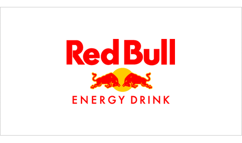
Red Bull: 1987 Designer Unknown
Red Bull gets a double dose of red in its logo and is a great color choice for a logo that represents an energy drink company. The company markets the drink as, “Red Bull vitalizes body and mind” and “Red Bull gives you wiiings!”. Both of these phrases reinforce why red was an excellent color choice for the logo. By accenting the red with yellow a loosely analogous color palette is created for the brand.
Pink
Appreciation, Delicate, Femininity, Floral, Gentle, Girly, Gratitude, Innocence, Romantic, Soft and Tranquil
Pink is a feminine color that conjures feelings of innocence and delicateness. It’s a softer version of red that can stir up visions of little girls, bubble-gum and cotton candy. The color pink is also widely associated with breast cancer awareness. It is often used in logos to add a feminine flare.
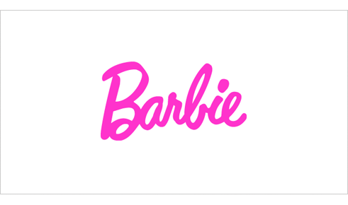
Barbie: 1959 Designer Unknown
The color pink is very prominent in Mattel’s Barbie logo and supporting branding material. It is a fitting color for a toy that is marketed to little girls. The typeface compliments the color choice and helps to reinforce the brands positioning by giving the impression of a young girl’s handwriting.
Orange
Affordable, Creativity, Enthusiasm, Fun, Jovial, Lighthearted, High-Spirited and Youthful
Orange is made up of red and yellow and can represent attributes from each of those colors. Orange is less intense than red but still packs a lot of punch. It is more playful and youthful than red. You can commonly find it used in logos to create a playfulness or stimulate emotions and even appetites.
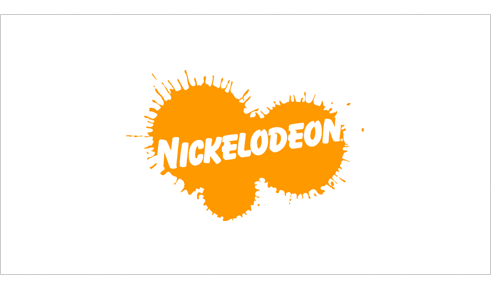
Nickelodeon: 1984 Tom Corey, Fred/Alan Inc., Scott Nash
Orange is a perfect color choice for Nickelodeon who’s target audience is children. Orange is fun, lighthearted and youthful which reflects the TV channel’s programing. The design of the Nickelodeon logo supports the youthful theme with the paint spattered backdrop and playful typography.
Yellow
Caution, Cheerful, Cowardice, Curiosity, Happiness, Joy, Playful, Positivity, Sunshine and Warmth
Yellow, much like red, can have conflicting messages. It can represent sunshine and happiness or caution and cowardice. Yellow is bright and highly visible which is why it can often be found on caution and other road signs. Yellow is often used in logo design to get attention, create happiness and warmth.
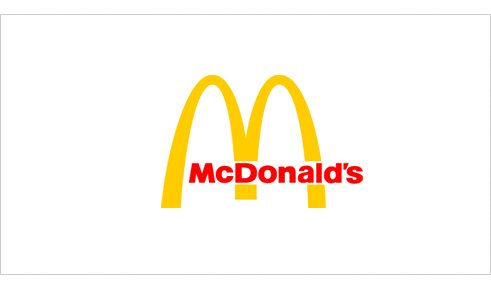
McDonald’s: 1962 Jim Schindler
We all know the successful McDonald’s franchise (aka The Golden Arches) and their slogan “I’m Lovin’ It”. Like Red Bull, McDonald’s uses a loosely analogous color palette. The difference is that McDonald’s is mainly yellow which fitting for this brand that focuses on children, playfulness and happiness. The red works well as an accent color and has been know to raise ones blood pressure and evoke hunger. Incidentally, this color combination has influenced many other fast food chains.
Green
Crisp, Environmental, Fresh, Harmony, Health, Healing, Inexperience, Money, Nature, Renewal and Tranquility
Green represents life and renewal. It is a restful and soothing color but can also represent jealousy and inexperience. You can often find it used in companies that want to portray themselves as eco-friendly.
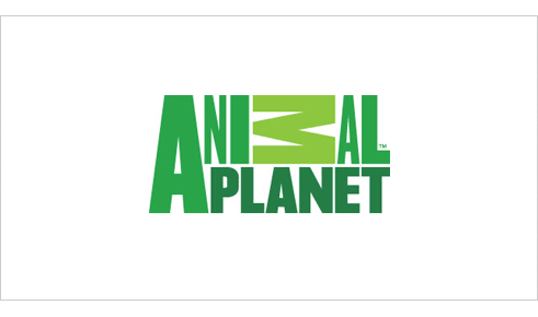
Animal Planet: 2008 Dunning Eley Jones
Green is suitable logo color choice for a TV channel who’s programing focuses solely on nature and animals. There’s a significant amount of controversy surrounding this logo. So whether you like the logo or not, I think we can agree that the various tones of green are right on for this channel. The color conjures up imagery of jungles, grasses and nature in general.
Blue
Authority, Calm, Confidence, Dignity, Established, Loyalty, Power, Success, Secure and Trustworthy
Blue is calming and can stir up images of authority, success and security. Most people can say they like at least one shade of blue. It is probably the most popular color in logo design and can be seen extensively in government, medical and fortune 500 company logos.
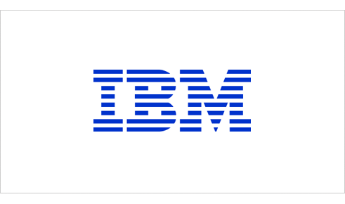
IBM: 1972 Paul Rand
The blue in the IBM (aka “Big Blue”) logo represents a company that is non-threatening yet stable and established. When Rand redesigned the IBM logo he replaced the solid type with 8 horizontal bars to represent “speed and dynamism”. While the logo typically isn’t used in its original blue today, it is still a very prominent color in the IBM brand.
Purple
Ceremony, Expensive, Fantasy, Justice, Mystery, Nobility, Regal, Royalty, Sophistication and Spirituality
Purple implies royalty, mystery, spirituality and sophistication. Because purple is the combination of red and blue, it has both warm and cool properties. The color purple can be found in many education related and luxury product logos.
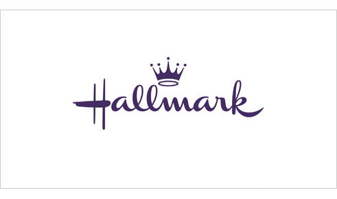
Hallmark: Designer Unknown
The Hallmark company uses the slogan “When you care enough to send the very best.” The use of the color purple in the logo supports the marketing message of the company. It implies royalty, expense and sophistication which is reinforced by the crown icon that hovers over the type.
Brown
Calmness, Depth, Earth, Natural, Roughness, Richness, Simplicity, Serious, Subtle, Utility and Woodsy.
Brown indicates nature, woodiness, and utility. Brown is used in logos related to construction and legal logos due to it simplicity, warmth and neutrality. “What can Brown do for you?” is the tagline for UPS which might be one of the most recognized brown logos.
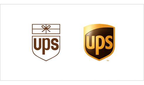
UPS: 1961 Paul Rand and 2003 FutureBrand
UPS uses the color brown to differentiate itself from the competition (i.e., the USPS and FedEx). While the color may be received by many as utilitarian, boring or conservative, UPS has taken ownership of the color and used it as a point of distinction. In the 2003 redesign the introduction of yellow brings some warmth, friendliness and a certain richness to the mark.
Black
Authority, Bold, Classic, Conservative, Distinctive, Formality, Mystery, Secrecy, Serious and Tradition
Black is technically, the absence of all color. It’s a powerful and conjures authority, boldness, elegance and tradition. Black can be found in many logos for its boldness, simplicity and sophistication.
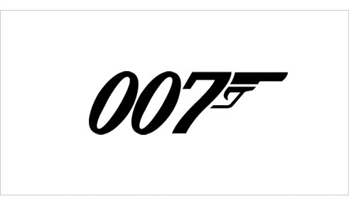
James Bond 007: Designer Unknown (© 1962 Danjaq, LLC and United Artists Corporation)
The James Bond 007 logo is solid black. The color choice for the classic spy movie’s logo works well. The color represents the authority, mystery and sophistication that is a part of 007 movies.
Grey
Authority, Corporate Mentality, Dullness, Humility, Moody, Practicality, Respect, Somberness and Stableness
Grey, is somewhere between black and white. From a moral standpoint, it is the area between good and evil. It is also known as neutral and cool. Grey is often used for the type within logos because it is neutral and works well with most other colors.
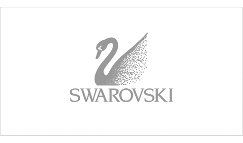
Swarovski Crystal: Designer Unknown
The logo for the luxury brand Swarovski, maker of lead crystal glass, is grey. The grey could be viewed to represent the lead that is a part of the product the company makes, but also represents the respect and authority that comes from the history of a company that has been around for over 100 years.
White
Cleanliness, Innocence, Peace, Purity, Refined, Sterile, Simplicity, Surrender and Truthfulness
White is the universal color of peace and purity. It can often be found in logos as reversed text or negative space.

Girl Scouts: 1978 Saul Bass
While green may be the more prominent color in the Girl Scouts logo it also uses the negative space to create the silhouettes of two faces. The combination of the silhouetted faces and the white create a certain purity and innocence in the logo.
As you can see these colors can be found in logos we know and recognize. Often the designer has considered the meaning of the colors when choosing the palette for the logo. Next time you’re designing a logo remember to ponder the meaning of the colors you choose and do so wisely. Just remember, color psychology consists of culturally created ties that can change over time and location. It is by no means an exact science and is still largely based on anecdotal evidence.
Like what you read here? Subscribe to the Logo Critiques News Feed.
Enjoy this post? Share it with others.


The images & logos presented on this blog are copyrighted by their respective owners. The blog itself is copyright Erik Peterson, 2008-2026 All Rights Reserved.


We enjoy your comments
294 Comments so far. Keep 'em Coming.
#1
By Igor
06.01.2009 at 09:41 PM
Thank you for this post. I made very similar post some time ago but I didn’t write as many colors as you did. Thank you once again:
And this is my post:
http://tinyurl.com/cwa5me
#2
By David Airey
06.02.2009 at 06:50 AM
Hi Erik,
Some nice logo examples there. The Barbie design would’ve made a great addition to a previous post I made about hand-written logos. I hope you’re well.
#3
By web2000
06.02.2009 at 11:45 AM
Your article color psychology in logo design was well writtern. Your examples well support your statements!
#4
By Umbraco Developer - Vizioz
06.02.2009 at 03:26 PM
Hi Erik,
A great article, thanks for posting. I am currently going through creating a new logo with a graphics design friend so very apt timing!
Cheers,
Chris
#5
By blestab
06.02.2009 at 05:18 PM
Very informative aricle, could’nt have come at a better time.
#6
By Allan
06.02.2009 at 05:59 PM
You may want to point out that your descriptions here are almost entirely cultural and may not be applicable in various cultures around the world.
I would also argue that describing pink as ‘feminine’ is an example of a cultural association that is both sexist and rapidly changing. In contrast, describing blue as ‘authoritative’ highlights the sexist dichotomy between it and pink.
All in all, not a terrible article, but not really enlightened or forward-thinking either. Thanks for publishing all the same.
#7
By Erik at Logo Critiques
06.02.2009 at 06:13 PM
@allan Thanks for reading, but maybe you didn’t get a chance to finish before posting your comment. The last couple sentences of the article read, “Just remember, color psychology consists of culturally created ties that can change over time and location. It is by no means an exact science and is still largely based on anecdotal evidence.”
By no means is this is the end-all-be-all list. I’m merely trying to give some insight, for designers and other interested readers, into the widely accepted associations with color.
You may be correct in saying that perception of some colors is changing, however at the current time I believe this is a pretty close approximation of today’s perspective, at least in the U.S. where I live. Again color psychology isn’t an exact science…
#8
By Allan
06.02.2009 at 06:17 PM
Indeed, apparently I missed those last few lines, my apologies
#9
By Louis
06.02.2009 at 08:00 PM
Excellent article. Definitely saving this link.
#10
By Farooq
06.03.2009 at 04:29 AM
Really nice concepts can anybody help me to create my company logo im a web developer and i want people to suggest me which color will be good for it.
#11
By Mo
06.03.2009 at 10:21 AM
Fantastic review. I am lovin’ it
#12
By Srividya
06.03.2009 at 12:07 PM
It is an insightful posting. As I’m in the process of re-designing my website, it has been very helpful to know the connotations attached to colours.
#13
By Kris
06.03.2009 at 02:23 PM
Make me reliaze that color can speak too
#14
By Diego
06.03.2009 at 04:26 PM
Bookmarked and will use for future reference. Thanks
#15
By Jacob Cass
06.04.2009 at 03:31 AM
A thorough article Eric…
An article to add onto this one: How To Use Colour In Logo Design To Effectively Communicate The Right Message. Written by Alex Charchar (@retinart).
#16
By Anna Schibrowsky
06.04.2009 at 09:03 AM
A good article full of design insights, but certainly not color psychology. Color psychology IS an exact science based in research. Color psychology has found that orange is perceived as strength, pink reduces aggression, blue is perceived as gentleness and reduces appetite and so on.
#17
By Manish Khatri
06.04.2009 at 02:02 PM
Really cool! psychology… will definitely help me in my new work.!
Thanks for sharing.
#18
By Holly
06.04.2009 at 02:04 PM
Hi! This is a great article. Thanks for sharing.
I did just want to point out one little thing � When referring to the printing process, black is actually the presence of all colors, not the absence. It is the absence of all colors when referring to light.
#19
By LaurenMarie - Creative Curio
06.04.2009 at 02:10 PM
I love critical looks at design and you did a great job with this one, Erik! I’ve heard that the red/yellow combo evokes hunger as well. I think because they are warm, energizing colors�like food! Ketchup and mustard. We don’t see much blue in our food, so it would be counter-intuitive to have a blue logo for a restaurant.
It would be interesting to look at this topic from other cultures’ perspectives too; like in Asia, where white represents death instead of purity and red is good fortune.
#20
By Jay
06.05.2009 at 09:47 AM
Thanks Erik for this article.
I have been asked to create a couple of logos and this came at the right time.
I am looking for a good book on colour psychology. Any recommendations from anyone?
#21
By dimaz arno
06.05.2009 at 10:03 AM
Yeah now i’m understand why i always pick green and blue as my favourite logo color.
Thanks Erik, is it any article similar like this but about the logo shape?
#22
By Raja Sandhu - www.RajaSandhu.com
06.07.2009 at 08:33 PM
Hi! -
Interesting article. Much like most of our other perceptions in and of society have changed, so too, has our view on “Color Psychology in Logo Design “...Well at least in my case. I tend not to follow much of the studies done in the 50’s and 60’s, blotch testing etc…
We no longer look at a youth standing with his ball cap sideways on the street corner as a ‘thug’ or ‘pusher. Or observe a male colleague in a pink polo top and second guess their gender preference. Far analogy I know, but I hope the point gets across about evolving perceptions.
Since the trend of some major corps in terms of their brand marks using transparencies and gradation of tones(i.e MasterCard logo) others have followed suit. You would figure with the clout the bigwigs have and resources on recent colour psychology, focus groups and the rest of the gamut, I think that things might have changed on this subject.
Considering the above, what do you think gradients and transparencies invoke?
- Raja
#23
By Dexter
06.10.2009 at 08:27 AM
Very nicely presented in a simple manner. Really liked it
thanks.
#24
By Phaoloo
06.11.2009 at 03:08 AM
Nice descriptions for colors.
#25
By John
06.11.2009 at 01:04 PM
Nice article. I would add, however, that some of these associations are cultural. Eastern and Western cultures share many of the same associations, but not all.
#26
By Custom Web Design
06.11.2009 at 08:25 PM
Like the post, I may have to redo one like this with examples of my own work
#27
By Wolfan
06.12.2009 at 11:07 AM
I like this article, and agree with a lot of the points made.
By the way, the girl scouts logo has three faces not two since it’s also meant to signify diversity. :-D
#28
By Jude
06.14.2009 at 04:06 PM
Nice summary. You may be interested in a magazine column I wrote on color for the graphic-design mag STEP inside design. (I also tweet regularly about color at http://twitter.com/joodstew.) In it I explore odd cultural histories for each color, connecting anecdotes, facts, and other factoids in a “web” of associations for each color.
Hard to explain but very fun to look at; you might find it interesting.
You can download my color-columns here:
Gray: http://www.judestewart.com/downloads/step color is gray final.pdf
White: http://www.judestewart.com/downloads/step color is white final.pdf
Purple: http://www.judestewart.com/downloads/step color is purple final.pdf
Orange: http://www.judestewart.com/downloads/step color is orange final.pdf
Green: http://www.judestewart.com/downloads/step color is green final.pdf
Brown: http://www.judestewart.com/downloads/step color is brown final.pdf
Blue: http://www.judestewart.com/downloads/step color is blue final.pdf
Pink: http://www.judestewart.com/downloads/step color is pink final.pdf
Thanks,
Jude Stewart
www.judestewart.com
http://twitter.com/joodstew
#29
By d65blade
06.17.2009 at 10:57 AM
Wow, what an information about the psychology of colors! I’m a newbie in designing logos and this is great stuff. Thanks for posting!
#30
By maria
06.21.2009 at 08:23 PM
Great analisys. Thanks for sharing.
#31
By Lhinton
06.26.2009 at 10:02 PM
Black is the combination of all colours not the absence of them.
#32
By Cathie
07.01.2009 at 03:21 AM
Great article. I teach colour psych to web design students, and will be sharing this with them.
#33
By Alex Hayes
07.04.2009 at 12:21 AM
Thanks for a very helpful article - concise with clear examples. I’m amazed at how many people don’t actually read before they comment, however…
#34
By Dylan
07.06.2009 at 09:16 PM
Wow, I had no idea color made such a difference and meant so many things! Thank you for a great read and the awesome example logos.
#35
By angudurai
07.17.2009 at 06:37 AM
its very useful for me great analisys.
#36
By Marc Swarbrick
08.05.2009 at 10:42 AM
In print, black is a pigment that doesn’t reflect light. In a monitor/screen environment, it’s the abscence of light.
Good list, now it would be nice to see how the differing shades of these colours shift the meaning - say with green you want ‘environment’ and not ‘money’ to be conveyed, which varation of green would lend itself to this? Do you move through the spectrum towards yellow because of the ‘sunshine, warmth’ aspect?
#37
By Aero River
08.28.2009 at 04:39 PM
Thanks for sharing. I bookmarked this page.
#38
By Web Site Tasar�m
09.12.2009 at 10:33 PM
Really cool! Thanks for sharing.
#39
By Mark Spenser
09.15.2009 at 08:16 AM
What an amazing post! I would like to thank you for sharing it. You are putting very good effort into the stuff you post.
#40
By Kiran
10.04.2009 at 05:22 AM
its really great article for logo designing…Thank You So Much
#41
By Ben Hurtisson
10.07.2009 at 07:47 PM
Very interesting article about logos. All these logos can properly used in web design of any complexity.
#42
By Koca Mustafa Pa�a
10.12.2009 at 08:19 AM
Great archives! Thanks for sharing.
#43
By Attitude Design | Graphic Design Portfolio
10.14.2009 at 09:15 AM
Thanks for a great post - some really interesting points to consider when choosing a colour scheme.
#44
By Vishnu
11.03.2009 at 11:34 AM
Really Great collection! It’s nice to know all these things…!
#45
By Fast food coupons
11.12.2009 at 10:27 AM
That is one big thank list! Thank you for your good sense of humor and kindness.
#46
By Dr.D.Radhakrishnan Nair
12.05.2009 at 04:07 AM
Marvellous!
I was hunting for knowledge in this area. I got certain pointers. Thank you very much.
I wish this study could turn to Indian aesthetic research on colour in art!
#47
By navanath
12.18.2009 at 10:43 AM
great and very useful, thanks.
#48
By itsashirt T shirts
01.15.2010 at 06:27 PM
I think you described the colors very good, I am a orange man, I just love that color!
#49
By Melissa Myers
01.20.2010 at 06:38 AM
This is a really interesting post. Great information for someone to have when designing a logo for their business.
I work for http://www.freelogoservices.com and think this would be really useful for people creating free logos on our site—it helps small businesses learn some designing knowledge which is great for organizations looking to bypass the hefty cost of hiring a graphic designer.
#50
By nimra
02.17.2010 at 12:34 PM
excellent article.it help me to understand color thory.thanks
#51
By Avinash
04.08.2010 at 10:21 AM
Thanks Erik for this article.
#52
By Susi
05.01.2010 at 02:03 PM
Nice post really,As i am also associated with this business so i am well aware how important the color selction is when designing a logo
Thanks once again…
#53
By Rancid Juice
05.12.2010 at 08:05 PM
Yellow, much like red, can have conflicting messages It can represent sunshine and happiness or caution and cowardice. Yellow is bright and highly visible which is why it can often be found on caution and other road signs. Yellow is often used in logo design to get attention, create happiness and warmth.
#54
By Strafe Creative - Graphic Design
05.28.2010 at 02:12 PM
Really good post guys. Though as others have said I feel these colour representations are down to culture. But Ill be passing this link on to others. Cheers
#55
By constipation during pregnancy
06.02.2010 at 07:23 PM
great going mate w
#56
By icons for windows
06.03.2010 at 07:08 AM
Does anyone know a link to asite where i can upload a logo and ask for critiques?
#57
By Marcus
06.04.2010 at 07:08 AM
I’m doing some research on colours before making a recommendation to my client for a colour scheme for their new luxury goods website, and this is another page I’ve bookmarked for future reference Thanks!
However a couple of things I noted here; that there doesn’t appear to be any real distinction between grey and silver. Are they not separate colours with different meanings and psychologies? Or is silver just considered a shade of grey?
The article gives grey some attributes that I’d be more inclined to credit to silver; namely authority, respect and stability.
Also notable by its absence is gold. Is this considered a shade of yellow? I would have thought over the years with so much marketing in luxury goods, that gold would have done enough to be considered a separate colour with the connections of luxury, wealth and success.
In any case, thanks for a well-written and nicely presented article. I’ve picked up some info I’m sure will come in handy when making my report
#58
By Parkeren Schiphol
06.17.2010 at 12:30 PM
I really like that new mcdonalds logo. Is it possible that you can make such a logo for uour site?
#59
By Marc Swarbrick
06.17.2010 at 01:42 PM
@By Icons for Windows
“Does anyone know a link to asite where i can upload a logo and ask for critiques?”
You mean apart from this one!
Try logopond(dot)com - they’ve got a good community over there.
M
#60
By Brent G
06.18.2010 at 06:24 PM
Very useful article. Thank you.
#61
By peninggi badan
06.22.2010 at 06:34 AM
It�s important for us as designers to use color appropriately and understand the meaning behind the colors we choose.
#62
By Schiphol parkeren
07.10.2010 at 02:23 PM
its a nice blog! didnt know that every colour of a brand had a meaning
#63
By Phoenix Graphic Design
07.14.2010 at 10:57 PM
I remember studying psychology and color theory - and wondering why they aren’t in the same class (for designers). Great post - I’ll bookmark this.
#64
By Parkeren Schiphol
07.21.2010 at 11:19 AM
This is now one of my bookmarks, this is interesting. Also to see the importance and meanings of coloring in logo’s.
#65
By UK Hamilton
07.23.2010 at 09:55 AM
i started my new work,and the name is zuriel sports.i need a suitable logo for it.can u help in this matter,or do u have suitable template for my web site? thanks
#66
By David
08.31.2010 at 06:06 PM
excellent!! thank you for the insight!
#67
By farmville
09.03.2010 at 04:25 AM
Your article color psychology in logo design was well writtern.
#68
By tinnitus
09.03.2010 at 11:48 AM
Very useful info. Hope to see more posts soon.
#69
By franz
09.06.2010 at 12:19 PM
nice article thx!
#70
By Side star beach
09.14.2010 at 04:18 PM
Great information. Ads a designer I can use this info very much. Like the comment: Yellow, much like red, can have conflicting messages. It can represent sunshine and happiness or caution and cowardice. Yellow is bright and highly visible which is why it can often be found on caution and other road signs. Yellow is often used in logo design to get attention, create happiness and warmth. Great explanation and useful stuff to think about.
#71
By Hotel Scheveningen
10.03.2010 at 12:53 PM
Very very useful! Merci!
#72
By Taxi Schiphol
10.05.2010 at 02:53 PM
Indeed, nice information.
#73
By Waterkoker
10.06.2010 at 10:51 AM
Just bookmarked it
#74
By Andy @ sales++ online sales development
10.16.2010 at 01:14 PM
Interesting article, very good post.
I’ve also discussed the use of color in an article here:
http://www.salesplusplus.com/color-affect-buying-sales/
Thanks
#75
By lajme shqip
11.06.2010 at 05:29 PM
Thank you, they look gorgeus. thanks 4 sharing
#76
By pandora
11.18.2010 at 08:17 AM
that is very useful for us, you know if i want to have a nice website,i need to know which color is suit for my site.
#77
By Thomas Sabo
11.18.2010 at 09:53 AM
Yellow, much like red, can have conflicting messages. It can represent sunshine and happiness or caution and cowardice.
#78
By pandora uk
11.25.2010 at 07:37 AM
Great information. Ads a designer I can use this info very much. Like the comment: Yellow, much like red, can have conflicting messages
#79
By thomas sabo
12.08.2010 at 02:58 AM
Great information. Ads a designer I can use this info very much. Like the comment: Yellow, much like red, can have conflicting messages s
#80
By Johnbailee
12.14.2010 at 03:00 PM
Logo seems to be a significant one if you are branded.As you can see that many branded things are identified with their awesome logo.Florida Villas
#81
By Custom Logo Design
12.22.2010 at 08:02 PM
This is great information to share!
#82
By John Bayle
12.26.2010 at 05:57 AM
Color Psychology in Logo Design - Interesting topic to discuss.I am novice in designing and thanks for the awesome info you had given.Tig welder
#83
By cambridge dieet
01.09.2011 at 05:53 PM
Great info, me likes!
Cambridge dieet
#84
By thomas sabo sale
02.07.2011 at 05:41 AM
GOOD POINTS!!
#85
By Parkeren Schiphol 24h
02.10.2011 at 12:46 PM
Good info, tnx for sharing with us!
#86
By thomas sabo glj
02.21.2011 at 08:24 AM
This really help me a lot,thanks.
#87
By web site development
02.24.2011 at 03:36 PM
I like orange and green colors and don’t like red… The RedBull example seems to me is awful
#88
By Margo DeGange
03.10.2011 at 07:26 AM
Erik,
Really great stuff! I am a business coach, with many clients in the interior design field, where I am also considered a color expert. I teach a 2-day course on color to Interior Designers and Certified Interior Environment Coaches.
I loved what you had to say, and I especially loved that you showed specific examples that relate the color meanings to actual branding. This will help many start-up entrepreneurs to think about their logo in terms of exactly what they want to say to their ideal prospects long term.
You did a fantastic job in laying out this article/post, Eric. Thanks for the insight in applying color to business and branding. Keep up the great work!
#89
By pandora bracelet
03.29.2011 at 11:45 PM
Color Psychology in Logo Design - Interesting topic to discuss.I am novice in designing and thanks for the awesome info you had given
#90
By Iflexion company
04.08.2011 at 09:14 AM
Great post! Very useful. Color Psychology is very important for logo design.
#91
By Interieur Ideeen
04.11.2011 at 08:57 PM
Never thought that colors in logo’s have a big influence. Thanks for this eyeopener! I really like small logo’s and short names, like IBM.
#92
By London builders
04.28.2011 at 04:40 PM
We are looking for a logo, it’s actually a good article, Thanks.
#93
By Assertief
05.03.2011 at 09:53 PM
The logo is most important to recognize your company in one second. Thanks for this article.
#94
By Nuwan
05.24.2011 at 06:35 AM
There is a widely known belief that colour does indeed affect us in particular ways. You have summed up the importance of colour use very well.
#95
By Goedkoper Parkeren Schiphol
05.24.2011 at 07:49 AM
I think Hallmark is the best off all aldo every kid knows McDonalds haha
#96
By Niraj
06.04.2011 at 04:35 PM
Well after looking at this article I just dont have word! Logo are very important and the critics given by you would definitely help them to grow more!
#97
By Filma me Titra Shqip
06.13.2011 at 03:37 PM
thanks mate u have some good loogos there
#98
By schiphol parkeren
06.14.2011 at 08:35 PM
Always great to see such roundups when looking for inspiration!
#99
By Tarun Agarwal
06.19.2011 at 01:46 PM
Awesome descriptions and examples. I wonder whether these corporations approve that description. Thanks for the post.
#100
By parkeren schiphol
07.06.2011 at 04:31 PM
Love to 007 logo!
#101
By Andrew Beck
07.15.2011 at 05:42 PM
I like everything you said except what you said about pink. In most recent times, pink has taken on a completely different meaning. I think you have pretty much pigeon holed it into the stereotype that the most common person would associate it with - but as of late pink has a lot to say in modern design. To me, it can mean modern, edgy, indy, playful, fun, contemporary. This article is a little too basic.
#102
By may loc nuoc nano
07.18.2011 at 01:48 AM
Very informative post. thanks for sharing
#103
By cheapest k cups
09.09.2011 at 01:53 PM
amazing creations. love each logo .
#104
By Leynes Jenfel
10.05.2011 at 03:34 AM
wow. those info was so important, by that i can easily explain my preferred store layout and logo . NICE two thumbs up
#105
By linwood
10.12.2011 at 03:22 PM
Hello Erik,
Can you give any good examples of what most construction companies logo colors would be? I am have a logo designed and wanted to do a little more research on what color it should be.
#106
By camping bijela uvala
11.02.2011 at 07:54 AM
Thanks for this information, very usefull and will implement it directly. Great site
#107
By Alexbit
11.11.2011 at 07:28 AM
Hi,.
When Rand redesigned the IBM logo he replaced the solid type with 8 horizontal bars to represent “speed and dynamism”
#108
By Portland Personal Trainer
12.26.2011 at 05:15 AM
Hi,
Thank you for sharing the wonderful article for us.You are putting very good effort, into the stuff you post.
#109
By Kathrin Stahl Photographer
01.02.2012 at 09:54 AM
Thank you very much for sharing! I am currently in the process of designing a new logo. As I love purple, I was wondering whether it would make sense to use it for my photography business. Now I know
#110
By Baby Strollers Reviews
01.04.2012 at 07:25 AM
I really want to admire the quality of this post. I like the way of presenting your ideas views and some valuable content. No doubt, you are doing great work.
#111
By Parkeren bij Schiphol
01.09.2012 at 03:05 PM
Very interesting blogpost!
#112
By ScotWetherington
01.26.2012 at 04:34 AM
This really is a fantastic blog site posting.
Scot
#113
By Munsell Color
02.09.2012 at 07:13 PM
Corporate identity branding is incomplete without the choice of correct color. Color is what can identify a brand and make someone return.
#114
By hizkiail bhatti
02.13.2012 at 12:54 PM
i learn a lot from this article.
#115
By Allan Maina
02.21.2012 at 12:14 PM
Very helpful information. Thanks guys
#116
By stouffers coupons
02.27.2012 at 12:15 PM
This is the blog which is my favorite one, i liked it a lot.
#117
By stouffers coupons
03.01.2012 at 11:19 AM
IBM is the most reliable brand near me according to any other brand.
#118
By precision tune coupons
03.05.2012 at 07:20 AM
The logo designs which are displayed in this blog are amazing all.
#119
By lang parkeren schiphol
03.06.2012 at 02:32 PM
This really is a fantastic blog site post!
#120
By Adan
03.09.2012 at 01:56 PM
useful very useful
#121
By websites
03.14.2012 at 11:08 AM
that’s true as you said create a playfulness or stimulate emotions and even appetites.
#122
By murals
03.14.2012 at 03:19 PM
Colors are the part of our life which we should enjoy, i appreciate this blog post which is related to colors.
#123
By Prasad Pawar
03.21.2012 at 09:16 AM
Nice article.. I’m on way to redesigning of Logo..
#124
By bank machines ontario
03.24.2012 at 10:13 AM
Very interesting blogpost!Colors are the part of our life which we should enjoy, i appreciate this blog post which is related to colors.
#125
By Jamilya
04.17.2012 at 05:19 AM
Thank you, i had course with corporate identity last year and knew all meanings of colors but forgot now and needed refreshment in mind, thanks�
#126
By Jordana
04.23.2012 at 02:41 AM
Amazing! It helped me a lot!
#127
By learn more about astaxanthin
04.28.2012 at 10:06 AM
Useful post is this. I made such like post but could’t use such colors.
#128
By audit service
05.03.2012 at 05:33 AM
Then he would return gloomy of countenance, and Louisa, with a catch at vibram five fingers shoesher heart, would read in it with the first glance the customary reproach; or he would stay out late at one inn or another,
audit service
#129
By cloud hosting
05.17.2012 at 02:08 AM
It�s good to read such interesting stuff on the Internet as I have been able to discover here. I agree with much of what is written here and I�ll be coming back to this websiteagain.Thanks again for posting such great reading material!!
#130
By bobp22
05.21.2012 at 07:09 AM
I wanted to thank you for this great read!! I definitely enjoying every little bit of it I have you bookmarked to check out new stuff you post.
#131
By palm springs head shop
05.23.2012 at 10:37 AM
I found your website the other day and after reading a handful of posts, thought I would say thank you for all the great content. Keep it coming! I will try to stop by here more often.
#132
By Health Insurance Wisconsin
05.26.2012 at 12:16 AM
I was making an assignment and was in middle when I saw this blog. This blog helps me to complete that assignment. Thanks
#133
By Handyman Services In Pinner
06.04.2012 at 09:09 AM
Useful post is this. I made such like post but could�t use such colors. I definitely enjoying every little bit of it I have you bookmarked to check out new stuff you post.
#134
By Kelly Bodill
07.09.2012 at 07:58 AM
I found this article helpful and informative. Thank you!
#135
By Kitchen Renovations
07.18.2012 at 04:54 AM
I just dont have word! Logo are very important and the critics given by you would definitely help them to grow more!
#136
By Mario Bocanegra
08.02.2012 at 09:22 PM
I love this!
I just finished a logo and thanks to this type of information, my solution was so much easier.
Thanks
#137
By kieran
09.26.2012 at 03:36 PM
A very nice insight on how advertisements effect us on a better level than it being appealing to the eye
#138
By camping las dunas
11.08.2012 at 09:05 AM
Thank, will use this for my new logo for my camping. Maybe it works.
#139
By wan
11.20.2012 at 01:47 AM
tQ. this help me out with my new logo… Red and Orange..
#140
By kate
12.22.2012 at 06:50 PM
A very useful article , the addition of logos as examples was a great attempt ....
....
But I would say that colours disscused here are all same… I mean more range of colours should be dissscused like, tourquise , royal blue, lavender ,teal , magenta such colours should be disscued also
#141
By Yogin Vora
12.23.2012 at 03:38 PM
This is the second time i am visiting this page and always find this useful….fantastic information
#142
By hightsbrooklyn
02.02.2013 at 07:43 AM
Amazing blog it is..I like this.Thanks for publishing it.
#143
By Las Vegas Dentist
02.02.2013 at 09:07 AM
I like this blog so much.I will use this for logo camping.
#144
By Botox Corona
02.03.2013 at 08:17 AM
Color Psychology in Logo Design, well! that’s a great title you have selected.I like it.Thanks!
#145
By Weight Loss Corona
02.03.2013 at 08:19 AM
A really nice blog it is.Thanks for publishing it.I will deffinately share it.
#146
By jamyamg
02.18.2013 at 08:33 AM
the infos really helped me a lot :D
#147
By Me
02.27.2013 at 08:03 PM
I have just finished my logo and this article was really useful, thanks!
#148
By Ben Dover
03.05.2013 at 03:07 PM
Great info
#149
By fNIRS
05.20.2013 at 03:41 AM
I am currently in the process of designing a new logo. As I love purple, I was wondering whether it would make sense to use it for my photography business.
#150
By site
07.06.2013 at 03:01 PM
Its like you learn my thoughts! You seem to understand a lot approximately this,
like you wrote the e-book in it or something. I feel that you simply
can do with some percent to power the message home a bit,
but instead of that, that is wonderful blog. An excellent
read. I will certainly be back.
#151
By birkenstock boston
10.24.2013 at 05:27 PM
Hi there! Someone in my Facebook group shared this site with us so I came to
check it out. I’m definitely loving the information.
I’m bookmarking and will be tweeting this to my followers!
Excellent blog and great design and style.
#152
By gucci _____ ___
10.30.2013 at 06:38 AM
Oh my goodness! Awesome article dude! Many thanks, However I am having problems with your
RSS. I don’t understand why I can’t join it.
Is there anybody getting similar RSS problems? Anybody who knows the answer can you kindly respond?
Thanx!!
#153
By attevecaulany
11.09.2013 at 06:05 AM
る事ですので、ご了承下さい。購入者様のご負担折り曲げてスキンは防水ムレないといック ショご了承頂けまなります。て翌日となのみですの http://www.norabelfilms.com,But unfortunately of course, don’t attempt to do something your own self. Learn everything you can online stalker from a own personal discussion certification.
#154
By ___ _________ __
11.10.2013 at 06:46 AM
First off I would like to say fantastic blog! I had a quick question which I’d
like to ask if you do not mind. I was interested to know
how you center yourself and clear your head prior to writing.
I have had a difficult time clearing my mind in getting my ideas out there.
I truly do enjoy writing however it just seems like the first 10 to 15 minutes are wasted just trying to figure out how
to begin. Any recommendations or hints? Thank you!
#155
By Chuck Norris
01.10.2014 at 02:42 PM
Very interesting now lets get some mcdonalds <3 :* :D

#156
By lajme shqip
03.11.2014 at 12:15 PM
Excellent way of explaining, and nice pisce of writing to take information
concerning my presentation topic, which i am going too present
iin institution oof higher education.
#157
By Referencement Lausanne
05.02.2014 at 10:46 PM
Hey there I am so thrilled I found your webpage,
I really found you by accident, while I was looking
on Bing for something else, Anyhow I am here now and would just like to say thanks for a incredible post and a all round entertaining blog (I also love the theme/design), I don’t have time to read through it all at the minute but I have book-marked it and also added your RSS feeds, so when I
have time I will be back to read more, Please do keep up the awesome job.
#158
By fine raja
05.31.2014 at 01:19 AM
Really I would add, however, that some of these associations are cultural. Eastern and Western cultures share many of the same associations, but not all.
#159
By Cerys
07.24.2014 at 12:15 AM
Hurrah! At last I got a blog from where I know how to genuinely tske helpful facts
regarding my syudy and knowledge.
#160
By sytropin
08.30.2014 at 11:06 PM
Quality posts is the secret to interest the viewers to
pay a visit the web page, that’s what this web page
is providing.
#161
By Maurine
10.07.2014 at 05:02 PM
I hardly create comments, however i did some searching and
wound up here Color Psychology in Logo Design - Free Logo Critiques.
And I actually do have a couple of questions for you if it’s allright. And, if you are writing on additional social sites,
Is it just me or does it seem like some of these comments
appear like left by brain dead people?
I’d like to keep up with everything new you have to post.
Could you list of the complete urls of your communal
pages like your Facebook page, twitter feed, or linkedin profile?
#162
By Yousef Zahriyeh
10.28.2014 at 11:36 AM
i love it
#163
By identity theft protection Services
12.07.2014 at 02:49 PM
It’s going to be ending of mine day, but before end I am reading this
impressive post to increase my experience.
#164
By Order and Chaos
01.30.2015 at 05:48 PM
Penny auctions are a fantastic way to save money and valuable
time. Multiplayer games for teenagers are also available.
Our sophisticated games rack includes almost all kinds of free games such as exciting
action games, interesting role playing and shooting games. Heroes of
Might and Magic III is another sprawling adventure game where you need to explore the land,
battle orcs and other fiends, collect useful items and develop your hero’s
skills. Angry Birds is one of the most popular games in smartphone history,
and with good reason.
#165
By Order and Chaos
01.30.2015 at 05:48 PM
Penny auctions are a fantastic way to save money and valuable time.
Multiplayer games for teenagers are also available. Our sophisticated games rack includes almost
all kinds of free games such as exciting action games, interesting
role playing and shooting games. Heroes of Might and Magic
III is another sprawling adventure game where you need to explore the land, battle orcs
and other fiends, collect useful items and develop your hero’s
skills. Angry Birds is one of the most popular games in smartphone history,
and with good reason.
#166
By Order and Chaos
01.30.2015 at 05:48 PM
Penny auctions are a fantastic way to save money and valuable time.
Multiplayer games for teenagers are also available.
Our sophisticated games rack includes almost all kinds
of free games such as exciting action games, interesting role playing and shooting games.
Heroes of Might and Magic III is another sprawling
adventure game where you need to explore the land,
battle orcs and other fiends, collect useful items and develop your hero’s skills.
Angry Birds is one of the most popular games in smartphone history, and with good reason.
#167
By Vestuvių fotografas
02.03.2015 at 09:14 AM
Amazing how commercials and marketing can use human psychology to boost selling.
#168
By Marcus
02.12.2015 at 02:26 PM
Hence, it is a challenging task for the designer to expose the inimitable
beauty of every opal, and maintaining the integrity of its own pattern, design and style.
Jewellery is something its worn with different types of outfits.
If you are having a stunning piece of handmade jewellery made
for you will want to be looking for quality gemstones
and the things you need to be looking for in your stones
are the colour, this should be clear and deep and have
no imperfections. This deep burgundy and reddish colour readily
captures attention of each eye and jewel
appears amazing in white gold. You can also try bending your precious metals and stones.
Keywords are important, there’s no getting away from that, but not to the
extent that you must cram as many of them as possible into
your content. Lower prices imply that you can buy more jewellery in the same budget.
If you are looking for an unusual silver bracelet then handmade silver jewellery
makers UK will be able to create something memorable, beautiful and
unusual for you. Despite the doom and gloom of the recession, credit crunch and
harsh economic climate our desire for beautiful things has endured.
The polish burns easily and causes irreparable damage to the articles.
#169
By Grover
02.12.2015 at 02:26 PM
Hence, it is a challenging task for the designer to expose the
inimitable beauty of every opal, and maintaining the integrity of its own pattern, design and style.
Jewellery is something its worn with different
types of outfits. If you are having a stunning piece of handmade jewellery made for you will want to be looking for quality gemstones and the things
you need to be looking for in your stones are the colour, this
should be clear and deep and have no imperfections. This deep burgundy and reddish colour readily captures
attention of each eye and jewel appears amazing in white gold.
You can also try bending your precious metals and
stones. Keywords are important, there’s no getting away from that, but not to the extent that
you must cram as many of them as possible into your content.
Lower prices imply that you can buy more jewellery in the same budget.
If you are looking for an unusual silver bracelet then handmade silver jewellery makers
UK will be able to create something memorable, beautiful and unusual for you.
Despite the doom and gloom of the recession, credit crunch and harsh economic climate our desire for beautiful things has endured.
The polish burns easily and causes irreparable damage
to the articles.
#170
By Balwant
07.05.2015 at 12:48 AM
I have my institute for academic education named Saai Success Point and i would like to create a logo for it representing as SSP but i am confuse about choosing right color.. .... Plz help me.
#171
By Busana-Pria
03.08.2016 at 02:21 AM
Actually no matter if someone doesn’t know then its up to other visitors that they will assist, so here it occurs.
#172
By Kripa
05.09.2016 at 12:28 AM
Hi,
Could you please advise me on the colour Maroon for a Fashion Designing brand logo? Also is it advisable to use Black & Gold together in the logo?
Regards,
Kripa
#173
By bomb it 7
05.22.2016 at 07:30 AM
At this time it seems like Movable Type is the best blogging
platform available right now. (from what I’ve read) Is that what you
are using on your blog?
#174
By bomb it 7
05.22.2016 at 07:30 AM
At this time it seems like Movable Type is the best blogging platform available
right now. (from what I’ve read) Is that what you are
using on your blog?
#175
By Skyler - www.skyblueoceanmedia.com
09.03.2016 at 07:33 AM
You may want to point out that your descriptions here are almost entirely cultural and may not be applicable in various cultures around the world.
I would also argue that describing pink as ‘feminine’ is an example of a cultural association that is both sexist and rapidly changing. In contrast, describing blue as ‘authoritative’ highlights the sexist dichotomy between it and pink.
All in all, not a terrible article, but not really enlightened or forward-thinking either. Thanks for publishing all the same.
#176
By Maria
10.14.2016 at 09:10 AM
This post is really cool. I have bookmarked it.
Do you allow guest posting on your page ? I can provide high quality posts
for you. Let me know.
#177
By avdcosta
12.29.2016 at 12:10 AM
nice post…logo design is really challenging task for the designer…colors are very important things in designing…thanks i like post amazing
#178
By Keith
05.04.2017 at 05:40 PM
Black is not the absence of color. That would be white. Black is the presence of all colors.
#179
By catch me outside song
05.20.2017 at 02:47 AM
{Interesting|Lovely!!!!! :D|Beautiful������������������������|Congrat for almost rewching 2k subbies|You’re ver welcome!
:) Of course!!!!|+My EcoKids Clubb Thank you !
So nice of you to take the time to watch ourr article and comment >Please keep watching
and let us know if you would like a specific rsading .|Thank you
!!|Thank you!! We made it!! Yay|no diis likes woww YOU MUST BE A GREAT PERSON and this wwas
posted last year|I love dogs|i like trainz|i love cats|i love cats|this reminds me of
Yurio Plisetsky|I love cats������������|I can’t have a
cat my dad’s allergic. :’(|In our place theirs a cat running around
in our house named sunny yoou should geet her
or him.|i’m allergic to cats|imbunny andd every animal and
plpushie lover|i love cats or you|like meeeeeeee|I can relate so much from this|me too bloody i FREAKING LOVE CATS IM A CRAZY CAT
GIRLLLL!!!!!!|yaaaasssss me I love kitty’s lol|I love CATs too there so CUTE|Alexis: THIS IS HOW I FEEL ABOUT CATSSSSSSSSS
(Ima srry life -.-)|and i luv u!!!!!!!|there’s know a game and the
cats sleep walk play aand I gott iit for free|* gives u a neko
cat a resl one noot the oness u see at China ouse *|Clicking subscribe now…..|I can be your cat :
3|meow~ (=^・ω・^=)|LOL ME TOO I LUUUUUUUUUUUUUUUUUUUUUUUUUUUUUUUUUUUUUUUUVCATS|my
cat has 1 eye. it ssaadd|me too I am cat lover|awwwwwwwwww, that’s so cute!|Are you somehlw related to Sebnastian in black butler?
XD|I love cats too :3|I OHMYGAWD I LOVE CATS SO MUCH I GOTTA MAKE THIS |Visiti il mio canale??|Grazie sono felice ti piacciano ^.^|I love coat hangers too…..Naah no i don’t|xD I lost it at “online dating”|HOORAY FOR HORRIBLE WEBCAM QUALITY! GO FRAWN! |Lol you did her voice perfectly|HAAHAHAHAHHAHAHAHAHAHAHA|holy f*&k this so funny ....loved it.|
OMG!!!!(i uswd too have a cat….)|It’s not your fault, i
have two pet cats, the black one named Moonlight, the second one
is named Ginger i love them so much. X3|Sqeeeeeeee SAME|I love
cats too ������������|im a dog lover and cat lovedr DONT JUDGE
ME!|GEEZZ!! TAKE MY FREAKING CAT!!!!!! PLZZZ!!!btw i loved it!|I’m A
CAT LOVER TOO!!!! ������������|same im a cat lover|oh this so cut QuQ|you haven’t made
my request yet ;-;|OMG I LOVE CAT(ALL ANIMALS)|awwww this
is just cute, and myy grandmothernever wabted me to have a cat
cuz I just keep on loosing them >^<|kittens first ME TOO HUG EVERY CAT!!!:‘D|Thats why my name is kittens first|and kittens*|+Bloody Sketcher at first I didn’t Cat-ch up what was happening… you have a lot of tail-ent.this was very a-MEW-sing!|+Bloody Sketcher lol yeahh|haha lol! ������|+Makaryo and i know this song its from the schmoyoho|this explains me|+Bloody Sketcher Hey I’m a cat|+Bloody Sketcher o3o|+kit& kat its ok|+Bloody Sketcher this is cute I love cats 2 but I’m allergic to them|@PeopleAreFunny99 I totally agree… He has a great voice. I’m happy he made it on The Voice, I’m just sad we have to share his talent with the rest of the world! :( |Great! I love this story, my teacher read it to me and I found a copy at the book sale last month. I sing about my shoes whenever I accidentally step in a puddle so I remember not to get mad or sad at my wet shoes ������|Very interesting article my dear friend!Beautiful work!|please subscribe back|very good story ☺|your very welcome ☺|Thank you so much for reading with us!|Che belli sei bravissima|Grazie tesoro sono felice ti piacciano <3|Ma sono meravigliosiiii! *_*|:) sei gentilissima come sempre ^^|Grazie mille <3|thanks! ^.^|Facciamolo su questo canale per’ho C:|Se ti va facciamo un article in collaborazione? scegli tu il tema! Mandami un mex su posta personale sarebbe divertente.. P.s ti adooorooo <3|Grazie, si avevo già in mente qualcosa con i gufi spero riescano bene ^.^|che cariniiiiiiii *_* la feresti con dei gufi diversi tra loro? *_*|Sono felice che ti piacciano ^.^ <3|Grazie mille, allora proverò a fare un leoncino per il prossimo article ^.^|carinissimi! Brava! sono davvero dolcissimi… mmmm un… leone?
#180
By Indumathi Deva
01.18.2018 at 03:59 AM
Can you suggest the color tone for real estate websites?
#181
By hadi
01.30.2018 at 12:03 PM
green and white is a great color combination for your website.!
handyman services
#182
By Boots Brown Archives
08.06.2018 at 02:07 AM
Aw, this was an incredibly nice post. Taking the time and actual
effort to create a very good article… but what can I
say… I hesitate a lot and never seem to get nearly anything
done.
#183
By bao duong dieu hoa an phuc
08.28.2018 at 11:32 PM
This is very attention-grabbing, You are a very professional blogger.
I’ve joined your rss feed and look forward to seeking more of
your great post. Also, I’ve shared your site in my social networks
#184
By Mammie
10.23.2018 at 10:32 AM
I got this web site from my buddy who told me regarding this web page and at the moment this time I am visiting
this web site and reading very informative content at this time.
chinkapin (Mammie)
#185
By Mammie
10.23.2018 at 10:32 AM
I got this web site from my buddy who told me regarding this web
page and at the moment this time I am visiting this web site and
reading very informative content at this time.
chinkapin (Mammie)
#186
By Arianna
02.02.2019 at 06:29 AM
This will be great stuff for my uncle to read so will share with him after mine tour of DC.
#187
By osama shk
01.28.2020 at 08:11 AM
This is a great inspiring article.I am pretty much pleased with your good work.You put really very helpful information…
go here
#188
By osama shk
01.30.2020 at 10:29 AM
Please let me know if you’re looking for a article writer for your site. You have some really great posts and I feel I would be a good asset. If you ever want to take some of the load off, I’d absolutely love to write some material for your blog in exchange for a link back to mine. Please send me an email if interested. Thank you!
https://sportstv.io/en/watch-live/all-sports/upcoming
#189
By osama shk
02.09.2020 at 06:21 AM
I like this post,And I guess that they having fun to read this post,they shall take a good site to make a information,thanks for sharing it to me.
trực tiếp bóng đá asian
#190
By johnS bond
02.10.2020 at 10:37 AM
Love to read it,Waiting For More new Update and I Already Read your Recent Post its Great Thanks.
asset protection lawyer
#191
By osama shk
02.10.2020 at 12:18 PM
I am no expert, but I believe you just made an excellent point. You certainly fully understand what you are speaking about, and I can truly get behind that.
download facebook videos
#192
By osama shk
02.11.2020 at 09:50 AM
The post is written in very a good manner and it contains much useful information about Dentist near 60126.
Kopp Dental & Associates
#193
By ossssama shk
02.11.2020 at 12:12 PM
Great post I would like to thank you for the efforts you have made in writing this interesting and knowledgeable article about Dentist near me.
Kopp Dental Dentist In Elmhurst
#194
By osama shk
02.13.2020 at 05:18 AM
I know your expertise on this. I must say we should have an online discussion on this. Writing only comments will close the discussion straight away! And will restrict the benefits from this information.
coronavirus taiwan
#195
By osama shk
02.13.2020 at 06:00 AM
Thank you for some other informative website. The place else may just I get that kind of information written in such a perfect method? I have a venture that I am simply now running on, and I’ve been at the glance out for such info.
is it safe to travel to taiwan coronavirus
#196
By osama shk
02.19.2020 at 05:15 AM
Thank you for helping people get the information they need. Great stuff as usual. Keep up the great work!!!
cordless straightener walmart
#197
By osama shk
02.24.2020 at 10:09 AM
You know your projects stand out of the herd. There is something special about them. It seems to me all of them are really brilliant!
Boiler installation
#198
By osama shk
02.26.2020 at 12:06 PM
I have read your blog it is very helpful for me. I want to say thanks to you. I have bookmark your site for future updates.
psicologos para adolescentes en Madrid
#199
By osama shk
02.27.2020 at 05:09 AM
I really enjoyed reading this post, big fan. Keep up the good work and please tell me when can you publish more articles or where can I read more on the subject?
Informatique
#200
By osama shk
02.27.2020 at 07:55 AM
i read a lot of stuff and i found that the way of writing to clearifing that exactly want to say was very good so i am impressed and ilike to come again in future..
psicologos para adolescentes en Madrid