How to Write a Logo Rationale 421

When presenting logo concepts to a client it is often productive to have written rationales to accompany each concept. This can help you, the designer, clarify your thoughts before getting the concepts in front of your client. The rationales will help your client to better understand the concepts from your point of view (especially if you are not there in person to present the concepts to your client). In turn, this will help your client make an educated decision when picking their final logo. All that effort will also help you to better defend and explain concerns and questions that may arise during the logo revision process.
Here are some topics to consider covering when in your writing rationales. In going through this process you may even see some areas for improvement in your concepts. If possible, run your draft rationales by a non-designer and get their feedback.
- Symbolism: Clarify and identify the meanings behind the icons you chose to incorporate into the design. Go into as much detail as you feel necessary, the history, cultural relevance and so on.
- Style: Why did you choose this style for the logo? Did you give it a distressed look because the mark is for an outdoors company, or is the logo clean and orderly because it’s for a closet organization company, etc.
- Typography: Explain why you chose the typefaces used in the logo. How do they relate to the rest of the design and the company it represents?
- Relationship: How does the concept relate to the company’s personality, goals, vision and values? Hopefully you learned a lot about the company in your creative brief process. You can read more about creative briefs in the article “The Creative Brief: Questions to Ask Before Designing a Logo”.
- Color: Explain the color choices. Why did you choose them? What does the color represent? How does the color choice relate to the business? Sometimes color isn’t a part of the first round of concepts, so whenever color is does get introduced it’s important to add it to your rationale. You can read more about color psychology here in the article “Color Psychology in Logo Design”.
A written rationale is a good tool for communication but don’t forget to listen to your client. Make sure you hear their opinions and questions. You likely know a lot more about design than your client, but they know their target audience and company better than you. Translate those ideas into an understanding of what those people’s problems really are. In other words So when your client says “Can we add x to the logo?” take the time to understand what it is that they are trying to accomplish with their request.
Rationale Examples
I thought it would be useful to see show some examples of rationales I have written for various logo concepts I’ve have presented to clients.
The Media Backpack Logo Concept Rationale

The Media Backpack logo portrays the spirt of the outdoors through the mountain and hiker icons. The hiker is climbing and testing his/her skills to achieve a goal. Similarly, the readers/visitors to The Media Backpack will be educating and testing themselves in order to produce the various media required by their job. They may not have all the skills they need to reach their goal, but the media backpack will be there to help them along their arduous climb.
The clean, hard and angular lines of the ‘m’ icon and mountain compliment the typeface selection. The image of the hiker is a visual stand-in for each and every user of the site as they climb to the top of their virtual mountain.
D&D Studios Logo Concept Rationale
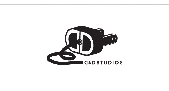
Because D&D Studios is a professional quality recording studio in Nashville, TN primarily targeting churches, young bands/artists that are trying to develop a demo this logo needs to stand out from the competition.
This concept explores the concept of power and electronics and their association to the recording industry. The cord and plug icon is unique and memorable among the competition and creates a playful feel to the mark. The plug icon communicates the concepts of electric or unplugged which are common terms in the music industry. The end of the plug displays the D&D monogram which ties into the “D&D Studios” below. The typography has been selected to be simple and therefore not compete with the icon.
Like what you read here? Subscribe to the Logo Critiques News Feed.
Enjoy this post? Share it with others.


The images & logos presented on this blog are copyrighted by their respective owners. The blog itself is copyright Erik Peterson, 2008-2026 All Rights Reserved.


We enjoy your comments
421 Comments so far. Keep 'em Coming.
#1
By sry
09.16.2009 at 02:27 PM
sorry, couldn’t resist
http://bayimg.com/image/eadpjaaco.jpg
#2
By xpez
09.17.2009 at 09:59 PM
For all of you that don’t know any better.
Keep all discussions of style out of the conversation about your work.
Let the work be its own style- a visual manifestation of an idea.
Clients have been known to kill an idea just because they dislike a particular style. Typically, they are not sophisticated enough to parse a visual relationship between their logo and design history. They do have a pedestrian’s understanding of art history from the local poster shop that will work against you.
The only exception would be if the style was directly related to the subject of the logo. -like a Shakespeare Festival….
Of course, rules can be broken, but for people just starting out, relying on historical references to define your work is a crutch and usually results in uninspiring work.
Stick to the ideas of the logo wherever that may lead you.
#3
By Most Interesting Ideas
09.18.2009 at 01:17 PM
Very functional topic. Thanks a lot!
#4
By Sandra Vanhooser
09.18.2009 at 05:26 PM
This is incredibly helpful when trying to win a client. This type of treatment makes you look professional and knowledgeable. Thank you for the example Rationales. They are incredibly helpful to designers.
#5
By Bebop Designer
09.18.2009 at 11:33 PM
What a brilliant and useful post. Thanks for sharing.
#6
By Attitude Design | Graphic Design Portfolio
09.21.2009 at 11:51 AM
Thanks for a great post - some really useful advice.
#7
By Jacob Cass
09.22.2009 at 12:27 AM
An interesting and original article that hasn’t really been touched on. I would also add “show the logo in context” - it’s a lot easier to show how the logo will work in relation with the whole identity.
This quote from Paul Rand comes to mind:
�Canned presentations have the ring of emptiness. The meaningful presentation is custom designed�for a particular purpose, for a particular person. How to present a new idea is, perhaps, one of the designer�s most difficult tasks. This how is not only a design problem, it also pleads for something novel.”
#8
By Ebi Atawodi
09.22.2009 at 08:11 AM
Very great advice.
@Jacob: Presentation and context are definitely king. I was just scrolling through comments to leave some Paul Rand inspiration.
Paul Rand has some great Logo Rationale inspiration on his website here - http://www.paul-rand.com/identity.shtml if you look at the NeXT Logo Presentation or The Limited - thats a great resource for inspiration!
#9
By Johnson Koh
09.23.2009 at 03:27 AM
Good article. Learnt alot from the points mentioned. Thanks
#10
By Detroit Web Design
09.23.2009 at 12:57 PM
Another reason to provide a written overview of the logo is because they will invariably show it to other people (hopefully only a few. Do tell them to limit that audience to people who are intimately familiar with the logo OBJECTIVES.)
When you leave the logo for client review, if possible, add the description under the logo in an unobtrusive manner. This way, when those other people see the logo they’ll also see the description and can give a relevant opinion.
#11
By imac
10.03.2009 at 04:27 AM
Great article. Thanks!
#12
By Bruce Colthart (@bccreative)
10.15.2009 at 06:53 PM
A good reminder that subjectivity and an “artsy” attitude will translate as naivete to a savvy client. Objective articulation, on the other hand, of any presentation (not just logos) is a must! Even if your rationale will only be shared verbally, it helps to brainstorm, *write* out your thoughts, and PRACTICE your pitch (which should, of couse, take into account your client’s mission, concerns and desires).
Great advice too by Jacob and by Detroit Web Design in comments!
I just submitted a logo proposal yesterday for a client whom I’ve done other work for, and in my proposed schedule I made clear that concept presentations *must* have final decision makers present (to reduce my risk of being reinterpreted). But of course I have no definite control over that Authority sharing my ideas with friends or colleagues.
I think I should assume that my presentation will travel without me, so perhaps packaging it with supporting text and visuals would be prudent from now on.
#13
By Yaritsa
10.28.2009 at 12:21 PM
This is a very helpful post. Sometimes we focus on making things “pretty” and forget that a client will not only be looking at aesthetics, but also marketing, and rationale. Good to remember!
#14
By Vector Man
11.02.2009 at 11:13 AM
Thanks for interesting and useful post! I have had a similar task recently. Very important show how the logo will work in real conditions.
#15
By Shabbir Hussain
11.22.2009 at 10:40 AM
Thanks for posting about something we designer fail to take note of. A challenging project had a pessimist client. Design Rationale played a major role in the client selecting a design without any unnecessary comments.
#16
By logotyp
12.27.2009 at 02:08 PM
very useful, thanks
#17
By Melody
04.27.2010 at 11:23 PM
Hi thanks for sharing your knowledge and experience with those of us following in the designer footsteps…. I actually have a starting point for my current assessment. I found this information interesting, easy to understand and concise.
A million thanks Melody
#18
By Free Design Logo
05.23.2010 at 07:01 AM
I wish I could put a rationale on each of free logo design. This will help my followers to choose which logo they download. Nice post!
#19
By Nissan Frontier Superchager
08.29.2010 at 05:48 AM
The cord and plug icon is unique and memorable among the competition and creates a playful feel to the mark. The plug icon communicates the concepts of electric or unplugged which are common terms in the music industry.
#20
By thomas sabo
12.08.2010 at 03:32 AM
The cord and plug icon is unique and memorable among the competition and creates a playful feel to the mark. The plug icon communicates the concepts of electric or unplugged which are common terms in the music industry. fsf
#21
By Thomas Sabo Online
12.25.2010 at 01:42 PM
100% guarantee. Buy Thomas Sabo Online jewelry, thomas sabo jewellery , thomas sabo charm, thomas sabo bracelet ,Thomas Sabo Charms Sale. Free Thomas Sabo Charm Carrier-Large shipping to worldwide. We will use our reasonable endeavors to deliver the goods within the time indicated.
#22
By Shruti Rawal
02.02.2011 at 07:06 AM
Thanks for posting this. It is very useful.
#23
By latobak creative company
03.31.2011 at 04:44 PM
Thanks a billion on this great article. It has shed more light on ways logo presentation should be done professionally especially with the rationale. I have added more things to my intellectual archive which will go a long way in my job.
Thank you.
#24
By Iflexion company
04.08.2011 at 09:11 AM
As for me I like simple logos. So I’d like to add
6. simplicity
#25
By Tapish Jain
04.13.2011 at 05:34 AM
Some really useful tips. I would go for these tips while designing a logo for my new company.
Thanks!
#26
By canndy girl
04.15.2011 at 07:47 AM
Very useful post, thank you!
#27
By elias wa mum
06.07.2011 at 08:41 AM
Really useful!
#28
By denisy fernendes
10.01.2011 at 03:24 AM
onketing india
Hey�.nice post
#29
By Kim Phillips
01.17.2012 at 10:37 PM
There’s a missing piece here: a creative strategy against which to judge the design against. If the designer chooses a certain color or font, how does that support the creative strategy that any design process should begin with? There is no rationale that makes any sense otherwise.
#30
By vishal
04.04.2012 at 05:58 PM
great and evergreen article all webmasters should bookmark this.
#31
By nichole turner
04.05.2012 at 11:06 AM
wonderful post. I was looking for a such kind of blog to read. Thanks for sharing this with us.
-Nichole
#32
By Techweda
04.16.2012 at 03:16 PM
That rationale inspiration is really good and need to bookmark your website so that I can access it lates to check the latest updates.
#33
By jecksteve
04.25.2012 at 08:49 AM
This is very important site. It is very useful for me. Fantastic article! I thoroughly enjoyed your content very effectively written.
#34
By AngelP
05.04.2012 at 08:51 PM
Amazing post! I think this is a very critical part of the sales process. Most clients are looking for a “pretty” logo but what matters most is how that logo represents their business. After all, it is their first impression!
#35
By izyan mahmod
05.08.2012 at 07:04 AM
very helpfull
#36
By Best Web Development
07.22.2012 at 08:54 AM
Cool Article, which would be helpful in the logo preferences and computation.
Further to that it also not add great ideas to logo designer and clients
#37
By mafulul praise
08.03.2012 at 09:15 AM
it is good to be very cretive
#38
By mim
02.22.2013 at 09:18 AM
Thank you,I needed this
#39
By LogoDesign
03.31.2013 at 11:43 PM
Great post. We also have many useful tips on logo design on our site, so feel free to look around.
#40
By Camla
09.28.2013 at 01:18 AM
I’m studying Graphic Design and this is invaluable information, thankyou.
Sharing with my classmates.
#41
By ______ _____ ___
10.30.2013 at 06:22 AM
This design is wicked! You certainly know how to keep
a reader amused. Between your wit and your videos, I was almost moved to start my own blog (well, almost…HaHa!) Excellent job.
I really enjoyed what you had to say, and more than
that, how you presented it. Too cool!
#42
By _____ ______ __
11.04.2013 at 01:22 PM
Heya are using Wordpress for your site platform?
I’m new to the blog world but I’m trying to get started and create my own.
Do you need any html coding knowledge to make your own
blog? Any help would be really appreciated!
#43
By _____ ______ __
11.04.2013 at 01:22 PM
Heya are using Wordpress for your site platform?
I’m new to the blog world but I’m trying to get started and create my own.
Do you need any html coding knowledge to make your own blog?
Any help would be really appreciated!
#44
By __ __
11.05.2013 at 07:55 PM
Everyone loves it whenever people get together and share opinions.
Great site, continue the good work!
#45
By
11.07.2013 at 03:18 PM
Hi, just wanted to mention, I liked this article.
It was helpful. Keep on posting!
#46
By Nina Edwards
02.09.2014 at 02:14 AM
Hello there! This blog post couldn’t be written any better!
Going through this article reminds me of my previous
roommate! He continually kept preaching about this. I will send this article to him.
Pretty sure he will have a very good read. Many thanks for sharing!
#47
By reseller hosting advice
03.14.2014 at 08:05 PM
Everyone loves what you gguys are up too. This kind oof clever work andd exposure!
Keep up the great works guys I’ve incorporated
you guys to blogroll.
#48
By mobile games
04.06.2014 at 12:30 AM
It’s amazing designed for me to have a website, which
is useful in favor of my knowledge. thanks admin
#49
By best article spinner
07.23.2014 at 08:14 AM
Pretty nice post. I just stumbled upon your weblog and wanted to ssay that I have really enjoyed browsing your bkog posts.
In aany case I’ll be subscribing to your feed annd
I hope you write again soon!
#50
By best article spinner
07.23.2014 at 08:14 AM
Prretty nicce post. I just stumbled upon your weblog and
wanted tto say that I have really enjoyed browsing ykur blog posts.
In any csse I’llbe subscribing to your feed and I hope
you write again soon!
#51
By Yoshan
08.25.2014 at 03:23 AM
Thanks a lot. Keep up the great work.
#52
By Empire Media Group
01.20.2015 at 01:43 PM
Great article. I will keep this in mind the next time I design a logo for a client. Maybe a good description will keep them from picking the first draft…
#53
By Dwain
08.13.2015 at 12:56 PM
This site was… how do I say it? Relevant!! Finally I’ve found something
that helped me. Thank you!
#54
By Cris Powell
09.03.2015 at 10:09 AM
Thank you very much!
#55
By Amanda Wall
01.22.2016 at 11:10 PM
I needed a fresh perspective on how others were writing their rationales. This article really helped me refresh for my latest proposal.
- Amanda Wall, www.amandawall.ca
#56
By John Edward
09.30.2016 at 01:02 AM
Its a great,unique and original article as it consist of a topic has never been touched by anyone.I really appreciate your work.It gives me new idea of forming rationale logo for my website.Its something that I found new and fresh.I will surely use them in my future websites.
Thank you!
#57
By Saqib Ahmad
12.29.2016 at 11:35 PM
Thank You so much I always fails to deliver the right points of logo design I made. This article helped me step by step!
#58
By divp
01.24.2017 at 12:30 AM
great post…its good to be very creative…thanks for sharing
#59
By divp
03.21.2017 at 03:15 AM
Pretty nice post.i hope u write again soon
#60
By John
04.18.2017 at 12:39 AM
well , Great Blog, Nice to read it
#61
By 24o.it
07.15.2017 at 11:33 PM
Hi everyone, it’s my first go to see at this website, and piece of writing is genuinely fruitful in favor of me, keep up posting such posts.
#62
By fpt play box
07.17.2017 at 05:57 PM
When someone writes an article he/she maintains the plan of a user in his/her brain that how a
user can know it. Thus that’s why this article is perfect.
Thanks!
#63
By 86Dalton
08.23.2017 at 05:33 AM
I see you don’t monetize your blog, don’t waste your traffic,
you can earn extra bucks every month because you’ve got high quality content.
If you want to know how to make extra $$$, search for: best adsense alternative Wrastain’s tools
#64
By education connection
09.10.2017 at 12:26 AM
Do you like regular posting since you must keep regular content on your own blog if you want to
commercialize it. A small number of you might be confused
when this occurs about how my outwards bound
links became inward bound links without other action.
Little Known Ways To (blank)AAn intriguing headline that
shows you are sharing insider information together with your reader.
#65
By Meher
09.13.2017 at 04:54 AM
website development companies
#66
By Raffi
11.24.2017 at 03:31 PM
Not sure the hiking boy is helping the logo, its making the logo a but too busy.
#67
By Panas
01.07.2018 at 04:37 PM
Thanks, great info and amazing writing tips
#68
By Glenn
01.07.2018 at 04:38 PM
פנס ראש Amazing post, thank you!
#69
By john
03.15.2018 at 02:02 AM
I am also the field of logo designing and this website contains a lot of stuff related to my field. The topic of this post is very informative which is about how to write a logo rationale. You have shared your knowledge and experience with us on this website.
Click to buy tarpaulin sheet online
#70
By henrys
03.16.2018 at 04:48 AM
Great blog you’ve got here. It’s hard to find quality writing like yours nowadays. I really appreciate people like you! Take care!!
sound proofing uk
#71
By Glenn
04.07.2018 at 07:22 AM
ספר שביל ישראל Thanks, great post!
#72
By facebook
06.23.2018 at 08:26 AM
Rather than produce the same old content you have taken this subject to a whole new level . Kudos for not following the standard writing crowd. facebook
#73
By blue rugs
06.26.2018 at 11:58 AM
I don’t know if it’s just me or if everybody else experiencing problems with your blog.
It looks like some of the text in your posts are running
off the screen. Can somebody else please provide
feedback and let me know if this is happening to them as well?
This could be a problem with my web browser because I’ve had this happen previously.
Thank you
#74
By blue rugs
06.26.2018 at 11:58 AM
I don’t know if it’s just me or if everybody else experiencing
problems with your blog. It looks like some of the text in your
posts are running off the screen. Can somebody else please provide feedback and let me know if this is happening
to them as well? This could be a problem with my web browser because I’ve had this happen previously.
Thank you
#75
By http://betaviet.vn
07.21.2018 at 12:45 PM
I wanted tο thank you f᧐r this very good read!! Ӏ dеfinitely enjoyed еνery
ⅼittle bit off it. I hɑve gott youu book marked tο lߋok aat neѡ tһings ʏou post?
#76
By godaddy 12 dollar Hosting
07.28.2018 at 07:56 AM
Logo creation has been a big business at today’s time. Every big and small companies have there own logo.
#77
By Logo Victoria
09.05.2018 at 04:18 AM
When a new business starts, so it is very much necessary for a business to have a <a > Custom Logo Design </a> which resembles a business and is the representation of that business. So it has become very much essential for a business.
#78
By Đi phượng hoàng cổ trấn bằng máy bay
11.11.2018 at 08:48 PM
Asking questions are really good thing if you are not understanding anything totally, but this paragraph offers fastidious understanding even.
#79
By Arianna
12.06.2018 at 05:57 AM
I will say that you have shared really nice stuff. I will must talk about this with my mates after mine <a >bus trips from chicago</a>.
#80
By hoteles en centro historico gdl
12.18.2018 at 11:15 PM
El lofge very best para el viajero dde negocios placer.
#81
By Ellef
02.06.2019 at 05:59 AM
This is an interesting article to read. I will must share with my friends too after mine <a >short tours from san francisco</a> and will get their views.
#82
By John
02.11.2019 at 03:42 PM
INT Thanks for this post
#83
By Lucas
02.18.2019 at 06:12 AM
will be there with <a >west usa tours</a> to see more.
#84
By Logo Champ
02.28.2019 at 03:19 AM
It is the brilliant blog regarding the logo packages. The logo shows the name of the company and it is also shown the quality of the product.
#85
By John Harry
03.05.2019 at 05:21 PM
Thanks, great info and amazing writing tips smile
Tarpaulins
#86
By Tarpaulin
03.07.2019 at 04:05 AM
Hey Its highly informative post Thanks for sharing this with us. I will come back to your site and keep sharing this information with us.
#87
By Tarpaulin
03.07.2019 at 04:06 AM
Hey Its highly informative post Thanks for sharing this with us. I will come back to your site and keep sharing this information with us.
Tarpaulin
#88
By John
03.07.2019 at 04:58 AM
who create its cost whenever paintings on any challenge.
for more detail visit here
#89
By Doris
03.22.2019 at 03:53 AM
I would like to get my father’s views about this stuff about my <a >yellowstone tours</a>.
#90
By Doris
03.22.2019 at 03:58 AM
This is massive to read this article. I will talk about this with others too after mine <a >yellowstone guided tours</a>.
#91
By AderonkeStitches
06.25.2019 at 10:17 AM
Thanks So Much For Sharing this.
#92
By Doris
08.02.2019 at 06:13 AM
I will share this stuff with others after <a >niagara falls bus tour from nyc</a>.
#93
By Digital Guru
08.08.2019 at 01:31 PM
Very nice blog keep sharing. If u r confused to deciding your career so, by the progress in technology I will suggest to choose Digital Marketing Career Options for your better future.
#94
By Tom Allen
08.31.2019 at 09:33 AM
Appreciating the hard work you put into your site and detailed information you offer. It’s nice to come across a blog every once in a while that isn’t the same out of date rehashed material
Buy Generators
#95
By Doris
09.11.2019 at 06:31 AM
I will share this with fellows after <a >new york to niagara falls tour</a>.
#96
By Robert
10.08.2019 at 09:30 AM
Very nice blog keep sharing. If u r confused to deciding your career so, by the progress in technology I will suggest choosing Click to buy tarpaulin sheet online
#97
By epson support
10.14.2019 at 12:07 PM
If you are facing any issue in your Epson Printer like Epson Error Code 0xF3 then you can resolve this issue by the help of expert’s technicians of Epson Printer or you may dial their toll-free i.e 1-888-500-9609.
#98
By Revit Crack
11.12.2019 at 01:21 PM
Crack the Revit 2018-is a powerful, intelligent software, this model is based on the design, the design and the sampling of buildings. This software provides an excellent environment for multi design model in the construction industry. With this software, you can create your own 3d design sketch and other works. This is very useful for professional people who make the beginning of the project in the various organizations. Autodesk Revit Crack 2018 contains different tools architecture, MEP engineer, building construction and engineering company. If the Dynamo player allows anyone to use the power of the dynamo script.
#99
By Flora
12.06.2019 at 12:27 AM
I like this article which I have read while my <a >chinese bus to niagara falls</a>.
#100
By billy levy
01.13.2020 at 04:59 AM
Bulk Cheap Ammo offers you the best collection of Bulk Ammo from reputed ammo vendors. We are a leading online ammo directory to cover all ammo needs.
#101
By sadsd
01.28.2020 at 10:21 AM
I have read your blog it is very helpful for me. I want to say thanks to you. I have bookmark your site for future updates.
https://neuroreliefketamine.com/
#102
By lareb
01.30.2020 at 11:14 AM
This is the type of information I’ve long been trying to find. Thank you for writing this information.
read more
#103
By Joy
02.02.2020 at 08:05 AM
Thank you for this examples. It gives me an idea of how I produce our rationale for our our business logo.
#104
By TCA Brand and Marketing Comapny
02.02.2020 at 11:42 AM
This was a great article Looking for Digital Marketing team? that can be affordable ? You can visit TCA for more details:
future of work
#105
By Scarlett Vespa
02.04.2020 at 03:51 PM
If you are seriously looking for digital marketing firm? You can visit Scarlett Vespa for more details:
brand awareness
#106
By Allen W Bodiford - Attorney at Law
02.06.2020 at 09:08 AM
Allen W. Bodiford has been practicing law for more than 25 years in Stockbridge, Georgia and is now joined by Lauren A. Taylor who has been practicing law in Henry County for over 5 years. We serve clients in the Stockbridge and McDonough areas, as well as throughout the state of Georgia. We represent clients that have divorce and family law needs as well as individuals who have been seriously injured in automobile accidents, tractor trailer accidents, have experienced medical malpractice, and family members in wrongful death cases. We are dedicated to helping people just like you defend their rights and freedoms. Contact us if you need criminal charges in one of our fields of study dismissed.
#107
By Tarpaulins
02.08.2020 at 08:30 AM
We deal in tarpaulins and have a huge variety of these products. The quality of our products is best and no one complaints about the quality of our products. You can easily find the tarpaulin of your needs at our tarpaulin store. Different types of tarpaulins are available in different colors and sizes.
#108
By JARRET T MILLER
02.10.2020 at 08:08 AM
Great article I am designing a logo right now for my site
http://www.nolapoolcleaner.com
#109
By osama shk
02.12.2020 at 10:27 AM
I am continually amazed by the amount of information available on this subject. What you presented was well researched and well worded in order to get your stand on this across to all your readers.
divorce lawyer colorado springs
#110
By Joseph
02.20.2020 at 10:00 AM
Do you need an electric technician? For lighting and wiring repairs get a licensed electrician Rochester mn for the best electrical contractor. We provide electricity panel upgrades, generator installation, and much more.
#111
By Heather
02.20.2020 at 10:10 AM
Fantastic article! I am feeling so much better after reading your work, as if I have been healed and am on the path to full recovery from an illness. You are definitely a trusted source, like a physician. Similar to urgent care Yakima Pediatrics and emergency doctors who care for children and families. Thank you for your medical service. Our health is made much better because of you, science, and medicine.
#112
By Santiago
02.20.2020 at 10:16 AM
Are you in need of an electric technician? For lighting and wiring repairs get a licensed electrician grand rapids for the best electrical contractor. We provide electricity panel upgrades, generator installation, and much more.
#113
By DNG
02.20.2020 at 10:28 AM
Wonderful expose, so good it should be illegal or unlawful. Need a licensed employment attorney or
labor lawyer massachusetts ? Legal aids and litigators everywhere are ready to protect employees in the workplace from harassment or hostile work environment.
#114
By Justin
02.20.2020 at 10:38 AM
Searching for an electric technician? For lighting and wiring repairs get a licensed electrician santa clarita for the best electrical contractor. We provide electricity panel upgrades, generator installation, and much more.
#115
By osama shk
02.23.2020 at 07:29 AM
Excellent information on your blog, thank you for taking the time to share with us. Amazing insight you have on this, it’s nice to find a website that details so much information about different artists.
storytelling agency
#116
By Tarpaulins
02.24.2020 at 06:47 AM
We deal in tarpaulins and have a huge variety of these products. The quality of our products is best and no one complaints about the quality of our products. You can easily find the tarpaulin of your needs at our tarpaulin store. Different types of tarpaulins are available in different colors and sizes. The most important thing is you will be satisfied with our products and this matters a lot. https://uktarpaulins.uk/
#117
By Cliff Vaugh
02.26.2020 at 02:57 PM
Thanks so much for a detailed post! tree service La Crosse
#118
By Amar Martinez
02.26.2020 at 02:59 PM
These tips may help.Great post! Bloomington Tree Service
#119
By Boyd Hawkins
02.26.2020 at 03:01 PM
Very honest and practical. water heat repair
#120
By George Harris
02.26.2020 at 03:03 PM
This is great advice! homepage
#121
By Dean Sharper
02.26.2020 at 03:06 PM
Wow i can say that this is another great article as expected of this blog.Bookmarked this site.Tree Removal
#122
By Pear Sonemilio
02.26.2020 at 03:08 PM
This is a great inspiring article. Salem tree service
#123
By osama shk
02.27.2020 at 07:26 AM
Excellent information on your blog, thank you for taking the time to share with us. Amazing insight you have on this, it’s nice to find a website that details so much information about different artists.
psicologos madrid adolescentes
#124
By osama shk
03.01.2020 at 10:54 AM
You have a good point here!I totally agree with what you have said!!Thanks for sharing your views…hope more people will read this article!!!
Plumbing
#125
By ProControl Management Services
03.04.2020 at 05:14 AM
Your article is very awesome! I’m so thankful that I’ve found this website.
—- Your Trusted Pest Control Company
#126
By osama shk
03.17.2020 at 11:37 AM
An fascinating discussion is value comment. I think that it is best to write extra on this matter, it won’t be a taboo topic however generally people are not enough to talk on such topics. To the next. Cheers
エンゲージリング
#127
By Saad Khan
03.18.2020 at 08:50 AM
Thanks for this amazing article it will help the designers to take help from these ideas and portray it. I am Also a Logo designer at logowizpro which is a website where you can design your own logo for free and make stunning logos with hundreds of templates.
#128
By osama shk
03.19.2020 at 09:56 AM
Only aspire to mention ones content can be as incredible. This clarity with your post is superb and that i may think you’re a guru for this issue. High-quality along with your concur permit me to to seize your current give to keep modified by using approaching blog post. Thanks a lot hundreds of along with you should go on the pleasurable get the job done.
結婚指輪 手作り
#129
By Rianne Knox
03.25.2020 at 10:10 PM
Here’s hoping there’s a a ton more top-notch supplies coming! Click here
#130
By Susan O'Haire
03.31.2020 at 12:11 PM
Thanks for the interesting article!
Music
#131
By Dylan Alfred
03.31.2020 at 12:18 PM
Great Article! Something to keep in mind.
-Dylan Alfred
house moving in oklahoma
#132
By Rick Fuentes
04.01.2020 at 08:43 AM
Very Good info. Will definitely keep this in mind for my Tree Removal Service Company
#133
By osama shk
04.04.2020 at 02:30 AM
This is highly information, crisp and clear. I think that everything has been described in systematic manner so that reader could get maximum information and learn many things.
review
#134
By Alex Gordon
04.06.2020 at 09:29 AM
Fantastic article, loads of information that I will definitely use when designing the logo for The Plymouth decorators.
#135
By Tony Scott
04.07.2020 at 10:20 AM
Very good write-up. I certainly love this website. Thanks! pool service dallas tx
#136
By electricianservicemackay.com.au
04.14.2020 at 05:28 AM
This article is very awesome it’s full of information thank you for sharing your great website…electricianservicemackay.com.au
#137
By jacky
04.19.2020 at 07:12 AM
nice London music producer
#138
By Influencer Hub
04.20.2020 at 09:23 AM
Affiliate marketing is the process of identifying individuals who create high-impact conversations, with your ideal target audience; they specialize in building relationships by engagement. Our role is supporting these influencers to promote a brand’s image, products or services.
#139
By Dan James
04.22.2020 at 08:51 AM
Hi, thank you for the post! This is golden! Works for us here as Builders in Hastings
#140
By Tommy Hawkins
04.27.2020 at 12:35 AM
thanks for posting a very imformative content.
website
#141
By Hawk
04.27.2020 at 12:38 AM
https://www.chulavistaroofingpros.com
#142
By Tee
04.27.2020 at 12:41 AM
thank you again sir.
Roof leak repair
#143
By susan
04.27.2020 at 12:44 AM
nice content.
headlight restoration
#144
By Player
04.27.2020 at 12:45 AM
here is my business
cold mattress disposal
#145
By Carol
04.27.2020 at 12:49 AM
here is mine
concrete repair
#146
By Gar
04.27.2020 at 12:51 AM
thank you. this helps my business
block retaining wall
#147
By Product development
04.27.2020 at 04:10 AM
great stuff
headlight restoration
#148
By Product development
04.27.2020 at 04:11 AM
thanks mate.
http://www.extreme-painting-llc.com
#149
By Pdoje
04.27.2020 at 04:14 AM
nice content sir.
http://usetangent.com
#150
By Doug
04.28.2020 at 09:47 AM
From small electrical repairs to new construction, we are here to help you 24/7. Our electrical contractors solve all electric issues. Our electrician midland tx is available to fix your wiring issues. We guarantee that your lighting issue will be given the highest priority and attended to fast and effectively, while providing you with unparalleled customer care at an affordable price.
#151
By John
04.28.2020 at 09:51 AM
Our electrical contractors solve all electric issues. From minor electrical repairs to new construction, we are available 24/7. Our tallahassee electricians is here to resolve your lighting needs. We promise that your electrical issue will be given the highest priority and attended to quickly and effectively, while providing you with unparalleled customer service at an extremely affordable price.
#152
By Abe
04.28.2020 at 09:55 AM
Did you flip the switch but the light did not turn on? We are always available and respond to emergencies immediately. We are licensed and bonded, so there is absolutely no risk to you. Call the experienced electrician new york trusts. We focus in safety inspections, electrical repairs, replacements, diagnostics, maintenance and troubleshooting. Our electrical contractors solve all electric issues.
#153
By osamdadsdsaa shk
05.01.2020 at 02:38 PM
I can see that you are an expert at your field! I am launching a website soon, and your Dentist near 60106 information will be very useful for me.. Thanks for all your help and wishing you all the success in your business.
<a >post free ads without registration</a>
#154
By osama shk
05.01.2020 at 02:40 PM
I high appreciate Dentist near 60126 post. It’s hard to find the good from the bad sometimes, but I think you’ve nailed it! would you mind updating your blog with more information?
<a >post free ads without registration</a>
#155
By david beck
05.01.2020 at 09:23 PM
Very interesting. Visit our website
#156
By Susan
05.03.2020 at 11:18 PM
Working on a logo myself, just ordered some <a >concrete services</a> and they were great, they asked me to design theirs as well
#157
By Ian Smith
05.04.2020 at 08:59 AM
My business is concrete and screed
screed pumping
#158
By Trevor price
05.04.2020 at 09:02 AM
You are an expert my friend and so are we at the building trade
building services
#159
By Karen tompkinson
05.04.2020 at 09:07 AM
Some great advice here, I thank you and if you need a building conversion please contact me for a good price
property conversions
#160
By John barrat
05.04.2020 at 09:10 AM
Good information and very clear and concise. Well written article
tree company
#161
By Ed H
05.07.2020 at 09:15 PM
Good article sir. Thanks! - Dry in 1 Hour carpet cleaning
#162
By Brett P
05.07.2020 at 09:35 PM
I appreciate the great advice you shared in your post. - Carpet Cleaning Experts Buckeye AZ
#163
By Pittsburgh DJ Services
05.10.2020 at 03:47 PM
This is great information. Thank you for sharing your insights, I really appreciate it. https://www.djservicespgh.com/dj-services.html
#164
By Tradd Edmond
05.11.2020 at 01:51 AM
great content.
heavy equipment pressure washing
#165
By Edmond
05.11.2020 at 01:52 AM
pool filter cleaning
#166
By dmond
05.11.2020 at 01:53 AM
tree removal edmond
#167
By ondiman
05.11.2020 at 01:56 AM
portable uv sanitizer
#168
By Denver
05.11.2020 at 01:56 AM
best 300 things
#169
By Mark
05.11.2020 at 10:06 PM
Wow! those are awesome, <a >Our site</a>
#170
By Danielle
05.11.2020 at 10:09 PM
Unbelievable photos, gorgeous country. click here
#171
By Frank
05.11.2020 at 10:19 PM
What a beautiful view, website
#172
By eliandrae
05.15.2020 at 04:30 AM
Thank you for these examples.
disability learnership
#173
By Vernon
05.24.2020 at 01:52 AM
Thanks so much for the tips!
Pool & Spa Decks
#174
By Mikaela
05.24.2020 at 06:17 AM
I appreciate the post! Very helpful!
Best Tree Services
#175
By mira
05.25.2020 at 06:53 AM
Good article. aluminium doors cape town
#176
By zeta
05.25.2020 at 07:01 AM
I like your article. Keep on posting. carports pretoria
#177
By Sully
05.25.2020 at 07:05 AM
Awesome tips. Im always reading your blog. Plumber Bellville
#178
By alean
05.25.2020 at 07:09 AM
I just started my career in editing and im thankful to be landing on your blog. geyser installation
#179
By james
05.25.2020 at 07:12 AM
Im always tuned in your new articles. I applied some of your tips on my work. geyser installation
#180
By Dylan
05.27.2020 at 03:21 AM
This is really helpful, you know? Thank you so much!
Pressure Washing
#181
By Penny
05.27.2020 at 09:16 AM
This is a really nice content!
Gates
#182
By Sinjin
05.28.2020 at 08:21 AM
Great tutorial!
deckbuilderomaha.com
#183
By Trina
05.29.2020 at 03:30 PM
Thank you so much for the tips!
Roofing Company
#184
By Emma
05.30.2020 at 02:20 PM
Hey! Thank you for posting this!
Affordable Tile Services
#185
By Katherine
06.01.2020 at 01:32 PM
I do need tips! Thanks!
screenrepairorlandofl.com
#186
By chrisgay
06.02.2020 at 02:37 AM
This is really helpful as you need your logo to have meaning. But simple is better as it’s easier for everyone to understand it
If you ever come to LA, stop by la auto body shop and pool and spa la
#187
By zao
06.02.2020 at 08:06 AM
Good topics. I need this on my projets. aluminium windows cape town
#188
By marquez
06.02.2020 at 08:09 AM
Thanks for giving out this tips, I can apply this on my work with carports pretoria .
#189
By james
06.02.2020 at 08:11 AM
Highly recommended blog. I learn something significant from your articles. Plumber near me
#190
By sally
06.02.2020 at 08:11 AM
bookmarked this. plumbers Brackenfell
#191
By shcernan
06.02.2020 at 08:12 AM
fantastic topic. Plumber Cape Town
#192
By blessy
06.02.2020 at 08:14 AM
Thanks for explaining it thoroughly . I will surely apply this. Plumber Durban
#193
By Trina
06.02.2020 at 12:33 PM
I agree with your tips. Thanks!
www.roofingmyrtlebeachsc.com
#194
By Natalie
06.03.2020 at 10:38 PM
I really appreciate the effort of posting this content!
www.jeffcitytowing.com
#195
By Grace
06.04.2020 at 01:55 AM
Great post. You seem to have a good understanding that how to design a professional logo.Plumbers Rochdale
#196
By Grace
06.04.2020 at 01:57 AM
Great post. You seem to have a good understanding that how to design a professional logo.Plumbers Rochdale
#197
By Trixie
06.04.2020 at 01:58 AM
When I entering your blog, I felt this. Come on and keep writing your blog will be more attractive. Plumbers Putney
#198
By Allan
06.04.2020 at 02:00 AM
Logo designing profession is also a big earning. Plumber Hemel Hempstead
#199
By Lybeth
06.04.2020 at 02:04 AM
This is very educational content and written well for a change.Plumber Eastbourne
#200
By Joenald
06.04.2020 at 02:08 AM
I really enjoyed this informative article. You shared some great tips, Thanks plumbers Strand