NeonKids Logo Concepts Critique 69
NeonKids Logo Concepts Critique
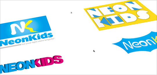
I received 4 logo concepts, at various stages of completeness, from Phil. He is working on a logo for a children’s ministry called “NeonKids”. The children in this group are from 3-14 years old. Phil had this to say about his project,
“The ministry is going to be called “NeonKids”, with the tag-line “Let your light shine brightly”. Some of the concepts I’ve played around with electricity, lightning bolts, light bulbs since those are some of the elements that are in the general theme the program is looking for.”
Once again, I won’t be following the normal format for critique that I’ve been using up until now. Instead, I’m going to pick two concepts from the group that I think have the most potential. I will critique them and offer thoughts on some other conceptual directions for Phil to explore.
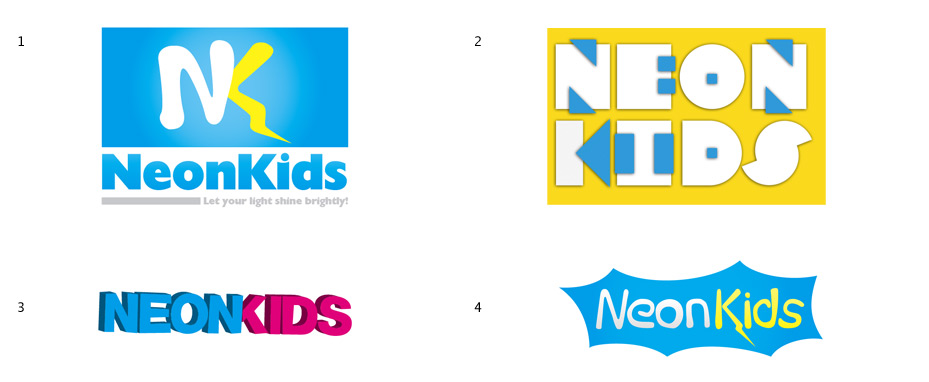
Concept 1
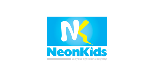
This concept appears to be the most complete out of the group. The blue and yellow colors of the logo are bright, vibrant and child friendly. I see the lightning bolt on the leg of the ‘k’, but I’m not sure I would make the connection if I didn’t know what it was supposed to be.
I find that the logo is lacking any strong kid-like tone. Maybe it’s just too structured. It could also be the typeface selection for “NeonKids”. It’s so static and straight, something a little more rounded or freeform could possibly work better. The blue rectangle behind the monogram seems a little awkward with all the extra space on either side. What if you tried something along the lines of a superhero emblem as a variation on this concept? Think, Flash Gordon, Superman, Marvel and stuff like that.
You could incorporate a lightning bolt, flashlight or lightbulb into some kind of icon and then work the text around it.
Question for the readers
please respond in the comments below
Do you think this concept fits the audience? If not, how would you alter it to make it more kid friendly?
Concept 3
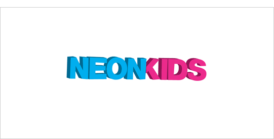
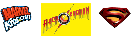
I like the 3D letters of this concept, but this one lacks a kid-like feel also. Although, this concept comes across with more life/energy (less static) than the previous concept. The bright blue and pink referencing the boys and girls that make up the group is a nice touch. Take a look at these logos that feel very kid oriented. What do you notice here?
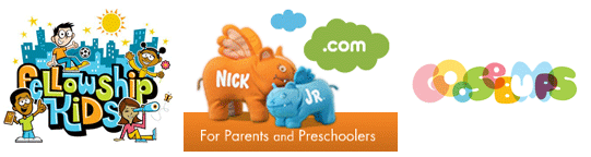
I notice the bright colors and playfulness of the logos. You’re on the right track with this concept, I just don’t think your quite there yet. If you could impart more of that playfulness and energy, as shown above, you’d have more of a kid friendly feel to the mark. As you can see in the examples above, the playfulness can come from typography, iconography or both.
Possible Improvements
It seems like you have explored mostly type driven concepts for this logo. Nothing wrong with that, but you may want to consider some alternative directions too. How about incorporating some sort of child representation or icon into the type? Nothing seems to be glowing or emitting light in the concepts, could you explore that further as well?
Question for the readers
please respond in the comments below
Any other ideas that Phil should consider exploring?
Overall, I think you have a good start on the logo concepts. Now you may just want to dig a little deeper and try out some of the suggestions mentioned. Please know that my intention in critiquing your work is not to hurt feelings, but to offer constructive feedback. I hope it was helpful. Best of luck, to you!
I appreciate and welcome your comments, and look forward to hearing from you soon. I purposely don't cover every possible improvement that can be made to this logo, so go for it if you think I missed anything. All I ask is that you keep your comments clean and appropriate.
Like what you read here? Subscribe to the Logo Critiques News Feed.
Enjoy this post? Share it with others.


The images & logos presented on this blog are copyrighted by their respective owners. The blog itself is copyright Erik Peterson, 2008-2026 All Rights Reserved.


We enjoy your comments
69 Comments so far. Keep 'em Coming.
#1
By Mighterbump
04.29.2009 at 11:14 AM
I would suggest a bolder look on the “Kids” part of the logo to emphasize on who wants to be interested.
#2
By Logo Design Works
04.30.2009 at 08:26 AM
To be honest, none of these concepts seem right for the brand in question.
Erik nailed down the drawbacks and offered some excellent suggestions too.
My only input would be that none of the concepts seem to relate the idea of a children ministry. Using soft rounded fonts would be a good start. On top of that perhaps icons of child like figures possibly playing on light coming from above kind of direction would really communicate well the message of the ministry.
#3
By Kirsten Navin
05.03.2009 at 05:01 PM
I agree with Logo Design Works, nothing about these designs says Children’s Ministry. Concept #1 has some interesting ideas but the execution is at odds with itself. By that I mean, the soft “kid friendly” letter forms merged with a soft lighting bolt (which is traditionally drawn with very sharp angles) confuses the concept. Is it a lighting bolt? Is is scribbley kid’s writing? Also I don’t know if a lighting bolt ever appears friendly, even a soft drawn one. It symbolizes power and danger. I do like the super hero theme that was suggested, certainly right for the audience. Concept #3 reminds me of the school house Rocks logo http://www.schoolhouserock.tv The simple hand sketched letters worked great for them but being animated helped.
I wonder how this logo is going to be used, web? print? both? with a name like Neon Kids, perhaps working the type to look like a neon sign. Might end up being too kitchey but could be worth a few sketches to flesh out. http://farm3.static.flickr.com/2187/2491089070_5783186629.jpg
http://media.photobucket.com/image/cool neon lights/Aj1t1/NeonLightsTut/bottomleftline.jpg
As you approach this design think of who it is for, and what is the message that you want to say. Best of luck and hope you will post some updates.
#4
By Tim Schmidt
05.04.2009 at 11:35 PM
I don’t really like any of them. But #4 is in the right direction.
You need a quick, simple playful read “Neon Kids”.
#1 will cause people to read NK first, and since this is not a corporate brandmark, keep it simple.
Suggestion:
Just use the letters"NEON KIDS” and maybe modify the “O” or the “I” into a lightbulb, candle, torch, etc.
#5
By Nissan Xterra Supercharger
08.27.2010 at 12:44 PM
It symbolizes power and danger. I do like the super hero theme that was suggested, certainly right for the audience….Nissan Xterra Supercharger
#6
By Johnterry
12.15.2010 at 02:00 PM
Really impressive and I think it is tough to make it for kids.Florida Villas
#7
By Iflexion company
04.08.2011 at 09:18 AM
I think that Concept 3 is the best from these.
#8
By document scanning services
11.08.2012 at 08:15 PM
My personal solely knowledge is that none of the basics manage to bring up the thinking behind a small children ministry. Using soft circular web page has to be nice beginning. Furthermore perhaps icons of kid just like statistics potentially playing on light-weight received from previously style of course would really communicate very well what it’s all about in the ministry.
#9
By mana
11.11.2012 at 10:50 AM
This idea looks like it’s probably the most entire out of the staff. The blue plus yellowish colors from the logo design are vibrant, vivid as well as kid pleasant. I see the actual fast bolt for the lower calf on the ‘k’, however I’m not sure We’d produce the association if I didn’t know what it absolutely was should be.
#10
By jim
03.10.2019 at 12:13 PM
Thanks, really enjoyed this article! לונלי פלנט תאילנד cool logos as well..
#11
By abc
03.22.2019 at 06:30 AM
Engineering as a subject combines mathematics, logic and science to find solutions to our daily life problems. Over the last few
decades, engineering as a profession has seen vast expansion.
agriculture college in Punjab
engineering college in mohali
B Tech college in punjab
MBA college in chandigarh
CGC campus
#12
By vote
03.28.2019 at 06:46 AM
Our academic pursuits, along with a range of extracurricular activities, help in honing a child’s skills and ensuring that he/she grows to be a mature and responsible citizen.
top rating school in greater noida
#13
By Gos
07.22.2019 at 04:47 AM
The Health system is created in a proficient way of expanding the network in the multispecialty services. With the ever-growing population, the hospital has announced many ambitious plans that have ultimately lead to the excellence.
best hospital in hisar
laparoscopy surgery in hisar
The goal of the society is to create professionally well skilled students To achieve the said goal, arrangements have been made with the pioneers and front runners both in India and abroad.
best cbse school in dehradun
top cbse school in premnagar
#14
By Allen
09.17.2019 at 01:47 AM
The blue rectangle behind the monogram seems a little awkward with all the extra space on either side. 1z0-1035 dumps
#15
By selfie
10.01.2019 at 06:19 AM
Provides multiple learning environment of International standard with holistic system of education at an affordable cost for the
successful life of young generation.
best placement college in dehradun
best paramedical college north india
top agriculture college in dehradun
#16
By test22
10.01.2019 at 06:19 AM
There is always an adventure waiting for you online.
cheap csgo accounts
#17
By test22
10.01.2019 at 06:20 AM
Our approach brings together best-in-class virtualized compute, storage, and networking infrastructure.
it solutions company in uae
mdm partner in uae
vmware partner in uae
bi as a service in uae
#18
By John1999
10.28.2019 at 11:28 AM
Good one. home automation London home automation Manchester ac repair San Diego
#19
By Marloue Lark lluch
12.09.2019 at 11:47 AM
Very impressive work!|click here
#20
By Anont
03.24.2020 at 10:33 PM
The blue rectangle behind the monogram seems a little awkward with all the extra space on either side. cheap russell and bromley
#21
By Sophie Miller
06.27.2020 at 06:09 AM
Je vous remercie de l’information! Je cherchais et ne pouvait pas trouver. Vous me aidé! <a >192.168.1.254</a>
#22
By Sam Nuzbrokh
03.19.2021 at 07:17 AM
The Logo is perfectly awesome! I love the details and it’s really design for kids. I have discover also the best tree service in hempstead, people are accomodating and they know your worth.
#23
By Cj chuck
03.22.2021 at 09:54 AM
This is definitely a cute one. Thumbs up for this
If you need j dogg junk removal services, our company is the best!
#24
By Tyler Solana
04.13.2021 at 08:04 AM
This looks great. Love the idea of the logo. It will be great if you find references at popcorn ceiling removal companies.
#25
By marktyz
06.07.2021 at 02:22 AM
Glad to see this post, I like the content of this forum.
http://blindsnewcastle.net.au//
#26
By lofh uids
01.10.2022 at 02:55 AM
wish I were a unicorn red ball so I could stab idiots with my head.
#27
By Neil Brown
03.05.2022 at 02:46 PM
Really interesting write up, there’s a lot to learn it seems. I find a good design is simple and effective if you overcomplicate things the meaning can be lost. As brampton handyman we like to keep our logo simple too.
#28
By glen
06.01.2022 at 03:54 AM
Very great post. I just found your blog and needed to say that I have truly appreciated perusing your blog entries. Some way I’ll buy in your feed and I truly want to believe that you post again soon. Huge gratitude for the valuable data. House Cleaners Sherwood Park
#29
By linnellaa
02.21.2023 at 10:45 PM
It’s hard to find a good article like this. With this article, you can understand many more things that you did not know. Since then, it has helped me a lot in life and work. See these resources moto x3m to learn more.
#30
By Brown
03.03.2023 at 04:34 AM
I am really happy to know this site. it gives me more useful knowledge. I will come back and hopefully have more good information. drift boss
#31
By Silver
05.03.2023 at 09:44 AM
This prompt generates a thousands of different styles and designs of logos with NEON art | contractors in saratoga springs ny
#32
By ragi
05.08.2023 at 06:56 AM
Thanks for writing this great article! It’s very informative, and you included some great points to the equally great article.
hrms application
#33
By Jane
05.24.2023 at 04:21 AM
With all the additional space on either side, the blue rectangle behind the monogram seems a little strange. What if, as a variant on this idea, you tried something akin to a superhero emblem? See: https://www.edmondpaintingpros.com
#34
By Mikasa
06.28.2023 at 09:32 PM
I appreciate how the article explores different perspectives and potential challenges related to the build now gg topic. It encourages critical thinking and provides a well-rounded view, allowing readers to form their own opinions.
#35
By larry larryellison
08.22.2023 at 09:24 PM
The designs are very trendy. Simple but accessible geometry dash bloodbath
#36
By sonalika dm
09.10.2023 at 11:40 PM
I was searching for a <a >best ERP software in india</a>blog, but found your blog about NeonKids Logo Concepts Critique. Thanks for sharing the information. I found the information very useful. A great article to read. I appreciate you spending some time and effort to put this article together.
#37
By Brian
09.18.2023 at 06:55 AM
I like the logo very much, in my opinion it brings a breath of fresh air into the company. A new logo has a great and positive effect, as it was with Snus.
#38
By Timothy J Evans
12.14.2023 at 06:00 AM
Thank you for creating a space where learning is not only easy but also enjoyable. Thanks for democratizing Minecraft enjoyment with your exceptional Minecraft Servers free.
#39
By Dena J Webster
01.06.2024 at 06:58 AM
Ваш блог обеспечивает постоянный поток интересной и ценной информации, и я хотел бы сказать вам спасибо. Независимо от того, используете ли вы мобильный телефон или используете мышь, кпс-тест предлагает универсальный способ повысить скорость кликов.
#40
By kathy23
01.09.2024 at 04:29 AM
Excellent work with the writing! Always keep an eye out for what the featured articles are going to be in this magazine!!
quordle today
#41
By zetictisno
03.04.2024 at 11:39 PM
viewership on par with traditional infinite craft sports tournaments, highlighting the mainstream acceptance of gaming as a legitimate form of entertainment.
#42
By John F Williams
03.09.2024 at 04:07 AM
Gracias por crear una comunidad de personas con ideas afines que valoran la gratitud. Contador De Clicks revolucionó la forma de controlar mis clics. ¡Compruébelo usted mismo!
#43
By KenyettaPesso
03.21.2024 at 11:00 PM
Your blog consistently prodentim delivers high-quality content. Kudos!
#44
By HilariaLear
04.01.2024 at 04:19 AM
The way you connected with prostadine your readers in this post is remarkable. It feels like a real community here.
#45
By Stanley A Caldwell
05.02.2024 at 02:50 AM
Vos messages sont tellement pertinents que c’est comme si vous lisiez dans mes pensées. Click test : les olympiades ultimes des doigts !
#46
By samgfg aliyu
05.18.2024 at 12:08 AM
GREAT.
لعبة بادل
#47
By billionaire
08.28.2024 at 07:20 AM
This hoodie is so billionaire studios versatile—I can wear it to the gym or out with friends.
#48
By Adam Sara
08.31.2024 at 03:07 AM
This is one of the coolest websites I’ve ever seen. The articles posted on this website are very qualified and have a lot of useful information in many fields. Suika game
#49
By selpinka pioky
09.26.2024 at 04:31 AM
It’s a great way to Drive Mad 2 improve your ability to stay calm and focused under pressure.
#50
By Gerald Ortiz
11.08.2024 at 01:30 AM
It’s exciting to see how Phil is incorporating electricity and light elements into the “NeonKids” logo. The use of lightning bolts and light bulbs fits well with the theme of letting your light shine brightly. I think he has a lot of creative potential here! @ Retro bowl
#51
By TAO WANG
11.09.2024 at 04:17 AM
sprunki phase 3 a fan-made mod inspired by the original Incredibox game. Mix fresh beats, create unique music, and enjoy exclusive content online at sprunkiphase3.com
#52
By TAO WANG
11.09.2024 at 04:22 AM
Incredibox Sprunki is a creative mod of the classic Incredibox game, blending Sprunki’s unique style with interactive beat-making. It offers fresh sounds and visuals, perfect for fans looking to remix their musical experience.
#53
By getrsa fararea
11.12.2024 at 03:51 AM
Playing games allows players Eggy Car to dive into unique worlds where they can create, explore, and imagine. It’s a fantastic way to engage the mind, encouraging out-of-the-box thinking.
#54
By MiaVardy
11.23.2024 at 11:47 AM
Enter a fast-paced world of racing where every second counts. Players must steer their way through tight corners and unpredictable obstacles, aiming to complete each track with minimal errors. In polytrack the gameplay is all about balance—speeding through the course while keeping control. The increasing difficulty of each level pushes players to sharpen their skills and improve their performance. With each race, the excitement grows, offering a dynamic and challenging experience for all who take on the tracks.
#55
By koni chi
12.13.2024 at 09:18 AM
driving directions is an online program or service that enables users to discover and obtain instructions from one location to another. It employs map data and the global positioning system (GPS) to give accurate and timely travel route information.
#56
By sprunki retake update
01.06.2025 at 02:01 PM
Play sprunki retake update online. sprunki retake update is a very cool mod for the game incredibox Sprunki mods.
https://sprunkiretakeupdate.com/
#57
By Money Clicker
01.08.2025 at 10:57 AM
Money Clicker is a simple and addictive incremental game where players aim to generate as much virtual money as possible by repeatedly clicking and upgrading. The gameplay involves clicking a central button to earn currency, which can then be used to purchase upgrades, automate income generation, and unlock new features. Over time, players focus on optimizing their income streams to maximize efficiency and unlock achievements.
#58
By blocky blast puzzle
01.08.2025 at 10:58 AM
Blocky Blast Puzzle is a fun and addictive puzzle game where players match and blast colorful blocks to achieve high scores and complete challenges. The game typically involves a grid filled with blocks of different colors. Your goal is to tap or click groups of adjacent blocks of the same color to clear them from the board.
#59
By Candy Clicker
01.08.2025 at 10:59 AM
Candy Clicker is a simple and fun incremental game where the main goal is to collect as many candies as possible by clicking on a candy button. As you accumulate candies, you can spend them on upgrades to increase your candy production, either by earning more candies per click or through automated passive income. The game is designed to provide a satisfying loop of progress and rewards, making it an enjoyable experience for players.
#60
By nytwordlehints
01.09.2025 at 01:14 AM
incredibox polobox delivers an innovative music creation experience. Players can look forward to discovering fresh characters and exploring exciting new rhythmic elements in this musical adventure.
#61
By Orson Amiri
03.04.2025 at 09:45 AM
Great read! The insights were well-explained and highly informative. Thanks for sharing!
Top 5 Crypto Accounting Software Of 2025
Top 5 Innovation Management Software Of 2025
Top 5 Network Monitoring Systems Of 2025
#62
By Fruit Merge
03.07.2025 at 07:35 AM
I can always rely on this game for a quick gaming session, and it never gets old! sFruit Merge
#63
By Ina A Warren
03.08.2025 at 05:34 PM
NeonKids Logo Concepts Critique is the best, and I love to have the right ideas that work the best to help us. When I used exterior house washing Hamilton I saw the best services that provide great results.
#64
By itbacklabs
04.16.2025 at 11:31 AM
Red city web meilleur agence web maroc au maroc
#65
By Crazy Cattle 3D
04.27.2025 at 01:19 PM
Experience the explosive chaos of Crazy Cattle 3D — a hilarious physics-based battle royale where sheep go rogue and only the craziest survive.https://crazycattle3dgames.com
#66
By Knit Out
09.22.2025 at 05:31 AM
If you like puzzle game, try [Knit Out] (https://www.knitout.net/)
If you like merge game, try [Stick Merge](https://www.stickmerget.games/)
If you like casual game, try [Causal Zap](https://www.causalzap.com/)
If you like sajaboys, try [Saja Boys](https://www.sajaboys.live/)
If you like gbagames, try [GAME BOY ADVANCE ARCHIVE](https://www.bestgbagames.com/)
If you like Stickman’s puzzle games, try [Hole People Level](https://www.holepeoplelevel.com/).
If you like cozy game about organizing and decorating, try [Whisper of the House] (https://www.whisperofthehouse.com/).
If you like 3D games, try [Duck Duck Click] (https://www.duckduckclick.com/)
#67
By 9types
12.11.2025 at 09:35 AM
Explore the Nine Types, Meet Your True Self.
#68
By Dispatch Choices
12.16.2025 at 09:02 AM
If you want to know the guide of Dispatch , try [Dispatch Choices]
#69
By Mohammad Akhtar
12.30.2025 at 02:43 AM
That’s a really interesting challenge! The superhero emblem idea sounds great. It definitely needs a more playful, kid-friendly vibe. Thinking outside the box, have you considered something totally unexpected and quirky? My kids are obsessed with silly animal games lately. Something like Crazy Cattle 3D, but adapted to the “NeonKids” theme, might be surprisingly engaging. Maybe neon animals wearing superhero capes? Just a thought to inject some fun! I agree a new typeface is a good place to start too. Good luck, Phil!