Incubox Logo Design Critique 84
Categories: CritiquesMarketing & Design
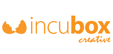
Incubox Logo Design Critique
Geoff submitted this logo for incubox, a graphic design and web development company. He left the following commentary about the logo.
“I came up with the name ‘Incubox’ after several days of trying names and seeing what domains were available. I started looking for variations of ‘(something)box’ as I was inspired by a commercial studio in LA called Smashbox... The egg represents the place where the idea derived and was released into the world. I like the egg concept, I'm just not sure THAT egg works. And on a practical level, when I try and make an avatar using the egg it doesn't work - too small. I would love to get some feedback on the logo because, frankly, I'm confused by it. Or rather, I'm not sure how to use it best. I'm frankly not sure if the composition I'm sending you should be considered the logo, or if I should drop the mark or the ‘creative’, etc. The three elements don't seem to tie in together well as one. In summary, I like the name incubox, I like the egg concept, but I'm not sure the logo represents well.”
The following critique is based on one designer’s opinion and experience. I always appreciate the readers thoughts as well. So, I’ll ask a question of two in the critique, please share your perspective in the comments at the end of this logo design critique.
Design Principles
I agree with Geoff that the three elements that make up the logo don’t work well together. The mark feels disjointed and the viewers eye doesn’t know where to focus. In the process the ‘incu’ part of the name tends to get lost because of its light weight. One possible revision might be to incorporate the egg concept/icon into the ‘o’ of ‘box’, thus creating a more unified and contained mark. Have you considered having the egg cracked instead of all the way open? Or maybe the egg could have a small hole in it with something starting to emerge (birth of an idea). Ultimately, I think the empty cracked egg may not send the appropriate message to the viewer. It’s almost as if the ‘idea’ has gone and there nothing more to offer.
Question for the readers
please respond in the comments below
How do you perceive the open and empty egg and the rest of the mark? How do you think the concept can be improved?
Functionality / Versatility
The logo is a single color, but in this case, I think the single color is contributing to the disjointed appearance of the mark. The viewer just doesn’t know where to let the eye settle. I see the word box and the egg having the same visual weight which is problematic. Perhaps a secondary color in the egg would allow for the eye to focus on the word ‘incubox’ instead. As it stands, the logo should reproduce well however, the script typeface may get hard to read at smaller sizes (like the current version of the logo on your website).
Does the Logo Work for the Audience?
The mark needs more work and refinement, it’s just not there yet. The concept of ‘birthing and releasing an idea’ is solid and can definitely work once the appropriate supporting visual and typography come together.
Typography
There is too much happening in the typography of this logo. You have the light weight ‘incu’ followed by the bold ‘box’ and then the script ‘creative’. All these different elements leave the logo feeling schizophrenic and unsettling. Introduce some unity and personality into the type. The mark is very static and lifeless in it’s current state. The concept of ‘life or birth’ should come through the whole mark.
Possible Improvements
Designing a logo for yourself or own business is one of the hardest logo designs you’ll ever work on. So what is the best way to improve the logo? Well I think have made some comments above that can certainly offer some direction. Here’s a list of actionable items.
- There is too much happening in this logo. Explore some solutions that eliminate all the different typefaces. One or two typefaces should be enough.
- Experiment with some different egg shapes and concepts (i.e., cracked all the open, still whole but a crack in the side, small hole in the egg with something emerging from it, etc)
- Create some life and personality in the mark.
Overall, I think you have a good start on the logo design. And with some refinement you can definitely improve it. Please know that my intention in critiquing your work is not to hurt feelings, but to offer constructive feedback. I hope it was helpful. Best of luck, to you!
I appreciate and welcome your comments, and look forward to hearing from you soon. I purposely don’t cover every possible improvement that can be made to this logo, so go for it if you think I missed anything. All I ask is that you keep your comments clean and appropriate.
Like what you read here? Subscribe to the Logo Critiques News Feed.
Enjoy this post? Share it with others.


The images & logos presented on this blog are copyrighted by their respective owners. The blog itself is copyright Erik Peterson, 2008-2026 All Rights Reserved.


We enjoy your comments
84 Comments so far. Keep 'em Coming.
#1
By Marc Swarbrick
08.05.2009 at 11:14 AM
How do you perceive the open and empty egg and the rest of the mark? How do you think the concept can be improved?
I think this is the beginnings of a concept. The open egg does convey the message but it looks like the idea has escaped! I’d probably explore what you could do with the ‘incubation’ concept. Maybe an egg in a box?
The script font should definately change. I’d maybe use the sans font ‘incubox’ in the bold weight and the ‘creative’ in light.
Less design elements = more simplicity, which would result in a more refined and polished product.
#2
By Geoff Towle
08.05.2009 at 01:48 PM
Erik-
I’m so glad you selected my logo for critique! I agree with everything you said. In fact, after submitting the logo I played with it some and one of the concepts I came up with was incorporating the egg in the “O” in “box.”
Thank you for the words of wisdom. Back to the drawing board!
Geoff
p.s. I’ll send an updated version some day. On that note, it would be cool to see updated (hopefully improved) versions of the logos you review.
#3
By Randy
08.05.2009 at 03:01 PM
Completely agree with Geoff. I would love to see updated versions of logos. Either revisit the original posts, or create a dedicated updated logo page.
#4
By Julie Cajigas
08.05.2009 at 04:10 PM
Alright, I’m gonna throw a few random ideas out there that I had when looking at the logo. I can’t promise that any of these will work out in the end, but you might have fun playing with them - and something genius could come of it!
(your playing, not necessarily my ideas).
1. What if you used the silhouette of a chick in addition to the egg? Maybe, it’s perched on the egg (the letter O is a great place to have the egg graphic, I concur), or maybe on one of the letters in inubox. Or, maybe it’s hopping away from incubox. The idea being that your company incubates and develops their great idea, and what you give back to them is the cute little chick of a well-formed, articulated idea.
2. Could the B in Box be capitalized and morphed into a graphic element. I’m thinking that the beam of the B is a box with two eggs in it (it would be turned on its side), maybe one is cracked open and the egg top is laying in front of the typeset word. The chick that has emerged can still be perched on the O or the X. In that case I would use one font for Incu ox, create the graphic on the B and use a separate font for creative in a different color. Because there is so much going on with incubox, creative could get lost otherwise.
3. Could all of the letters be sitting inside a box which is a different color than Incubox, and creative could be written on top of the box in white knockout? Then, the O could become a cracked egg. Maybe in this treatment, the chick is standing right on the edge of the box, about to head off into the big wide world?
Ok - just some ideas. Enjoy!
#5
By Julie Cajigas
08.05.2009 at 04:12 PM
P.S. I think I like the use of a chick because it has so many very positive associations like new birth, spring, freshness, cuteness…. etc. I know I would be drawn to a company that had something cute in their logo - and the cutest part of eggs incubating is the result .
.
#6
By Erik Peterson
08.05.2009 at 05:20 PM
@Geoff & @Randy,
Agreed. I’ve wanted to show updated versions of logos for sometime now, but haven’t been successful in obtaining them from the individuals. On 1 or 2 of the early critiques the designer/owner has posted an updated version in the comments (see Michael Austin Designs). I would prefer to get the new version and do a short write up about it. Hopefully we’ll make it happen in the near future.
Thanks for the comments all.
#7
By Julio Verani
08.06.2009 at 12:18 AM
Hi Geoff and lads!
Well, my first impression of your logo was a bit negative, as i saw the broken egg, just as Marc said. Here follow some of my ideas to help you:
1.Maybe you should try something funny, and by that, i mean something slightly funny, without losing the direction and becoming a comic brand. Maybe the type itself should be a bit more soft.
2.INCUBOX, maybe you should search for a related word for incubation, that delivers a more creative touch, since you’re selling creative work. (Just a thought!)
3.I understand that you work with creativity, but directed to what? I mean, maybe it’s important to tell your client what kind of professional you are: graphic, product, package, etc. Maybe this misterious touch can bring clients, but i guess that a more direct approach would show more results. Remember, design, creative and concept are the fashionest words of today’s world, and so, there are tons of creative, concept and design studios around. Find your own personality, translate it into adectives and explore the relations between them and the world in mind maps, then you can find the most creative representations of your personality to tell your clients that you are really unique, and not another “concept-creative-designer” in the market.
4.Just as marc said, leave the script or the sans, the two of them together rarely do a nice combination.
5.I know, i’m boring, but i think that if i give you ideas to use on the logo, in the end i�d be stitching around your work. I believe that telling you all this will help you not only to build a more unique brand, but to become a better professional by using some interesting creative techniques.
Best luck to you, and remember, design is 99% about transpiration and 1% inspiration.
#8
By Julio Verani
08.06.2009 at 12:24 AM
Just an append:
Forget your computer while in the creative process, it just block your speed and capacity. Get the good old pencil+paper set, sit on a table/desk and start drawing, don�t mind about lousy sketches, that’s what they�re for, to generate quantity. Go to the PC only to finish the quality alternatives you generated.
#9
By ewadowsky
08.07.2009 at 10:56 PM
I agree with Julio about the pencil and paper. Anytime I’m beginning to work on a logo, I’ll draw 5-10 concepts before I touch my computer..but once I find one I really like I’ll go to the computer (but never be afraid to go back to pencil and paper even after you started).
I love the idea of using the egg as the ‘O’ in box. At first I honestly didn’t understand why the egg was involved until I realized ‘incubation’. VERY clever. I agree with Erik in that you shouldn’t leave the egg cracked open and empty, it comes off as though what has been ‘born’ (your ideas), is already gone. Maybe have a beak breaking open the egg, somewhat like someone else had suggested.
I would make creative the same font as ‘incubox’, incorporate some of the blue that you have used on your Website.
Finally, think outside the box. Good luck.
#10
By anon
08.18.2009 at 11:59 AM
broken egg looks like boobs.. or a bra… just saying.
#11
By Geoff
08.18.2009 at 01:16 PM
Ha! That’s funny. Never occured to me. I always saw a rack of moose antlers, especially when downsized.
Thanks to everyone for taking the time to provide constructive criticism. Once I do get an updated version designed I’ll submit it.
#12
By Constantin
09.02.2009 at 09:37 PM
So this may be too late but I’ll post anyway - hoping someone is still reading this.
I don’t know how readable it would be - maybe too abstract but what if box is as box and thats it? that would bring everything a little closer together so it appears as one item rather than three.
incu[]
and drop the creative
#13
By Internet marketing company
01.11.2010 at 08:38 AM
Hello guys!
Very expressive logo designs and the web development too and moreover,Best luck to you, and remember, design is 99% about transpiration and 1% inspiration…
#14
By Projektowanie logo
03.23.2011 at 03:29 PM
i don`t like this
#15
By reklama koszalin
09.23.2011 at 07:55 PM
The egg concept is not very creative
#16
By asomedia.pl
05.26.2016 at 06:18 AM
Great post, good job! strony internetowe tarnowskie góry
#17
By divpt
10.30.2017 at 12:58 AM
very informative articles and all post…waiting for the next post
#18
By Findurings
04.03.2019 at 10:48 PM
The mark feels disjointed and the viewers eye doesn’t know where to focus. Find U Rings
#19
By lseodk
04.08.2019 at 04:57 AM
Nice article
#20
By Allen
11.18.2019 at 02:07 AM
The mark is very static and lifeless in it’s current state. The concept of ‘life or birth’ should come through the whole mark. MCD-Level-1 dumps
#21
By Fank
02.27.2020 at 07:08 AM
i have been trying to design a new logo for my pool business but im stuck any help would be appreciated New Orleans Pool Cleaner
#22
By johan smith
03.11.2020 at 09:12 AM
Very good write-up. I certainly love this website. Thanks! legal advisor
#23
By jacky
04.19.2020 at 08:02 AM
nice
Oxford moving company
removals Slough
#24
By jacky
04.19.2020 at 08:03 AM
thankyou for sharing moving company Telford
#25
By Charles
04.21.2020 at 10:46 PM
Hard to tell what the image is but I like the font! I’m a painting contractor in Fargo, not a graphic designer though.
#26
By John
04.21.2020 at 11:27 PM
nice work congrats on creating this. painter in Yakima
#27
By Tails
04.28.2020 at 05:22 PM
Call the experienced staten island electrician for wiring repairs.
#28
By Rolland Vega
05.12.2020 at 06:56 AM
The interesting fact is their motion suits for their logo. concretecontractorprosgastonia.com
#29
By Chya
06.26.2020 at 01:05 PM
Such a fantastic piece you wrote. electricians alexandria va
#30
By MateoJ
11.13.2020 at 02:17 PM
Thank you for the online
article, very structured knowledge.
#31
By mcihell blaken
11.14.2020 at 08:15 PM
Wow. nice info on logos. Thanks!
Concrete in Gastonia
#32
By michel ranks
11.14.2020 at 08:16 PM
The mark is very static and lifeless in it’s current state.
CBD Oil
#33
By connie b
11.14.2020 at 08:17 PM
Not a huge fan of it, but Its not horrible.
Locust insurance
#34
By bruitna bebr
11.14.2020 at 08:18 PM
Thanks for sharing.
Elderberry syrup for sale
#35
By Michel Rood
01.04.2021 at 08:50 AM
Really appreciate you sharing
truth or tradition jim staley indicted
#36
By Michael Ariel
01.19.2021 at 11:34 PM
I love it! Thanks!
#37
By Mickei Ruynnin
01.19.2021 at 11:35 PM
Great job! charlottegracecarpetcleaning.com
#38
By Tilly Racker
01.25.2021 at 07:11 AM
¿Me puede decir un poco más, por favor? https://guitarlessonsfresnoca.com
#39
By Gigi Smith
01.25.2021 at 07:16 AM
¡Gracias por la información! https://financialadvisortacoma.com
#40
By Tayla
03.11.2021 at 11:20 PM
Thank you. It was great to see useful information.
https://joinerynewcastle.com.au/
#41
By Sam Nuzbrokh
03.19.2021 at 07:08 AM
Thank you, This article vividly explained and easy to understand as an inspired businessman, you need to be more patient and in detail visually and strategically. Keep on posting!
I inpired to my norwalkdumpster.com, I feel overwhelmed to my costumers feedback and they really love the service.
#42
By johnlead
03.23.2021 at 01:18 AM
Interesting to see how you work, has actually helped and cleared the brain fog for me! Fantastic, thanks! Visit here bricklayinglakemacquarie.com.au/bricklayer-newcastle
#43
By jenrich
03.24.2021 at 03:39 AM
Thanks a lot for sharing this with all folks you really understand what you are talking approximately. Click here
#44
By James
04.09.2021 at 02:33 AM
Thank you for sharing such a wonderful article, please check out these Bricklayers Randwick has to offer!
#45
By Geoff
04.09.2021 at 02:34 AM
Thank you so much for taking the time to compose such brilliant content, please check out these launceston gardening experts!
#46
By Mark Rogan
04.13.2021 at 07:46 AM
It’s so cute and simple. The egg crack is also cute.
Just like the logo at the hood cleaning services near me
#47
By marktyz
05.05.2021 at 02:20 AM
This is such a great blog. Thank you for sharing your talent with everyone. You are an inspiration.
https://joinerynewcastle.com.au/
#48
By Chloe Smith
07.13.2021 at 04:44 PM
Nice work. My friend would be interested
#49
By Shirley
07.19.2021 at 09:20 AM
There are a lot of blogs over the Internet. But I can surely say that your blog is amazing in all. It has all the qualities that a perfect blog should have. www.okieconcrete.com
#50
By cheapvapejuice
03.22.2022 at 12:14 PM
“Great article” learn more about ‘la pool leak detection.
#51
By Sandy
06.13.2022 at 01:14 AM
Happily I had the option to track down your blog. It is exceptionally enlightening. Your expound up on logo designs is so astonishing. Very much made sense of! If you want some kelowna concrete contractors you should check the link.
#52
By Mona
09.20.2022 at 11:07 AM
Happily I had the option to track down your blog. <a >pool cleaning in kansas city</a>
#53
By David
12.18.2022 at 06:40 AM
It is not advisable to attempt ukwritings review without a strategy and wait for inspiration. Instead, they should begin with some introspection and brainstorming. They must next compile a list of everything they do aside from schooling.
#54
By marry68
12.29.2022 at 04:16 AM
This is an excellent article. I read this site every day, and it never ceases to amaze me!
#55
By bingo
12.29.2022 at 04:18 AM
We have a lot of fun playing different games available on the internet. run 3 is a very engaging and fun endless runner game that is loved by a lot of people, and I play it once every hour after work.
#56
By hena
02.24.2023 at 02:48 AM
a good logo should be versatile, drive mad meaning that it can be used across different mediums and platforms without
#57
By Bobby Rencher
04.10.2023 at 08:28 AM
This article is excellent! I appreciate you making it accessible. Surprisingly, I liked that! Your suggestions are excellent, wow! Sorry for changing the subject, but if you would like to sell my house fast dallas tx, please visit the link included in this message.
#58
By Shane W.
04.24.2023 at 06:29 PM
Oh wow what a great design, I am definitely interested in learning more about doing this. www.dumpsterrentalwinnipeg.com
#59
By Shannon
04.24.2023 at 06:33 PM
I have really enjoyed spending time here to help improve my design skills, I was lacking for awhile but now that I have somewhere to learn and grow my skills I have gotten a lot better with design projects. -Shannon, basement renovations
#60
By Tony Howell
04.24.2023 at 06:37 PM
Excited to learn more here, thanks for a quality resource.
-Tony, flooring contractors
#61
By Lance V.
04.27.2023 at 01:12 PM
Great to read this. Thanks.
bathroomrenovationsoshawa.com
#62
By Neil
05.17.2023 at 06:38 AM
This blog is great and has some really interesting information. Thanks so much and keep up the good content! From stamped concrete scottsdale az
#63
By Malcolm
05.17.2023 at 08:00 AM
Great post! Keep up the good content this was a very interesting read. thank you! concrete driveway cary nc
#64
By Justine
05.24.2023 at 04:06 AM
The logo only has one color, yet in this instance, I believe the color is adding to the mark’s jumbled appearance. Simply put, the spectator is unsure of where to let the sight rest. See: www.flashpartyphotobooth.com/prom
#65
By Digital Marketing Agency
06.01.2023 at 05:41 AM
Digital marketing utilizes a wide range of channels and platforms, including search engines (such as Google), social media platforms (such as Facebook, Twitter, and Instagram), email marketing, content marketing, display advertising, mobile apps, and more
#66
By SEO
06.14.2023 at 03:39 AM
SEO is the process of optimizing your website to rank higher in search engine results pages (SERPs)
#67
By Ames
07.03.2023 at 04:12 PM
I love this site!! painters Ames, IA
#68
By Gyms World
07.04.2023 at 04:43 AM
GymsWorld, a leading fitness center, aims to revolutionize the way people approach their fitness goals. In this ultimate guide, we’ll explore how can help you achieve your fitness goals and lead a healthier life.
#69
By totomargin
07.05.2023 at 02:24 AM
I came here because my friends recommended me how good this article is. There is priceless information that I have found. I will also recommend to my relationship. https://totomargin.com
#70
By Minia
08.15.2023 at 05:14 AM
I’m impressed by the thoroughness of your content. It covers all aspects of the topic. Milton Concrete Services
#71
By lindamartn15
08.22.2023 at 02:19 PM
I admire what you’ve accomplished here. I like how you say you’re doing it to give back, but based on the responses, I’m guessing it’s also working for you.
credit repair fort worth
#72
By Trisha
09.05.2023 at 06:40 AM
Extremely decent blog! I would like to thank you guys for sharing such a fantastic blog. Residential Window Cleaners
#73
By Edgar M Rood
12.27.2023 at 12:07 AM
Sangat mengagumkan, teruskan berkarya! Suka banget sama fitur uji coba tes di Klik Tes, keren.
#74
By Regina F Posey
03.12.2024 at 01:28 AM
Tu blog es un testimonio de tu pasión y dedicación por compartir contenido valioso. Experimente la emoción de hacer clic rápido con Clics Por Segundo: ¡pruébelo ahora!
#75
By KenyettaPesso
06.07.2024 at 10:32 PM
Paris is a city that hardee’s breakfast hours captivates with its charm and elegance.
#76
By porno dla dzieci
10.05.2024 at 04:57 AM
The sound of the shower echoes throughout the empty house. The bathroom door is open. He knows he has privacy. He is alone. No older brother. No father. Or mother. It is just him. “Was it because of that?” His dad asks as he points a finger towards him. And his midsection.
#77
By Kenyetta
10.05.2024 at 11:00 AM
The attention to bob clothing store sustainability here is impressive.
#78
By Justin
10.08.2024 at 04:53 AM
Justin
#79
By Corey Hamilton
10.30.2024 at 01:26 PM
Amazing post! We at
Air Duct Cleaning Evanston IL specializes in this kind of article. If you want to read something similar to this, pay us a visit at Air Duct Cleaning Evanston IL
#80
By TCI Express
04.04.2025 at 04:58 AM
Thanks for sharing such insightful information. TCI Express truly stands out as the best air logistics company, offering fast, secure, and efficient air express and cold chain transportation services. To all readers, explore TCI Express for seamless logistics and real-time consignment tracking!
best express logistics company |
best logistics company
#81
By Ahtisa Lee
05.02.2025 at 07:27 AM
Good job! Amazing post! www.anthonywayneroofingandconstruction.com
#82
By Orlando Custom Railings
08.25.2025 at 03:15 PM
I like the concept, but the logo needs more unity—maybe simplifying the typography and reworking the egg idea would help.
#83
By Sprunki
12.23.2025 at 04:22 AM
Hey Geoff, thanks for sharing your logo! I agree, the “Incubox” name is quite catchy. The egg concept is interesting, but I understand your concerns about its scalability and overall integration with the rest of the design. It might be helpful to explore different egg styles – perhaps something more abstract? Or, you could try incorporating the egg into the “Incubox” text somehow. Thinking outside the box (or should I say, Sprunki box?) can really help! I’m curious, have you experimented with different color palettes?
#84
By Chapio
03.21.2026 at 01:44 PM
While looking for details about starburst, I found a review on https://cardmates.net/demo-sloty/starburst
where the slot is explained clearly. The article describes the main features and gameplay mechanics. It helps to understand how the game works. A useful overview of starburst.