Michael Austin Designs Logo Design Critique 48
Categories: CritiquesMarketing & Design
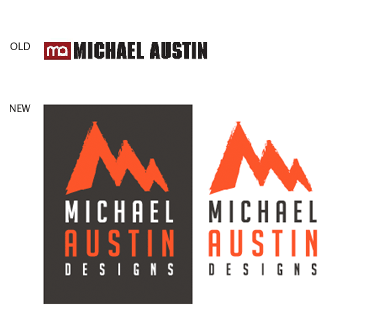
Michael Austin Designs Logo Design Critique
Mike submitted this logo redesign for his design company. He had the following to say about his new logo,
“This is my revision to my previous logo. I wanted to add more of an an artistic flair to the design. My initials are used to create mountain bringing a strong presence to the logo. The mountains are drawn with a paint brush effect. The font I used is BigNoodleTitling,this font is “firm”, but not overbearing to the overall logo.”
The following critique is based on one designer’s opinion and experience. I always appreciate the readers thoughts as well. So, I’ll ask a question or two in the critique, please share your perspective in the comments at the end of this logo design critique.
Design Principals
The redesigned logo for Mike’s company is certainly an improvement over the old. The old logo felt disjointed and amateur, while the redesign feels more current and balanced. The repetition created by the alternating colors of the logo creates balance, although the red really brings ‘Austin’ to the foreground. Have you tried ‘Michael Austin’ as one color and the remaining elements in an alternate color in order to give your name a more unified look? You could also consider deemphasizing the word ‘design’ even further to bring out your name.
Functionality / Versatility
The logo is functional and versatile. It is clear that Mike has thought through how to use his new mark on both light and dark backgrounds. This mark will also work in one color and should scale well.
Does the Logo Work for the Audience?
The new logo feels very much like an outdoors company. The North Face and REI are the first two that come to mind. This is a little troubling since your company is doing design. Maybe you live in a mountainous area and this makes sense for you company, but with the details I have, the logo doesn’t communicate design well. Meaning, with a quick glance your logo could look like some kind of outdoors company as opposed to a design company.
Question for the readers
please respond in the comments below
What was your impression when you first saw the logo? What kind of company did you think the logo represented?
Uniqueness
Incorporating your initials into a shape representing a mountain is unique, but I am lost as to the ‘why’ a mountain (see #3 in 10 Mistakes Designers Can Make When Designing Logos). It took me a while to see that the mountain was made up of your initials. Actually, I didn’t see it until I read your description the second time. If you stick with this idea I would suggest reworking the graphic to make a stronger reference to your initials in the mountain graphic. You could start by creating a small separation between the ‘m’ and ‘a’.
Typography
The typeface selection is modern and clean and compliments the mountain graphic appropriately. However the inconsistent letterspacing is bothersome. The word ‘design’ being the most problematic while the word ‘Michael’ looks good. I understand your were trying to create a ‘block’ of type where each line matched a certain width. Perhaps, you could consider making the letterspacing consistent in each word and the working out something else to create the ‘block’ look (i.e., maybe ornaments, or a containing shape).
Question for the readers
please respond in the comments below
Do you have any suggestions on how Mike could improve the typography in his logo?
Possible Improvements
Designing a logo for yourself or own business is one of the hardest logo designs you’ll ever work on. So what is the best way to improve the logo? Well I think have made some comments above that can certainly offer some direction. Here’s a list of actionable items.
- Experiment with the color choices within the logo. Try making your name all one color and the remaining elements another.
- Revise the mountain ‘MA’ monogram to more clearly show your initials. Currently, it looks more like a mountain than your initials.
- Is the outdoors feel that your logo creates appropriate for your company and your audience? If not, consider tweaking the design to more clearly communicate the message you want to send.
- Adjust the letterspacing of ‘Michael Austin Design’ to make it more consistent.
Overall, I think you have a good start on the logo design. You have made some big improvements when compared to your previous logo. With some refinement you can definitely improve this version too. Please know that my intention in critiquing your work is not to hurt feelings, but to offer constructive feedback. I hope it was helpful. Best of luck, to you!
I appreciate and welcome your comments, and look forward to hearing from you soon. I purposely don’t cover every possible improvement that can be made to this logo, so go for it if you think I missed anything. All I ask is that you keep your comments clean and appropriate.
Like what you read here? Subscribe to the Logo Critiques News Feed.
Enjoy this post? Share it with others.


The images & logos presented on this blog are copyrighted by their respective owners. The blog itself is copyright Erik Peterson, 2008-2026 All Rights Reserved.


We enjoy your comments
48 Comments so far. Keep 'em Coming.
#1
By Julie Cajigas
05.11.2009 at 12:37 PM
I liked the logo and didn’t mind the “mountains.” Without reading anything, I was able to surmise that Michael owned a design firm, just by virtue of the logo consisting of his name and the word design predominantly (indeed exclusively) in the type.
To me mountains conjure the idea of strength, stability, ruggedness and climbing to the peak - “reaching the top.” I think if these kinds of words describe your firm or your work, the mark can really work for you. Is there a tagline that you can addend to the logo in some uses that brings these characteristics to light?
“Climbing to Creative Heights”
“Helping our Clients Scale The Creative Landscape”
“Reaching the Peak of Visual Communications”
“The Pinnacle of Creative Communications”
(you know, stuff like that )
)
If it can become a part of your branding overall, it will make sense and become more memorable to your clients.
I think there are a few options to help the mark make more sense with the typography:
1. Consider aligning the M and A of your name in a position where they echo the shapes in the mountain mark. Right now it’s hard to make a connection between the mark and the initials because the alignment doesn’t allow our eyes to make a shape relationship. (Of course changing that will change your typography significantly - which might have the added benefit of fixing the spacing issue).
2. Consider a similar font that makes a more direct relationship between the mountain shapes and the type. The M relates well, but the rounded A doesn’t.
3. Another way to help us make the relationship between your initials and the mark would be to bar the A in the mountains. A little unexpected, but it might produce a visually interesting result. I’d consider giving it a shot.
4. The spacing doesn’t bother me as much as it does the poster, but I think it’s especially problematic because it’s not that far from aligning. The last four letters almost align with the text above. I would definitely work on it. Too bad your business name isn’t “Michael Austin Design.” That would be much easier to space .
.
All in all, I agree that this is a strong concept and if you stuck with it as-is, would be a pretty good logo. I do think you can play a little bit more with the mark/type relationship to get some even better results.
Sorry for the long winded critique!
#2
By Tim Schmidt
05.11.2009 at 05:48 PM
Hey Michael-
At first glance, I like it. Very strong and recognizable. But it struck me right away as an “outdoor adventure” company. That’s not a bad thing, but if you’re in New York City (vs. Denver) it might not feel appropriate or comfortable to your client base.
I agree with Julie C. on selecting a different font that uses sharp angles for the “M” and “A”. And maybe do something handwritten with the word “designs”.
Also, very nit-picky here, I feel the mountains need to lean ever-so-slightly to the right. Just a slight skew. It feels “left heavy”.
Good luck!
#3
By Michael austin
05.12.2009 at 07:46 PM
Thanks everyone for taking the time to help
me out with my logo. I took everything said here
and redesigned my logo. I does look like an outdoorish
company.
This is what I came up with.
http://www.logocritiques.com/images/uploads/comment_images/mikeAustin_rev.png
#4
By Tim Schmidt
05.13.2009 at 01:50 AM
I like it alot. Strong, contemporary, and cool. You have a great new symbol (the intersecting M and A) that you can do alot with by itself. Nice work.
#5
By Julie Cajigas
05.20.2009 at 02:04 AM
I like the new logo a lot - the only thing I miss is the organic look of the M & A in the original. Can you recapture the organic feeling to offset the very clean geometric look of the type and the line on the outside?
Otherwise, I think the redesign is generally a lot stronger than the original.
#6
By Alejandro Diaz
05.27.2009 at 03:19 PM
Love the inmprovement you made to the previously submitted logo. The M & A wordmark looked a little dated, from early 1990s.
Regarding your latest entry, good color choice. I like the constructivist feeling you added to it. It is always a good thing to see some graphic design history background in a designer’s work. The only thing I would take care of would be the consistency in stroke weights for each letter. I think it’d be great to see the same stroke weight on letters H, A, E, L, T so they won’t look like they had been stretched arbitrarily.
Saludos from Guadalajara, Mexico!!
#7
By organizein
06.02.2014 at 01:40 AM
For recognition of any company, is logo becomes a crucial visual advert in order to permeate through the brains of your customer and register your brand in it. And when it comes to a logo of a company which designs logos, the artistic approach becomes complex. This new logo do looks good.
#8
By Ely
04.25.2020 at 03:33 PM
The redesigned logo is awesome Michael. Nowadays, you can design this kind of logo easily. You don’t need to learn how to use computer without Keyboard in Windows 10 using onscreen keyboard. All you need is Canva.
#9
By Mike
05.07.2020 at 05:48 PM
Love this logo, great job!!!
Drywall Company
#10
By tj52
01.13.2021 at 06:26 AM
You can use our zipjob to get a great resume to achieve new career heights in 2021
#11
By Alice Viejo
04.09.2021 at 05:45 AM
The logo looks great! Love the new look. I am also finding reference for my concrete work.
#12
By Richard Stevenson
05.17.2021 at 06:05 AM
Cement mixed with fine aggregate produces mortar for masonry, or with sand and gravel, produces concrete.
concrete services
#13
By Allen
05.31.2021 at 06:58 AM
Revise the mountain ‘MA’ monogram to more clearly show your initials. Currently, it looks more like a mountain than your initials. Oracle 1z0-819 Exam
#14
By Patsy
08.02.2021 at 12:00 PM
Do your research at Google
#15
By Werneree Granadosotte
08.22.2021 at 05:58 AM
Hey there mate, I wanted to say thank you for sharing this awesome article on “10 Mistakes Designers Can Make When Designing Logos” - this is definitely a great help for those people who are looking forward to start their designer career. Check this guide how to play dragon city online for PC - this game offers so much fun and you will surely enjoyed it. Read more details about the cool features of Games.lol website
#16
By trantongray
01.01.2022 at 03:09 PM
You have some real insight into the things you write about. I like your writing style. https://www.amazon.com.au/dp/B09M5G164R
#17
By trantongray
01.10.2022 at 10:53 PM
There couple of fascinating points in time here but I do not determine if every one of them center to heart. There exists some validity but I am going to take hold opinion until I explore it further. Very good post , thanks and that we want much more! Included with FeedBurner as well billing software
#18
By trantongray
01.28.2022 at 08:11 AM
I’m a blog crazed person and i love to read cool blog like yours . cbd packaging uk
#19
By trantongray
02.03.2022 at 10:58 PM
It’s hard to find knowledgeable folks during this topic, but you could be seen as guess what happens you are discussing! Thanks Визни центар за Турску
#20
By trantongray
03.16.2022 at 05:05 PM
I together with my buddies were found to be analyzing the great key points from your website while suddenly got a horrible suspicion I had not thanked the blog owner for those secrets. These boys were definitely consequently happy to read through all of them and have in effect extremely been using these things. Appreciate your really being well accommodating and then for obtaining such terrific useful guides most people are really wanting to learn about. Our own sincere regret for not saying thanks to you sooner. happyluke.casino
#21
By David
12.18.2022 at 06:36 AM
The review panel for admittance is not interested in one’s past behavior https://essaysservicesreviews.com/proessaywriting-review
#22
By David
12.18.2022 at 06:38 AM
The review panel for admittance is not interested in one’s past behavior essaypro
#23
By Ramona
01.19.2023 at 01:35 AM
Your point of view is the most compelling among many. I really appreciate your writing skills. I’ll confess that this piece’s writing style kept this novice reader interested. On a website where dice are rolled, I also have a blog. To visit the d10 dice roll blog and share your thoughts.
#24
By hena
02.24.2023 at 02:46 AM
a good logo should be simple, recognizable, and easily identifiable. Garten Of Banban This means that it should be easy to read and understand, even when viewed from a distance or at a small size.
#25
By Guadalupe Parnell
03.21.2023 at 07:01 AM
Paving contractors in Tauranga offers a range of services, from installing new paving to repairing and restoring existing surfaces. Here you check this paving contractors Tauranga and get more new ways for construction. With years of experience and expertise, these professionals can help transform any outdoor space.
#26
By Ken
05.24.2023 at 06:02 AM
The sleek, straightforward typography complements the mountain imagery effectively. See: https://www.spartanconcretepros.com/
#27
By zetisno zetisno
08.11.2023 at 03:08 AM
In the unfortunate event that crossover grid your card is lost or stolen, you can quickly report it and prevent any unauthorized transactions.
#28
By Bekean Loinse
08.15.2023 at 10:13 PM
The author’s fnf game expertise shines through every word of this article, making it a valuable companion for anyone seeking personal and professional growth.
#29
By Roy
08.29.2023 at 04:06 AM
Thanks for sharing this information which useful and provides an insight.
Cégeladás honlap áll a rendelkezésére, amennyiben befektetőként vagy cégvásárlóként eladó cégek adequit adásvétele iránt érdeklődik.
#30
By Kelly M Hedge
11.18.2023 at 03:50 AM
Your blog is my go-to for inspiration; your passion for the subject shines through. Kudos for making cps testaccessible for everyone; your step-by-step guides are fantastic to improve my click test speed.
#31
By Amber
12.01.2023 at 02:09 AM
This post is very cool! Thank you for sharing the knowledge! In case you are interested in the celeb height wiki information and news, it’s our pleasure to have you visit our website.
#32
By Carlos K Castillo
01.02.2024 at 01:10 AM
We express gratitude to our diverse contributors, adding depth and richness to our content. Impressed by the accuracy of this Reaction Time Test; it’s a useful tool for measuring and boosting brain reflex speed.
#33
By zetdtisno
03.04.2024 at 11:41 PM
with great power comes great 2048 cupcakes responsibility, and the gaming industry is not exempt from scrutiny.
#34
By Margaret J Baxter
03.11.2024 at 06:09 AM
Tus ideas siempre me invitan a la reflexión y me dejan con una nueva perspectiva. Descubra el placer de hacer clic rápido con CPS Test: ¡pruébelo ahora!
#35
By zapatas
05.15.2024 at 11:02 PM
I’m continually amazed by zapata mexican restaurant your ability to tackle complex problems with ease. Your analytical skills are truly outstanding.
#36
By Robert
08.12.2024 at 04:43 AM
Aprecio tus consejos prácticos y el impacto positivo que tienen. Tu blog me motiva e inspira constantemente. ¿Qué tan rápido puede hacer clic? Descúbralo con Contador De Clicks, la herramienta perfecta para probar y mejorar su velocidad de clic para un mejor rendimiento en el juego.
#37
By palm
08.28.2024 at 07:22 AM
I appreciate the pink palm puff eco-friendly materials used in this hoodie.
#38
By fully paid tracksuit
01.18.2025 at 02:22 PM
Great blog post! I love how you’ve stressed the rearmost fashion trends, also mention fully paid tracksuit. fully paid tracksuit are a fashion-forward choice. With their distinctive designs and premium materials, they’re a stylish designs that offers both comfort and a touch of luxury.
#39
By kayali perfume
01.18.2025 at 02:23 PM
Great blog post! I love how you’ve stressed the rearmost fashion trends, also mention kayali perfume. kayali perfume
#40
By vale clothing
01.18.2025 at 02:26 PM
Great blog post! I love how you’ve stressed the rearmost fashion trends, also mention vale clothing. vale clothing is a fashion-forward choice. With their distinctive designs and premium materials
#41
By Ostrich Boots
01.19.2025 at 01:04 AM
Great blog post! I love how you’ve stressed the rearmost fashion trends, also mention Ostrich Boots. The combination of style and comfort in these shoes is truly remarkable.
#42
By deutsch
02.03.2025 at 03:00 AM
Es ist erstaunlich, deepseek wie schnell sich die KI-Technologien entwickeln.
#43
By Geometry Dash
04.09.2025 at 08:16 AM
Whether you’re trying to clear your first level or attempting a demon-level challenge, one thing’s for sure: Geometry Dash isn’t easy—but it is unforgettable.
#44
By broli
02.03.2026 at 01:10 AM
As a huge fan of Geometry Dash, I was pleasantly surprised by Geometry Lite on geometry-game.io. The one-click control is smooth, and the music syncs perfectly with the levels. The practice mode with checkpoints is a lifesaver for tough segments—I couldn’t imagine finishing the Demon levels without it.
#45
By Steven
04.07.2026 at 07:39 AM
Great post, I liked how detailed the critique was without being confusing. I used a Mouse Click Speed Test recently. It shows your clicking speed and lets you notice progress in speed and consistency every time you practice.
#46
By chanchal rani
04.30.2026 at 01:14 AM
Our service transforms hidden desires into sweaty, breathless reality every time. Ghaziabad Escort specializes in intimate bold adventures where physical pleasure meets emotional trust. We ensure every 18+ encounter leads to explosive orgasm wrapped in genuine warmth. No judgment, only authentic connection. Let us turn your fantasies into unforgettable memories. Real passion lives here—daring, discreet, and deeply satisfying. Start your journey now.
#47
By Henry Bevan
05.14.2026 at 09:30 PM
Hey Mike, thanks for sharing the redesign! I like the concept of using your initials to form a mountain range – that’s a clever idea. The paintbrush effect is a nice touch too, giving it a more personal feel. I’m wondering if BigNoodleTitling is the perfect fit though. It does feel firm, but maybe something slightly more modern would balance the artistic mountain peaks nicely. My Granny used to say “simple is the best”, perhaps consider cleaner lines.
#48
By run 3
05.25.2026 at 04:44 AM
In Run 3, you run through a bunch of tunnels that look different each time. The floor can go away, the tiles can break, and gravity can bend in strange ways. To get to safe places, you can run on walls and even the roof. You can unlock many characters, and each one has its own special skill. Running 3 is fun to play because it has both fast-paced and puzzle-like parts.