NeonKids Logo Design Revisited 154
NeonKids Logo Design Revisited
Back in April I critiqued a logo for a kids group called Neon Kids. Phil (the designer) got in touch with me recently to let me know he had made some changes to his original concepts based the critique here and feedback from the commenters.
From the Designer (Phil)
First off, thanks to all the great Logo Critiques readers who commented on the review of the Neon Kids logo! It has been about three months since the critique was posted. Since then we’ve done quite a bit of work on the logo — including a ton of research, incorporating some very informative user feedback, and of course, we spent lots of time in Adobe Illustrator CS4.
After the critique I went to Barnes & Noble, and like a true creep sat down in their children’s section with a pile of well illustrated children’s books. I flipped through them, occasionally snapping a photo of an especially well illustrated page or type I liked.
We also spent a bit of time doing research on fonts and playing with different type treatments that felt kid-friendly, as well as parent approved. It was important to realize that while the logo had to be appealing to kids, it also needed to portray “we are very professional and will indeed keep your kids safe”.
We ended up purchasing the Burbank Family from House Industries, and it was well worth the price tag of $300.

Once we had two versions of the logo worked out to a somewhat final state, we showed them to a select group of children and parents. Each group liked different things about the logos, but they both chose the same logo in the end.
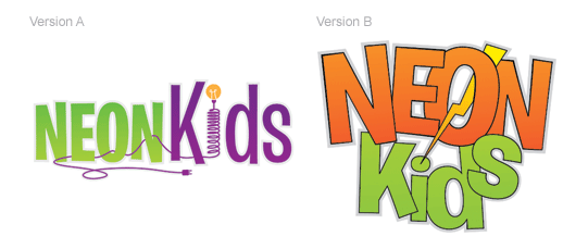
Version A of the logo was a little more playful and fun. However, version B was stronger and more energetic, which is what the kids, parents, and Neon Kids staff were looking for.
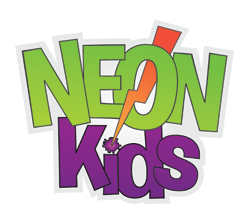
With a final logo chosen, I made a few minor tweaks, and that resulted in the logo they are using today.
Great job Phil! I think you have made some great improvements. I’m glad to see you did your research and listened to feedback. So what do you guys think?
Like what you read here? Subscribe to the Logo Critiques News Feed.
Enjoy this post? Share it with others.


The images & logos presented on this blog are copyrighted by their respective owners. The blog itself is copyright Erik Peterson, 2008-2026 All Rights Reserved.


We enjoy your comments
154 Comments so far. Keep 'em Coming.
#1
By Fbanczak
09.10.2009 at 06:17 PM
I think this is a vast improvement to the original designs. The closeness of the letters bothers me a little bit but the fact that you picked a fun/funky font with CLEAN EDGES makes the look work. The bright green and purple are terrific colors for this logo. I think you’ll find it to be far more versatile than your first round of logos. Great job!
#2
By Bullardino
09.15.2009 at 06:20 AM
I really like it. Makes me think of the the children tv channels logos.
#3
By linko
09.17.2009 at 08:27 AM
Very interesting design concepts. I think the color combination is really good.
#4
By imac
10.03.2009 at 04:29 AM
Great post. i like it. thanks!
#5
By SmykReloaded
10.06.2011 at 12:57 PM
Please i am new in the game and i need a link to download graphic software that i will use to create loggos and designs.
#6
By divya
05.16.2017 at 03:36 AM
Nice post thanks for sharing info..very informative article
#7
By Androdumpper full apk
10.23.2018 at 12:20 AM
Awesome post about also check it Blog!
#8
By Justin Ruark
02.21.2019 at 05:13 AM
Awesome post about also check it Blog! https://moviebox.tips/apk/ and https://videomix.software/apk/ and https://youtvplayer.live/apk/
#9
By Andy
03.10.2019 at 12:14 PM
Thanks, loved this reading! reminded me of the time I went to the Western Wall and sew all the Hebrew logos there.
#10
By James Crews
03.15.2019 at 01:34 PM
it’s nice blog i am sharing my website How to Download Mobdro Latest 2.1.14 for Android APK and for PC and Lucky Patcher Original APK 8.0.5 (Latest) How to Download for Android and Crackle – Free TV & Movies 5.0.0.0 (Android 4.0+) APK How to Download
#11
By Blossom
03.19.2019 at 04:20 PM
Thanks, admin for this helpful article. Check this out
#12
By seoers
04.03.2019 at 10:54 PM
It has been about three months since the critique was posted. Wholesale Ray Ban Sunglasses
#13
By mary
05.04.2019 at 07:11 AM
great post.
#14
By anna
05.04.2019 at 07:13 AM
Logo Critics is an excellent site. The aim of the site is to help logo designers to create powerful logos by the opinion of the browsers. In this article, truck accident attorney los angeles they discussed the logo design of NeonKids. The logo of NeonKids is really a good one.
#15
By Randy Wright
06.03.2019 at 03:51 AM
I like the logo. I show how creative the kids are. inline water descaler
#16
By Glen Owens
06.07.2019 at 01:10 AM
Awesome logo! It depicts how active the kids are. It was like designing for a Digital Marketing Company.
#17
By Brielle Luna
07.07.2019 at 11:33 PM
I miss simplicity of logos just like this one, but very attractive!
beard trimmer
#18
By Glen Owens
07.10.2019 at 02:42 AM
Awesome logo! Very straightforward but attractive.
Cincinnati SEO Agency
#19
By Lewis Kyle
08.30.2019 at 07:01 AM
I like the way you design the things, keep it up!
https://tokfollowers.com
#20
By Lewis Kyle
08.30.2019 at 07:02 AM
https://tokfollowers.com
#21
By Morningstar
09.19.2019 at 08:45 AM
Nice improvements. You really know how to enhance a simple design. I hope one day I can talk to you so that you can enhance our logo.
Luce | harrisburgphotobooth.com
#22
By Gian Carlos
09.25.2019 at 09:10 AM
Loving that design! That’s so cute and simple.
Gian | http://www.southstargranite2.com
#23
By Peter
11.26.2019 at 01:00 PM
Nice logo design! hvac services santee hvac services san diego hvac services chula vista
#24
By Jasmine
11.28.2019 at 01:52 PM
Wow! nice logo design. https://www.makeuseof.com/
#25
By Marloue Lark lluch
12.10.2019 at 10:59 PM
Nice logo design!Great work kids. keep it up.
www.seo-tampa.org/
#26
By eva marcin
12.25.2019 at 03:01 AM
do you love shopping? check out here, necklace for women with the best prices ever
https://aixonne.com/l/necklace.html
#27
By James
01.07.2020 at 06:27 PM
We could really use an awesome logo like this too. stucco repair riverside
#28
By Yeh Rishta Kya Kehlata Hai
03.25.2020 at 07:32 AM
Khatron Ke Khiladi is all set to come up with the new season very soon.
based television reality show has completed their 9th season successfully.
#29
By Steven
04.18.2020 at 07:14 AM
Looks good. I think I need a good design for my business.
#30
By jacky
04.19.2020 at 07:50 AM
nice
tree removal harrogate
edinburgh trees
#31
By Raymond
04.21.2020 at 10:41 PM
Nice logo from a Bozeman fence contractor
#32
By Vicki
04.21.2020 at 11:23 PM
Nice work! reminds me of an old cartoon TV Channel logo. painting contractor in Tacoma
#33
By luigi
04.28.2020 at 05:00 PM
Our long island electrician is here to resolve your lighting needs
#34
By Bigg Boss 14 Online
05.21.2020 at 07:20 AM
After Bigg Boss 13 new season Bigg Boss 14 is just going to start in October 2020
doors for the commoners with only a few celebrities being part of it.
#35
By Movierulz
06.01.2020 at 12:43 PM
Yomovies is the one of the top rated site that offers online free movies, video content that viewers can watch on this webpage. From being most
#36
By Radha Krishna
06.06.2020 at 08:19 AM
Lord Krishna and Radha share pure love for one another but things take
a turn when Radha receives a curse that she will be separated from him.
#37
By The Pink Dumpster
06.24.2020 at 07:33 AM
3039 Turner Church Rd
McDonough, GA 30252
404-985-1163
www.thepinkdumpster.com
Mon-Fri 7am-6pm Sat 8am-1pm
The Pink Dumpster is a local provider of roll-off dumpster services. We pride ourselves on fast, reliable, and affordable disposal options. We are proud to serve our local community and beyond.
#38
By Alex
06.26.2020 at 01:01 PM
This is so fantastic! electrician alexandria
#39
By asif raza
06.30.2020 at 10:57 AM
Ishq Mein Marjawan is a Indian Drama Season 2
Are Coming Up Too Soon. On Aired In after Few Day’s At Colors Tv.
Ishq Mein Marjawan2 Online
#40
By Yeh Rishta Kya Kehlata Hai Online
10.14.2020 at 10:11 AM
rom some members of Yeh Rishta Kya Kehlata Hai members testing
positive for the novel Coronavirus to makers of Kaun Banega Crorepati
Yeh Rishta Kya Kehlata Hai Online
#41
By Movierulz 2021
10.28.2020 at 10:23 AM
Movierulz Telugu is a movies piracy site, it allows to download
Hollywood, Tamil, Telugu Movies. Movierulz Telugu gives you the
Movierulz 2021
#42
By among
11.05.2020 at 04:18 PM
Great Article!!
#43
By Sara
11.05.2020 at 04:20 PM
Nice article!!
amongmod
#44
By Ghum Hai Kisi Ke Pyar Mein
11.09.2020 at 05:36 AM
Trapped between the past and the present, will he find love beyond the chains
of duty? Watch Ghum Hai Kisikey Pyaar Meiin - Hindi Romance serial on Disney+
#45
By FastDrama
11.24.2020 at 03:51 AM
FastDrama is (Korean Drama); 검법남녀 시즌2;Which plays Investigation
Partners Season 2;Investigation Couple Season 2;Gumbeobnamnyeo 2
#46
By Raleigh IT Service
11.28.2020 at 04:32 AM
Pretty great post. Managed IT Services Raleigh
#47
By Anupama Online
11.29.2020 at 05:13 PM
anupama is one of the pioneering show revolving around the story of
middle aged women unlike the mushrooming romantic serials with young
Anupama Online
#48
By Desi Serial
12.01.2020 at 06:13 AM
Welcome to DesiSerials. we provide hindi tv top favorite tv shows
Online free star plus colors tv provider reviews on voot and hotstar
#49
By David Gate
12.04.2020 at 05:48 PM
I really liked this movie creator for my kids. And upon checking their logo, my kids would definitely be attracted to this logo. And if you want your texture wall to be repaired. Just click the link.
#50
By Desi Serial
12.06.2020 at 10:59 PM
Desi Serial, Desi TV Box Watch Online All Indian TV Shows, Dramas, Serials,
and Reality Shows online. Visit us for your daily dose of entertainment
Desi Serial
#51
By Anupama Latest Episode
12.07.2020 at 06:31 AM
Anupamaa sacrificed a lot to become a loyal wife, a devoted
only to be disrespected in return. After the bitter realization
Anupama Latest Episode
#52
By Kasauti Zindagi Ki
12.26.2020 at 04:42 AM
I would never have thought of on my own. Your content gives readers things to think about in an interesting way.
Pinjara Khubsurti Ka
#53
By Jems
01.03.2021 at 12:24 AM
Great Content and thanks for sharing
#54
By Hub
01.03.2021 at 12:27 AM
Great Contant Visit Here : https://codingpedia.in/
#55
By Jack
01.03.2021 at 12:34 AM
Great and thanks for sharing Vist Here : CodingPedia
#56
By Scott Zoeerd
01.05.2021 at 06:09 AM
Energy Services is one of the busiest oilfield services companies working today, and we reward our professionals with a very competitive total rewards package,
equipment rentals
#57
By samantha
01.12.2021 at 07:23 AM
thanks for this site
#58
By Tilly Racker
01.25.2021 at 07:06 AM
Hahahah! Esto fue bien dicho! https://bestguitarlessonsdallas.com
#59
By Gigi Smith
01.25.2021 at 07:07 AM
Creo que necesito más información https://cabinetslubbocktx.com
#60
By Ghum Hai Kisi Ke Pyar Mein
01.28.2021 at 08:36 AM
Ghum Hai Kisi Ke Pyar Mein Hindi Desi Serial watch online. Ghum Hai Kisi Ke Pyar Mein
hotstar free episodes watch online in hd.
Ghum Hai Kisi Ke Pyar Mein watch online
Ghum Hai Kisi Ke Pyar Mein Full Episode
Ghum Hai Kisi Ke Pyar Mein All Episodes
Download Ghum Hai Kisi Ke Pyar Mein
Ghum Hai Kisi Ke Pyar Mein watch Live
#61
By Bernice Leanard
02.16.2021 at 05:35 AM
Great advicce for small business at home and reference.
commercial steam cleaning
#62
By Hilda
02.20.2021 at 10:24 AM
Do you know where can I sell runescape 3 gold fast?
#63
By carl james juevesano
03.22.2021 at 08:41 PM
Is this the brand of a book or notebook? tree surgeon Cheltenham area
#64
By carl james juevesano
03.22.2021 at 08:42 PM
It was great. Locksmith Gloucester
#65
By aiza
03.28.2021 at 11:32 PM
thanks fo posting plumbers in polokwane
#66
By jima
03.28.2021 at 11:34 PM
awesome, this is best for the kids. keep posting plumbers durbanville
#67
By shyra
04.06.2021 at 03:54 AM
highly recommended nextplumbing.co.uk
#68
By luke
04.06.2021 at 03:56 AM
wow this is friendly to use. https://plumberindurbanville.co.za/
#69
By garin
04.06.2021 at 03:57 AM
keep sharing a adorable books. www.abcplumbingsolutions.co.uk
#70
By Justin Kelly
04.13.2021 at 08:33 AM
This is cool. Very helpful when it comes to creating logo especially for towing services.
#71
By Bigg Boss 15 Online
04.17.2021 at 03:55 PM
Bigg Boss 15 Will on air from 15th October 2021, this time contestant will include the
celebrities and common person both as well, this show trp will high as previous one.
Bigg Boss 15 Online
#72
By Knight Shift
04.27.2021 at 08:12 PM
So happy I found this blog. So much inaccurate information out there. Thank you guys for spending the time to put out quality content. Read more
#73
By Knight Shift
05.05.2021 at 09:50 PM
Very nice and informative article. LOVED the simple yet thorough writing. This is a very nice blog that I will definitively come back to more times this year! Thanks for the informative post. ceiling repairs
#74
By LM Company
05.12.2021 at 05:34 AM
I’m impressed with Neon Kids when it comes to kids show. They are brilliant when my kids watch them. If someone want this design for their home ideas can visit our website.
#75
By Jordan smith
08.02.2021 at 07:22 AM
Last year, we studied the old ways of having fun, but for this activity, it is best to keep the children at home.
Visit our site:
#76
By mtom
08.03.2021 at 07:53 AM
dog houses need not be elegant, it only needs to be a design that makes it easier for us to clean.. rent a car in karachi
#77
By Salesforce interview questions and answers
08.14.2021 at 04:07 AM
I like this post a lot. I will definitely be back. Hope that I will be able to read more insightful posts then. Will probably be sharing your knowledge with all of my associates!
#78
By Ghum Hai Kisi Ke Pyar Mein
09.25.2021 at 04:18 PM
Mehndi Hai Rachne Wali is Star Plus & Hotstar started newly launched Drama Serial
Raghav puts necklace on Kirti, Kirti thanks Pallavi, Pallavi says thank Raghav
Ghum Hai Kisi Ke Pyar Mein
#79
By john lead
11.29.2021 at 11:01 PM
Thank you for sharing this blog post. It’s very interesting and helpful. Keep sharing!
#80
By Local Directory USA
12.17.2021 at 02:26 AM
Is that an old logo? It doesn’t look like neon colors and is a bit catchy. localdirectoryusa.com
#81
By Richard Son
02.04.2022 at 09:07 PM
Thank you for sharing great content. Chimney repair cheltenham
#82
By udaariyaan
02.11.2022 at 09:13 AM
udaariyaan Today Episode
https://udaariyaan.club/
Watch Udaariyaan Today Live Full Episode, Udaariyaan Latest Full Episode Streaming on Mx Player, Hindi Drama Udaariyaan All Episode Season 1 Youtube, Colors Tv Drama Udaariyaan Today Full Episode Watch Online In High Qualiy Video Youtube Dailymotion, Udaariyaan Today Episode Promo, Get all the information about Udaariyaan Tv Series
udaariyaan Today Episode
#83
By Wally
03.09.2022 at 07:11 PM
Your blog has very enjoyable content. Many thanks! cash for junk cars roxbury
#84
By mom
03.17.2022 at 12:33 AM
This is a correct weblog for anyone who wishes to be familiar with this topic. You are aware of a lot its almost tricky to argue together with you (not too I really would want…HaHa). You definitely put a brand new spin over a topic thats been written about for many years. Great stuff, just great! dissertation proofreading service
#85
By zishi khan
03.25.2022 at 12:45 PM
Health has an important role in feeling happy . those people who suffer from diseases, they become physical unfit and feel uncomfortable or lack enjoyment in life like any normal person. So health is said…
I would never have thought of on my own. Your content gives readers things to think about in an interesting way.
Human Health Imp
#86
By keer
04.03.2022 at 08:43 PM
Retro Video Games
#87
By rose
04.16.2022 at 02:49 AM
Thanks for sharing such a great info! Keep sharing
mobile casino singapore
#88
By trantongray
06.05.2022 at 05:14 PM
You made some decent points there. I looked on the net for your problem and located most people goes together with along with your internet site. สล็อตออนไลน์
#89
By John
06.10.2022 at 07:24 AM
A perfect info source. Thanks for taking the time to discuss this, I feel strongly about it and love learning more on this topic.
Concrete Driveway Maitland
#90
By trantongray
06.15.2022 at 03:16 PM
Hello. Very cool web site!! Man .. Beautiful .. Superb .. I’ll bookmark your web site and take the feeds also…I’m satisfied to locate a lot of useful information here in the article. Thanks for sharing.. Gaming Slots Online 2022
#91
By Danny R.
06.28.2022 at 07:13 AM
Wow, this is good. Kodus! More here
#92
By Karlyn W.
07.06.2022 at 03:52 AM
cool.. so love it!
—click for free consultation
#93
By Hope
07.21.2022 at 03:13 AM
Hello! I just now would choose to give a huge thumbs up for the fantastic info you might have here with this post. I will be returning to your site for more soon.
Office Upholstery Sydney
#94
By Steven Hamill
08.19.2022 at 12:23 AM
Thank you for this information nice article and helpful also. I went to your site the first time and this is helpful on my side.You have a PC with limited storage space and you want to get rid of some files. How do you delete them safely? It helps you view, analyze and clear Windows file usage on your computer. So WinDirStat download for Windows
now. This article explains how to use windirstat to clear files safely without deleting any important data.
#95
By www.basketballstarsunblocked.net
09.02.2022 at 01:17 PM
Thanks for sharing. I am grateful for your posts. I’m glad you discovered it. I will visit often.
#96
By Dianna Brown
09.20.2022 at 11:24 PM
What’s the font?
- check details.
#97
By Juan Santino
09.22.2022 at 06:29 PM
Good job mate!
Juan - Concreting Sydney
#98
By Suzy
10.04.2022 at 07:27 AM
If you are looking for a company to design your logo’s, we can definitely help you with that. We are specialized in Logo Design Genk
#99
By Althea S.
10.05.2022 at 09:27 PM
Your brand might also tell a story or involve an adventure—and that might mean including a character in your logo. Think of all the cereal brands that have mascots.
#100
By Jose
10.13.2022 at 05:33 AM
Cute!
- tips
#101
By ned banner
10.29.2022 at 05:06 AM
If you are looking to use the tool like a robot, Voicemod can help you do that. The tool is spectacularly easy to use, free across all Windows platforms, and operates in real-time. Additionally, the software can work on Skype, Twitch, and other online chat or streaming platforms. And you can easily set up this voiceMod by reading this amazing article about “<a herf=“https://rafaelbrown.livejournal.com/487.html”>VoiceMod Download</a>”.
#102
By Tommy Smith
11.24.2022 at 07:22 PM
To keep parents happy, limit your logo’s palette to no more than two colors—anything more and your kid’s logo might read as too busy for their tastes.
Tommy@Kitchens Parramatta
#103
By katie lashley
12.01.2022 at 02:31 AM
Hey guys, I feel happy to share an article about emulator info. On this article you will get 5 Best emulators for mac which helps to access android-only apps on your macs and this emulator is independent on your operating system. Moreover, it is an Android-based OS that is completely free and open-source. Here is the site which helps you to get information about “Emulator Info”.
#104
By Gina
12.08.2022 at 10:29 PM
I eally loved your information on your blog post. Thank you for sharing. upholstery shop penrith
#105
By katie lashley
12.10.2022 at 02:51 AM
Hey, Today I find an amazing article about NBA 2K23 LOCKER CODES. In this article, We looked at how we enter text code into our game with the help of locker code. If you want to know the complete process of NBA 2K23 LOCKER CODES then Click on “NBA 2K23 LOCKER CODES”.
#106
By Japhine
12.15.2022 at 05:54 AM
I have read your post and I am very impressed. We prefer your opinion and will visit this site frequently to refer to your opinion. When would you like to visit my site? colorbond fencing hobart
#107
By lady james
12.29.2022 at 04:13 AM
Thank you for sharing flagle
#108
By jason bevis
02.08.2023 at 11:37 PM
I am sure that I will be able to use some of the information that you have shared retro bowl in my blog. Thank you again for your time and I look forward to reading more articles from you in the future.
#109
By Clark S.
02.20.2023 at 11:33 PM
super love..
Mr. Clarkies - Landscaping North Shore
#110
By Mate Andres
02.28.2023 at 12:29 PM
Simple. Relevant. Congrats, mate!
Mr. Andres (CEO)
Bathroom Renovations Parramatta
#111
By Radha Mohan Zee Tv
03.20.2023 at 02:28 AM
I visited Your website and read some informative articles. I got useful infomation. Good Work keep it up. Thanks for writing
Radha Mohan Zee Tv
#112
By genibig gdgf
04.08.2023 at 04:23 PM
Discover Pikashow, the ultimate streaming platform to watch your favorite movies and TV shows for free. No subscription needed! pikashow | pikashow
#113
By antoniodego47
04.28.2023 at 04:21 PM
yes, anyone who provides details such as name, email and password can easily access the ChatGPT page.
#114
By borne007
04.30.2023 at 02:41 AM
nice to hear this keep going
Cuevana 3
192.168.1.1
#115
By Caleb
05.06.2023 at 03:30 AM
Love the design on this one. Really encapsulates the feel of the company. Great work look forward to seeing more.
https://excelorange.com.au/
#116
By Bobby Rencher
05.18.2023 at 11:04 AM
The logo of Neon Kids captivates with its vibrant colors, dynamic design, and playful imagery, perfectly capturing the essence of fun and excitement that the brand brings to children’s entertainment and products. credit repair league city
#117
By norries
05.20.2023 at 01:26 PM
The Absolute Best Word to Start Wordle. Statistically, the best Wordle starting word is CANOE. But, if you want to try other 5 letter words that have similar statistical effectiveness, your choices are ROATE, CRANE, RAISE, and TRACE.
#118
By Sunshine Brown
05.23.2023 at 06:54 PM
perfect!
Sun Brown
small business coach sydney
#119
By allen
06.19.2023 at 10:22 AM
Cuevana 3: Peliculas, series y documentales nuevos en linea. Disfruta de todo el contenido en latino y castellano con toda la información disponible.Cuevana Cuevana
#120
By John
06.27.2023 at 09:54 AM
Awesome article Townsville Lawn Mowing
#121
By eladó vállalkozás hirdetése
06.27.2023 at 03:02 PM
I liked this article. It was inspiring. Please keep on posting.
#122
By Roy
06.27.2023 at 03:04 PM
Thanks for sharing this informative content ,
Cégeladás honlap, amennyiben befektetőként vagy cégvásárlóként eladó vállalkozás hirdetése iránt érdeklődik.
#123
By John
06.27.2023 at 11:20 PM
Nice to be here keep goin roofing services rockhampton
#124
By Agustin
07.10.2023 at 06:56 AM
I got inspired and start planning the perfect neon logo design today | local deck company
#125
By John
08.03.2023 at 11:44 AM
I love this website. I really appreciate this so much and its info is great. Thank you so much! leather upholstery seaforth
#126
By JCM
08.03.2023 at 11:46 AM
Your article is absolutely fantastic, with valuable information. Thank you for generously sharing it! https://posts.gle/zUys7ukKRhWhXtSQ6
#127
By lindamartn15
08.13.2023 at 09:51 AM
This looks great. It’s simple but brings out the message just by reading the name. credit repair montgomery village
#128
By Carlo
08.29.2023 at 09:41 AM
Thanks for the blog loaded with so many information. https://posts.gle/cMYRRjmFp9V3714a6 Stopping by your blog helped me to get what I was looking for.
#129
By fulvic acid
09.26.2023 at 10:38 AM
Whenever I have some free time, I visit blogs to get some useful info. Today, I found your blog with the help of Google. Believe me; I found it one of the most informative blog.
#130
By Harry
09.26.2023 at 10:39 AM
Whenever I have some free time, I visit blogs to get some useful info. Today, I found your blog with the help of Google. Believe me; I found it one of the most informative blog. fulvic acid
#131
By Nora W Gustafson
12.27.2023 at 06:30 AM
Terima kasih untuk membagikan pandangan yang menarik dan berpendidikan. test cps untuk mouse yang brilian, memberikan cara yang interaktif dan efektif untuk meningkatkan kecepatan.
#132
By Brady Vancura
02.08.2024 at 04:50 AM
We wanted a logo that felt modern and trendy, and the neon kids logo delivered! The neon effect adds a cool, futuristic vibe that appeals to our tech-savvy audience. It’s a fresh take on traditional kids’ branding and has been a hit with our customers.
Brad - sydney roof repairs
#133
By Driveway
03.11.2024 at 01:15 AM
Thanks for the post!
#134
By Kenneth A Breaux
04.15.2024 at 06:17 AM
Il tuo blog è per me una continua fonte di ispirazione, grazie. Metti alla prova il tuo tempo di reazione e la velocità di clic con questo CPS Test!
#135
By Japhine Monday
05.15.2024 at 06:57 AM
Those logos are so cool even though I just saw it now. Can you please make a blog on how these are made? plunge pool above ground want to create like this kind of logo too.
#136
By Pete Fe
06.26.2024 at 05:48 AM
Thanks for keeping us informed; your clear and concise communication is invaluable to us. Leading Concrete Company
#137
By Dino Game
07.01.2024 at 12:08 PM
The Dino game features a dinosaur running through a desert, leaping over cacti and evading flying creatures to earn points and achieve high scores.
#138
By Laverriere
08.02.2024 at 06:22 AM
あなたの魅力的な記事は読むのが楽しいです。積極性と知恵を広めるためにご尽力いただきありがとうございます。 針ゲーム は、タイミング スキルが試される中毒性の高いゲームです。 100 以上のレベルがあるので、楽しいチャレンジを求める人に最適です。
#139
By Clara
08.29.2024 at 03:10 AM
Wordle helps you get acquainted with many new words, especially 5-letter words. Finding the right words and eliminating the wrong choices will help you expand your vocabulary naturally.
#140
By Sowers
12.17.2024 at 08:47 AM
Cette explication m’a facilité la tâche. Merci de l’avoir simplifiée. Apprenez quelque chose de nouveau grâce aux idées partagées dans cet article de Geometrie Dash. Geometry Dash est un jeu auquel je ne peux pas m’arrêter de jouer. La musique est amusante et les niveaux sont difficiles mais super excitants à terminer.
#141
By Michael Robles
02.27.2025 at 10:36 AM
NeonKids Logo Design Revisited is the best for us to learn how to deal with it. There are a lot of people who need to know about these ideas to get the desired results. Also, we can click to read more about these ideas that provide the right results.
#142
By Click
03.13.2025 at 08:24 AM
Very interesting topic, thank you for putting up.
#143
By myers briggs colorpersonalitytest
04.07.2025 at 06:24 AM
Self-awareness starts here
Want to know your MBTI® type? Take the official MBTI color personality test today to learn what makes you, you.
The Myers-Briggs Type Indicator® color personality is a tool that helps people increase their self-awareness, understand and appreciate differences in others, and apply personality insights to improve their personal and professional effectiveness.
Use the MBTI® assessment for:
Personal growth
Communication
Team development
Leadership development
Stress management
The MBTI color personality test identifies people as one of 16 MBTI personality types. Each type reflects how a person naturally prefers to direct and receive energy, take in information, make decisions, and approach the outside world. Knowing this provides a powerful framework for understanding and relating to people.
#144
By Tommy
05.03.2025 at 02:59 PM
Have you heard of best OSRS services?
#145
By Siêu thị Daisy Mart
08.08.2025 at 02:39 PM
Hãy đến Daisy Mart để trải nghiệm mua sắm tiện lợi và đáng tin cậy! https://sieuthidaisymart.com/
#146
By Zendee
01.16.2026 at 06:21 PM
It’s fantastic to see how Phil took the critique to heart and actively sought out feedback from both kids and parents. The research he conducted in the children’s section of Barnes & Noble is a brilliant way to gather inspiration and understand what appeals to the target audience. Choosing a typeface that balances playfulness with professionalism is key, especially for a children’s group that wants to convey safety and trustworthiness.
zendee m..,north shore carpet cleaners
#147
By refurbished laptops uk
01.17.2026 at 04:47 PM
Choosing our remanufactured laptops means fewer failures, lower return rates, and long-term reliability.
#148
By refurbished laptops uk
01.17.2026 at 04:48 PM
Choosing our remanufactured laptops means fewer failures, lower return rates, and long-term reliability. refurbished laptops uk
#149
By lsm99
01.18.2026 at 06:16 PM
It has only been in recent years that the consumer market for visco-elastic foam lsm99 เข้าสู่ระบบ mattresses has increased with customers taking note of the benefits that these mattresses have over standard spring based structures.
#150
By genioplastie menton
02.11.2026 at 08:13 AM
Great site!
#151
By jili
04.23.2026 at 07:19 AM
I feel this could be a valuable addition to your article, helping to expand on the ideas you’ve already presented. It provides extra context that may benefit your readers and keep them engaged. I’d love to know what you think about it!
#152
By Mathieu Dscanchez
05.21.2026 at 10:32 AM
Great redesign journey! I like how the feedback, research, and testing with both kids and parents helped shape a much stronger final logo. The final result feels fun, energetic, and professional at the same time. Clone Designers shop
#153
By Gernacho Huncho
05.22.2026 at 06:07 PM
We were aiming for a logo that felt modern, fresh, and on-trend and the Neon Kids design completely hit the mark! The glowing neon effect brings a fun, futuristic edge that perfectly resonates with our tech-savvy audience. It’s a bold, contemporary spin on classic kids’ branding, and our customers have absolutely loved it.Dumpseller
#154
By Philip Jones
05.25.2026 at 06:54 PM
Have you encountered a distress level in life that this is just your best option possibly? Clone cards market