$99 Music Videos 43
Categories: CritiquesEntertainment
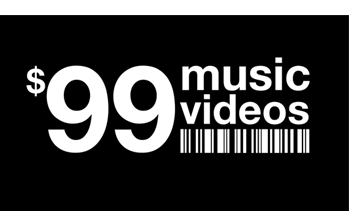
$99 Music Videos
Lee submitted this logo for $99 Music Videos, an independent music channel of music videos that have all been made for less than $99 (time not included). He made the following remarks about the company,
“Most musicians and filmmakers are unable to spend thousands of dollars on a music video. But in the age of digital film making, you no longer need those kinds of budgets. In fact, amazing original music videos are being made for the web every day for next to nothing. It was in this spirit that $99 Music Videos was born. We wanted to get back to the basics about what it is to make a music video; so we went with a really basic, yet strong logotype.”
The following critique is based on one designers opinion and experience. I will ask a question or two during the critique and would love to hear your thoughts in the comments section.
Design Principals
The $99 Music Videos logo is simple and bold. The typeface appears to be Helvetica Neue Bold. I don’t understand the upc/barcode graphic below the text. To me, the upc graphic says nothing about music, videos, or cost effective music videos. More than anything the barcode evokes ideas of retail and monetary transactions. I say loose the upc/barcode graphic, it’s not doing anything for the design.
Question for the readers
please respond in the comments below
What do you think about the upc/barcode graphic? Is it working for you?
If you take the upc graphic out of the design, you might consider bringing in a graphic element that ties to music or video. Another option would be to rework the type and not include a graphic element at all.
Functionality / Versatility
The bold typeface choice for the logo works well from a functionality and readability standpoint. When the logo is used small next to the artist and song name in the videos it is still legible. However, the upc graphic does get a little blurry when used small.
Does the Logo Work for the Audience?
I think Lee did the right thing in keeping this logo simple and somewhat generic. The music video channel focuses on low cost collaborative work. The generic look of the logo represents the overall concept of the music video channel quite well. Ok, maybe the collaboration part isn’t communicated, but the low cost part is conveyed.
Uniqueness
The logo is not particularly unique, as a matter of fact it’s really quite generic with it’s use of Helvetica Neue and no color. As I stated before though, I think it fits the business.
Typography
The typography in this logo is extremely important, since that’s about all there is to it. With that said, very close attention should be paid to the kerning, leading and alignment. These things are always important in logo design, but here they come to the forefront as there is nothing to distract the viewer. Your typography must be spot on! The problem here is, it’s not. There are kerning issues throughout. One glaring example surrounds the letter ‘o’. I would also like to see some more leading between the words ‘music’ and ‘videos’. The ‘d’ is uncomfortably close to the ‘u’.
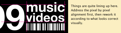
The alignment of the left edge of ‘videos’ is off. Just a bit too far to the left. The word ‘music’ (in exact alignment with the top of ‘99’) visually appears slightly higher than ‘99’ because of the curved top of the ‘9’. Sometimes exact alignments need to be adjusted in order to look right visually.
Possible Improvements
So what is the best way to improve the logo? Well I think have made some comments above that can certainly offer some direction. Here’s a list of actionable items.
- Consider removing the upc/barcode graphic from the mark. With the upc graphic removed, you’ll have to revaluate the design. You could just drop the text ‘music videos’ to the baseline of ‘99’, however that may not be enough to stand on it’s own. In which case you could reorganize the type or introduce a graphic that makes more sense for the business (think: film, video, music, bands, collaboration, etc.).
- Really take a close look at the typography. Make the kerning, leading and alignment adjustments needed to make the mark pleasing to the eye.
Overall, I think you have a good start on the logo design. And with some refinement you can definitely improve it. Please know that my intention in critiquing your work is not to hurt feelings, but to offer constructive feedback. I hope it was helpful. Best of luck, to you!
I appreciate and welcome your comments, and look forward to hearing from you soon. I purposely don’t cover every possible improvement that can be made to this logo, so go for it if you think I missed anything. All I ask is that you keep your comments clean and appropriate.
Like what you read here? Subscribe to the Logo Critiques News Feed.
Enjoy this post? Share it with others.


The images & logos presented on this blog are copyrighted by their respective owners. The blog itself is copyright Erik Peterson, 2008-2026 All Rights Reserved.


We enjoy your comments
43 Comments so far. Keep 'em Coming.
#1
By Paul Turner
04.16.2009 at 12:58 PM
I agree, the barcode doesn’t add anything for me, although I do like the idea of having some element there other than just type - perhaps something to signify music (a stave?) or video or both.
#2
By Sergej
04.16.2009 at 02:06 PM
The barcode doesn’t add anything to the logo in my opinion.
I think it would be better if the barcode would be replaced with a film or sheetmusic graphic (maybe a bit corny but better than a barcode).
#3
By Andrew Minogue
04.16.2009 at 10:50 PM
Personally, I think that the barcode graphic ties the whole logo together and explains the concept of the show too. Considering that the show is about making a music video on a set budget and buying items (which is where the barcode fits)
#4
By AJ Teachout
04.17.2009 at 01:44 PM
I agree with the barcode critique, but for a different reason. I think that the barcode is meant to show that it is an off-the-shelf, fixed price. You only pay $99, that’s it.
In that effort, however, it becomes more like a product than it is a service. In my opinion, the barcode may cheapen the service by showing that it is an off-the-shelf product as opposed to a creative service. (i.e. template vs. hand crafted)
Maybe a film reel or film tape may serve better underneath the text. I think a text only logo for this service would make it a far too generic logo for a creative service.
#5
By Matt T Davidson
04.18.2009 at 11:52 PM
At the beginning of the post I was ready to defend the bar code, but by the end you had me convinced.
I like it because it references money and spending. I also saw it as taking a shot at big budget videos. Almost used as an oxymoron here.
The fact that it would lose face in a small size and the thought of using something playing more toward a film reel brought me back around to your point of view.
#6
By Annabelle Gruner
09.11.2018 at 07:28 AM
I love to find this article this is just amazing it has many videos on it this was not free but at least it has videos on high quality on it. I got that link when I was working my college project by taking help from https://aussiessayservices.com/essayroo-com-review/ this was amazing that have all details on it.
#7
By Eve Vial
10.03.2018 at 03:28 AM
Critiques of the videos and all singes have been taken out for the future times. The analysis is carried out for the outstanding issues for http://customwritingreview.com/ the candidates in different pastures.
#8
By Arianna
01.21.2019 at 06:24 AM
Nice to get this stuff sow ills hare with others too after mine <a >best day trips from atlanta ga</a>.
#9
By Antivirus Support Number
04.21.2019 at 11:51 PM
One major advantage provided by it is Panda Antivirus Support Phone Number which helps the users by protecting their computers even when they do not access the internet. Just contact at our toll free number +44 203 880 7918 and get complete support within seconds.
https://www.advisorexpert.co.uk/antivirus-support-phone-number/
#10
By Emma watson
05.01.2019 at 07:46 AM
To get the step-by-step information in order to fresh papers heads for the durability of your body, you can look into the records supplied with each Dell Printer Support Number +44-203-880-7918
Get More Information:-
http://dellprinter.supportphone-number.co.uk
https://printercontactsupport.co.uk
#11
By Allen
11.12.2019 at 05:22 AM
The logo is not particularly unique, as a matter of fact it’s really quite generic with it’s use of Helvetica Neue and no color. As I stated before though, I think it fits the business. C_C4HL2C_92 exam question
#12
By osama shk
04.12.2020 at 03:18 PM
Fantastic blog! Do you have any tips and hints for aspiring writers? I’m planning to start my own website soon but I’m a little lost on everything. Would you propose starting with a free platform like WordPress or go for a paid option? There are so many options out there that I’m completely overwhelmed .. Any suggestions? Many thanks!
<a >windows 10 startup folder location</a>
#13
By Veronica
04.21.2020 at 11:11 PM
This roofer in Pasco feels that it looks too much like a barcode.
#14
By Sof Clarke
04.13.2021 at 08:27 AM
This logo is simple. The font goes so well with the black color. This is definitely a style of popcorn ceiling removal services.
#15
By Karen Thompson
08.14.2021 at 06:26 PM
This stuff you have written is just awesome. Thank you for sharing your ideas. decorative concrete contractor
#16
By odobfhrt
01.10.2022 at 02:27 AM
Loss leaves us empty – but drift boss learn not to close your heart and mind in grief. Allow life to replenish you. When sorrow comes it seems impossible – but new joys wait to fill the void.
#17
By AlyceRyan
07.18.2022 at 02:22 AM
I have been using this barcode on my labels for the past few weeks and I have noticed that it is working great. I use the free online barcode generator from omni barcode to generate a barcode for each label I print. Then I put the barcode on each label, print it, and cut it out. I prefer https://masterbundles.com/templates/presentations/powerpoint/music/ source to get premium templates for free. When I scan the barcode, I get a lot of information about the item (name, price, etc.) as well as any links to other sites where I can find more information about that item.
#18
By jason bevis
02.08.2023 at 11:34 PM
I find it very creative coreball. Wish you always have more interesting and creative new ideas
#19
By Darine
02.10.2023 at 06:58 PM
How about these positive words that start with S for children or students?
#20
By Amya West
04.14.2023 at 03:07 AM
Thanks for this post Google
#21
By anna
04.15.2023 at 01:39 AM
Regarding the upc/barcode graphic, I agree with the designer’s opinion that it does not seem to communicate anything related to music or video, and it might be Snow Rider 3D confusing to the audience. Therefore, removing it and introducing a graphic element that ties to music or video might be a better option.
#22
By Joms
05.24.2023 at 05:58 AM
The music video channel’s general theme is fairly nicely captured by the logo’s basic appearance. See: https://www.joplinsprayfoampros.com/
#23
By Posduia
07.03.2023 at 08:19 PM
FNAF online game is a horror adventure game created by Scott Cawthon that requires you to survive five nights in a pizzeria where the animatronics come to life. You play fnaf games as a security guard who must check cameras, maintain power, close doors, and use various tools to avoid being killed by these creatures should they get too close.
#24
By Mary Solero
08.02.2023 at 11:28 AM
Well I think have made some comments above that can certainly offer some direction.
home remodeling Fireside
#25
By Jennifer Shelton
08.16.2023 at 11:21 AM
This idea is good, and I like to find more updates that help me to know about the logo ideas. We can also use the painting company to find more colorful ideas that can make the things easy for us. You are good to share these amazing ideas in one post.
#26
By Jessica J Martinez
12.13.2023 at 12:58 AM
I love how your blog combines expertise with a friendly tone. Invaluable guide on How to Calibrate Your PS or Xbox Controller in Windows 10—your step-by-step instructions made the process seamless.
#27
By Robbie T Parsons
12.29.2023 at 04:16 AM
Grateful for the ongoing feedback from our audience, helping us refine and improve our offerings. On this Online Reaction Time Test—it’s a user-friendly and impactful tool for gauging and refining cognitive abilities.
#28
By Cheryl E Serrano
03.19.2024 at 02:42 AM
Tu blog es un ejemplo brillante de lo poderosa y transformadora que puede ser la narración. Gracias por ser una gran inspiración. ¿Crees que tienes dedos rápidos? ¡Pruébalo en la CPS Test!
#29
By samgfg aliyu
05.18.2024 at 12:13 AM
nice post.
لعبة بادل
#30
By KenyettaPesso
06.07.2024 at 10:31 PM
The Ordinary’s Niacinamide arby’s breakfast menu serum has significantly improved my skin.
#31
By Ramona
08.02.2024 at 04:50 AM
あなたの実践的なヒントと、あなたがもたらすポジティブなエネルギーに感謝します。あなたのブログは常に私にインスピレーションとモチベーションを与えてくれます。 まち針ゲーム は反射神経と戦略スキルが試されるゲームです。中毒性があり、レベルが徐々に難しくなるため、あらゆるゲーマーに最適です。
#32
By iliada
10.15.2024 at 07:19 AM
Geometry dash games have improved my mood. Feeling more positive, sometimes get angry because of level hardness but it’s ok. geometry dash is one of the best games ever made.
#33
By Laria
10.15.2024 at 01:28 PM
I remember the first time I played the slope unblocked I was instantly hooked! The thrill of racing down those slopes while avoiding obstacles brings back such fond memories. It’s amazing how a simple game can evoke such nostalgia and excitement!
#34
By irafa
11.29.2024 at 09:29 AM
Its simple mechanics in red ball 4 and cheerful visuals make it enjoyable for players of all ages.
#35
By maka
12.07.2024 at 10:00 AM
The simple mechanics of idle breakout are what make it so easy to pick up and enjoy.
#36
By Anderson
12.17.2024 at 08:00 AM
J’aime la simplicité et l’efficacité de vos conseils. Merci. Cet article de Geometrie Dash partage des conseils faciles à suivre et à essayer. Geometry Dash a des niveaux colorés et une excellente musique. C’est délicat mais tellement satisfaisant de battre enfin un niveau difficile après avoir essayé tant de fois.
#37
By kathrine
02.22.2025 at 08:35 AM
Thanks for this royal essays review ideas.
#38
By Eloy Yost
02.22.2025 at 08:36 AM
This is www.streamlined.finance good for your health
#39
By Fireboy And Watergirl
04.09.2025 at 08:22 AM
Since its release, Fireboy And Watergirl has become a favorite on many gaming websites and is still played widely today. Its combination of fun puzzles, teamwork, and charming characters makes it a timeless experience.
#40
By Phillips
05.12.2025 at 06:19 AM
Thanks for this, worked great on my end too! Use this article of Geometry Dash Online to improve fast. During long trips or boring moments, Geometry Dash keeps players entertained with colorful graphics, tricky obstacles, and levels that match perfectly with the music.
#41
By Nancy
07.24.2025 at 10:30 PM
I love the way you shared the post with the title $99 Music Videos, as these videos are amazing and people love to buy them. When I visited the website here, I saw these are the best services to choose for our work to get the best results.
#42
By Yvon Murray
09.18.2025 at 02:55 AM
Interesting point about the barcode! I agree, it feels a bit misplaced. It reminds me of collecting trading cards back in my Poptropica days – always scanning those codes! Perhaps a more musical visual element would be stronger. Maybe a stylized waveform or a play button icon? Good design should immediately communicate the core message.
#43
By 378azure
06.10.2026 at 01:35 AM
First, let’s be clear: Wordle Unlimited isn’t designed as a store management game in the traditional sense. It’s a word-guessing puzzle. But the beauty of gaming, and indeed, of human imagination, is that we can often find new ways to engage with familiar mechanics. For the purpose of this article, we’re going to playfully stretch the definition and explore how the principles of a good store manager can be applied to the endless stream of words offered by wordle unlimited