Missylist Logo Concepts Critique 49
Categories: CritiquesComputers & TechnologyServices

Missylist Logo Concepts Critique
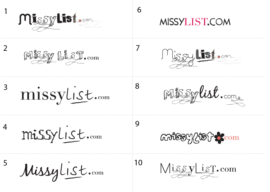
The folks over at MissyList submitted a whole bunch of logo concepts, 10 to be exact. If you’re interested in seeing them all, here ya go.
I won’t be following the normal format for critique that I’ve been using up until now. Instead, I’m going to pick three concepts from the group that I think have the most potential. I will critique and talk about what’s working and what’s not.
According to the company info I received, the target market for the site is described as: female, 25-40 years old, young professionals, students, mothers, computer savvy, social network savvy, online shoppers. The tone & feel of the site was described as: girly fun, slightly sophisticated, community safe, trendy, second hand, bargain, recession fighter. The company used to be called feminads but is now being rebranded.
Design Principals
Alright, so lets jump right in... I always find it distracting when a ‘.com’ or other suffix becomes part of a logo. Same goes for ‘llc’ and other business identifiers. It’s not needed and clutters the design. Leave suffixes for use in body copy if they need to be used in conjunction with the name. Take a minute and look at all the web based businesses out there. How many include a ‘.com’ in their logo? I can’t think of any, though in the late nineties it was more common. I’m sure there some, but this is 2009. Look the some of the major web based businesses out there like, eBay, Amazon, Google, Craigslist, Flickr, Twitter and Facebook. I think you get the point...
Question for the readers
Do you know any web based businesses that use a ‘.com’ in their logo? Do you think it should be part of a logo for a web business in 2009?
The other thing I want to mention is that the new name “Missylist” is so much better than the previous “feminads” which sounds like a feminine hygiene product.
Concept 8
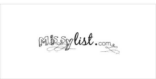
My first selection for review is concept 8. I choose this one because I think it fits a lot of the characteristics of the target market. The logo is definitely trendy (good and bad though, what’s trendy now is not likely to be so in another 1-4 years). This concept feels very personal and unique. It has a ‘girly fun’ and hand crafted feel while maintaining a certain level of sophistication.
The hand drawn letters of ‘Missy’ might benefit from some refinement. The identical ‘s’ bother me immensely. First, because hand drawn letters aren’t going to be identical like these are. Second, because the overlapping tails get too messy. Lastly, because of the large gap between the two letters. I do like the contrast and interest created by the dimensional letters (m, i, y) compared to the flat ‘s’. Overall the juxtaposition between ’Missy’ and ‘list’ works well. One side being very sophisticated and pretty while the competing side is raw and informal. The heavier weight of the word ‘list’ helps to balance out the differences in length.
I think the logo would benefit from some color. You might explore a half and half treatment like concept 6 or possibly explore filling the dimensional letters with a color and everything else a different color. Lastly, please loose the ‘.com’ suffix.
Concept 6

The second concept I chose to talk about is concept 6. This is one of the few concepts that showed any color, though I think it works without color also. I like the sophisticated and modern feel of this logo. It’s hip without being overly trendy. This concept is less likely to look dated over time than some of the others.
The contrast of the modern serif font to the rougher hand drawn sans-serif font is pleasing to the eye. However, I think the hand drawn sans-serif could use a little refinement. I’m not sure if it’s an actual font of if it has just been modified. At any rate, I think it is a little too subtle. At first look it almost looks like a mistake, especially at the bottom of the ‘c’. Possibly modify the existing typeface or choose a new one that is a little more apparent, just don’t go overboard. Moving on, the kerning needs to be adjusted as well. Look at the gap between the ‘s’ and ‘t’. Once again, please loose the ‘.com’ suffix.
Concept 10
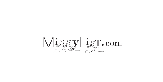
My third choice is concept 10. There is a very playful attitude to this logo. While multiple fonts in a logo can often be overwhelming to a viewer, I think it’s working in this case. To me the logo implies how everyone or every woman is different. Each one has their own style and personality.
The contrast and balance within the letters is working well. Still, the repeated s’s in this concept are a problem to me. When the tails overlap it looks messy and unrefined. Why not modify the ‘s’ and have three slightly different variations of it? The two that are side by side could join tails and become one, while the other lone ‘s’ could have a slightly different tail and shape. My feeling on ‘.com’ remains the same as in my previous remarks.
Question for the readers
What concepts did you like and why. Any thoughts on possible improvements?
Conclusion
I didn’t have the time to talk about all 10 concepts, however hopefully something can be gained from the 3 I did talk about. Overall, I prefer concept 8. Although, if there is any concern in the logo feeling dated in the near future, you may want to stick with something less trendy like concept 6. Please know that my intention in critiquing your work is not to hurt feelings, but to offer constructive feedback. I hope it was helpful. Best of luck, to you!
I appreciate and welcome your comments, and look forward to hearing from you soon. I purposely don't cover every possible improvement that can be made to this logo, so go for it if you think I missed anything. All I ask is that you keep your comments clean and appropriate.
Like what you read here? Subscribe to the Logo Critiques News Feed.
Enjoy this post? Share it with others.


The images & logos presented on this blog are copyrighted by their respective owners. The blog itself is copyright Erik Peterson, 2008-2026 All Rights Reserved.


We enjoy your comments
49 Comments so far. Keep 'em Coming.
#1
By Paul
04.23.2009 at 11:20 AM
Although there are a lot of concepts there are really only 3 styles here, for me number 3 is the winner, perhaps with some added color. I don’t like the handdrawn letters, they just make me think ‘messylist’ instead of ‘missylist’. But then again I’m the I’m the wrong age and sex for the target audience…
#2
By Fred
04.24.2009 at 01:34 PM
For me I certainly like Concept 6 (#2 analysed). Works really well for me, although as stated refinement may help.
May I just add though Erik, that Amazon do indeed have the suffix at the end, at least on the website on both the .com domain and the .co.uk, top left. Same thing for Play.com, although you didn’t mention them.
#3
By samuel
04.25.2009 at 12:22 PM
Thank you so much for your critique, it confirms some of the feedback I allready received. Like Fred, I think the .com can work in some cases and are still used by 2009 companies. However I got your point on the distracting aspect of it and will definitly explore options without it.
Also I want my brand to resist time and based on your feedback, I think I might go for the number 6, even though at first it seemed to me a bit too much like a typical female publishing site, eg ELLE.com and not the social classified type site (wem will have features such as facebook connect, gmail, yahoo, etc.. email import and facebook and twitter feed when people post an ad) I am intenting to launch. What do you think?
Anyway, thank you so much for your help, and will definitly show you the winner logo once finished.
Kind Regards
Samuel
Missylist.com
#4
By Erik Peterson
04.27.2009 at 06:03 PM
@Fred, you are correct about Amazon. For some reason I was imagining the logo without the .com. Wishful thinking I guess… Sorry I should have checked first. Thanks for pointing it out!
#5
By web design companies dc
03.17.2011 at 09:09 AM
Logo design is an important area of graphic design, and one of the most difficult to perfect. The logo is the image embodying an organization. Because logos are meant to represent companies’ brands or corporate identities and foster their immediate customer recognition, it is counterproductive to frequently redesign logos.
#6
By sacramento marketing
07.21.2011 at 04:52 AM
Although the art of web design and development may sound little simple and easy going, but this belief is far away from the reality because there are many are many approaches to web design and web development.
#7
By Knnedy
07.31.2018 at 01:22 AM
Everyone is interested in following the critiques listed best college essay help concepts. In the list you will get logo designing concepts for helping all critiques and others.
#8
By anna
09.19.2018 at 12:13 AM
Great informative site. I’m really impressed after reading this blog post. I really appreciate the time and effort you spend to share this with us! I do hope to read more updates from you.
#9
By NN
09.19.2018 at 12:14 AM
Woah! I’m really enjoying best college paper writing service the template/theme of this site. It’s simple, yet effective. A Blog! lot of times it’s hard to get that “perfect balance” between user friendliness and visual appeal. I must say that you’ve done a very good job with this. Additionally, the blog loads super quick for me on Safari. Outstanding
#10
By hassan
11.05.2018 at 08:00 AM
It is interesting to read your blog post and I am going to share it with my friends.republic
#11
By aftab ali
02.21.2019 at 02:09 AM
The component of 8 1/2"W x 6"H x 2 1/2"D is sufficiently sufficient to hold your own fundamentals for day by day utilizing. With respect to its value, I wager $175 is so tempting to your wallet. Walmartone associate login
#12
By aftab ali
02.21.2019 at 01:13 PM
By utilizing a rockery, a cascade, bended flowerbeds, and little trees or shrubberies, it’s exceptionally simple to add shape to your greenery enclosure and camouflage any exhausting lines. technospeak
#13
By מדריך טיולים
03.11.2019 at 04:53 PM
amazing article, thank you לונלי פלנט דרום אמריקה and also cool logos and analysis!
#14
By New Jardo
04.03.2019 at 10:53 PM
It’s hip without being overly trendy. Oakley Sunglasses Australia
#15
By Daniel Perez
05.15.2019 at 05:16 AM
Your logo designs are cool, in the business we need to create a logo which is very strong and elegant because this is the front line of all business and in line with your designs this very friendly and simple. Thanks for sharing your article to us ! keep posting.
discoverziehler.com
#16
By Justin
05.24.2019 at 03:33 PM
When it comes to logo it should be stylish, attractive and meaningful to all clients for them to have a strong trademark for their business.
maggardlaserart.com/
#17
By Brett James
07.19.2019 at 06:55 AM
I think concept 6 is more appealing to the target market.
https://thesoutherninstitute.com/travel-merchant-account/
#18
By Allen
10.07.2019 at 07:40 AM
The tone & feel of the site was described as: girly fun, slightly sophisticated, community safe, trendy, second hand, bargain, recession fighter. The company used to be called feminads but is now being rebranded. 212-89 dumps
#19
By Allen
11.12.2019 at 05:21 AM
According to the company info I received, the target market for the site is described as: female, 25-40 years old, young professionals, students, mothers, computer savvy, social network savvy, online shoppers. The tone & feel of the site was described as: girly fun, slightly sophisticated, community safe, trendy, second hand, bargain, recession fighter. 5V0-21.19 exam question
#20
By Zayne
04.21.2020 at 11:08 PM
This looks like it was handwritten. I’m not very impressed. I’m a roofer in Ogden and could draw this.
#21
By Tony Diaz
04.13.2021 at 07:56 AM
The design could be better. Try to look for more references like logos from pest control services.
#22
By Garry
03.02.2022 at 01:34 AM
What a super site, lots of interesting stuff in here, thank you! photographers in miami
#23
By Julia
02.10.2023 at 07:04 PM
Whether it be a soulmate or the 2727 angel number twin flame sign, the spiritual meaning remains the same.
#24
By leona
02.24.2023 at 02:49 AM
a good logo should be simple, recognizable, Garten Of Banban and easily identifiable. This means that it should be easy to read and understand, even when viewed from a distance or at a small size.
#25
By Chris
05.24.2023 at 04:24 AM
This logo has a classy, contemporary vibe that I appreciate. It is trendy without being overtly so. Compared to some of the others, this idea is less likely to look antiquated over time. See: https://www.stpaulguttercleaner.com/gutter-installation-in-stpaul-mn
#26
By bloxdio
05.26.2023 at 11:23 PM
A simple bloxd io and clean design helps in creating a memorable and versatile logo that can be easily recognized across different platforms and sizes.
#27
By jonas999
06.13.2023 at 05:36 AM
I really get robux free like the post.
#28
By Losudya
07.03.2023 at 08:16 PM
The player must gather and deliver the janitor Gerome to the entrance. So that it can unlock the door that conceals the hidden treasure on each level in pizza tower. Most levels also have three secret rooms, which are quick challenges that award extra points and enhance the level’s completion.
#29
By Tagalog
08.05.2023 at 08:27 AM
The contrast and balance within the letters is working well.
drywall installation Highland Meadows
#30
By Jacksom
08.15.2023 at 10:14 PM
I’m truly grateful for this article’s contribution to my learning hoop grids journey, it’s a compass guiding me toward excellence in both work and study.
#31
By Damien
09.29.2023 at 01:49 PM
I personally love this logo, because the word “Missy” and the doodle design of the font together makes me think of happy, silly times, or at least not taking life too seriously. However, if you want to see my favorite logo of all time check out this auto wrecker Victoria BC company. Now they know how to present a logo!
#32
By Thomas D Fabre
11.29.2023 at 01:01 AM
Your blog consistently delivers impressive insights and engaging content – a true intellectual feast. Thanks for providing the best jitter click test – it’s become an essential part of my gaming routine.
#33
By Coby Brian
02.21.2024 at 12:18 AM
From the provided logo concepts, I’d select three with the most potential given MissyList’s target market and brand tone. The chosen designs should reflect femininity, trendiness, and community appeal. Key aspects to consider are simplicity, versatility, and memorability. I’d prioritize concepts that effectively blend sophistication with approachability, resonating with the 25-40 female demographic. This approach ensures the rebranding aligns with MissyList’s evolution and engages its audience authentically.
Tier list of Tower of Fantasy
#34
By Jarred Golf
02.21.2024 at 12:19 AM
Based on the target market and desired tone, three concepts with potential could be: 1) a fashion resale platform named “ChicCycle,” combining trendiness with bargain finds; 2) a community-driven lifestyle blog called “SheSavvy,” offering tips on fashion, budgeting, and networking; and 3) a podcast series titled “Scripts: Episode & Choices,” discussing women’s empowerment, career strategies, and personal growth in a fun and relatable manner. Each concept aligns with the target demographic and brand values while offering unique value propositions.
#35
By samgfg aliyu
05.18.2024 at 12:12 AM
NICE.
لعبة بادل
#36
By Vincent Kyle
05.24.2024 at 06:09 AM
Thank you immensely for creating this site; your efforts are greatly appreciated. I’ve learned something new today, all thanks to you. This website is now my primary resource. The ideas presented here are truly inspiring. Expert Concrete Services
#37
By Niko Stern
06.06.2024 at 06:41 AM
This was a great read. Thanks for the insights! Solar
#38
By Lucy Hood
06.28.2024 at 10:43 AM
The use of vibrant and playful colors aligns well with the “girly fun” and “trendy” aspects of the brand. This can appeal to the young professional, student, and mother heardle 70s demographics.
#39
By URL
08.26.2024 at 02:41 PM
Love the way you explain things. Very clear and helpful.
#40
By Kirbi
08.26.2024 at 02:42 PM
This post was very enlightening. Appreciate the detailed insights. URL
#41
By Adam Sara
08.31.2024 at 03:08 AM
Your articles have helped me to learn a lot of interesting information on this topic and they are important material from which I can come up with many good ideas. aa route planner
#42
By AlvisMarvin
12.07.2024 at 01:16 AM
MissyList’s logo concepts showcase potential but require refinement. Key critiques focus on avoiding clutter, such as unnecessary suffixes like ‘.com’ in logos. This attention to design aligns with targeting tech-savvy young women. Speaking of strategy, why not engage in a game of wordle game to enhance your creative thinking? Remember, clarity prevails in branding, much like finding the right word in Wordle. Make every design choice count!
#43
By Ed Gaines
04.09.2025 at 08:28 AM
Welcome to the Dinosaur Game, also known as the Chrome Dino, a hidden gem built into Google Chrome that turns your “no internet” nightmare into a nostalgic, fast-paced joyride.
#44
By Reynolds
07.05.2025 at 06:06 AM
What makes traffic road exciting is how unpredictable the traffic patterns are. It keeps you alert and tests your reaction time. I always try to stay in the middle lane early on – gives more flexibility to switch directions when traffic builds.
#45
By curverush
11.05.2025 at 02:23 AM
Your style of writing is refreshing and enjoyable curve rush. The way you present complex ideas in a simple and relatable manner makes your work very accessible. Keep up the great work—I’m definitely interested in reading more!
#46
By Logan Isaachsen
12.17.2025 at 03:46 AM
Interesting takes on the MissyList logos! I see where you’re coming from with the suffix critiques; who even puts a dot com in their logo anymore? I agree that Concept 8 has that girly fun vibe, but the identical ‘s’s are definitely screaming for attention. Concept 6 is probably the safest bet long term and Concept 10 looks a little chaotic. Speaking of chaotic, I once designed a presentation with way too many fonts, it looked like a ransom note. Share this wisdom, slope unblocked style! I ended up simplifying everything and it was so much better. It’s all about balance, right?
#47
By lanaconda
12.24.2025 at 01:43 AM
Those are some interesting logo concepts! Thinking about that target demographic – young professionals, students, and moms looking for bargains – it makes me think of the feeling of accomplishment after finding a great deal. It’s almost like the rush you get from a successful run in Snow Rider 3D. Fun, maybe a little challenging, and ultimately rewarding. I’m curious to see which design will best capture that slightly sophisticated yet fun vibe.
#48
By Carl1995
02.24.2026 at 09:04 AM
Operating an adult webcam site taught me the difficulties of processing high-risk transactions, and using a adult content payment processor solved these challenges with fast payouts, fraud protection, regulatory compliance, and flexible platform integration, allowing me to focus on creating quality content rather than worrying about blocked accounts, refunds, or disputes, while providing a seamless payment experience for customers and optimising my financial management across multiple currencies.
#49
By Viktor99
02.26.2026 at 11:15 AM
Я долго сомневался, стоит ли вкладываться в недвижимость за границей, но в какой-то момент решил, что нужно хотя бы разобраться в теме. Начал искать информацию и наткнулся на World Estate. Решил попробовать и записался на консультацию. Уже после первого общения стало понятно, что здесь работают профессионалы. Мне подробно рассказали о возможностях, рисках и перспективах. Я рассматривал разные варианты и параллельно изучал предложения через worldestate.homes это помогло мне лучше ориентироваться и понимать рынок. В итоге я выбрал объект, который подходит под мои цели. Сделка прошла спокойно, а сопровождение было на каждом этапе.