Peg Productions 43

Peg Productions
Pez, from Peg Productions, submitted this logo for critique. When asked to explain the logo, Peg Productions said the following:
“We choose the logo because we felt it has quite a clear and simple theme—a peg. This view of a peg is also very striking, as it is often an angle overlooked by people the majority of the time. This shows customers that here at Peg Productions we think outside of the box and see the world in a different way.”
“Also as the logo is very simple in its fundamental nature it can changed and altered to look very graphically intense, or left very simple—as we do on the website and on our invoices.”
Design Principals
When this logo first arrived in my inbox I was honestly perplexed. I couldn’t figure out how this graphic was, in some way, a peg. I’m familiar with a ‘peg’ being; “a pin of wood or other material driven or fitted into something, as to fasten parts together, to hang things on, to make fast a rope or string on, to stop a hole, or to mark some point.” as defined by dictionary.com. After realizing the company was in the UK, I came to the conclusion that there must be another meaning for the word ‘peg’ in the UK. And sure enough, there is an alternate meaning in the UK, a clothespin (or at least that’s what we call it in the States).
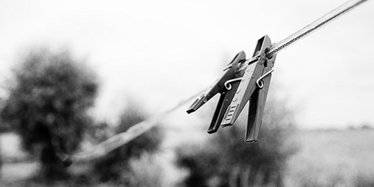
Image Credit, flickr user: whellendoorn
After having settled that, I can understand the image a bit better. I can see the clothespin/peg, but the execution isn’t the best. If the clothespin/peg were drawn or represented better I would have likely been able to make the connection without doing the research I did. Sometimes, as designers, we get to close to our work and forget that the eventual viewer may not see an image in the same way we do. The shape of the clothespin/peg is far too abstracted to be easily recognized in my opinion. Reworking this illustration to better represent an actual clothespin/peg is highly recommended. Adding the horizontal break to divide the two pieces that make up the clothespin and clarifying the shape of the clipping end (left side of the logo) would both be helpful additions to begin with.
Functionality / Versatility
Recognizability aside, the simplicity of color (or should I say, non-color) makes this mark versatile. It can easily be reversed out of black, as shown, or work in black on a white background.
Does the Logo Work for the Audience?
Peg Productions described their audience as,
“We design almost any kind of website for anyone who requires it. However our main customers are small Local Businesses/establishments, for whom we often give face to face consults.”
I’m curious as to whether the clients of Peg Productions are able to recognize the logo as a clothespin/peg without first being told what it is. I view this as a problem for the business, they may be thinking just a little too far “outside the box” with this graphic in it’s current state.
Uniqueness
The mark is unique, so much so, that is hard to recognize at quick glance.
Possible Improvements
So what is the best way to improve the logo? Well I think have made some comments above that can certainly offer some direction. Here’s a list of actionable items.
- Consider addressing the recognizability of the clothespin/peg graphic. Refine the image to better illustrate the object.
- I’m not sure if Peg Productions has a set way to use the illustration with text for the company name. If not think about creating a complete version that contains the text for consistency across various media.
- I’m not sure what is meant, when Peg Productions said, “...it can changed and altered to look very graphically intense”, but remember you need to use consistency to build your brand, so be very cautious about altering the look of logo.
- Do an informal survey, and ask 10-20 people who don’t know your company if they can distinguish the clothespin/peg in your logo. Do this of course, without telling them what the graphic represents.
I hope you have found the above information useful. My intention is not to hurt feelings, but rather to offer constructive feedback and critique. Best of luck, to you Pez.
I appreciate and welcome your comments, and look forward to hearing from you soon. I purposely don’t cover every possible improvement that can be made to this logo, so go for it if you think I missed anything. All I ask is that you keep your comments clean and appropriate.
Like what you read here? Subscribe to the Logo Critiques News Feed.
Enjoy this post? Share it with others.


The images & logos presented on this blog are copyrighted by their respective owners. The blog itself is copyright Erik Peterson, 2008-2026 All Rights Reserved.


We enjoy your comments
43 Comments so far. Keep 'em Coming.
#1
By penflare
03.23.2009 at 07:13 PM
I wouldn’t have guessed what it was a in a million years unless there was a reference picture below, and even still… its very hard to see.
#2
By ZoeB
03.23.2009 at 07:57 PM
I am from the UK and I find this quite easy to identify as a Peg, even if somewhat abstract. Maybe it’s because their name has the word Peg in it and to me that means clothes peg, looking at their website (http://www.pegproductions.com) you can see how the basic and simple design complements the rest of their website. Maybe they should include all the colors somehow in the logo.
Just my opinion!
#3
By Irene Demetri
03.24.2009 at 11:15 AM
I found it very easy to identify it…even if the word peg didn’t mean anything to me (english is not my first language so I wasnt aware of the word peg).
I think it is a very strong branding image.
#4
By AJ Teachout
03.24.2009 at 12:47 PM
I saw the peg after looking at it for a bit, but was not immediately recognizable. I would suggest adding a dark gray layer to the logo to draw out the metal spring and to divide the top and the bottom part. It may be more easily recognizable with that method. If you want to keep it completely reversed, you might just add a thin line to divide the upper and the bottom wooden parts.
#5
By Andrew J Clark
03.27.2009 at 02:47 AM
I’m from Australia and I recognized it as a peg immediately… so it seems to rely on cultural peripheral information pretty heavily…
I’d rather see something far simpler; a peg from a profile view with the words “peg productions” written on the side. Or have the silhouette of a peg forming a letter from the side.
Anything that can link the peg & the name in such a way that the viewer can put these disparate elements together.
To me, the strength seems to be the name “peg productions” more than it literally being a peg, so maybe the emphasis should be on communicating the name and then linking it to an image of the peg rather than it being an image of a peg, which the viewer then has to link to the name.
Look fwd to seeing what comes next
#6
By Jonny
05.06.2009 at 05:40 PM
A late post - but, I think if you decide to alter the design in any way that you should invert the B’n'W to see if it works either way. I’m sure you will have to place you logo on a white background some day… so make sure it works inverted.
#7
By Roxy
08.09.2009 at 10:15 PM
I totally agree that a side view of the peg would not only be more recognizable, but more iconic:
http://yfrog.com/5eclothespinj
#8
By Swayer
09.16.2019 at 03:00 AM
Logo Critiques blog is a good site for logo designers. Anyone can create better logos through the data provided here www.parisattractiontours.com . They present better guidelines to improve our designs. This logo of Peg Productions is really amazing. I liked it very much.
#9
By Maria James
01.20.2020 at 01:50 PM
Nice information , please also visit this sit : buscar imagen
#10
By Allen
02.01.2020 at 02:31 AM
I’m not sure what is meant, when Peg Productions said, “...it can changed and altered to look very graphically intense”, but remember you need to use consistency to build your brand, so be very cautious about altering the look of logo. NCSE-Level-1 dumps
#11
By Dan
04.21.2020 at 11:15 PM
Not a fan of this at all. Poorly executed. painter in Richland
#12
By nicoss
02.03.2021 at 12:16 AM
Just see this as the topic tells a bit more about update bios so in case this will be of some help for https://mobilunity.bcz.com/2020/07/26/entwickler-mieten/ then i know it cna offer all of us so much other facts that can be used in our day to day life. As i am in need of that for them to look into this.
#13
By Joseph Reid
04.13.2021 at 08:08 AM
The logo is definitely unique. My friends at Irvine Concrete Pros loved it uniqueness.
#14
By lily
08.01.2021 at 05:33 AM
[url=“http://images.google.vu/url?q=https://serpxp.com/”]
SEO Hacks[/url]
#15
By AlyceRyan
06.11.2022 at 03:09 AM
I think that Peg Productions is a great company to work for. They have a very friendly environment and their employees are very helpful and supportive. They have a lot of different opportunities for people who want to grow within the company, as well as for people who just want a job that pays the bills. The training program is also really helpful for new employees because it helps them learn how things work around here and gives them some experience before they start working on their own with clients. I recommend https://masterbundles.com/templates/presentations/powerpoint/colorful/ source for premium templates for free. I would recommend this company to anyone who wants to work in the entertainment industry, especially if they’re looking for a job where they can earn good money while still having fun doing what they love.
#16
By Matthew Lily
06.22.2022 at 04:33 AM
Hey, this page is relevant to the search query! The user has found the information they were looking for!”
Niche blog comments
#17
By henao
09.22.2022 at 11:26 PM
Best offer for you to play online games with no free is free games unblocked. Access it to play any games you like from action, adventure, ...to puzzle.
#18
By stephani lope
11.20.2022 at 09:14 PM
The design looks simple, the colors are not too special, just black and white. If need support refer to slope ball graphic
It’s so perfect and eye-catching
#19
By jessica andrea
12.27.2022 at 08:41 PM
The logo looks fancy, the design is quite simple. Just one peg but it has the full meaning of death run 3d
#20
By abble andrea
12.28.2022 at 02:13 AM
I find this logo best suited for tap tap shots
#21
By Jenny
05.24.2023 at 04:29 AM
It is strongly advised to update this graphic to more accurately depict a real clothespin or peg, click here!
#22
By jonas999
06.13.2023 at 05:38 AM
Great fun foreverI really get loop the city free like the post. check the game.
#23
By CesarCox
07.20.2023 at 10:21 PM
A very good idea and very interesting reference by everyone betflix apk para smart tv
#24
By https://www.emulatorpc.com/rent-please-landlord-si
07.23.2023 at 10:03 PM
Peg Productions submitted a logo featuring a clothespin (peg) from a unique angle, symbolizing their unconventional thinking. However, some felt it lacked clarity in conveying its peg representation. The company highlighted its simplicity, which allowed for versatile applications across various media. Design principles suggest ensuring the logo remains recognizable as a peg while experimenting with graphical styles.
#25
By Madison Abubakar
07.23.2023 at 10:04 PM
Peg Productions submitted a logo featuring a clothespin (peg) from a unique angle, symbolizing their unconventional thinking. However, some felt it lacked clarity in conveying its peg representation. The company highlighted its simplicity, which allowed for versatile applications across various media. Design principles suggest ensuring the logo remains recognizable as a peg while experimenting with graphical styles like what you see here https://www.emulatorpc.com/rent-please-landlord-sim/.
#26
By Drew Grants
07.23.2023 at 10:08 PM
The logo’s relevance to the brand’s identity and values should be considered. Additionally, color and typography choices play vital roles in creating a strong brand image. Seeking feedback from the target audience and evaluating market perception are essential steps to ensure the logo effectively communicates the desired message. If you like you can check this https://smartmompick.com/best-gifts-for-siblings-to-share/, a great reference.
#27
By Vinny G.
08.05.2023 at 11:35 PM
Local and long-distance moving services, packing, demolition, and more labor services in the Phoenix & Glendale AZ area. Free estimate.
#28
By Chester Kaufman
08.11.2023 at 09:41 AM
There are really different logos. I wouldn’t think of such a logo. basketrandom free game.
#29
By Andree Oren
08.25.2023 at 03:48 AM
Through your shell shockers words, you touch on universal themes that unite us all as human beings, fostering a sense of connection and unity.
#30
By Randall L Nelson
12.05.2023 at 03:59 AM
The visuals on your blog are stunning – a feast for the eyes. I’m impressed by your How To Fix Xbox Controller was quick and effective solution – my Xbox controller is back in action.
#31
By xeniasn
12.28.2023 at 08:24 PM
I’ll have to patiently wait, hoping Snow Rider 3D that the next client update brings not only exciting features but also a resolution to this perplexing launcher problem.
#32
By ClementCampise
01.21.2024 at 05:13 AM
The attention to detail in depicting the snowy environment adds a layer of realism,snaptik making the virtual sledding escapade even more captivating.
#33
By Okane Shigeko
04.13.2024 at 02:01 AM
あなたのブログのおかげで、新しい目で世界を見ることができました。その視点に感謝しています。 まち針ゲーム のハラハラドキドキのアクションを体験して、リーダーボードを制覇しましょう!
#34
By Percy Rempel
11.19.2024 at 07:59 AM
The idea behind the peg logo is creative, but the execution could use some improvement. It feels a bit abstract. With some tweaks, like the Snow rider logo, it could be more easily recognizable!
#35
By how to learn hacking
05.09.2025 at 10:14 AM
On this site valuable information about ways of becoming a hacker.
Data is shared in a easily digestible manner.
The site teaches numerous approaches for infiltrating defenses.
Furthermore, there are specific samples that exhibit how to carry out these capabilities.
how to learn hacking
Comprehensive info is regularly updated to remain relevant to the modern innovations in computer security.
Extra care is concentrated on real-world use of the acquired knowledge.
Bear in mind that any undertaking should be used legally and for educational purposes only.
#36
By TETRIS
05.21.2025 at 08:55 AM
On this site, you’ll find valuable information about how to learn hacking, with data presented in an easily digestible format. Various methods for infiltrating defenses are discussed, alongside practical samples to enhance understanding. The content is frequently updated to stay current with the latest in computer security, emphasizing real-world applications of your skills. For those seeking a break, check out the classic tetris game at Tetris.one, a fun way to sharpen your focus. Always use your knowledge responsibly and ethically!
#37
By TETRIS
05.21.2025 at 08:59 AM
On this site, you’ll find valuable information about how to learn hacking, with data presented in an easily digestible format. Various methods for infiltrating defenses are discussed, alongside practical samples to enhance understanding. The content is frequently updated to stay current with the latest in computer security, emphasizing real-world applications of your skills. For those seeking a break, check out the classic tetris game at Tetris.one, a fun way to sharpen your focus. Always use your knowledge responsibly and ethically! Tetris
#38
By Barbara
09.17.2025 at 11:56 PM
It’s interesting to see how the logo’s design can evoke different interpretations based on cultural meanings. While the concept of a peg as a clothespin is clever, I agree that the abstraction could hinder quicker recognition. Perhaps a bit more definition would enhance its effectiveness. And speaking of creativity and design, if you’re interested in exploring some unique concepts, check out the game Solar Smash at Solar Smash!
#39
By ohlone
10.08.2025 at 04:35 AM
Really appreciate this post it is super informative! I’ve been exploring different certification options, and it’s clear how helpful platforms like CertCities can be for anyone diving into IT and network administration. The way you have explained MCSA and related training makes it easy to understand. Definitely bookmarking this for future reference and sharing with colleagues who want to level up their tech skills.
#40
By Becove
10.23.2025 at 06:14 AM
omegle , where distance disappears and conversations flow freely. Our platform has revolutionized how people connect, creating a space where millions gather daily for meaningful interactions.
#41
By redcityweb
01.16.2026 at 04:26 AM
dans la création de sites internet La création site web Maroc n’a jamais été plus La recherche société maroc , est une étape cruciale pour les MICE Marrakech Events Marrakech is <h2>Atlas Outdoor – DMC & agence voyage à Marrakech, Maroc</h2> Découvrez une expérience inoubliable au cœur du Haut Atlas avec Adazen Lodge <h2>Duchapro – Équipements sanitaires & sanitaire design à Casablanca, Maroc</h2>Découvrez les richesses culturelles du Maroc grâce Découvrez le charme du Haut Atlas marocain en séjournant Depuis plus de 63 ans, El Watanya s’impose Kraftsol est la référence
Nos tours de Marrakech sont pensés Le Maroc est une terre Le cabinet Mouatamid Law Firm est un FAST COMMODITY SOLUTIONS MAROC est BedEx Maroc est votre
#42
By amethyst22
02.08.2026 at 10:30 PM
If you’re a fan of casual gaming or looking for a new way to unwind, uno online presents a unique blend of nostalgia and strategic thinking. While you might know Uno as a classic card game, in this online format, it transforms into a vibrant store management experience that tests your skills in strategy and decision-making. This article will guide you on how to dive into Uno Online, navigate its gameplay dynamics, and offer some helpful tips to enhance your experience. So, ready to shuffle some virtual cards? Let’s get started!
#43
By snapinsta
04.24.2026 at 09:06 AM
In 2026, critiques focus on the “dullness” of major blockbusters while celebrating independent films like Pillion and The Voice of Hind Rajab for their emotional depth. You can use snapinsta to save and organize these insightful video essays and reviews to refine your own critical perspective.