Jack Tree Thai Cuisine Logo Design Critique 50
Categories: CritiquesFood & Beverages
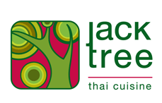
Jack Tree Thai Cuisine Logo Design Critique
Mario submitted this logo for Jack Tree Thai Cuisine and had this to say about his logo,
“The colours and logo name were already handpicked by the client according to his personal auspicious religious beliefs. These colours denotes growth and energy. The jack tree is a plant which is very common in Sri Lanka. The logo is a stylized Jack Tree and you will be able to make out the tree and a jackfruit. client wanted simple yet strong typo for the logo. I stylized the typo by linking the letter 'j' and 't' I kept the typo separate from the icon, in order to have the freedom to use the icon all by itself.”
The following critique is based on one designer’s opinion and experience. I always appreciate the readers thoughts as well. So, I’ll ask a question of two in the critique, please share your perspective in the comments at the end of this logo design critique.
Design Principals
The first thing I notice when looking at the Jack Tree Thai Cuisine logo is the ‘j’ and ‘t’ ligature. I don’t care for this ligature. A ligature should create rhythm and flow within the type. This one tends to interrupt both and feels forced. The icon does a good job at depicting a tree, however I don’t understand the circle at the bottom and to the left of the tree trunk. It feels misplaced to me. Is it supposed to be more foliage or a piece of jackfruit? If it’s a fruit, consider making it look different from the foliage. I would prefer to see some more contrast in the line weight and color of the icon as well, particularly at the outer border. Everything feels too much the same in its current state.
Question for the readers
please respond in the comments below
What do you think about the ligature? Is it working for you?
Functionality / Versatility
This logo functional and will reproduce fairly well, as long as it’s on-screen or in four-color process printing. Have you considered a two-color version and one-color version of the mark? I’m concerned that the words ‘thai cuisine’ may be awfully small when the logo is reduced to a small size for a business card or similar applications. The two main colors (dark green and dark pink) have a very similar value which could cause a very low contrast greyscale version.
Does the Logo Work for the Audience?
I can understand the green color representing growth, but I think pink is more representative of femininity, gentleness and romance. You did choose a darker and more saturated pink, but a true red may do better to represent energy, passion or vigor. That could create a new problem though... Red + Green = Christmas.
Uniqueness
The logo is not particularly unique or memorable. The image of a tree is very common in logo design. I’m not saying it’s a bad thing, but maybe there’s another take on it. Perhaps an alternate perspective of the tree that isn’t used as much.
Typography
The current choice of Helvetica Neue doesn’t compliment the circular design reflected in the Jack Tree icon all that well. Perhaps a more circular typeface choice could reflect the icon and create a stronger tie between the two elements. Cutting off the top of the lower-case ‘k’ makes it look like a capital ‘k’ creating a disconnect and awkwardness in the typography. The inconsistent spacing under the word ‘tree’ and above the words ‘thai cuisine’ could be adjusted to be equal on both top and bottom.
Question for the readers
please respond in the comments below
Do you have suggestion for a typeface that would tie better to the icon?
Possible Improvements
Designing a logo for yourself or own business is one of the hardest logo designs you’ll ever work on. So what is the best way to improve the logo? Well I think have made some comments above that can certainly offer some direction. Here’s a list of actionable items.
- Try out some alternate typeface choices. See if you can find a more circular typeface to reflect the circles within the tree icon.
- I would like to see more contrast in the icon. Whether it be line weight, color selection or both.
- Remove the ligature since it is interrupting the visual flow and readability of the logo.
- Consider removing the line between ‘tree’ and ‘thai cuisine’ or adjusting the spacing to be consistent.
Overall, I think you have a good start on the logo design. And with some refinement you can definitely improve it. Please know that my intention in critiquing your work is not to hurt feelings, but to offer constructive feedback. I hope it was helpful. Best of luck, to you!
I appreciate and welcome your comments, and look forward to hearing from you soon. I purposely don’t cover every possible improvement that can be made to this logo, so go for it if you think I missed anything. All I ask is that you keep your comments clean and appropriate.
Like what you read here? Subscribe to the Logo Critiques News Feed.
Enjoy this post? Share it with others.


The images & logos presented on this blog are copyrighted by their respective owners. The blog itself is copyright Erik Peterson, 2008-2026 All Rights Reserved.


We enjoy your comments
50 Comments so far. Keep 'em Coming.
#1
By Tim Smith
05.19.2009 at 03:07 PM
This logo works for me. I like the ligature it kinda looks like the branches of a tree. I like the colors and I think that the logo would still look good resized. I like it. Thumbs up.
#2
By Tim Schmidt
05.19.2009 at 08:34 PM
It’s all good. I’m only slightly bugged by the J & T touching. But I’m sure there was much exploration in that area. Personally, I would raise the descending J and let the tree icon BE the symbol.
#3
By Sneh | LBOI Blog
05.20.2009 at 12:10 AM
I love the colors, not something you see in a logo everyday, so stands out for me! The mark is really nice. The type is strong, but although I get the concept of “j” and “t” merging to form some sort of tree limb/branch thing, it unsettles me and I want to reach out and pluck the two apart.
#4
By Blair
05.20.2009 at 12:44 AM
I’m fine with this logo. Out of the recent reviews you’ve done I’s say this logo is the best overall (not that the others were bad, this one just steps above).
A suggestion would be to make the tree that cuts through the icon as negative space/white space. I think that would make this stand out a bit more.
#5
By Fabian
05.20.2009 at 01:33 AM
They seem like two separate logos, I feel there is a missed opportunity to create something true memorable and unique with a wordmark integrating the “Jack Tree”.
#6
By Mario De Kauwe
05.21.2009 at 04:09 PM
Hi Guys!!!
THanks alot for your comments. I really appreciate the review.
Unfortunately though my hands are tied on editting this logo as the client has already bought it :D
But i did experiment with your comments and i think i have an improved version. But as i told you i cannot upload it due to the legal reason.
But anyways..
let me explain on why i have done this logo.
The Colours: its not pink. its actually red. I don’t know if there was something wrong with jpeg that it looked pink. But it actually IS red. This is how i went onto selecting colours.
The client is a firm believer in astrology. Therefore he had consulted his astrologer and these were the colours which were suggested. We tried to convince him otherwise but he is a firm believer. therefore i needed to stick to these colours. and in the Sri Lankan culture red and green does not ring a bell as to being Christmas colours because its a Buddhist country. In a western country it will be perceived differently though.
I actually thought that it would show Green and Red chillies.
But i agree with you that the contrast within the circles arent enough. And the icon stroke weight can be a bit more. Maybe i can tweak the colours a bit to give it more contrast without a clash. Thats something that i will improve if given a second chance
And I also do agree on the ligature. And use a better font. But i really wanted to keep the font simple because it would clutter the logo too much. But yes i agree with the ligature and fonting.
Ill be posting more stuff soon. Hey thanks everyone who comments and criticism… specially for ones who liked my logo hehe
hehe
#7
By Mario De Kauwe
05.21.2009 at 05:21 PM
And Thanks alot Erik for taking time to review this logo. your criticism was really valuable keep up the awesome work dude!!
#8
By Erik at Logo Critiques
05.22.2009 at 09:59 AM
@mario thanks for submitting your work. I’m glad you were able to get something from the critique.
#9
By Allen
11.18.2019 at 02:08 AM
The logo is not particularly unique or memorable. The image of a tree is very common in logo design. I’m not saying it’s a bad thing, but maybe there’s another take on it. Perhaps an alternate perspective of the tree that isn’t used as much. SAP-C01 dumps
#10
By Cameron White
11.18.2019 at 06:31 AM
What really attention puller from this content is that there is very detail discussion about logo designing and for branding purpose for my own site like inexpensive paper writing services UK which purely deals in academic writing and bears a great reputation among its rival. Now you keep commenting on and on but the thing is not just simple to applaud this content just as it but it needs more inspiration
#11
By Amelia Kirz
02.03.2020 at 11:34 AM
I like the logo, it’s interesting, colorful and it gets my attention. I must say it’s almost a perfect work as well and graphic when ordering a dissertation hypothesis
#12
By Elliot Harvey
03.03.2020 at 05:23 AM
This logo for Jack Tree Thai Cuisine looks great.
order a dissertation methodology chapter
#13
By Kelly
03.05.2020 at 07:15 AM
As far as I can see, some hypothesis help services may specialize in creating your amazing logo which will be attractive for readers and penetrating at the same time.
#14
By Moses
04.21.2020 at 11:02 PM
Doesn’t look Asian to me. Anyone else? fencing contractor in Moses Lake
#15
By Jane
05.26.2020 at 01:05 AM
Logo is pretty cool, could be easily recognized. Great job!
you did it almost perfectly like experts write a dissertation literature review
#16
By Jorge
06.25.2020 at 05:38 AM
I did not notice when looking at the Jack Tree Thai Cuisine logo is the ‘j’ and ‘t’ ligature. Great point! To order a dissertation introduction online is also wise if time is against you.
#17
By nicoss
02.02.2021 at 07:31 AM
nice post like it
#18
By Ronald Phillips
04.13.2021 at 08:15 AM
The tree logo is cute! This is perfect for popcorn ceiling removal.
#19
By mary
05.20.2021 at 09:11 AM
Hi. if you’re looking for a pool builders. do visit Inground Pools
#20
By Shirley
08.03.2021 at 09:06 AM
Glad to know about this. very inspiring. Thank you for sharing this with us. Okie Concrete
#21
By JoeVargas
11.30.2021 at 01:46 AM
If you are looking for Login Details, know about official employee login links & employee benefits, get all the access to your account easily.
#22
By trantongray
01.07.2022 at 04:55 PM
I just love to read new topics from you blog..~`.- https://www.rb88.casino
#23
By trantongray
01.10.2022 at 04:06 AM
Good – I should certainly pronounce, impressed with your web site. I had no trouble navigating through all the tabs as well as related info ended up being truly simple to do to access. I recently found what I hoped for before you know it at all. Reasonably unusual. Is likely to appreciate it for those who add forums or anything, website theme . a tones way for your client to communicate. Nice task. free billing software
#24
By trantongray
01.28.2022 at 12:56 AM
This website is actually a walk-through it really is the information you desired relating to this and didn’t know who ought to. Glimpse here, and you’ll undoubtedly discover it. custom cbd boxes wholesale
#25
By trantongray
02.03.2022 at 03:07 PM
i love to do both online shopping and online window shopping for goods and other stuffs.. India toeristenvisum
#26
By trantongray
02.16.2022 at 12:44 PM
Hey there! Good post! Please when all could see a follow up! pg slot
#27
By trantongray
02.23.2022 at 04:24 PM
An impressive share, I merely with all this onto a colleague who had previously been conducting a little analysis within this. And that he the truth is bought me breakfast simply because I uncovered it for him.. smile. So well then, i’ll reword that: Thnx for your treat! But yeah Thnkx for spending plenty of time to go over this, I believe strongly regarding it and really like reading read more about this topic. When possible, as you become expertise, does one mind updating your blog with more details? It’s highly ideal for me. Huge thumb up due to this text! eta new zealand visa
#28
By trantongray
03.19.2022 at 11:35 AM
I don’t commonly comment but I gotta state thankyou for the post on this amazing one . happyluke.casino
#29
By trantongray
03.22.2022 at 04:07 PM
social bookmarking has been the trend in the last few years, Facebook really dominated Friendster, Myspace and others, India Visa Application
#30
By trantongray
03.26.2022 at 05:06 PM
Good – I should certainly pronounce, impressed with your website. I had no trouble navigating through all tabs as well as related information ended up being truly simple to do to access. I recently found what I hoped for before you know it at all. Quite unusual. Is likely to appreciate it for those who add forums or anything, web site theme . a tones way for your client to communicate. Nice task. 캐나다 의료 비자
#31
By trantongray
03.31.2022 at 05:02 PM
Oh my goodness! a fantastic post dude. Many thanks However We are experiencing problem with ur rss . Don’t know why Can not sign up to it. Could there be anybody finding identical rss difficulty? Anyone who knows kindly respond. Thnkx Kanadaga viza
#32
By Jamie
04.06.2022 at 04:33 AM
I had a great time reading your blog. It was well-written and simple to comprehend. Unlike some of the other blogs I’ve seen, which aren’t that good. Many thanks!
PoundToy Discount Code
#33
By https://dollar6essay.com/
09.29.2022 at 04:57 AM
I believe you’ve made a good start on the logo design. You can definitely improve it with some refinement. Please understand that my goal in critiquing your work is not to hurt feelings, but to provide constructive feedback. I hope you found it useful. Best wishes to you!
#34
By yangyeo339
10.24.2022 at 03:24 AM
share meaning with a great app word unscrambler
#35
By Alan
12.04.2022 at 02:54 PM
I read about it in google last week
#36
By https://meoktwi.com/
06.20.2023 at 10:35 PM
Sweet site, super design and style, real clean and employ pleasant. https://meoktwi.com/
#37
By https://totogorae.com/
06.20.2023 at 10:39 PM
I am really delighted to glance at this webpage posts which includes plenty of helpful data, thanks for providing these kinds of data. https://totogorae.com/
#38
By https://mymelee.com/
06.20.2023 at 10:39 PM
I simply wanted to post a comment in order to appreciate you for those unique secrets you are posting at this site. https://mymelee.com/
#39
By https://totovera.com/
06.20.2023 at 10:40 PM
A lot of times it’s hard to get that “perfect balance” between usability and visual appeal. https://totovera.com/
#40
By helen
08.28.2023 at 06:10 AM
I’m happy to find such an engaging article. https://thediscountcodes.co.uk/
#41
By helen f
08.28.2023 at 06:10 AM
Don’t forget to check out The Discount Codes as well.
#42
By google semantics
09.10.2023 at 05:37 AM
Your recent blog post really resonated with me! I loved how you delved into the topic, and I’m eager to read more from you. google semantics
#43
By meleciaang
01.25.2024 at 12:25 AM
it’s a good start, and with a few adjustments, it has the potential to be truly exceptional
Lecia Ang
Renovations sydney
#44
By Marc Tan
03.06.2024 at 10:54 PM
Agree! The use of a stylized jack tree icon adds a unique touch that sets the brand apart from competitors.
Mr. Marcelo: Upholstery Cleaning Parramatta
#45
By bharatbhoomitimes
04.07.2024 at 05:14 AM
The Railway Recruitment Board (RRB) has announced the RPF Recruitment 2024
#46
By dropshipping
08.25.2024 at 10:47 AM
Looking at this article, I miss the time when I didn’t wear a mask. Hopefully this corona will end soon. My blog is a blog that mainly posts pictures of daily life before Corona and landscapes at that time. If you want to remember that time again, please visit us. dropshipping
#47
By Senán
05.22.2025 at 09:03 AM
Your insight on this topic is remarkable and refreshing. You’ve added a new perspective to a well-discussed subject that makes it hard to disagree with your points. Truly excellent work lsm99th.
#48
By harrydaily
10.27.2025 at 02:12 AM
In PolyTrack, every second of racing feels alive — it’s pure adrenaline, fast reflexes, and joy of speed combined.
#49
By Lauren Lynton
12.23.2025 at 04:14 AM
The Jack Tree logo definitely has some interesting aspects. What colors they’ve selected. I wonder about their overall choice. I can see the Sri Lankan influence. I think the ligature feels clunky, and that fruit thing is weird. Once, I had to design a website where the client insisted on using Comic Sans everywhere. It was visual nightmare, similar to this logo’s typography. In my case, after showing client many times how bad it was, client changed his mind. Sharing my thoughts: The Dinosaur Game in my browser offers better design coherence than this logo.
#50
By jame222
05.12.2026 at 09:33 PM
This forum creates space for thoughtful conversations and innovative thinking. Even products that already meet high standards can still become better, and that pursuit of progress is what separates great brands from others, speed stars game