From Scratch Bakery Logo Critique 80
Categories: CritiquesFood & Beverages
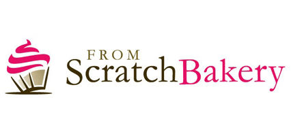
From Scratch Bakery Logo Critique
Kelly, submitted this logo for the From Scratch Bakery. She left the following comment about the logo.
“This logo is for a new bakery in a downtown, upscale neighborhood. I am still working on the colors, but I wanted a simple, clean look. I selected the cupcake because it seems more subtle and I like the way it's on an angle. The bakery is a full service bakery but specializes in cakes and cupcakes.”
The following critique is based on one designer’s opinion and experience. I always appreciate the readers thoughts as well. So, I’ll ask a question of two in the critique, please share your perspective in the comments at the end of this logo design critique.
Design Principals
Upon a quick glance Kelly’s logo does a good job at communicating “bakery” to the viewer. The colors are inviting, modern and cheery. I wouldn’t mind seeing the pink toned down to a light pink, similar to frosting. The cupcake icon concerns me slightly because it looks as though it could be clip art. I don’t know if Kelly drew the cupcake icon or if she picked it from a stock library somewhere. I just want to warn, that if it is stock, please check the license for that piece artwork as many are not allowed for use in logos. Kelly, maybe you could let us know where the cupcake icon came from in the comments section. There’s a post over at Webdesigner Depot that touches on the subject of stock imagery. Please check it out if you haven’t read it already.
Question for the readers
please respond in the comments below
First impressions? Is the mark working for you? Does it meet the criteria spelled out in Kelly’s comment?
Functionality / Versatility
The logo is wide, maybe too wide for some applications. Kelly, have you considered a narrower version of the logo? I’m concerned that the width will limit the size you can use the logo in certain applications. Aside from the width, the logo should reproduce well. It is two color and uses some screens all of which should work fine in most applications.
Question for the readers
please respond in the comments below
What do you think about the width of the mark? Can you foresee some problematic applications?
Does the Logo Work for the Audience?
I think the mark is pretty straight forward and legible. It’s directly obvious that the company at hand works with cakes or baked goods of some sort. The color choice conveys that this bakery may be more modern or trendy than the typical bakery.
Typography
The devil is in the details right? Unfortunately, the type suffers from poor kerning. Take a look at all the space surrounding the ‘o’ in ‘from’ or the ‘S’ in ‘Scratch’. There are actually several areas throughout the type that would benefit from some kerning. This issue seems to come rather often in the logos I critique. It seems many designers are getting so caught up in their concepts that they are forgetting to look at the small details too.
Possible Improvements
Designing a logo for yourself or own business is one of the hardest logo designs you’ll ever work on. So what is the best way to improve the logo? Well I think have made some comments above that can certainly offer some direction. Here’s a list of actionable items.
- Consider trying a lighter pink that might feel more like frosting.
- If the icon is stock/royalty free please double check the license to be sure your use in a logo is permissible.
- Adjust the kerning in the type. There are many gaps that need attention.
Overall, I think you have a good start on the logo design. And with some refinement you can definitely improve it. Please know that my intention in critiquing your work is not to hurt feelings, but to offer constructive feedback. I hope it was helpful. Best of luck, to you!
I appreciate and welcome your comments, and look forward to hearing from you soon. I purposely don’t cover every possible improvement that can be made to this logo, so go for it if you think I missed anything. All I ask is that you keep your comments clean and appropriate.
Like what you read here? Subscribe to the Logo Critiques News Feed.
Enjoy this post? Share it with others.


The images & logos presented on this blog are copyrighted by their respective owners. The blog itself is copyright Erik Peterson, 2008-2026 All Rights Reserved.


We enjoy your comments
80 Comments so far. Keep 'em Coming.
#1
By Fbanczak
07.22.2009 at 06:53 PM
My first impression is very positive. I really like this logo and the color palette but I agree with Eric that stock photos and vectors are not to be taken lightly plus it’s best to avoid them altogether since I doubt many clients would be happy to see their icon as part of another company’s logo which is a potential scenario with stocks/clip art. Otherwise here are some ways I think you could tighten up your design:
1) Make visual improvements to the word “from.” It appears to be dancing and perhaps because the R and O are not level with the top and bottom of the F and M. The character weight also looks weird when it’s shrunk to that size. You could adjust the thickness of the characters to appear more consistent. Is it the same color as “Scratch”? It seems slightly lighter to me but it should really be the same color so that you only have 2 colors in the logo
2)The S in “Scratch” and B in “Bakery” should be level with the rest of the word. It bothers my eye that the B descends below the line upon which the rest of the word sits.
3)Play around more with the alignment of “From.” Part of the reason it seems to be floating is because it has no strong alignment to anything else in the logo.
4)On the alignment note, the cupcake should really align to something, whether the bottom of it aligns to the bottom of the S or the bottom of the Y.
I hope that helps you. I think it’s a great logo already but it could use some minor adjustments.
#2
By Erik Peterson
07.23.2009 at 03:55 PM
@Fbanczak I appreciate your thoughts on the logo. All very well thought out. Thanks for offering another perspective for Kelly.
#3
By Derek Li
07.27.2009 at 06:36 PM
I too get a good feeling from the logo at first glance. I like the choice of typeface; it says fun and classy. It’s a playful serif. What I’m concerned with is the size and placement of “from”. The mark reads more like “Scratch Bakery” than “From Scratch Bakery”. The “from” is hierarchically more like “The Scratch Bakery”.
Also, Erik, I believe it should be “Design Principles”, rather than “Principals.”
#4
By Catherine
09.22.2009 at 02:47 AM
I think the cupcake is nicely rendered. As for the type, I agree with the comments regarding its kerning.
When I read the logo, however, I put more focus on “Scratch Bakery” than “From Scratch”, which I believe is the most important part of the title, as “Bakery” just describes the line of business. If she put “From” on the same line as “Scratch”, and then moved “Bakery” lower, I think it would make more sense.
Otherwise, I like the colors and how the “S” & “B” are slightly larer!
#5
By Jason
09.26.2009 at 03:15 PM
I agree with Catherine. The name of the company is “From Scratch” and that should be the primary focus. I would even consider leaving off Bakery. You accomplish that meaning with the icon and the name itself.
#6
By me me
05.10.2010 at 05:12 PM
lol
#7
By How to Make a Cake
04.10.2012 at 07:10 PM
Some comments from my side:
1) The colors seem lovely and inviting. The tone of pink is catchy.
2) The cream on cup cake rings bell of both creamy taste and also the steam in my head.
3) Font of letters both are sharp and curved which enables both firm brand image and attractiveness in the eyes of final consumer.
4) Compared to the logo, brand name is too long (compare the place used by logo and the brand name)
5) The word of “FROM” seems a little bit blurred/unsharp.
Anyway, repetition makes perfection
Linsey from how to make a cake
#8
By Muminah
07.31.2013 at 09:08 AM
Hi!!
I need a logo to be designed immediately for my bakery business. Can you help?
#9
By divp
05.30.2017 at 03:00 AM
Thanks for sharing nice one
#10
By soa leather vest
06.09.2017 at 04:42 AM
Write your message here.This is a decent blog by any means. I simply satisfied to peruse about it. I was anticipating perused about this kind of motivational and achievable point.
#11
By Felicia
08.09.2018 at 10:03 AM
This blog has find so many updates from logo critiques and scratch bakery. That has made so many reviews and essay articles for the aussiessayservices.com/instantassignmenthelp-com-au-review writers. So, I prefer to know something about their interesting articles and essay books.
#12
By Review
09.14.2018 at 08:57 AM
Check out our my assignment help review of the new Gluten-Free and Vegan bakery in Pinecrest, Start From Scratch. It is the only one of its kind in South Florida.
#13
By Allen
10.21.2019 at 03:41 AM
The colors are inviting, modern and cheery. I wouldn’t mind seeing the pink toned down to a light pink, similar to frosting. The cupcake icon concerns me slightly because it looks as though it could be clip art. I don’t know if Kelly drew the cupcake icon or if she picked it from a stock library somewhere. C1000-003 exam questions
#14
By Tom
02.20.2020 at 10:11 PM
Might need a logo for a cheap cleaning service.
#15
By Anoniem
03.24.2020 at 10:27 PM
I always appreciate the readers thoughts as well. https://www.yesextoys.com
#16
By Darren
04.21.2020 at 10:50 PM
Great stuff I really like this! Looks delicious. I wish I had a site like this but I’m a roofer in Great Falls
#17
By osama shk
04.22.2020 at 05:33 AM
Impressive web site, Distinguished feedback that I can tackle. I am moving forward and may apply to my current job as a pet sitter, which is very enjoyable, but I need to additional expand. Regards.
<a >D365 Credit Card Processing</a>
#18
By osama shk
04.29.2020 at 10:55 AM
Wow, cool post. I’d like to write like this too – taking time and real hard work to make a great article… but I put things off too much and never seem to get started. Thanks though.
<a >pemf therapy</a>
#19
By dadaddadaaosadaa shk
05.16.2020 at 06:10 PM
I can’t imagine focusing long enough to research; much less write this kind of article. You’ve outdone yourself with this material. This is great content.
<a >moroccan lamps</a>
#20
By asdasdad
06.01.2020 at 06:07 AM
This is highly information, crisp and clear. I think that everything has been described in systematic manner so that reader could get maximum information and learn many things.
article source
#21
By Yejefol
06.15.2020 at 01:51 AM
We are quite thankful for this post to make us aware of this information.
dean winchester jacket
#22
By kevin bear
10.23.2020 at 06:23 AM
Thanks for sharing this valuable stuff post it’s very helpful for me to keep doing a great job
Mandalorian Jacket
#23
By Amelia jack
11.14.2020 at 10:50 AM
Wow, this is a very interesting reading. I found a lot of things which I need. Great job on this content. I like it.
F95zone
#24
By kevin bear
12.26.2020 at 05:46 AM
Your information is very interesting and informative I really impressed this stuff such a wonderful content post I like it dear The USA Suits
#25
By Tilly Racker
01.25.2021 at 07:09 AM
Me encanta esto https://guitarlessonssanantoniotx.com
#26
By Gigi Smith
01.25.2021 at 07:14 AM
Este es el único sitio al que me ayudó https://cabinetswaco.com
#27
By Man and Van Dundee
02.03.2021 at 04:28 AM
Amazing service from start to finish. I can highly recommend man with a van Dundee.
#28
By Brent Woods
04.09.2021 at 06:01 AM
The logo is simple yet elegant. I would love to have a logo like this for my Elk Grove Tile.
#29
By Richard D
04.10.2021 at 10:56 AM
We have been battling the new design to our logo for a little while. Thank you for your article, even though we aren’t bakers, it made a difference to see what some other companies go through. We are just an affordable insulation company who has a female owner who enjoys baking also. Keep up the great work!
#30
By Shirley
08.03.2021 at 09:07 AM
Thanks for this great info of yours. This is so much a lot to do with my life. Lifesaver. Keep sharing with us. Concrete Company
#31
By Virgil Luke
10.18.2021 at 06:10 AM
My admiration for your article is enormous. I have read it in its entirety. It is one of the most useful blogs I have come across. I look forward to reading more of your posts.
Please refer to the article below to learn more about Virus-Free Autoclicker. Here’s a post you should read: Virus-Free Auto Clicker For Roblox.
#32
By rtda dfdg
01.10.2022 at 06:53 PM
I don’t know basket random what my future holds, but I’m hoping you are in it.
#33
By vpn highly suggested
05.05.2022 at 07:42 AM
I am a thirty year old person and a lawyer by profession . I fought many criminal cases in my carrier. It is really nice. I search many sites for more information and there is vpn suggestions.It is good and provide a high security. It is of very high speed. I am very happy with it.
#34
By natashaevans
05.19.2022 at 11:39 PM
Thank you for sharing this data. I really enjoy what you’ve written on your blog. You’ve shared a very useful and entertaining blog post with the public
#35
By AlyceRyan
06.03.2022 at 07:33 AM
I am very glad to read this informative article. google
#36
By Basketballstarsgame
09.02.2022 at 12:54 PM
Thanks for sharing. I’m glad you discovered. Thank you for sharing this data. I really enjoy what you write on your blog.
#37
By kossmoss
09.07.2022 at 03:21 AM
Thanks All comment personal use for me thanks alot..
https://gbplusmod.com/
#38
By Ultimo Fashions UK
10.25.2022 at 06:26 AM
Your blog website provided us with useful information to execute with. Each & every recommendation of your website is awesome.
#39
By shearling jackets
11.18.2022 at 02:50 AM
Interesting article; many thanks for sharing it. We sell leather jackets and coats online. Free shipping is available to all countries.mens & womens shearling jacket & coat.
#40
By Joel Mudd
12.18.2022 at 06:42 AM
They shouldn’t name their best cv writing service uk in their response as they have did it in another section of the application. It is not necessary for it to be an honor society or another thing that appears to be quite impressive. The admissions committee must see one’s patients outside.
#41
By Glenn Banker
01.19.2023 at 06:53 AM
Hello, I value your candid post. I really appreciate your post. By creating random numbers using a dice roll, you can improve your gaming skills. There are D4, D6, D8, and so on. Visit that page for more information. Roll D20 Dice Online.
#42
By tommchris
02.21.2023 at 08:30 PM
It’s hard to find a good article like this. With this article, you can understand many more things that you did not know. Since then, it has helped me a lot in life and work. See these resources 1v1 lol to learn more.
#43
By Mira Sherronm
02.24.2023 at 03:03 AM
I love this logo design, bubble shooter simple yet beautiful
#44
By laura lorde
02.24.2023 at 04:17 AM
In the case of From Scratch Bakery, melon playground a good logo might incorporate elements that communicate the handmade, artisanal quality of their baked goods. This could include imagery of a rolling pin, mixing bowl, or other baking tools.
#45
By Emma
03.03.2023 at 04:31 AM
Your post is fascinating and remarkable in its format! I find it to be quite useful krunker and informative, and I eagerly await your next communication.
#46
By lady james
03.07.2023 at 10:14 PM
I am very grateful to the author of this piece for bringing this information to our attention flagle.
#47
By Pamela Huffman
03.15.2023 at 02:15 AM
I have to say what a fantastic article it is. The fact that your piece is so well-written and concise convinced me that you are an authority on the subject. I’ll take your RSS feed, which you’ve given me permission to use, and subscribe in order to stay up to date on new entries. Keep up the great work and thank you so much. When you want to create random numbers, must-visit <a href =“https://numbergenerators.wixsite.com/my-site/post/8-best-online-random-number-generators”>random number generator</a> offers you a variety of alternative options.
#48
By natalie portman
03.29.2023 at 11:21 PM
Your logo brand is easy to read and instantly io games recognizable.
#49
By geometry dash subzero
04.15.2023 at 07:31 AM
Hi, all is going perfectly here and ofcourse every one is sharing information, that’s actually excellent, keep up writing.
#50
By Harry
05.24.2023 at 06:04 AM
The hues are warm, trendy, and positive. I wouldn’t mind if the pink was softened to a frosting-like light pink. | https://www.photoboothrentalscharlotte.com
#51
By https://myaccesshealth.com
07.10.2023 at 10:42 PM
I shared your blog with a friend who was doing school homework about this. My friend is happy because there is a lot of useful information in this blog. It’s rare to find a blog like this these days. 메이저사이트
#52
By emoji
07.19.2023 at 02:10 AM
Your article is great, I have read a lot of articles but I am really impressed with your writing style. I will review this post.
#53
By merrrty
07.19.2023 at 02:11 AM
You have given very useful information. Keep it up and keep blogging. I look forward to reading your next post. emoji
#54
By Neta Rose
08.23.2023 at 02:36 PM
well.. love the simplicity
Neta R.
landscapers in gold coast
#55
By helen
12.05.2023 at 10:57 PM
I definitely enjoyed every bit of it. It’s a great site spanish dictionary and nice sharing. I want to thank you. Good job! You guys do a great blog and have some great content. Please continue to uphold. lol beans
#56
By Charles G Chambers
02.21.2024 at 07:44 AM
Muy agradecido por esta lectura reveladora, me dio mucho en qué pensar. ¡La CPS Test es increíble! ¡Pon a prueba tu velocidad de clic y desafía a tus amigos!
#57
By billy
05.15.2024 at 11:03 PM
Your creativity knows no billy nomates bounds. You have a unique ability to think outside the box and come up with innovative solutions.
#58
By agia
05.28.2024 at 07:40 AM
Thanks for Nice and Informative Post. This article is really contains lot more information about This Topic. Utility Box
#59
By sarimshaikh
06.04.2024 at 03:23 AM
This was a shocking post. It has some look at here fundamental data on this subject. Link Building
#60
By KenyettaPesso
06.07.2024 at 10:33 PM
The iPad Pro is an incredibly arby’s happy hour menu versatile and powerful tablet.
#61
By Adam Sara
08.31.2024 at 03:06 AM
Run 3 is so fun.
#62
By slope 2
09.23.2024 at 03:57 PM
Thanks for sharing!
#63
By Poisuya
09.23.2024 at 03:58 PM
I like it
slope 2
#64
By jeffreestar
11.13.2024 at 01:59 AM
Great start, and with these refinements, the logo could definitely that’s not my neighbor stand out and effectively represent the brand.
#65
By retro games
11.27.2024 at 07:25 AM
There are many popular video games, but this one may not be. Try it to see how great it is!
#66
By Yasir Elecctronics
01.13.2025 at 06:40 AM
nice great post
Dc Inverter Ac in Pakistan
Samsung Ac Price in Pakistan
Fryer Price in Pakistan
Samsung Refrigerator
#67
By Furniture 4us
01.13.2025 at 08:23 AM
very nice great work keep it up this great work
Furniture 4 US
Home Furniture Karachi
Bedroom Set
Bedroom Chairs Set
#68
By Malik Furniture
01.15.2025 at 05:36 AM
nice great work
Malik Furniture
Bed Set in Lahore
Sofa Set Price in Lahore
Dining Table Set Price in Lahore
Lcd Rack in Lahore
Center Table Price in Lahore
#69
By wheelie bike
01.21.2025 at 10:37 AM
This piece held my attention throughout. Your insights are incredibly stimulating, and I can’t wait for your next post!
#70
By Jetcool
09.11.2025 at 11:53 PM
Solid advice, well done.
Dehumidifier Price in Pakistan
Water Dispenser Price in Pakistan
Bottom Load Water Dispenser Price in Pakistan
#71
By Sadaat Electronics
09.11.2025 at 11:54 PM
Very useful, thanks for sharing.
Sadaat Electronics
AC Install & Repair in Karachi
Washing Machine Repair in Karachi
Water Dispenser Repair in Karachi
Dishwasher Repair in Karachi
Cooking Range Repair in Karachi
#72
By NationalTechtools
10.11.2025 at 01:13 AM
<a >National Techtools</a> is an Indian supplier of industrial tools and equipment, based in Junagadh, Gujarat. Founded in 2014, it has become a significant online retailer, catering to a wide range of customers from professionals to DIY enthusiasts. The company offers a broad catalog of over 10,000 products, including power, hand, and gardening tools, as well as construction consumables.
#73
By NationalTechtools
10.11.2025 at 01:15 AM
National Techtools is an Indian supplier of industrial tools and equipment, based in Junagadh, Gujarat. Founded in 2014, it has become a significant online retailer, catering to a wide range of customers from professionals to DIY enthusiasts. The company offers a broad catalog of over 10,000 products, including power, hand, and gardening tools, as well as construction consumables.
#74
By NationalTechtools
10.11.2025 at 01:16 AM
National Techtools
#75
By Sandy88
11.02.2025 at 10:50 PM
Play Traffic Jam 3D, an addicting and entertaining puzzle game in which you must control traffic to avoid congestion. As you progress throughout the game, you’ll unlock additional game types and enhance your reflexes.
#76
By Laura
11.23.2025 at 09:29 PM
When you play speed stars, you become a top speedrunner and fight in fast races to win difficult tracks. Do you think you’re very good at time, speed, accuracy, and rhythm? speed stars game
#77
By Genesys Energy Solutions
12.16.2025 at 06:35 AM
Thanks for sharing such valuable insights.
Genesys
Perkins Generators
Yangdong Generators
Portable Generators
#78
By Font Generator
12.19.2025 at 10:33 AM
Online Fonts Generator is a free web-based tool that lets you convert normal text into stylish Unicode fonts instantly. Create fancy, gothic, cursive, bold, and decorative text for social media bios, posts, usernames, gaming names, and designs—no downloads or sign-ups required. Copy and paste fonts easily and use them across Instagram, Facebook, WhatsApp, X, and more.
#79
By Bunny2
01.25.2026 at 10:33 PM
Poor Bunny game is a creative and challenging indie game project with a rabbit survival race; this is one of the interesting arcade games we created. Poor Bunny is a flagship game that the company is developing; in addition, we have developed and designed many games with light challenges to help you entertain yourself after stressful working hours.
#80
By Super Electrocity
03.17.2026 at 01:27 AM
At Super Electrocity, discover reliable appliances that make everyday living easier. Stay refreshed with modern Water Dispensers, keep your food perfectly stored in a high-performance Refrigerator, and simplify laundry with an efficient Washing Machine. Experience quality, durability, and innovation—all available at Super Electrocity for your home needs.