Sophie’s Tavern Logo Design Critique 91
Categories: CritiquesFood & Beverages
Sophie’s Tavern Logo Design Critique
Kevin submitted this logo for Sophie’s Tavern along with the following commentary,
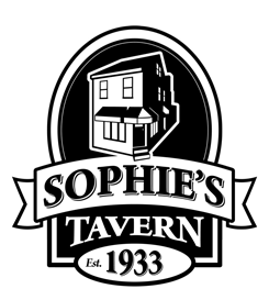
“Sophie’s Tavern is located in the heart of Camden, NJ and has been a cornerstone of the community since 1933. Like the city itself, Sophie’s has recently undergone a major renovation to improve the facilities both inside and out. It was decided that the building itself would be featured as it is such a recognized building in Camden. The main goal was to keep the home town feel of the bar to remind regulars and locals of the history and also introduce the bar as a great place to eat and drink to those who are unfamiliar with Sophie’s. A 3D model was built in SketchUp and then converted to vector art in Illustrator.”
The following critique is based on one designer’s opinion and experience. I always appreciate the readers thoughts as well. So, I’ll ask a question of two in the critique, please share your perspective in the comments at the end of this logo design critique.
Design Principals
This logo shows promise, but it lacks refinement in the building illustration and would benefit greatly from color. I have nothing against black and white logos, it’s just that this style of logo (what I’ll call the beer label style) screams for color. Is there a specific reason for black and white?
Question for the readers
please respond in the comments below
How do you feel about the lack of color in this logo? Do you think it could be improved with color?
The building illustration seems sterile and floats in it’s given space. It is almost touching the containing shape which leaves it feeling a bit cramped. Giving the building some breathing room around the top would be nice. The building should feel grounded and solid. Adding some context into the background will help. Perhaps the streets or sidewalks surrounding the building. I also noticed (from a the photo of the actual building) that there are some shutters on the building, perhaps adding those shutters would give the illustration more character and make it less sterile.
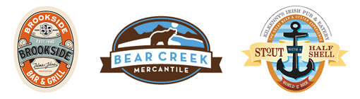
From left to right: Brookside Bar by jaredm, Bear Creek by bartodell, Kilkenny’s Menu by jaredm.
These logo examples show how color can really bring your mark to life. The Brookside logo has a very historical feel while the Bear Creek logo is an example of a background offering context to the illustration.
Functionality / Versatility
The logo is functional and should scale well. Being one color, it will work in almost any application without any modification. Keep in mind, there are some very small areas on the right side of the illustration that could fill in when reproduced at small sizes in certain mediums.
Does the Logo Work for the Audience?
The logo does have a certain sense of history to it. It is classic and memorable. For people that know the location, the illustration should be easily identifiable. The current state of the logo seems to be lacking character. It may just be the starkness of the front of the building being all white. Adding some light and shadow, without getting to complex, might help. I’ve mentioned him before, but I think Micahel Schwab’s work can offer some great examples of architectural elements in poster and logo design.
Question for the readers
please respond in the comments below
What do you think of the current illustration? Can it be improved with some refinement? If so, how would you bring more life and character to it?
Typography
The typography looks good. I especially like the treatment for ‘Tavern’ as it arches over the oval shape below it. Although I think the visual weight of the three typographical elements (Sophie’s, Tavern, Est. 1933) could use refining. The size of the year ‘1933’ and it’s surrounding oval is too large which makes it compete with ‘Sophie’s Tavern’. Consider reducing the size to around 50% of the current size. The asymmetry created by setting ‘est’ off to the left of ‘1933’ doesn’t fit with the symmetry in the rest of the design.
Possible Improvements
Designing a logo for yourself or own business is one of the hardest logo designs you’ll ever work on. So what is the best way to improve the logo? Well I think have made some comments above that can certainly offer some direction. Here’s a list of actionable items.
- Consider bringing some color to the logo. When doing so, think about the historical elements of the tavern and choose your palette accordingly.
- Refine the illustration further. Perhaps add some background elements to create a context and grounding for the building. Add more light and shadow to the illustration along with with the missing shutters.
- Consider reducing the established date so it doesn’t compete with the name of the tavern.
Overall, I think you have a good start on the logo design. And with some refinement you can definitely improve it. Please know that my intention in critiquing your work is not to hurt feelings, but to offer constructive feedback. I hope it was helpful. Best of luck, to you!
I appreciate and welcome your comments, and look forward to hearing from you soon. I purposely don’t cover every possible improvement that can be made to this logo, so go for it if you think I missed anything. All I ask is that you keep your comments clean and appropriate.
Like what you read here? Subscribe to the Logo Critiques News Feed.
Enjoy this post? Share it with others.


The images & logos presented on this blog are copyrighted by their respective owners. The blog itself is copyright Erik Peterson, 2008-2026 All Rights Reserved.


We enjoy your comments
91 Comments so far. Keep 'em Coming.
#1
By Rachel Ortiz
05.14.2009 at 03:25 PM
For me, the b&w shouldn’t even be an issue. A logo should be able to stand on its own in b&w, and if it does, then color can (and must be) considered.
#2
By csleh
05.14.2009 at 06:31 PM
A few suggestions:
- remove the shadow from “1933” in addition to the other comments in the post, that will help “sophie’s” stand out
- the windows on the side could be a little bigger, to make that side less dark and scary.
- the house seems a bit plopped in space. It’s nice the stairs overlap the ribbon but take it further. Make the image larger so the stairs overlap the “H” a little. We don’t need to see the roof, so it would be interesting to play with foreground/background by making the roof disappear under the oval. Think of the oval as a window, through which we see the house, instead of a frame.
- from the photo, the lights over the window things give a lot of character. The banister and plants by the doorway make the entry inviting. something of that would be really nice in the drawing.
- yes, it has to work in black and white first, but this design is pretty much there. adding color now will really make it sparkle.
#3
By Irene Mendez
10.14.2018 at 12:26 AM
Value of the critiques has been evaluated for the future error free documents for the people. It has been mild and essay ontime is designed for the reforms and all challenges for the humans in life.
#4
By Santiago
10.23.2018 at 10:56 AM
I blog quite often and I truly appreciate your information. The article has really peaked my interest.
I’m going to bookmark your website and keep checking for new information about once a week.
I opted in for your RSS feed too.
hagiographers (Santiago)
#5
By Lucas Scorfield
11.02.2018 at 12:55 AM
Logo design keeps lots of important for brand and business and hiring best designing services could be helpful for us. This logo is looking fine in shape and described almost all important boomessays review features of business to their targeted market.
#6
By abc
03.22.2019 at 06:31 AM
Engineering as a subject combines mathematics, logic and science to find solutions to our daily life problems. Over the last few
decades, engineering as a profession has seen vast expansion.
top engineering college
top MBA college in chandigarh
mechanical engineering college in chandigarh
Private management college in punjab
college with best placement in punjab
#7
By john morris
03.25.2019 at 08:13 AM
you have a huge collection of logo and design but your ranking on this keyword is very low try to improve your seo
by joining best digital marketing training institute in rohini after this you can boost up your site. by optimizing seo
#8
By vote
03.28.2019 at 06:46 AM
Our academic pursuits, along with a range of extracurricular activities, help in honing a child’s skills and ensuring that he/she grows to be a mature and responsible citizen.
top cbse school in greater noida
#9
By DWS
05.31.2019 at 11:12 PM
Here we always find best and creative logo for our website design company, which make our client site attractive and good looking with your logo.
#10
By Gos
07.22.2019 at 04:48 AM
The goal of the society is to create professionally well skilled students To achieve the said goal, arrangements have been made with the pioneers and front runners both in India and abroad.
top cbse school in premnagar
The Health system is created in a proficient way of expanding the network in the multispecialty services. With the ever-growing population, the hospital has announced many ambitious plans that have ultimately lead to the excellence.
multispeciality hospital in hisar
ivf treatment in hisar
ivf treatment in hisar
#11
By Starbucks menu
08.19.2019 at 04:49 AM
Je vous remercie de l’information! Je cherchais et ne pouvait pas trouver. Vous me aidé!
#12
By swayer
09.06.2019 at 03:08 AM
The data provided in this site is very much relevant for logo designers. As a designer, Wrongful Death Lawyer I liked this section very much. We can create better logos with the data contributed here. This article on Sophie’s Tavern Logo Design Critique is really good to read. Thanks for sharing.
#13
By Harmony7
09.25.2019 at 02:52 AM
The critics shared here is very helpful for logo designers. Such healthy criticisms help people to improve themselves and make better changes. Thanks for sharing this news with us. It was inspiring to read. I had been looking for goo logo design for my business.. best online recording studio thanks
#14
By abc
10.01.2019 at 06:20 AM
Our approach brings together best-in-class virtualized compute, storage, and networking infrastructure.
load balancer in uae
security partner in UAE
virtualization partner in uae
mobility partner in uae
vdi partner in uae
#15
By dpc
10.01.2019 at 06:21 AM
Provides multiple learning environment of International standard with holistic system of education at an affordable cost for the successful life of young generation.
paramedical College india
best agriculture college in dehradun
best agriculture college in north india
#16
By dpc
10.01.2019 at 06:21 AM
There is always an adventure waiting for you online.
csgo prime accounts at low prices
#17
By Anonie
03.24.2020 at 10:39 PM
This logo shows promise, but it lacks refinement in the building illustration and would benefit greatly from color. russell & bromley outlet
#18
By Grant
04.21.2020 at 11:04 PM
Nice logo. I like this and will use the style for my roofing contractor in Moses Lake business.
#19
By Javier McLaughlin
03.17.2021 at 01:20 AM
Creative brainstorming and gathering information about your project so the wisest decisions are made.
Moose Jaw snow clearing service
#20
By Saul Maynard
04.13.2021 at 08:06 AM
For me, I love the b&w since it looks really sophisticated and clean just like how the logo of concrete contractor companies.
#21
By Powergate Software
06.17.2021 at 06:32 AM
Your article is valuable for me and for others. Thanks for sharing your information, Software product development services.
#22
By Outside Gang
06.17.2021 at 06:37 AM
Your post is nice and very informative. Thanks for sharing keep it up, wine cooler.
#23
By Paloma Blanca Hotel
06.17.2021 at 06:42 AM
This article is awesome. It’s helped me a lot. Please keep up your good work, boutique hotel Marbella.
#24
By Ram Automotive
06.21.2021 at 05:05 AM
Thank you so much for sharing this amazing article with us. I Will stay connected with your blogs for a future post, Short term vs Long term car hire.
#25
By B Tech Tools
07.09.2021 at 10:34 AM
B-Tech Tools is a specialized manufacturer of professional power tools, pneumatic equipment, and hand tools for industrial and commercial applications. With B-Tech Tools, you receive the highest standard of quality, performance, and reliability.
#26
By Shirley
08.10.2021 at 10:05 AM
Thank you for the update, very nice site.. Exterior Painter Saint Paul MN
#27
By Anthony Carson
08.14.2021 at 05:55 PM
Your articles are a good read. I will stay connected to check updates from time to time. decorative concrete contractor
#28
By Ram Automotive
09.22.2021 at 10:12 PM
Amazing post, thanks for sharing this article. I am truly motivated by you for blogging. Thank you longest you can rent a car.
#29
By PG Landscaping
09.28.2021 at 08:54 AM
Thank you so much for the informative and interesting post I like the points which you have discussed over here, great job. Florida Internet Tax.
#30
By natashaevans
05.19.2022 at 11:42 PM
Thank you for sharing this data. I really enjoy what you’ve written on your blog. You’ve shared a very useful and entertaining blog post with the public. waffle
#31
By Victoria Payne
09.28.2022 at 03:01 AM
Time was, you had to buy something if you wanted it: a book, a record, a print, a song. Not anymore. You don’t need to pay for vince grant music. Well, you do need to pay for it. You just have to wait until it’s free. That’s what makes this situation weird.
#32
By Mark
03.02.2023 at 06:31 AM
Hey Erik, great analyses overall. What do you think about more minimalistic logos(one of the examples I can give is nearby hunting store https://gritroutdoors.com/ I guess). How well do those work since sometimes it feels like more people gravitate to this simplicity. Thanks!
#33
By James Core
03.27.2023 at 01:36 AM
Wordlenytimes is a word game created by the New York Times. In the game, you are presented with a five-letter word, and you have six chances to guess the word. After each guess, the game will tell you which letters are correct and in the correct position (marked with a green square), and which letters are correct but in the wrong position (marked with a yellow circle). The goal of the game is to guess the word correctly in as few tries as possible.
https://wordlenytimes.net/
#34
By Ava
03.30.2023 at 04:46 AM
Enjoy the best online slot pg games through the website pgslot.bar, the best game to make money, easy to play. Earn ten thousand, hundred thousand easily. Which the website has a great promotion and good service to support all players Join the fun today and receive a huge set of bonuses right away.
#35
By dordle
04.13.2023 at 04:50 AM
This is a miracle for you! This is the most extraordinary article I have ever read. This has made my day significantly better today.
#36
By vietbantinh
05.03.2023 at 11:14 AM
This logo template is designed with a very unique style that not everyone wordle make, I really like the thinking and imagination of the person who made this logo template!
#37
By George
05.24.2023 at 04:18 AM
The drawing of the building appears sterile and hovers in the available area. It feels a little confined because it is practically touching the confining form. It would be wonderful to give the building some breathing room around the top, more info.
#38
By Preedee Saksun
07.30.2023 at 01:18 PM
การทำความเข้าใจและปฏิเสธ: บางครั้งคนที่ออกแบบโลโก้อาจต้องมีความเข้าใจที่เกี่ยวข้องกับธุรกิจหรือองค์กรนั้น ๆ ก่อนที่จะสามารถสร้างโลโก้ที่เกี่ยวข้องและมีความหมายได้อย่างเหมาะสม การปฏิเสธความคิดเห็นและไม่เปิดใจต่อความรู้และเสน่ห์ที่คนอื่นให้กับโลโก้อาจทำให้เกิดความเสียหายในการสื่อสารและติดตัวต่อผู้บริโภคหรือลูกค้าที่เป้าหมาย
ความเกี่ยวข้องกับตัวตนและความเป็นเอกลักษณ์: โลโก้ที่สร้างขึ้นอาจมีความสำคัญในการสร้างตัวตนและความเป็นเอกลักษณ์ของธุรกิจ โลโก้ที่น่าจดจำและสื่อความคิดเห็นที่ตรงกับบุคลิกขององค์กรจะช่วยเสริมสร้างความเชื่อมั่นและความภาคภูมิใจให้กับพนักงานและลูกค้า
ความกระชับและความอ่อนโยน: ความกระชับในการออกแบบโลโก้จะช่วยให้ผู้ชมรับรู้และจดจำได้ง่าย โลโก้ที่มีรายละเอียดที่น้อยและเป็นภาพหน้าสัมผัสอาจช่วยให้โลโก้นั้นตัดสินใจเสร็จเร็วขึ้น นอกจากนี้ การออกแบบโลโก้ที่อ่อนโยนและสามารถปรับใช้ได้ในหลายสถานการณ์หรือสื่อสารต่าง ๆ จะช่วยให้โลโก้นั้นสามารถเหมาะสมกับความต้องการและสภาพแวดล้อมต่าง ๆ
ความโดดเด่นและอัพเดต: โลโก้ที่มีความโดดเด่นและไม่เหมือนใครจะช่วยให้ธุรกิจแยกตัวจากคู่แข่งและนำมาซึ่งความนิยมของลูกค้า อย่างไรก็ตาม การออกแบบโลโก้อาจต้องอัพเดตหรือปรับปรุงเมื่อมีการเปลี่ยนแปลงในองค์กรหรือตลาด
ความเหมาะสมในมุมมองต่าง ๆ: บทวิจารณ์เกี่ยวกับการออกแบบโลโก้อาจมีความหลากหลายในมุมมอง คนบางคนอาจให้ความสำคัญกับความเรียบง่ายและความชัดเจนของโลโก้ในขณะที่คนอื่นอาจเน้นไปที่ความคิดสร้างสรรค์และความเฉลียวฉลาดในการให้ความหมาย
ความคิดเห็นเกี่ยวกับการออกแบบโลโก้จึงเป็นเรื่องส่วนตัวและขึ้นอยู่กับความเห็นแต่ละคน หากสร้างโลโก้ที่สอดคล้องกับองค์กรหรือธุรกิจ มีความสำคัญ โดยรวมแล้ว การออกแบบโลโก้ควรให้ความสำคัญในเรื่องของความเป็นอยู่ ความเป็นเอกลักษณ์ ความเหมาะสมและความคิดสร้างสรรค์เพื่อตอบสนองความต้องการและมุมมองของกลุ่มเป้าหมายที่แตกต่างกัน
PGSLOT เป็นผู้ให้บริการเกมสล็อตออนไลน์ระดับโลก ที่ได้รับความนิยมอย่างแพร่หลายในกลุ่มผู้เล่นเกมทั้งมือใหม่และมืออาชีพ ด้วยการออกแบบและพัฒนาเกมที่น่าตื่นตาตื่นใจ รูปแบบการเล่นที่เหมาะสม และความเข้ากันได้ที่ดีกับทุกแพลตฟอร์ม
เกมสล็อตของ PG เครดิตฟรี 100 มาพร้อมกับกราฟิกที่สวยงามและเสียงที่น่าตื่นเต้น ทำให้ผู้เล่นตื่นเต้นและหลงใหลในการเล่นตลอดเวลา นอกจากนี้ยังมีระบบโบนัสและโปรโมชั่นที่น่าสนใจ ที่ช่วยเพิ่มโอกาสในการชนะในเกม
PGSLOT มีเกมสล็อตหลากหลายรูปแบบที่เลือกเล่น ทั้งเกมคลาสสิกแบบ 3 วงล้อ และเกมสล็อตวิดีโอแบบ 5 วงล้อ ทำให้ผู้เล่นสามารถเลือกเล่นเกมที่ตรงใจได้ตามความชอบ
หากคุณต้องการประสบความสำเร็จในการเล่นสล็อตออนไลน์ ไม่ควรพลาดที่จะลองเล่นเกมของ PGSLOT ที่นี่ เข้าร่วมกลุ่มผู้ชนะและสัมผัสประสบการณ์ที่น่าตื่นเต้นอย่างแท้จริง
อย่างน้อยก็เพียงพอแล้วสำหรับบทความนี้ครับ หวังว่าคำว่า “PGSLOT” จะเป็นที่น่าสนใจและเป็นประโยชน์ในการส่งเสริมให้คุณค้นพบเกมสล็อตที่ดีที่สุดสำหรับความบันเทิงของคุณ!
#39
By nytwordle
08.02.2023 at 02:45 AM
NYT Wordle is a word-guessing game that challenges players to guess a five-letter word within a limited number of attempts. It combines wordplay, deduction, and logic to provide an engaging and addictive gaming experience.
Play New York Times Wordle and Find Today’s <a href=“https://www.nyt-wordle.com”>Wordle NYT Answer.
#40
By Mary
08.05.2023 at 04:41 AM
This logo shows promise, but it lacks refinement in the building illustration and would benefit greatly from color. drywall company Hamilton Park
#41
By costa
08.31.2023 at 05:15 AM
สีสันแห่งความสนุกที่คุณสามารถเพลิดเพลินได้อย่างที่ใจต้องการ nagaสล็อต มอบประสบการณ์พนันสุดล้ำ จากค่ายเกมดังระดับโลก บริการด้วยทีมงานที่ดีที่สุดที่สร้างความมั่นใจให้กับผู้เล่นได้อย่างสมบูรณ์แบบ รองรับการใช้งานมากกว่า 1 ล้านยูสเซอร์ทั่วโลก อัดแน่นไปด้วยคุณภาพที่ส่งตรงจากค่ายเกมดังระดับสากล ให้ความช่วยเหลือและมอบคำแนะนำที่ดีที่สุดให้แก่สมาชิกตลอด 24 ชั่วโมง
#42
By costa
08.31.2023 at 05:17 AM
Thanks for sharing the post https://all4slot.com/
#43
By costa
08.31.2023 at 05:19 AM
นำเสนอช่องทางการเข้าเล่นสล็อตที่สะดวกสบาย www.22dragonslot.com ตอบโจทย์สไตล์การเล่นที่ครบทุกความต้องการ ด้วยนโยบายที่ต้องการสนับสนุนให้ผู้เล่นเข้าถึงเกมมากคุณภาพ ผลักดันโมเดลใหม่ล่าสุดด้วยพันธมิตรค่ายซอฟต์แวร์กว่า 30 แบรนด์ ระดมกำลังพัฒนาธีมเกมใหม่ที่ตอบโจทย์ความต้องการของนักเดิมพัน รับสิทธิพิเศษต่างๆ ได้โดยตรงผ่านทางเว็บ สำรวจเกมสล็อตแท้ถูกลิขสิทธิ์ ฟินกับทุกช่วงเวลาแห่งความสนุกที่คุณออกแบบได้เอง
#44
By costa
08.31.2023 at 05:19 AM
ความโดดเด่นของคอนเทนต์เกมคุณภาพ okslot สล็อตแจกเครดิตฟรีเล่นได้ทุกค่ายไม่จำกัดขั้นต่ำ ข้อเสนอสุดพิเศษที่ช่วยให้คุณใช้เวลาไปกับการเล่นได้อย่างต่อเนื่อง ดื่มด่ำไปกับความทันสมัยของอุตสาหกรรมการผลิตเกมสล็อต ที่ขับเคลื่อนด้วยการแข่งขันในเชิงคุณภาพ หากคุณต้องการรู้จักเกมสล็อตในมิติที่กว้างขึ้น ลองเช็คอันดับเกมฟรีที่ดีที่สุดที่ให้บริการบนเว็บเราได้เลยตอนนี้! สมัครฟรี ไม่มีขั้นต่ำ
#45
By costa
08.31.2023 at 05:20 AM
เว็บตรงไม่ผ่านเอเย่นต์ ใหม่ล่าสุด naga games นำเข้าอย่างถูกกฎหมาย มีใบรับรองการันตี ตามมาตรฐานสากล มั่นคงเชื่อถือได้ ไม่มีโกง เปิดมานานกว่า 10 ปี คาสิโนออนไลน์อันดับ 1 พร้อมทั้ง แจกเครดิตฟรี ทดลองเล่นบาคาร่า ทดลองเล่นสล็อตได้ไม่อั้น ไม่ต้องฝากไม่ต้องแชร์ เล่นได้ฟรี เราคือ คาสิโนออนไลน์กับผู้ให้บริการที่ดีที่สุด ที่นี่ตอนนี้
#46
By www.pgslot.ink
09.30.2023 at 05:18 AM
จุดเด่นเกมสล็อต www.pgslot.ink ตัวเกมสล็อตรูปแบบใหม่ที่น่าสนใจอย่างมาก และทำให้สล็อตพีจี กลายเป็นค่ายเกมชั้นนำแนวหน้าของเมืองไทย ที่ใครเป็นนักปั่นสล็อตตัวจริง บอกเลยว่าไม่ควรพลาด
#47
By tonme
09.30.2023 at 01:10 PM
น่าสนใจ
#48
By misspuy27 misspuy27
09.30.2023 at 01:13 PM
แนวทางพิจารณาเว็บตรงที่จะเข้าเล่น PGSLOT
การเข้าเล่นสล็อตออนไลน์ผ่านเว็บไซต์ตรงได้ครับ การเข้าเล่นเกมสล็อตออนไลน์ผ่านเว็บไซต์ตรงหมายถึงการเล่นสล็อตโดยตรงผ่านเว็บไซต์ของผู้ให้บริการเกม โดยไม่ต้องผ่านเอเจนต์หรือพ่อค้ากลาง นี่คือวิธีที่คนสามารถเข้าเล่นสล็อตออนไลน์ได้อย่างตรงไปตรงมา และเว็บไซต์ตรงส่วนใหญ่มักมีระบบรางวัลและโปรโมชั่นที่น่าสนใจสำหรับผู้เล่นด้วยครับ อย่าลืมอ่านข้อมูลและเงื่อนไขของแต่ละเว็บไซต์ก่อนเริ่มเล่นเพื่อประสิทธิภาพและความปลอดภัยในการเล่นเกมด้วย
การเข้าหน้าเว็บ PGSLOT หรือเว็บไซต์ตรงของ เกมสล็อต ค่าย PG เว็บตรง อาจมีขั้นตอนเบื้องต้นดังนี้
1. เลือกเว็บ PGSLOT ในการเริ่มเล่นเกม PGSLOT ตรง คุณจำเป็นต้องเลือกเว็บไซต์ที่เป็นไปตามกฎหมายและน่าเชื่อถือ สามารถค้นหาเว็บ PGSLOT ที่น่าเชื่อถือได้จากบทวิจารณ์และแหล่งข้อมูลออนไลน์ที่เชื่อถือได้
2. ฝากเงิน หลังจากที่คุณสมัครสมาชิกเสร็จสิ้น คุณจะต้องทำการฝากเงินเข้าสู่บัญชีผู้ใช้ของคุณ ทางเว็บไซต์จะมีวิธีการฝากเงินต่างๆ ให้เลือกใช้งาน ให้ทำการโอนเงินเข้าสู่บัญชีตามขั้นตอนที่ระบุ
3. เลือกเกม เมื่อคุณมีเงินในบัญชีผู้ใช้แล้ว คุณสามารถเลือกเกม PGSLOT ที่คุณต้องการเล่น ในหน้าหลักของเว็บไซต์ คุณจะพบกับรายการเกมที่สามารถเลือกเล่นได้
4. เล่นเกม เมื่อคุณเลือกเกมที่ต้องการ เพียงแค่คลิกที่เกมนั้นและเริ่มเล่น คุณสามารถเดิมพันและหมุนวงล้อของสล็อตเกมได้ตามต้องการ
หลังจากที่คุณทำขั้นตอนเหล่านี้เสร็จสิ้น คุณก็สามารถเข้าเล่นเกม PGSLOT บนเว็บไซต์ตรงได้แล้ว โดยควรจะมีความสนุกสนานและระวังการเดิมพันของคุณเสมอ และอย่าลืมทำความเข้าใจกฎกติกาของเกมแต่ละเกมก่อนที่คุณจะเริ่มเดิมพันด้วยเงินจริง การเข้าเล่นคาสิโนออนไลน์ผ่านเว็บไซต์ตรง (เช่น PGSLOT) เป็นทางเลือกที่นิยมมากในปัจจุบัน เนื่องจากมีความสะดวกสบายและปลอดภัย นี่คือสาเหตุบางอย่างที่ทำให้มันเป็นที่นิยม
1. ไม่ต้องดาวน์โหลด การเล่นผ่านเว็บไซต์ตรงไม่ต้องการการดาวน์โหลดและติดตั้งซอฟต์แวร์เสริมหรือแอปพลิเคชันเพิ่มเติม นี่คือข้อได้เปรียบมากในกรณีที่คุณไม่ต้องการให้คอมพิวเตอร์หรืออุปกรณ์มือถือของคุณมีแอปพลิเคชันเสริมมากมาย
2. ความปลอดภัย เว็บไซต์คาสิโนตรงมักมีมาตรการความปลอดภัยที่เข้มงวด เพื่อให้คุณมั่นใจในการทำธุรกรรมการเงินและความเป็นส่วนตัวของคุณ
3. ความสะดวกสบาย คุณสามารถเข้าเล่นเกมได้ทุกที่ทุกเวลาที่มีการเชื่อมต่ออินเทอร์เน็ต ไม่ว่าคุณจะใช้คอมพิวเตอร์หรืออุปกรณ์มือถือก็ได้
4. หลากหลายเกม เว็บไซต์ตรงมักมีรายการเกมสล็อตออนไลน์ที่หลากหลาย ซึ่งคุณสามารถเลือกเล่นเกมที่คุณชื่นชอบและทดลองเล่นหลายแบบได้
5. การให้บริการลูกค้า ส่วนใหญ่เว็บไซต์ตรงมักมีบริการลูกค้าที่พร้อมให้ความช่วยเหลือผู้เล่นตลอด 24 ชั่วโมง ซึ่งช่วยให้คุณได้รับความช่วยเหลือเมื่อมีปัญหาหรือข้อสงสัย
#49
By wordle 2
10.01.2023 at 01:41 AM
Wordle 2 is an updated version of the popular word puzzle game called “Wordle.” The word-guessing game challenges players to guess a hidden five-letter word within six attempts. Here’s how to play Wordle 2
#50
By swetaaa
10.09.2023 at 02:50 AM
If you’ve ever bought something an influencer recommended online, you’ve likely come across an affiliate marketing Delhi Affiliate Marketing business. Online creators often build partnerships with brands to promote its products and services. In return, they earn a commission for each sale.
#51
By Nywordle
11.02.2023 at 02:37 AM
Ny Wordle is a popular word puzzle game in which players are tasked with guessing a hidden five-letter word within six attempts. The player’s objective is to deduce the target word by making educated guesses and using the feedback to narrow down the possibilities. Wordle Ny has become a popular and addictive word puzzle game, and it is often played online or through dedicated apps. It’s a fun and challenging way to test your vocabulary and deduction skills.
#52
By filter bags
11.02.2023 at 11:51 PM
Filter bags used in Pulse jet dust collector is the most prominent component of this type of dust collector. It is the heart of the dust collection process. The filter bags in the pulse jet dust collector are supported on the interior cage and are hung from a tube sheet near the top of the baghouse.
#53
By indianfilters
11.02.2023 at 11:53 PM
Filter bags used in Pulse jet dust collector is the most prominent component of this type of dust collector. It is the heart of the dust collection process. The filter bags in the pulse jet dust collector are supported on the interior cage and are hung from a tube sheet near the top of the baghouse.
filter bags
#54
By riyadh massage
11.03.2023 at 01:41 PM
I’ve found this interesting! Check it out!
Erotic Massage Riyadh |
#55
By game11
11.06.2023 at 07:39 AM
เทศกาลเครดิตฟรี สล็อต เว็บตรงที่ดีที่สุดที่ 1 ทดลองเล่นสล็อตฟรีทุกเกม การรับเครดิตฟรีเพียงแค่สมัครเท่านั้น คุณสามารถสำรวจเกมต่างๆ ประสบการณ์การสัมผัสผู้เล่นบนแพลตฟอร์ม และนำเงินเข้ากระเป๋าของคุณ
#56
By Wordle NYT
11.10.2023 at 01:42 AM
Wordle is a word puzzle game that challenges players to guess a five-letter word within six attempts. After each guess, the game provides feedback by highlighting the letters in different colors. If you want to play Wordlenyt in The New York Times or any other platform.
#57
By NytwordleNyt
11.30.2023 at 02:16 AM
Wordle is a word puzzle game where the goal is to guess a five-letter word within six attempts.After winning or losing, you can choose to play again and continue testing your word-guessing skills.Remember that is not only about finding the correct word but also about using a strategic approach to maximize the information gained from each guess.
#58
By NytwordleNyt
11.30.2023 at 02:18 AM
Wordle is a word puzzle game where the goal is to guess a five-letter word within six attempts.After winning or losing, you can choose to play again and continue testing your word-guessing skills.Remember that is not only about finding the correct word but also about using a strategic approach to maximize the information gained from each guess.
#59
By Peggy R Bilodeau
12.05.2023 at 01:24 AM
Your insightful perspective always adds a refreshing twist to the topic. Thanks a million for the quick 10 easy fixes of PS4 CONTROLLER – my PS4 controller is back in action.
#60
By James Core
12.12.2023 at 01:32 AM
To activate your Bally Sports account, please access the official activation website at ballysports.com/activate. You can typically find the URL for this site either during the activation process or displayed on your TV screen. Be sure to use the authorized activation website for a seamless experience.
To activate MY5 on your computer or mobile device, simply open a web browser and visit the official activation website at my5.tv/activate. You can usually find the activation URL displayed on the activation screen within the app. Once on the activation website, you’ll be prompted to enter the activation code that you received from your device. Make sure to enter the code correctly for a successful activation.
Open the Prime Video app on your television. Select the option “Register on the Amazon website” to obtain a 5–6 character activation code. Go to primevideo.com/mytv using any web browser on your computer or mobile device. Sign in to your Amazon account by entering your username and password. Input the activation code displayed on your TV screen when prompted.
In your web browser’s address bar, enter the following URL: usanetwork.com/activatenbcu and then press “Enter.” Sign in or register for an account if prompted to do so. You will be asked to input the activation code, which is typically displayed on your TV screen when attempting to access USA Network. Ensure accurate entry of this unique code into the designated field. Once you have correctly entered the activation code, click on the “Activate” button to initiate the activation process.
#61
By James Core
12.12.2023 at 01:32 AM
Wordle Nyt is an enhanced version of the classic game that was featured in The New York Times Wordle. What sets it apart is its social and competitive features, allowing players to challenge their friends and see who can guess the word in the fewest attempts
Nyt Wordle
Wordle Nyt
Wordle Game Vs Quordle has taken the internet by storm. This intriguing and challenging game has captured the hearts and minds of word enthusiasts worldwide. If you’re looking to improve your skills and make the most of each round.
Quordle
Quordle Today
Wordle 2
Wordle2
Tvcodeenter website is purely for Information Purposes. which provide information related to the Entertainment channels and remove difficulties with that.We are a team of all Streaming app & Channels experts and experienced authors that provide the best user experience to watch online streaming app on your streaming devices.
hbomax/tvsignin
fubo.tv/lgtv-connect
#62
By Henry K Bray
12.23.2023 at 12:42 AM
I always look forward to your comments; they bring a unique and valuable perspective. User-friendly interface, each click test was swift.
#63
By costa
12.23.2023 at 08:25 AM
เปิดใหม่ล่าสุด และยอดนิยมแห่งปี ทดลองเล่นบาคาร่า เล่นผ่านเว็บตรง เว็บใหญ่ ฝาก-ถอน ออโต้ที่รวดเร็วมากที่สุด สมัครสมาชิก เล่นสล็อตฟรี ไม่มีค่าบริการ เราคือผู้ให้บริการเกมสล็อตออนไลน์ยอดฮิต เว็บเกมสล็อตออนไลน์ที่ดีที่สุด อันดับ1 สล็อตออนไลน์ ท่านจะพบกับความสนุกสนานเพลิดเพลินแบบไร้ขีดจำกัด เรียกได้ว่าเป็นค่ายใหม่มาแรงอย่างมาก สุดยอดเกมทำเงินผ่านมือถือแบบไร้ขีดจำกัดระดับพรีเมี่ยม สะดวกสบายมากที่สุด
#64
By costa
12.23.2023 at 08:25 AM
เล่นสล็อตกับเราท่านจะได้เล่นเกมสนุกสุดมัน nagagame89 มากมายให้เลือกกว่าหลายค่ายดัง ให้ผู้ใช้งานได้เลือกสรร รวมถึงเงินรางวัลมากมาย ผ่านการเล่นสล็อตออนไลน์ เว็บตรง เว็บคาสิโน auto ระบบเกมทำเงินมือถือที่ได้รับมาตรฐานระดับสากล โปรโมชั่นเด็ดๆมากมายผ่านเว็บหลักเว็บใหญ่ เต็มเปี่ยมไปด้วยคุณภาพคับคั่ง พร้อม เกมสล็อตแตกง่าย รวมสล็อตแตกดีไว้ที่นี่
#65
By ezy789th
12.27.2023 at 06:40 AM
เกม Slot แตกง่าย โปรโมชั่นเด็ด วิถีทางทำเงินสล็อตเว็บไซต์ตรงรูปแบบใหม่ไม่เหมือนใคร สามารถเล่นบนโทรศัพท์เคลื่อนที่ แท็บเล็ต รวมทั้งคอมพิวเตอร์ได้ไม่ยาก ไม่ต้องดาวน์โหลดแอพสล็อตให้ยุ่งยาก การเข้าเล่นเกมสล็อตกับพวกเรา ezy789th นั้นผู้เล่นสามารถเล่นผ่านโปรแกรมท่องอินเตอร์เน็ตได้ทุกวิถีทาง รองรับทุกระบบปฏิบัติการ ครอบคลุมทุกการใช้แรงงานแค่เพียงผู้เล่นมี Internet ซึ่งสามารถเชื่อมต่อได้ ไม่ต้องเสียเวล่ำเวลาหรือเปลืองเนื้อที่สำหรับเพื่อการดาวน์โหลดแอพพลิเคชั่นอีกด้วย ทั้งยังย่นระยะเวลา แล้วก็มีความสบายสบายตลอดการใช้งานอย่างยิ่งจริงๆ
#66
By Antoine R Reynoso
12.28.2023 at 05:07 AM
I resonate with your viewpoint and appreciate the clarity of your writing. I appreciate the engaging design of this Reaction Speed Test – a great tool for improve brain reaction ability.
#67
By costa
01.07.2024 at 07:46 AM
พัฒนาระบบ ทางเข้าสล็อต 22dragonslot.net เน้นรูปแบบอัตโนมัติ สามารถทำรายการได้ด้วยตัวเอง สมัครเกมสล็อตแตกง่าย สล็อตออโต้ โดยไม่ต้องรอ call center เพื่อเสียเวลาแห่งความสนุกสนาน ปัจจุบันได้ปรับปรุงให้เอื้อต่อผู้ใช้งานมากยึ่งขึ้น ด้วยระบบที่สามารถเล่นได้ทุกที่ ทุกเวลา อีกทั้งยังรองรับทุกระบบปฏิบัติการ ไม่ว่าจะเป็น SLOTมือถือ iPad , computer PC , MacBook ,Tablet และยังสามารถรองรับเครือข่ายตั้งแต่ 3G ขึ้นไปอีกด้วย
#68
By ทดลองเล่นสล็อต 2024
01.11.2024 at 12:03 PM
สมัครเล่นฟรี ทดลองเล่นสล็อต 2024 รวมทุกค่ายในเว็บเดียว แจกเครดิตฟรี100% ที่นี่ที่เดียว !
#69
By goodman
03.08.2024 at 12:38 PM
dlawdmkwladmlw aaa
#70
By gurock4869
03.08.2024 at 12:44 PM
Baccarat is a game that is full of excitement and fun BCR99Thailand whether playing in a very luxurious casino or play through online platforms in comfort Baccarat is still one of the most exciting games that people choose to play and enjoy every day. But why is baccarat such a popular game.
Baccarat games are simple and easy to learn. No special skills required to play. And it doesn’t require a complicated strategy. This is what makes the game so beloved and addictive to players all over the world. Anyone can come and play without having to have prior knowledge. and can have fun without limits
Baccarat also has a fast-paced gameplay mechanism and unlike other games, has a long playing time. in just a few minutes Players can place bets and show cards in just a few rounds and know the results immediately. This makes it an ideal game for those who have little free time and want to enjoy the game in a short period of time.
Another thing that makes baccarat popular every day is the winning opportunities it offers. It is not a very complicated game to keep players wondering whether to win or not. There is generally a chance of a tie between the Banker and the Player. This makes it popular and attractive for those who want to try their luck with a small capital.
So when you want to enjoy the game of baccarat every day. You don’t need to think too much. Just sit back and play. It is endlessly exciting and fun, and in the end, you might even get a chance to win some huge prizes.
#71
By Marina W Vanscyoc
03.09.2024 at 05:23 AM
¡Gran publicación, realmente disfruté leyéndola! Experimenta la emoción de hacer clic rápido con Clics Por Segundo. ¿Podrás seguir el ritmo?
#72
By nyt connections
04.15.2024 at 01:28 AM
Networking has long been hailed as a crucial component of professional success, and in today’s digital age, its significance has only magnified. In the realm of career advancement and personal growth, the ability to forge meaningful connections can open doors to opportunities that may have otherwise remained elusive. Understanding the dynamics of networking and how to navigate them effectively is key to leveraging its full potential.
#73
By nyt connections
04.15.2024 at 01:30 AM
Networking has long been hailed as a crucial component of professional success, and in today’s digital age, its significance has only magnified. In the realm of career advancement and personal growth, the ability to forge meaningful connections can open doors to opportunities that may have otherwise remained elusive. Understanding the dynamics of networking and how to navigate them effectively is key to leveraging its full potential.
nytconnections
#74
By Robert L Green
05.02.2024 at 02:43 AM
Votre blog est une bouffée d’air frais dans une mer de contenu, merci ! Je ressens une montée d’adrénaline à chaque fois que je joue au Click test !
#75
By subhanakhar
05.06.2024 at 02:26 AM
Communicate complex ideas effortlessly through visual storytelling. 3d Rendering Services
#76
By outlander
05.15.2024 at 11:05 PM
It’s evident that you outlander brewery have a strong work ethic and a passion for excellence. Your dedication is truly admirable.
#77
By zoeyvida293
06.01.2024 at 09:19 AM
Platforms and communication channels in the online baccarat community
Online baccarat communities often use a variety of platforms and communication channels to connect and exchange information with each other. This is a popular platform.
Online Forums Forums such as Reddit, Quora, and gambling-specific forums provide a space for players to ask questions and share experiences.
Social Media Facebook Groups Twitter and Instagram are where players can follow the latest news about sexy bacara Baccarat Online and share their opinions.
Chat Applications Apps like Discord and Telegram are popular for creating dedicated chat groups among baccarat players. This makes it possible to exchange information in real time.
YouTube Channel and Streaming Many baccarat players and game analysts have YouTube channels or Twitch streaming channels where they can share strategies and play games live for viewers to watch and learn from.
Community activities and contests Events and contests are a way for the online baccarat community to have fun and promote learning. This is a popular activity.
Online Baccarat Tournament Players can participate in contests held on various online casino sites to win prizes and bonuses.
Bonus distribution activities Some communities and platforms often offer bonuses or special promotions for participating members.
Teaching and workshops Online workshops are organized to teach new players baccarat strategies and techniques.
The role of technology in the online baccarat community Technology plays an important role in the development of the online baccarat community. Makes connecting and exchanging information easy and convenient. This is where technology plays an important role.
Mobile application Mobile application development allows players to access games and communities anywhere, anytime.
live streaming Live streaming of baccarat games allows players to learn and watch play from experienced players.
Artificial Intelligence (AI) AI is used to analyze games and help in making betting decisions. This allows players to develop more effective strategies.
Safety and Privacy in the Online Baccarat Community Security and privacy are important matters that players should pay attention to when joining the online baccarat community. Here are some tips for staying safe.
Secure use of information Avoid sharing personal information such as passwords or credit card information in online communities.
Choosing a reliable website Check the reliability of the participating website or platform, such as whether it has a license and has good reviews from other players.
Using an antivirus program Install anti-virus and anti-malware programs to prevent malicious attacks.
Joining social and online baccarat player communities not only helps players develop strategies and increase their chances of winning. But it is also a good way to build a network of relationships. and enhance the gaming experience in a fun and safe way. Players can learn and improve themselves by exchanging experiences and strategies in this community. There will be a great advantage in playing online baccarat.
#78
By https://kiskertek.com/
06.13.2024 at 07:20 AM
click me my name https://kiskertek.com/
#79
By https://kaspivo.com/
06.13.2024 at 07:25 AM
click me my name https://kaspivo.com/
#80
By https://kurtweitzmann.com/
06.13.2024 at 07:35 AM
click me my name https://kurtweitzmann.com/
#81
By https://superawesomebook.com/
06.13.2024 at 07:41 AM
click me my name https://superawesomebook.com/
#82
By https://netshellinfosystem.com/
06.13.2024 at 07:44 AM
click me my name https://netshellinfosystem.com/
#83
By NYT Wordle Today
07.09.2024 at 04:26 PM
To win the Nyt Wordle Game, you need to approach each guess strategically. Start by choosing a word that includes different letters from your previous guesses. This will help you narrow down the possible options and eliminate incorrect choices faster.
NYT Wordle Today
#84
By Connections NYT
07.25.2024 at 03:12 AM
Connections NYT involves connecting seemingly unrelated words or phrases based on their underlying connections. It encourages players to think outside the box and make creative associations between different concepts. By playing this game, students can improve their cognitive abilities while having a blast at the same time.
Connections NYT
#85
By Immaculate Grid
08.13.2024 at 04:09 AM
Immaculate Grid Game involves guessing words based on clues given in a grid format, adding an element of challenge and excitement to each round. Players have to use their wit and creativity to decipher the hidden words within the grid.
Immaculate Grid
#86
By Sig Sauer 716i Tread Problems
08.21.2024 at 12:03 PM
Sig Sauer 716i Tread problems persist, it might be worth consulting with a professional gunsmith or reaching out to Sig Sauer customer support for further assistance. Remember, addressing these issues promptly can help ensure optimal performance from your weapon in every shooting session.
Sig Sauer 716i Tread Problems
#87
By Lewis
09.07.2024 at 07:24 AM
Tus publicaciones siempre ofrecen valiosos consejos de vida. Gracias por su dedicación para ayudar a otros a crecer a través de sus escritos perspicaces. Consulte este artículo para obtener más consejos. ¿Tienes curiosidad por saber tu edad mental? La Test De Edad Mental ofrece información divertida sobre cómo envejece su mente en comparación con la de los demás.
#88
By goodboy
10.08.2024 at 07:28 PM
การดูแลสุขภาพเป็นสิ่งสำคัญที่มีผลต่อคุณภาพชีวิตของทุกคนการรักษาสุขภาพไม่เพียงแต่ช่วยป้องกันโรค more
#89
By https://150freeslots.com/
12.16.2024 at 07:07 PM
เกมสล็ตอออนไลน์ในรูปแบบใหม่ https://150freeslots.com/ เปิดมิติใหม่แห่งการเล่นเกมสล็อตออนไลน์ ที่มาพร้อมกับความสนุกสนาน สุดมันส์ และความบันเทิงครั้งยิ่งใหญ่ ซึ่งเป็นอีกหนึ่งหนึ่งบริการเกมสล็อตออนไลน์ ด้วยรูปแบบที่มีความทันสมัย เกมลิขสิทธิ์แท้ชั้นนำจากต่างประเทศ
#90
By สมัครเว็บ lsm99
12.11.2025 at 04:32 PM
We are looking for a lot of data on this item. In the meantime, this is the perfect article I was looking for . Please post a lot about items related and I am waiting สมัครเว็บ lsm99 for your article. And when you are having difficulty writing articles, I think you can get a lot of help by visiting my .
#91
By lsm99 ทางเข้า
05.17.2026 at 10:49 AM
You made such an interesting piece to read, giving every subject enlightenment for lsm99 ทางเข้า us to gain knowledge. Thanks for sharing the such information with us to read this .