Oodles of Doodles Logo Critique 228
Oodles of Doodles Logo Critique
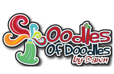
Dawn sent a handful of her concepts for the Oodles of Doodles logo. I choose this one to critique because I thought it was the best fit for her company. It’s worth mentioning that Dawn prefers the first concept in the attached concepts. She is starting a home business doing wall murals for children’s rooms.
“My Logo is for children’s wall Murals. I’ll be mostly doing children’s rooms but other things a well. I wanted the logo to give the feeling of fun, color, artistic, childlike, put still professional. I’m not sure that it works on every aspect, but most I hope. I want to use the logo for just about everything, website, business cards, mailings, invoices, signage for the car. Any input would be greatly appreciated.”
The following critique is based on one designer’s opinion and experience. I always appreciate the readers thoughts as well. So, I’ll ask a question or two in the critique, please share your perspective in the comments at the end of this logo design critique.
Design Principals
I chose this version over the other logo that Dawn liked best because I think it does a much better job at representing what she does. This logo for Oodles of Doodles oozes fun and youthfulness, which sounds a lot like what Dawn wanted to achieve with the mark. However, the paintbrush in place of the ‘l’ isn’t working very well. Maybe it could use some more detail to make it look more like a paintbrush (i.e., adding a ferrule), since it sorta looks a little like a torch in its current state. Perhaps flipping the brush 180 degrees could help as well. The word ‘of’ is visually too strong for me. Reducing the size of the word and perhaps using a lowercase ‘o’ will help the word ‘doodles’ to stand out more.
Question for the readers
please respond in the comments below
What do you think of the paintbrush? Do you think it is too much for logo? Does it need refinement?
Functionality / Versatility
First, I’ll begin with suggesting that you remove the drop shadow, which is generally not a good thing in logo design. In your case its not really needed anyway. The black outline creates plenty of definition for the logo. Next, I think that the white stroke around your name along with the typeface choice, make it harder to read your name when the logo gets smaller. The thick and thinness of the letterforms in this typeface are problematic in this usage.
Does the Logo Work for the Audience?
Based on your description, I think your logo does a good job of reflecting your work. The logo is colorful, creative, kid-like and playful. This logo implies that you do some kind of painting in contrast to some of the other concepts you sent.
Typography
Perhaps your real signature “by Dawn” would be a nice touch as opposed to the current typeface choice. This would help to identify the logo with you even further and give it a signed by the artist appearance.
Have you thought about making the letters look more handmade and unique? Possibly alter the duplicate letters like the ‘o’ so that no two are are identical. This will give a more authentic appearance to the mark which coincides with your work (unique hand painted wall murals). You might also consider removing the subtle light blue outline from the letters. It’s not doing much for the design and tends to complicate rather than contribute to the mark.
Question for the readers
please respond in the comments below
Would you agree that some customization of the typeface could benefit the logo and give it a more personalized or handcrafted feel?
Possible Improvements
Designing a logo for yourself or own business is one of the hardest logo designs you’ll ever work on. So what is the best way to improve the logo? Well I think have made some comments above that can certainly offer some direction. Here’s a list of actionable items.
- Remove the drop shadow. With the black outline you don’t need it.
- Consider customizing the typeface. Alter the letters to make feel more handmade. Think of you logo like a big mural. If you were painting letters no two of them would be the same.
- Rework the way the paintbrush integrates with the design and make sure it is immediately recognizable as a paintbrush.
- Remove the medium blue stroke around the letters.
Overall, I think you have a good start on the logo design. And with some refinement you can definitely improve it. Please know that my intention in critiquing your work is not to hurt feelings, but to offer constructive feedback. I hope it was helpful. Best of luck, to you!
I appreciate and welcome your comments, and look forward to hearing from you soon. I purposely don’t cover every possible improvement that can be made to this logo, so go for it if you think I missed anything. All I ask is that you keep your comments clean and appropriate.
Like what you read here? Subscribe to the Logo Critiques News Feed.
Enjoy this post? Share it with others.


The images & logos presented on this blog are copyrighted by their respective owners. The blog itself is copyright Erik Peterson, 2008-2026 All Rights Reserved.


We enjoy your comments
228 Comments so far. Keep 'em Coming.
#1
By Vassilis Mastorostergios
06.22.2009 at 03:43 PM
I very muched liked both concepts (1 and 3).
I noticed though that in the “oodlesConcepts.jpg” pic that you provide, the featured logo is different. The paintbrush has been moved to the right and removed from the ‘l’.
To be honest I also prefer No 1 better, although it could use some improvements. I like No 1 and 3 concepts very much but what if you could combine them in some way?
In No1 there’s no apparent info on the actual service offered (painting) so perhaps maybe implement a subtle looking paintbrush like you did in No3. Also, no matter how nice the ‘heart-star-circles cloud’ looks I think it will be tough to show correct on paper and smaller sizes like business cards.
What I like a lot about No1: The look of professionalism it demonstrates along with an obvious scent of playfulness and joy.
No3 however nice and more “to the point” looks more like a graffiti of some sort.
I can really imagine though No3 logo drawn on the door of a white car. It would make a great effect and urge you to take a look.
Other than that I completely agree with the article on pretty much every aspect (especially the drop shadow and the size of the ‘of’ word).
Couple of thoughts about the other concepts:
No2 is possibly the 3rd best (after 1 and 3). Needs some typeface adjusting (i.e. too much letterspace between the first two O’s ) and maybe some layout adjusting in the typeface as well, perhaps some vertical distance between the words Oodles and Doodles.
No4 - very pretty but loses too much detail when sized down, I can barely read by dawn and I can’t tell what the little yellow graphic in the middle is.
No5 - Instantly reminded me of Google. Not a wise choice in my honest opinion. I think it’s the colors and the double O’s. I would want something unique that identifies my company and not some huge corporate giant.
No 6 - no no no
No 7 - Very nice too but I something is missing, can’t exactly say what, but maybe it looks too ‘usual’? Can’t really express it.
Overall, great work! I think with a few alterations and maybe combination of concepts 1 and 3 the logo will be superb.
#2
By Fbanczak
06.23.2009 at 01:35 PM
I think #3 is by far the strongest concept. The other concepts are very dated looking as they feel like knock-offs of past logos/concepts. I’m fairly certain concept 1 is a copy (including the colors) of a logo that I’ve seen before (but I cannot remember what it was for). Beyond that, I’ll direct my comments to concept #3.
The “s” characters in the “Oodles of Doodles” font do not look as smooth as the rest of the font, perhaps the curves could be improved and I agree, making “of” smaller would be less distracting. Replacing the L with an obvious paintbrush would work better. Maybe make the handle color black to contrast with the rest of the word “Oodles” but not introduce another color into the fonts. I agree that removing the extra stroke and shadow on the letters will make a huge difference in readability. If you want to work on the playful-professional balance, try another font that is as bold as this but perhaps more hand-crafted and mature looking. Overall, #3 is a strong concept; it’s fresh, dynamic, and has a fun spirit of its own, plus the paint tube is very eye-catching.
#3
By dawn knepp
06.27.2009 at 05:27 PM
Thank you for all the commments and suggestions. I’m very greatful and they all have been very helpful. I hope to send the revised logo with all or most of the suggestions. I was a bit worried about comments that some friends and family made on the logo.
Can you look and see if you see what they see. I what to change it right away if you also notice it too. This what they mentioned. A friend of mine son made this comment when he look over his email I sent her to get comments on the logo.
This is what he said my son asked..“why does it have a penis in it?” I didn’t see it at first but he showed me that the green bottle with the yellow cap looks similar to that of the male sex. I just thought I’d give you a head’s up, in case you . My father also said it look a bit like it too. My logo will be used for just about everthing so you see where my concern is.
Thanks a million
Dawn
#4
By Vassilis Mastorostergios
06.28.2009 at 04:28 PM
A penis? O_o
Duh, It’s puzzling if children are more familiar with the male sexual organ than with an acrylic paint bottle.
Anyway, although we come from different cultures I didn’t even think once about it resembling a penis or anything like that. But then again I’m an adult, who knows what children think nowadays.
Maybe you could consult a children’s psychologist about it or something?
I think you’re just being overworrying though.
#5
By Erik Peterson
06.30.2009 at 10:24 AM
Dawn,
If your concerned at all, just rework the drawing of the paint tube. There’s no reason to move forward with a logo that represents you and your business if you’re having thoughts of inappropriate imagery in the back of your mind. I think you could easily adjust the drawing to eliminate the problem.
Anyway, I obviously didn’t see it before, or I would have mentioned it in my critique, but after you described it, I could see how someone could think that (though I think most people wouldn’t).
#6
By Don van der Zaan
07.15.2009 at 05:15 PM
Hi Dawn,
Overall: nice logo! Does the job for me.
As for the two questions: I think the tip of the brush should be bigger or not there at all. I didn’t notice it at first.. And yes, customizing the type would give the logo a more handcrafted feel. Especially the e-s and s-es. They look to slim I think.
The first thing I noticed was that I misread (and did’t understand) the right red splatter from the tube. You might want to look at putting that in another spot. Maybe rotating the tube CCW to close the gap a bit would improve the logo to.
I didn’t see the penis either
My two cents..
#7
By Daniel
07.28.2009 at 11:41 AM
Maybe you should see all the concepts here
http://logomyway.com/contestView.php?contestId=128
#8
By Mark Ewans
02.18.2010 at 10:21 AM
Very interesting as well as informative post.Thanks for providing for us.I read your article with my pleasure.
corporate christmas gift ideas
#9
By ruth island
03.11.2010 at 04:07 PM
Excellant post the drop shadow is such an eighties thing i agree it has to go..
#10
By pens parker
03.13.2010 at 07:27 AM
I like the logo alot how everr i have to question how well it would look in one colour or without tints. I say this because tints and multiple colours can be problemitic or expensive to reproduction in some of the likely situations the logo maybe used..
#11
By trabajo desde casa
09.23.2010 at 05:52 AM
Hi,
I going to start a home business pretty soon, but the thing is I don’t know anyone personally to find out how to go about starting one. So I wanted to know what are the things I need to know and things I need to do before I jump in, preferably from people who have home businesses or who are planning to start one as well.By the way I live in Toronto, Canada. If I could get some info and advice from you all, I would appreciate it!
#12
By excelvou
10.22.2010 at 06:37 AM
I don’t know. I think the logo have a classic style something like oldies
#13
By website design companies washington dc
03.18.2011 at 02:25 AM
Color is considered important to brand recognition, but it should not be an integral component to the logo design, which could conflict with its functionality. Some colors are formed/associated with certain emotions that the designer wants to convey.
#14
By career personality
10.07.2011 at 07:14 AM
Very impressive and useful post! I am also a web designer so more useful for me. Thanks to share it with me…....
#15
By Astrologer in Gurgaon
10.29.2011 at 06:48 AM
Logo is something that is most important for your business. I hope to get more information here.
#16
By CC Limit
04.04.2012 at 09:08 AM
Shade is regarded important to company acknowledgement, but it should not be the key element to the emblem, which could issue with its performance. Some colours are formed/associated with certain feelings that the developer wants to express.
#17
By scaffolding rental
07.02.2012 at 11:42 AM
Thanks for the awesome material here. I was looking for something like that for quite a while and at last I have discovered it here. Your web page is better than others because of useful and significant material. Keep publishing them later on too, I will be awaiting that..
#18
By hentry
09.06.2019 at 02:38 AM
Thx for the website that helps hire remote dedicated linux engineerreaders to easily accomplish various tasks. The collection of such useful ideas makes the page really impressive for all kinds of readers to make the page one of the best in the coverage area.
#19
By Allen
11.18.2019 at 02:04 AM
This will give a more authentic appearance to the mark which coincides with work (unique hand painted wall murals). SPLK-1003 dumps
#20
By Mark Matthews
04.09.2021 at 06:00 AM
The logo is so colorful and bubbly! Elk Grove Movers loved it so much.
#21
By Fred
03.28.2022 at 11:27 PM
It was very impressive post. Thank you. lead generation agency
#22
By Matthew
04.20.2022 at 08:48 PM
I absolutely agree with your post. graffiti removal Northwest Arkansas
#23
By shiniwashi
09.23.2022 at 03:12 AM
More explosive maneuvers, death-defying stunts, and spectacular acts. This is stickman boost game. Come on! let’s play
#24
By Haibara Eilish
02.22.2023 at 03:48 AM
The comparison may help to clarify certain aspects of palaeoart content, fnf including some of its production methods and relative recurrence of fundamental shapes and responses by rock painters to existing markings and geological structures (such as drawing and scratching).
#25
By swenyly
03.29.2023 at 01:22 AM
I find the design quite suitable for fleeing the complex
#26
By Maxine
08.08.2023 at 06:10 AM
Thanks for this informative blog and for forgiving us and for the opportunity to share our views. www.contractormilton.com
#27
By Rosie
09.04.2023 at 06:17 AM
Thanks for sharing this information to increase our knowledge. Looking forward for more on your site. Perfect Fitness Solutions
#28
By zetisno zetisno
09.14.2023 at 11:28 PM
The game’s difficulty curve is Dinosaur Game another factor that keeps players coming back for more. It starts off easy enough, but as you progress, the speed increases, and obstacles become more challenging to avoid.
#29
By Trixia
09.15.2023 at 04:17 AM
The examples provided in this post really helped me understand the topic better. Deck Contractor
#30
By Losida
10.04.2023 at 02:33 AM
While having a car may be becoming a thing of the past, there’s no drop in the production of car games like drift boss.
#31
By zetisno
12.29.2023 at 09:28 PM
Timing is crucial here, as a Snow Rider 3D well-timed jump can help players overcome obstacles or achieve impressive aerial maneuvers, contributing to their overall score.
#32
By Stephen M Pauley
01.03.2024 at 12:02 AM
Thank you for your balanced and constructive input. SuperSMP’s innovative survival experience, highlighted in this Minecraft servers, seems like an enticing alternative to Donut SMP—must visit for the insights details!
#33
By rice purity test
01.06.2024 at 12:14 AM
Bozeman Concrete Company operates rice purity test in the Gallatin valley with exceptional service.
#34
By Yvonne D Regan
01.06.2024 at 04:03 AM
Спасибо за контент, заставляющий задуматься и побуждающий читателей размышлять и учиться. Я понимаю, почему профессиональные геймеры используют тест кпс. Этот сайт делает его доступным для всех, и результаты говорят сами за себя. Браво!
#35
By Noona
01.12.2024 at 07:24 AM
Keep up the great work! Thank you for sharing this valuable information. I found it to be highly informative on this site. Please keep sharing more insights and updates. https://www.piiperdigitalsolutions.com/
#36
By Kelvin
01.15.2024 at 07:32 AM
This blog consistently delivers high-quality content. I always look forward to new posts.Roofing Services Surrey, BC
#37
By Walter B Mucci
02.16.2024 at 04:26 AM
Reading your posts always fills me with gratitude for the simple joys in life. Your dedication to gaming is impressive; I’m sure you’d enjoy the challenges awaiting you on Clicks Per Second!
#38
By Sid Homman
03.05.2024 at 05:45 AM
I extend my thanks for the informative blog and the opportunity it provides for sharing perspectives. Your platform fosters meaningful dialogue and enriches our understanding, Thomasville plumber Site!
#39
By Jaila
04.17.2024 at 07:06 AM
Your article is super helpful, and I’ve shared it with friends. Thanks! In Personal Training Sherwood Park
#40
By bendbounce
04.26.2024 at 04:06 AM
Do you like this drift hunters game?
#41
By Giovanni
04.30.2024 at 08:55 AM
great post colors tips and ideas for men
#42
By Giovanni
04.30.2024 at 09:56 AM
awesome post Bodyguard Services NYC
#43
By Ryan Bang
06.01.2024 at 04:48 AM
Keep writing helpful posts; they’re valuable. explore our site
#44
By Gordon Chua
07.16.2024 at 07:13 AM
Very a lovely article I love it! keep sharing! http://www.sidingrichmondbc.com
#45
By Yaya Urasaya
11.06.2024 at 01:45 PM
Loved the clever analogies you used in this post! New Home Insulation Installation Coquitlam
#46
By Whosay
01.09.2025 at 12:43 PM
Your content consistently stands out from the crowd. It’s always well-researched and thought-provoking. Keep up the excellent work!www.contractorlethbridge.com
#47
By Freddie Edwards
01.15.2025 at 12:27 PM
Amazing post! We at HVAC repair in Aurora IL specializes in this kind of article. If you want to read something similar to this, pay us a visit at HVAC repair in Aurora IL
#48
By Frans Banks
01.21.2025 at 12:27 PM
Can you expand on the second point a bit more? www.roofingburnaby.com
#49
By Caddie Morgan
01.30.2025 at 05:33 AM
You’re spot on about the paintbrush design. It definitely needs a bit more detail to clearly convey its purpose. Adding a ferrule could make it instantly recognizable, and flipping it around might just give it that professional touch while still keeping the fun vibe intact. As for the word ‘of,’ I agree that toning it down would help ‘doodles’ pop more. Maybe a lowercase ‘o’ could do the trick!
Caddie Morgan
Renovations Campbelltown
#50
By Oprit installatie Aarschot
07.19.2025 at 04:52 AM
Love the suggestion to make the letters more handmade—it would reflect the mural style beautifully.
#51
By Beerse
07.19.2025 at 04:54 AM
Good catch on the typeface: simpler, more uniform strokes would improve legibility at smaller sizes. You could find this worth checking out. Oprit installatie Beerse
#52
By Pitched Roof
07.30.2025 at 08:42 AM
Thank you for sharing these logo concepts—this one really captures a playful and creative vibe, perfect for children’s wall murals. If you happen to need roofing services, feel free to check out our site! Pitched Roof
#53
By Ralph
07.31.2025 at 05:46 AM
Thank you for the suggestion—adding a personal touch like a real signature could make a big difference. If you happen to need tree services, feel free to visit our site. Crown Reduction Thornbury
#54
By Hedge Cutting Yate
07.31.2025 at 05:47 AM
I appreciate the idea of using a handwritten signature—it really would add a more personal, artistic feel. If you’re ever looking for reliable tree services, our website is always open. Hedge Cutting Yate
#55
By Mhieyo
08.02.2025 at 02:50 PM
Thank you for sharing the thought process behind this logo choice—I really appreciate the attention to detail! I agree, the overall vibe feels playful and fitting for Oodles of Doodles. And great point about the paintbrush—it could definitely benefit from a tweak or two. If you happen to need a driveway while refining your brand, feel free to visit our site—we’re always happy to help!
#56
By SNB
08.06.2025 at 02:54 PM
Really fun logo concept—perfect for a business focused on children’s murals! Wishing Dawn the best with her new venture. And if you happen to need a tree surgeon contractor, feel free to visit our site!
#57
By Penrith Road Tek
08.07.2025 at 10:01 AM
Really helpful critique. I love how the design aims for both playful and polished—it’s a great fit for a children’s mural business.
#58
By Quirindi
08.07.2025 at 10:02 AM
Appreciate the insight! The questions at the end are a nice touch—makes it easy to reflect and join the discussion. Asphalt Surfacing Quirindi
#59
By Solap
08.09.2025 at 06:49 AM
Thanks for sharing — the logo definitely feels playful and creative, perfect for a children’s mural business. Tree Surgeon Mildenhall
#60
By Nazeing Tree Surgeons
08.09.2025 at 06:50 AM
Great concept! The colors and design really convey fun and imagination. Tree Surgery Nazeing
#61
By Logan
08.18.2025 at 10:54 AM
Thanks for sharing—love how playful and creative this logo feels, definitely fits a children’s mural business. Asphalt & Bitumen Surfacing In ESK
#62
By Nolas
08.18.2025 at 10:55 AM
Great concept! It balances fun and professionalism really well. Asphalt Surfacing Goondiwindi
#63
By Mon
08.19.2025 at 10:21 AM
Thanks for sharing this critique—really helpful to see how the logo ties into the playful and professional vibe for children’s murals. Asphalt & Bitumen Surfacing In Lowood
#64
By Ronald
08.19.2025 at 10:22 AM
I like how you explained the balance between fun and professionalism. Great insights for anyone working on branding for a creative business. Asphalt Surfacing Maleny
#65
By SNB
08.19.2025 at 11:41 AM
Love the playful vibe of the logo—it really captures the brand’s energy! If you happen to need a roofing contractor, feel free to visit our site! Mono Pitched Roofs Haverhill
#66
By SNB
08.21.2025 at 04:21 AM
Really interesting critique on the Oodles of Doodles logo—great points about readability and design choices. If you happen to need a roofing contractor, feel free to visit our site. Dormer Roofs Lutterworth
#67
By SNB
08.21.2025 at 05:17 AM
Really thoughtful critique on the Oodles of Doodles logo—great points about balance and readability. If you happen to need a roofing contractor, feel free to visit our site. Chimney Repairs near me
#68
By Nate
08.25.2025 at 06:21 AM
Thanks for sharing this—great to see how the logo reflects fun and creativity for kids’ spaces. Roofing Swaffham
#69
By Nirvana
08.25.2025 at 06:30 AM
Thanks for posting—helpful feedback for anyone working on logos for creative businesses. Roofer Swanton Morley
#70
By Luigi
08.27.2025 at 11:08 AM
Thanks for sharing this! It’s great to see thoughtful feedback on a logo that aims to balance fun and professionalism—tricky but important for a children’s brand.Roofers Near me
#71
By Samson
08.27.2025 at 11:09 AM
Interesting critique. I like how the design captures a playful vibe while still feeling polished enough for broader branding use. Flat Roofing Saxmundham
#72
By Juztine
09.03.2025 at 08:36 AM
Thanks for sharing your perspective! I like how you made it clear that this is just one viewpoint—it makes the critique feel open and approachable. RD Medical Products love to hear how others see it too.
#73
By SNB
09.03.2025 at 11:44 AM
Great critique—small design tweaks could really make that logo shine. If you need a roofing contractor, feel free to visit our site. Slate Roof
#74
By Lorina
09.08.2025 at 05:18 AM
Thanks for sharing this critique—great point about the paintbrush needing more detail, I hadn’t noticed that at first.
#75
By Anthony
09.08.2025 at 05:18 AM
Really helpful feedback! I agree the logo captures a fun and playful vibe, perfect for children’s murals.
#76
By Julie
09.08.2025 at 05:20 AM
Appreciate the suggestions—especially about adjusting the word ‘of’ to make “doodles” stand out more. Roofing Stamford Bridge
#77
By Jonathan
09.16.2025 at 06:28 AM
Thanks for sharing this critique — I like how the logo balances playfulness with professionalism, which seems perfect for children’s murals. Asphalt & Bitumen Surfacing In Aratula
#78
By SNB
09.17.2025 at 10:03 PM
Loved reading the Oodles of Doodles logo critique! If you happen to need driveway repair services, feel free to visit our site. Tarmac Driveway Great Shelford, Cambridgeshire
#79
By cristal67
09.19.2025 at 02:54 AM
I also lean toward No. 1—it’s cleaner and more intuitive—but it does need refinement. What if you merge No. 1’s layout with No. 3’s dynamic elements? For example, add interactive cues, smoother transitions, and a clear CTA, similar to how drift boss ramps difficulty smoothly. A/B test color hierarchy and spacing for scannability. This hybrid could boost engagement, retention, and accessibility across devices.
#80
By Griffith
10.14.2025 at 06:30 AM
Thanks for sharing this! I really like how the critique focuses on balancing professionalism with a playful, childlike feel — that’s key for a business like this. Pothole & Grading Surfacing Griffith
#81
By SNB
10.17.2025 at 03:43 AM
Love the playful and creative vibe of the Oodles of Doodles logo—it really captures the spirit of the brand! If you happen to need fencing services, feel free to visit our site.
Fence Installers Ashford, Kent
#82
By SNB
11.11.2025 at 11:55 PM
Really enjoyed this critique — it’s amazing to see the thought process behind logo design! If you happen to need a roofing contractor, feel free to visit our site for trusted services.
Pitched | Gable Roofs KEMPSTON
#83
By SNB
11.12.2025 at 12:17 AM
Really enjoyed this logo critique — it’s great to see such detailed feedback! If you happen to need a roofing contractor, feel free to visit our site for trusted services.
Tiled Roofs DAVENTRY
#84
By Forbes Road Tek
11.12.2025 at 05:20 AM
I highly recommend this! Grateful for the continuous improvements. Pothole & Grading Surfacing Forbes
#85
By Burwell
11.13.2025 at 06:49 AM
Thanks to this platform for sharing such useful knowledge—it really helps broaden perspectives. Tree Felling Burwell
#86
By Chipping Ongar
11.13.2025 at 06:49 AM
Grateful to the platform for making important topics accessible and easy to understand. Crown Reduction Chipping Ongar
#87
By SNB
11.16.2025 at 11:48 PM
Great logo analysis! If you happen to need a tree surgeon, feel free to visit our site.
Tree Surgeon Tamworth
#88
By SNB
11.16.2025 at 11:49 PM
Interesting critique! For tree surgeon services, check out our website anytime. Professional Tree Surgeons In LONG EATON, NOTTINGHAMSHIRE
#89
By SNB
11.16.2025 at 11:50 PM
Loved your detailed feedback! Our site also offers tree surgeon services if needed. Tree Surgery West Bridgford
#90
By SNB
11.16.2025 at 11:50 PM
Helpful insights here! Visit our site for tree surgeon services too. Tree Felling Ruddington
#91
By SNB
11.16.2025 at 11:51 PM
Very clear suggestions! If a tree surgeon is needed, our site can assist. Tree Cutting | Pruning | Trimming KEMPSTON, BEDFORDSHIRE
#92
By SNB
11.16.2025 at 11:55 PM
Nice breakdown of the logo! Feel free to visit our website for tree surgeon services. Crown Reduction Shortstown
#93
By SNB
11.16.2025 at 11:56 PM
Good points on design! Our site also provides tree surgeon services if needed. Stump Grinding Sandy
#94
By SNB
11.16.2025 at 11:57 PM
Informative read! Don’t forget to check our site for tree surgeon services. Hedge Cutting Daventry
#95
By Click here
11.17.2025 at 06:30 AM
Love how playful this logo feels—great direction! If you need driveway repair services, feel free to visit our site.
#96
By Erica
11.17.2025 at 11:03 AM
The overall playful, artistic style works well for the brand, but small tweaks like adjusting the brush and ‘of’ will make it more versatile across different uses (e.g., website, business cards, signage). Roof Repairs Southend-on-Sea, Essex
#97
By Ashton
11.19.2025 at 03:29 AM
Interesting feedback! I love how the logo captures the playful and youthful spirit of Dawn’s business. The suggestion about refining the paintbrush design to make it clearer is spot on.Tarmac Driveway Grantham, Lincolnshire
#98
By Tyro
11.23.2025 at 09:21 AM
Thanks for sharing this critique! I love how you pointed out the need for more definition on the paintbrush—it’s those small details that make a big difference. If you’re working on property improvements too, our Driveways services can help make your home or business shine! Tarmac Driveway Sutton-in-Ashfield, Nottinghamshire
#99
By Rose
11.24.2025 at 01:42 AM
Thanks for sharing this! Really interesting breakdown of the logo concept—great insights on how small tweaks can strengthen the design. If you ever need to enhance your home’s exterior, check out our driveway services! Tarmac Driveway Berkhamsted, Hertfordshire
#100
By Andrew
11.25.2025 at 07:58 AM
Great insight! Balancing childlike creativity with professionalism is a smart branding move. Don’t forget—we also offer excellent driveway upgrades to elevate your outdoor space. Tarmac Driveway Hoddesdon, Hertfordshire
#101
By Tailem Bend
11.26.2025 at 06:57 AM
Thanks to the platform team for creating such a valuable and user-friendly service! Asphalt & Bitumen Surfacing In Tailem Bend
#102
By Anna
11.26.2025 at 08:08 AM
Thanks for posting this analysis! The suggestion to adjust the size of “of” really makes sense. And if anyone here needs roof maintenance, don’t hesitate to contact us. Roof Repairs Fleet, Hampshire
#103
By Nico
11.26.2025 at 10:06 AM
Very informative! The breakdown of design principles was super helpful. And just like good design, good roofing matters too—contact us anytime for quality service. Roof Repairs Winchester, Hampshire
#104
By Mhieyo
11.27.2025 at 02:49 AM
Thank you for sharing this logo critique! It’s great to see the thought process behind choosing a concept that balances fun and professionalism—perfect for a children’s mural business. I really appreciate how Dawn wants the logo to be versatile across all her materials, from business cards to car signage. If you happen to need a driveway, feel free to visit our site for more information and services!
#105
By Andrew
12.02.2025 at 02:29 AM
Thanks for sharing this! It’s great to see the thought process behind the logo choices. I agree that the current paintbrush could use more definition to make it more recognizable. If you need a solid roof over your new business, don’t hesitate to reach out—our roofing services can help keep your space secure and safe! Roof Repairs Grays, Essex
#106
By SNB
12.02.2025 at 04:05 AM
Really enjoyed this critique—great breakdown of what works and what could be refined. If you happen to need a roofing contractor, feel free to visit our site. Tiled Roofs Aldridge
#107
By SNB
12.02.2025 at 04:06 AM
The point about the paintbrush looking like a torch made me smile—totally get it. And if you ever need roofing help, our website is always open. Pitched | Gable Roofs Bilston
#108
By SNB
12.02.2025 at 04:06 AM
Love how playful the logo feels overall. With a few tweaks it could be perfect. If you need a roofing contractor, feel free to stop by our site. Hipped Roof Bloxwich
#109
By SNB
12.02.2025 at 04:07 AM
Interesting idea about customizing the typeface to feel more handmade—fits the brand well. And if roofing services ever come up, check out our site. Mansard Roofs Brierley Hill
#110
By SNB
12.02.2025 at 04:08 AM
I agree that removing the drop shadow would clean it up a lot. If you ever need roof work done, feel free to visit our website. Dormer Roofs Brownhills
#111
By SNB
12.02.2025 at 04:08 AM
Great reminder that designing for yourself is always the hardest. If you need a reliable roofing contractor, our site is here when you need it. Mono Pitched Roofs Burntwood
#112
By SNB
12.02.2025 at 04:09 AM
The suggestions about improving readability at smaller sizes are spot-on. And as always, if you happen to need roofing help, feel free to visit our site. New Roof Cannock, Staffordshire
#113
By Rosie
12.03.2025 at 09:49 PM
Very informative. Love how the critique focuses on balancing fun with professionalism—perfect for a children’s mural brand.
Thinking of upgrading your driveway? We’re here for you. KTarmac Driveway Beverley, East Riding of Yorkshire
#114
By Rosie
12.03.2025 at 09:51 PM
Very informative. Love how the critique focuses on balancing fun with professionalism—perfect for a children’s mural brand.
Thinking of upgrading your driveway? We’re here for you. Tarmac Driveway Beverley, East Riding of Yorkshire
#115
By SNB
12.08.2025 at 04:29 AM
Love how playful this logo concept feels—definitely captures that kid-friendly vibe. If you happen to need driveway repair services, feel free to visit our site! Carpet Cleaning Tunbridge Wells
#116
By SNB
12.08.2025 at 04:30 AM
The paintbrush idea is fun, but I agree it could use a little refinement. And if you ever need driveway repair services, our site is always open! Carpet Cleaners In Hythe, Kent
#117
By SNB
12.08.2025 at 04:30 AM
Really like the color and energy in this design—it suits the brand perfectly. If you need driveway repair services, feel free to check out our website! Domestic Carpet Cleaning Services In Kent
#118
By SNB
12.08.2025 at 04:31 AM
Customizing the typeface sounds like a great way to make the logo feel even more personal. And if your driveway needs some attention, you can visit our site anytime! Commercial Carpet Cleaning Littlebourne
#119
By SNB
12.08.2025 at 04:32 AM
Removing the drop shadow makes sense—cleaner logos always scale better. If you’re also looking for driveway repair services, feel free to stop by our site! Upholstery | Sofa Cleaning Margate
#120
By SNB
12.08.2025 at 04:32 AM
The idea of making each letter unique is brilliant for a hand-painted mural business. And if you need any driveway repair services, our website is here for you! Rug Cleaning Services In Rainham
#121
By SNB
12.08.2025 at 04:33 AM
Overall, it’s a strong start—just a few tweaks and it’ll really shine. If you happen to need driveway repair services, feel free to visit our site! End Of Tenancy Carpet Cleaning In Sandwich
#122
By Ashton
12.09.2025 at 10:47 AM
Very informative! I love how the feedback focuses on balancing fun with professionalism. Speaking of upgrades, a new driveway installation can add instant curb appeal — feel free to contact us. Tarmac Driveway Mansfield, Nottinghamshire
#123
By Barossa Road Valley Tech SA
12.10.2025 at 07:35 AM
Thanks for sharing this! The logo concept fits perfectly with a fun, kid-friendly brand. Pothole & Grading Surfacing Barossa
#124
By Ashton
12.10.2025 at 10:18 PM
Thanks for sharing this! Really interesting to see how the logo concepts reflect the playful, creative vibe of children’s murals. And if you’re ever looking to upgrade your home exterior, check out our driveway services!Tarmac Driveway Abbots Langley, Hertfordshire
#125
By Mika
12.12.2025 at 11:30 AM
Great read! The point about versatility across business materials was especially helpful. Don’t forget—our team also offers reliable driveway installations and repairs. Tarmac Driveway Hertford, Hertfordshire
#126
By Lucas
12.15.2025 at 12:22 PM
Very interesting perspective. The suggestion about refining the paintbrush detail makes a lot of sense and could strengthen the logo’s clarity. Just like good design, a solid roof matters—contact us for reliable roofing help.Roof Repairs Crawley Down, West Sussex
#127
By Mika
12.17.2025 at 02:32 AM
Thanks for sharing such a thoughtful critique. The balance between creativity and practicality really stands out, especially for a growing home business. When you’re ready to invest in your home too, we’re just a call away for roofing services. Roof Repairs Whitchurch, Hampshire
#128
By Attleborough
12.17.2025 at 08:05 AM
Grateful for this platform and the value it offers. Roofing Attleborough
#129
By Bungay
12.22.2025 at 06:00 AM
Thanks for sharing this—interesting insight into the logo selection process and brand fit. Roofing Bungay
#130
By Ashton
12.24.2025 at 02:31 AM
Overall, a solid and useful critique that invites discussion and different viewpoints, which is always valuable in design conversations. If you found this kind of feedback helpful, check out our DRIVEWAYS services — we bring the same level of care, clarity, and professionalism to every project we work on. Tarmac Driveway Heathfield, East Sussex
#131
By Lucas
12.27.2025 at 02:51 AM
Great breakdown of the design principles. It’s helpful to see how visuals align with a business’s purpose. If your home needs roofing work, we’re just a message away.Roof Repairs Epping, Essex
#132
By Cessnock
12.27.2025 at 05:18 AM
Thanks for sharing this—great insight into the logo design process and considerations for a children’s business. Asphalt & Bitumen Surfacing In Cessnock
#133
By Mika
12.29.2025 at 12:18 PM
Very informative breakdown of the design principles and visual balance. Great feedback for a growing business. For reliable driveway services, contact our team. Tarmac Driveway Beeston, Nottinghamshire
#134
By Newport
01.02.2026 at 12:12 AM
Thanks for sharing this blog—great insight into logo design and tailoring it for a children’s business. Tree Surgery Newport
#135
By Ashton
01.06.2026 at 02:22 AM
Informative and easy to follow, with practical suggestions that make sense. When it’s time to enhance your property, choose our expert DRIVEWAYS services. Tarmac Driveway Louth, Lincolnshire
#136
By Lucas
01.06.2026 at 03:16 AM
Enjoyed reading this detailed critique—it’s clear a lot of thought went into making the logo shine. For durable, high-quality results at home, choose our DRIVEWAYS services. Tarmac Driveway Abbots Langley, Hertfordshire
#137
By Nico
01.06.2026 at 07:36 AM
Interesting critique and solid design insight. The playful tone works well for a child-focused brand, and small tweaks could elevate it even more. Speaking of upgrades, check out how our driveways can refresh the look of your home exterior. Tarmac Driveway Hemel Hempstead, Hertfordshire
#138
By Nico
01.07.2026 at 08:12 AM
Thanks for sharing this! I really like how playful and colorful the logo feels—definitely matches the children’s mural theme. By the way, if you ever need a roof that’s as reliable as this logo is fun, check out our roofing services! Roof Repairs Byfleet, Surrey
#139
By Mika
01.15.2026 at 09:43 AM
Interesting perspective on balancing fun and readability in a kids-focused brand. For expert roofing you can trust, contact us today. Roof Repairs Tadworth, Surrey
#140
By Lucas
01.15.2026 at 10:43 AM
Interesting perspective, especially the points about hierarchy and making the paintbrush element clearer. Upgrade your home’s exterior with our driveway services.Tarmac Driveway Crawley, West Sussex
#141
By SNB
01.15.2026 at 08:53 PM
Love the creativity and playful feel of the logo—perfect for a children’s mural business! Looks professional while still fun. If you happen to need a roofing contractor, feel free to visit our site. Slate Roof
#142
By Miles
01.15.2026 at 11:30 PM
Thank you for sharing this—such a great concept and a perfect fit for a children’s mural business. If you ever need professional driveway services, feel free to visit our site. Hardstands Surfacing Labrador
#143
By Jackie
01.15.2026 at 11:31 PM
Really enjoyed this breakdown, and I can see why this concept stands out for her brand. If you happen to need driveway services, feel free to check out our website.
#144
By Kian
01.15.2026 at 11:31 PM
Thanks for this insight—the logo feels playful and well-suited for kids’ spaces. If you’re ever looking for reliable driveway services, our site is always open. Pothole & Grading Surfacing Yatala
#145
By Angel
01.16.2026 at 12:44 AM
Thank you for this—love the idea of using a real signature. It really adds a personal, signed-by-the-artist feel. If you ever need professional tree services, feel free to visit our site. Tree Surgery Keynsham
#146
By Jose
01.16.2026 at 12:45 AM
Great suggestion, thank you. A handwritten “by Dawn” would definitely strengthen the personal identity of the logo. If you happen to need tree services, feel free to check out our website. Tree Surgeon Malmesbury
#147
By Matet
01.16.2026 at 07:59 AM
Thanks for sending over your ideas, Dawn, they look great. If you ever need professional tree services, feel free to check out our site.
#148
By Matet
01.16.2026 at 11:08 AM
Thank you for this insightful take. Clear opinions like this really help designers build stronger identities. If you happen to need driveway services, feel free to visit our site.
#149
By Mario
01.16.2026 at 11:10 AM
Really enjoyed reading this. Strong guidance like this makes logo design more meaningful and effective. If you ever need driveway services, feel free to check out our website.
#150
By Ashton
01.19.2026 at 12:59 AM
Interesting take on the paintbrush detail; small tweaks can really clarify the message. For a complete exterior update, check out our DRIVEWAYS solutions. Tarmac Driveway Warlingham, Surrey
#151
By Gilbert
01.20.2026 at 01:54 AM
Thank you for this—great suggestion on flipping the brush and softening the “of,” it really helps “doodles” stand out. If you happen to need driveway services, feel free to visit our site. Resin Patio
#152
By Hiro
01.20.2026 at 01:54 AM
Appreciate this insight; reducing the size of “of” and using a lowercase really makes a difference visually. And if you ever need professional driveway services, our website is always open. New Resin Driveway
#153
By Liezel
01.21.2026 at 02:30 AM
Thank you for this—great points raised, and I like being invited to share perspectives. If you ever need professional tree services, feel free to visit our site. Best Arborist
#154
By Jad
01.21.2026 at 02:31 AM
Really appreciate this critique and the openness to reader opinions. Also, if you happen to need reliable tree services, our website is always there to help. Tree Felling Uckfield
#155
By Charlene
01.21.2026 at 03:34 AM
Thank you for this insight—great points about readability and simplifying the logo. If you ever need reliable roofing services, feel free to visit our site. Slate Roof
#156
By Vince
01.21.2026 at 03:35 AM
Really helpful feedback, especially about the drop shadow and typeface clarity at smaller sizes. If you happen to need professional roofing services, feel free to check out our website. Roofer Uckfield
#157
By Elijah
01.22.2026 at 01:24 AM
Thank you for this—great point about using a real signature, it really adds a personal touch. If you ever need professional driveway services, feel free to visit our site. Tarmac | Tar & Chip | Block Paving Driveways & Surfacing Reigate
#158
By Joaquin
01.22.2026 at 01:26 AM
Appreciate this insight; a “by Dawn” signature would definitely make the logo feel more authentic. If you happen to need driveway services, you’re welcome to check out our website. Driveway Resurfacing Weybridge
#159
By Kali
01.22.2026 at 01:26 AM
Thanks for sharing—love the idea of a signed-by-the-artist look, it builds a stronger connection. And if driveway services are ever needed, our site is always open.
#160
By Gina
01.22.2026 at 01:28 AM
Thank you for this suggestion, it truly helps elevate the brand identity. If you’re ever looking for reliable driveway services, feel free to visit our site. Resin Contractor Near Me
#161
By Pitched Roof
01.22.2026 at 08:45 AM
Love the creativity behind the Oodles of Doodles logo—very eye-catching! Thank you for sharing this. If you happen to need roofing services, feel free to visit our site.
#162
By Katrina
01.23.2026 at 01:43 AM
Thank you for this—really helpful insights on improving your own logo. If you ever need reliable roofing services, feel free to visit our site. Flat Roof Repairs
#163
By Isabelle
01.23.2026 at 01:44 AM
Great points here, especially the actionable tips. Thanks for sharing! If you happen to need roofing services, feel free to check out our website. Dormer Roofs Burnham
#164
By Ashton
01.24.2026 at 07:31 AM
Thanks for sharing this—great insight into balancing playful, childlike elements with a professional look. If you need expert craftsmanship for your home, remember our reliable roofing services are just a call away. Roof Repairs Colchester, Essex
#165
By Lucas
01.24.2026 at 08:31 AM
Nice breakdown of fun versus readability—very helpful for anyone creating branding for kids. For a reliable and long-lasting driveway, reach out to our team.
#166
By Jessie
01.24.2026 at 11:22 PM
Thank you for this—really helpful feedback, especially about readability at smaller sizes. If you ever need professional carpet services, feel free to visit our site. End Of Tenancy Carpet Cleaning In Canterbury
#167
By SNB
01.25.2026 at 06:07 AM
Great critique—really helps highlight how the logo could better capture the fun and playful vibe! If you happen to need a roofing contractor, feel free to visit our site. Roofers Near me
#168
By Resin Patio
01.26.2026 at 07:36 AM
Thank you for this—oodles of doodles really made my day. If you ever happen to need driveway services, feel free to check out our website too.
#169
By Troy
01.26.2026 at 10:29 PM
Thank you for this—great point about the drop shadow, simplicity really improves readability. If you happen to need carpet services, feel free to visit our site. End Of Tenancy Carpet Cleaning In Gravesend
#170
By Ryan
01.26.2026 at 10:30 PM
Appreciate this insight, especially on how outlines already give enough definition. If you ever need professional carpet services, you’re welcome to check out our site. Carpet Cleaning Near Me
#171
By Chad
01.26.2026 at 11:05 PM
Thank you for this insight—it’s always interesting to hear a designer’s perspective. If you ever need reliable fencing services, feel free to visit our site. Feather Edge Fencing
#172
By Kyle
01.26.2026 at 11:06 PM
Appreciate you sharing your thoughts here, it really makes readers think. And if fencing services are ever needed, our website is always open. Picket Fencing
#173
By Mitcch
01.27.2026 at 01:05 AM
Thank you for this—designing your own logo really is a challenge, and these tips help a lot. If you ever need professional tree services, feel free to visit our site. Stump Grinding Felixstowe
#174
By Toby
01.27.2026 at 01:05 AM
Great insights here, especially for business owners working on their own branding. By the way, if you need reliable tree services, you’re welcome to check out our website. Tree Surgeon Near Me
#175
By Jerome
01.27.2026 at 01:06 AM
Thanks for sharing this—very helpful and practical advice. If you happen to need carpet cleaning or repair services, feel free to visit our site. Best Carpet Cleaner Eastbourne
#176
By Nero
01.27.2026 at 01:07 AM
Appreciate these actionable tips, they definitely give clearer direction. And if carpet services are ever needed, our website is always open. Carpet Cleaning Near Me
#177
By Niks
01.27.2026 at 01:58 AM
Thank you for this—great point about making the letters feel more handmade and authentic. If you ever need professional driveway services, feel free to visit our site. Block Paving
#178
By Jervs
01.27.2026 at 01:59 AM
Really appreciate this insight, especially about varying duplicate letters for a more genuine look. And if you happen to need driveway services, our website is always there. Driveway Contractor Near Me
#179
By Matet
01.27.2026 at 08:08 AM
I really enjoyed this take on helping logo designers create powerful brands. And if you happen to need tree services, visit our site anytime.
#180
By Mario
01.27.2026 at 08:10 AM
This was a helpful and thoughtful read—thank you for sharing. By the way, if you’re looking for reliable tree services, feel free to stop by our website.
#181
By Kengkeng
01.27.2026 at 09:35 AM
Love this—oodles of doodles really spark creativity. Thanks for sharing! If you ever need driveway services, feel free to check out our website.
#182
By Jim
01.28.2026 at 12:54 AM
Thank you for sharing this. The chosen concept really suits a fun children’s mural business. If you ever need reliable roofing services, feel free to visit our site. Flat Roof Repairs
#183
By Nam
01.28.2026 at 12:54 AM
Appreciate this insight. The logo feels playful and fits perfectly with children’s room murals. If you happen to need roofing services, you’re welcome to check out our website. Roofer Hemsworth
#184
By Jessica
01.28.2026 at 01:36 AM
Thanks for this breakdown. I agree the concept works well for Dawn’s home mural business. And if roofing services are ever needed, feel free to visit our site. Hipped Roof Gamston
#185
By Camille
01.28.2026 at 01:37 AM
Great explanation, thank you. The logo choice clearly aligns with her creative direction. If you ever need professional roofing services, don’t hesitate to visit our website. Mansard Roofs Newark on Trent
#186
By Chard
01.28.2026 at 02:03 AM
Thank you for sharing this—great insights and questions that really make you think. If you ever need reliable roofing services, feel free to visit our site. Roofing Companies Near Me
#187
By Kat
01.28.2026 at 02:04 AM
Appreciate this critique, very informative and well explained. Always enjoy thoughtful perspectives like this. And if roofing services are ever needed, our website is there to help. Roofers Near me
#188
By Matet
01.28.2026 at 08:02 AM
I appreciate this breakdown; you explained clearly why this concept works best. Also, if you ever need reliable roofing services, you’re welcome to check out our website.
#189
By Mario
01.28.2026 at 08:05 AM
Thanks for this insight—I can see why this logo stands out for her company. By the way, if you’re in need of roofing services, feel free to visit our site.
#190
By Mario
01.28.2026 at 08:10 AM
Thank you for sharing this perspective—I always enjoy hearing different viewpoints. If you ever need driveway services, feel free to visit our website.
#191
By Mattie
01.28.2026 at 11:31 PM
Thank you for this insight—a real signature like “by Dawn” would definitely make the logo feel more personal and authentic. And if you ever need reliable roofing services, feel free to visit our site. Roof Repairs Near Me
#192
By Ethan
01.28.2026 at 11:31 PM
Great suggestion, thank you. Using “by Dawn” really adds that signed-by-the-artist feel and strengthens the brand identity. If you happen to need roofing services, our website is always open. Roof Repair Bircotes
#193
By Lauren
01.29.2026 at 02:17 AM
Thanks for sharing this—a handwritten “by Dawn” would beautifully reinforce the personal touch of the logo. If you’re ever looking for professional roofing services, feel free to check out our site. Chimney Repairs near me
#194
By Grantt
01.29.2026 at 02:18 AM
Appreciate this feedback. The “by Dawn” signature would make the logo feel uniquely yours and more memorable. And if roofing services are ever needed, you’re welcome to visit our website. New Roof LETCHWORTH GARDEN CITY, HERTFORDSHIRE
#195
By Luna
01.30.2026 at 12:16 AM
Thank you for sharing this— I can see why this concept stands out and suits her children’s mural business perfectly. If you ever need reliable driveway services, feel free to visit our site. Tar & Chip Surfacing Sittingbourne
#196
By Yani
01.30.2026 at 12:17 AM
Great insight here, thank you. This logo really fits the playful nature of a kids’ room mural brand. And if driveway services are ever needed, our website is always open. Click here
#197
By Fendi
01.30.2026 at 12:31 AM
Thanks for this thoughtful critique. The design feels like a great match for Dawn’s home-based mural work. If you happen to need fencing services, feel free to check out our site. Fencing Crowborough
#198
By Telly
01.30.2026 at 12:33 AM
Appreciate this breakdown— the concept clearly aligns with her vision for children’s spaces. On a side note, if fencing services are needed, you’re welcome to visit our website. Fence Installers Edenbridge, Kent
#199
By Driveways Long Eaton
01.30.2026 at 12:41 AM
Very informative — the balance between fun and professionalism is well analyzed, and the design principles are easy to follow. If you’re planning an upgrade outside too, our DRIVEWAYS team can help. Tarmac Driveway Long Eaton, Derbyshire
#200
By Driveways Worksop
01.30.2026 at 12:43 AM
Great critique — it’s constructive, respectful, and offers practical solutions without dismissing the original concept. Quality and clarity matter to us too — contact our DRIVEWAYS experts. Tarmac Driveway Worksop, Nottinghamshire