European Masonry Logo Critique 306
Categories: CritiquesHome & Construction
European Masonry Logo Critique
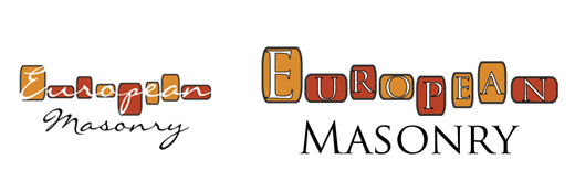
Erik, of Quick Productions, submitted this logo he did for his client, European Masonry. He had this to say about the design,
“This is the first logo design I have ever really been involved with. The client came to me looking for a website, and also mentioned they needed a logo so I thought I would give it a shot.”
“...The company specializes in stone and brick work. The left logo was the first submission which they really liked, but the company had printed brochures and believed it would be too hard to read so they asked for a second version, which is the right logo. For the 2nd logo I went with a really smooth font to try and keep that ‘fancy’ feel but also make it more readable. I chose different size blocks and colors to help represent how stone structures can look, and to also separate it from other logos. A lot of the masonry logos I've seen all have some sort of brick and a trowel which I wanted to steer away from.”
The following critique is based on one designer’s opinion and experience. I always appreciate the readers thoughts as well. So, I’ll ask a question of two in the critique, please share your perspective in the comments at the end of this logo design critique.
Design Principals
This critique will focus on the design on the right since this is the one the client chose. I think the concept of using bricks or stones for a mason’s logo works well and is a pleasant departure from the expected. There are some technical aspects that need to be addressed. The stroke around the bricks is too strong. It competes with the black stroke around the letters, which by the way, should probably be removed. The stroke on the letters make an already delicate font even thinner, thus reducing readability. Of course removing the stroke from the letters is going to create a new problem. The white isn’t going to have enough contrast against the yellow bricks. Have you explored alternate versions of the bricks? What if they were rougher, or looked like stones or bricks as opposed to more rounded paver look?
Question for the readers
please respond in the comments below
What would you do to make the letters stand out from the bricks if the stroke is removed?
Functionality / Versatility
Reducing the size of this logo too far will create some readability problems. Mainly in the letters that make up the word ‘European’. The combination of the heavy outside stroke on the bricks and the stroke around the letters are already competing for the viewers attention. If you reduce the size of the logo, the white space of the letterforms is just going to fill in and look really bad.
Does the Logo Work for the Audience?
The logo says brick pavers to me. This could be based on my location. Being in Southwest Florida, brick pavers are common for driveways and lanais. Many companies specialize in paver work but don’t do general masonry work. I’m not sure if the logo would have that effect in the geographic area that it is used in, but I thought it was worthwhile to mention since European Masonry offers far more services than brick paver work. The round shape and coloring of the bricks contributes to this impression. Ultimately, it’s not bad thing that I see pavers, unless the company doesn’t want to focus/specialize in that type of work.
Question for the readers
please respond in the comments below
What do you see when you look at the logo, does it communicate masonry in general or something more specific to you?
Typography
The typography shows your lack of training in logo design. There are gaping holes between letters and inconsistent spacing throughout. This shows up in both the spacing between the bricks and in the word ‘masonry’.
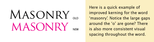
The Trajan typeface cap and small cap heights are only slightly different. This makes for an awkward height change in the word ‘Masonry’. Consider removing the cap ‘M’ and replacing it with a matching small cap (notice the cap ‘M’ is removed from the improved version above).
The contrast within the bricks and the type over them isn’t intense enough. And letters that make up the word ‘European’ are too large for the bricks they are on. The letters feel compressed and uncomfortable. Have you considered some alternate fonts? Perhaps a typeface that is more uniform in weight could increase the legibility.
Possible Improvements
Designing a logo for yourself or own business is one of the hardest logo designs you’ll ever work on. So what is the best way to improve the logo? Well I think have made some comments above that can certainly offer some direction. Here’s a list of actionable items.
- Adjust the kerning between the letters of ‘Masonry’. Also adjust the spacing between the bricks that make up the word ‘European’.
- Remove the stroke around the letters for the word ‘European’ . This will help the readability somewhat. However, if you switch to a stronger more uniform typeface you could improve the readability even more.
- Lighten the stroke around the bricks or maybe even do away with it altogether. It shouldn’t be competing for the viewers attention.
- Think about and explore the shapes and textures that make up the bricks. Keep in mind you need strong contrast in order to make the letters that sit on top of the bricks readable.
Overall, I think you have a good start on the logo design. And with some refinement you can definitely improve it. Please know that my intention in critiquing your work is not to hurt feelings, but to offer constructive feedback. I hope it was helpful. Best of luck, to you!
I appreciate and welcome your comments, and look forward to hearing from you soon. I purposely don’t cover every possible improvement that can be made to this logo, so go for it if you think I missed anything. All I ask is that you keep your comments clean and appropriate.
Like what you read here? Subscribe to the Logo Critiques News Feed.
Enjoy this post? Share it with others.


The images & logos presented on this blog are copyrighted by their respective owners. The blog itself is copyright Erik Peterson, 2008-2026 All Rights Reserved.


We enjoy your comments
306 Comments so far. Keep 'em Coming.
#1
By Quick Productions
06.09.2009 at 05:34 PM
Thanks so much for the critique! In honesty this helps show how new I am to logo design, but I’m excited to play around with your suggestions and see what comes of it. In all, very nice work and I look forward to hearing what others have to say as well. Thanks again for your input.
#2
By Tom Okeefe
06.09.2009 at 05:46 PM
along with what Erik pointed out. The one thing that pops to mind is making the bricks interesting enough that if needed could be used without type in as a branded element to the logo and could be used on printed material as a design. Also maybe adding other bricks without letters could be interesting. I thought the best way to attempt explaining I put together a quick example. The font used is FPO and only to relay the concept. It’s just a thought.
http://www.logocritiques.com/images/uploads/comment_images/euroMason_con.jpg
Best,
Tom
#3
By Tom Okeefe
06.09.2009 at 06:11 PM
Forgot to add:
What would you do to make the letters stand out from the bricks if the stroke is removed?
Picking a different type would help and also giving more room around each letter within the bricks can help.
#4
By Mario De Kauwe
06.11.2009 at 04:08 PM
Good review!
I like the brick concept. good start on that!!
But execution needs to improve just like Erik pointed out.
The shape of the bricks needs to be improve. because at the moment the ‘bent’ left and right sides of the bricks doesn’t seem to fit together.
Answering the question: What would you do to make the letters stand out from the bricks if the stroke is removed?
Change the font. Preferably a nice san-serif font.
Get rid of the strokes around the lettering.
try using the name out side the bricks to see if works. Because im worried how legible it will be when it come to using it in a small size eg: visiting card
Overall : For the very first logo, this is a good start because the concept is good.
But execution needs improvement.
#5
By Granite cladding
10.20.2010 at 10:29 AM
You have all inspired me to focus on providing more informative and resource type link building posts in the
future, so stay tuned for more soon.
#6
By Andy
03.12.2019 at 12:14 PM
Thanks, really cool post, what is the Best Headlamp?
#7
By Nettie W. McLean
05.21.2019 at 03:45 AM
The nightmare of constipation finally done due to Kris Thorkelson Myplace medicines of problems related to the side effects of the chemotherapy. Like his company was leading the market of medicine in Canada and the United States of America.
#8
By tj52
01.13.2021 at 06:22 AM
it is a huge mistake to think that writing a resume is a waste of your time. check it on best cv writing service uk. Indeed, this document is practically the “face” of anyone looking for a job. And the chances of a positive outcome of an interview, depending on how exactly this person is presented.
#9
By John Golden
04.13.2021 at 08:21 AM
This is a nice logo but it seems that is doesn’t really picture masonry concrete.
#10
By Ashton McGuinness
05.25.2021 at 03:40 AM
I don’t mind this logo, but I feel it is not immediately clear that it is a masonry company. Perhaps the use of some images such as bricks, blocks or concrete would make it a clearer connection.
Ashton from The Concrete Cure Toowoomba
#11
By Allen
05.31.2021 at 06:51 AM
The white isn’t going to have enough contrast against the yellow bricks. Have you explored alternate versions of the bricks? What if they were rougher, or looked like stones or bricks as opposed to more rounded paver look? Checkpoint 156-315.80 Exam
#12
By Mitchell Dionogi
06.29.2021 at 06:44 AM
I like to double-check everything coz the web is not the safest place nowadays. So, when I came across a study bay review on one website, I studied everything carefully and even re-checked feedback on other platforms. Now it is my favorite writing service that always gets my back.
#13
By Snooker game
08.21.2021 at 07:50 AM
Stay tuned for more shortly, as you’ve all motivated me to focus on delivering more educational and resource-type link-building pieces in the future. Check out this page Snooker game and play with us!
#14
By wernereegranad75
08.21.2021 at 09:20 AM
Hey man, this is my first time to visit this site and I find this article you shared about the Trajan typeface cap to be interesting. You discussed this topic pretty well and I’m sure that the other readers will agree with this statement. Read this article about the 10 best free online car racing games of 2021 that you can play on your PC or mobile devices. I tried some of this games and they are amazing!
wsop poker game
#15
By mason ethan
01.07.2022 at 02:35 AM
Get the best paper help Hire our specialists to help you improve your grades right now. Great Assignment Help delivers a high-quality, plagiarism-free A-grade solution on time. We have a team of pros who are statistics experts and can assure you an A+ grade solution at the most affordable price.
#16
By trantongray
01.07.2022 at 05:10 AM
Just since the blogs cover each number of topics, they have become a quality source of hyperlink for several online resources. An effective comment for just a site encourages somebody to add your website link into the other ?nternet site. By indexing links from weblog remarks you possibly can draw immense attention with your internet site. https://www.siam855.casino
____________________________________________________________
articulo agregado a favoritos, lo imprimiré cuando llegue a la oficina. billing software
#17
By kris
01.14.2022 at 03:54 AM
There is no perfect solution in the world, and the existing resources do not offer a 100% assurance of a subject-specific answer to your academic track. Furthermore deeper learning will be your metric to help you succeed in the coming days. What are the steps to take to produce a good-quality Project in Counselling Psychology for instruction academic work? It is recommended that you contact Ignou Synopsis help service to get rid of your worries. Through the affiliation of this online advisory council, there is no need to submit a request on your own to find the solution. You are now in the position of being able to come up with an answer before the deadline. And if you are looking for help in Ignou MAPC Solved Assignment 2021 22 also feel free to visit our website.
https://ignousynopsis.com/project-in-counselling-psychology/
#18
By s
01.14.2022 at 03:54 AM
There is no perfect solution in the world, and the existing resources do not offer a 100% assurance of a subject-specific answer to your academic track. Furthermore deeper learning will be your metric to help you succeed in the coming days. What are the steps to take to produce a good-quality Ignou MAPC project for instruction academic work? It is recommended that you contact Ignou Synopsis help service to get rid of your worries. Through the affiliation of this online advisory council, there is no need to submit a request on your own to find the solution. You are now in the position of being able to come up with an answer before the deadline. And if you are looking for help in Ignou MAPC Solved Assignment 2021 22 also feel free to visit our website.
#19
By elightsigns
01.19.2022 at 09:14 AM
This is pretty well impressive thing I have found here. It looks cool and I agreed with the topics you just said. Thanks for the share. but if you guys want Led Shop Sign then contact Us.
#20
By Amara Jones
01.21.2022 at 11:07 PM
Thanks for the informative article. I hope you will provide more articles like this. metamask | metamask extension | metamask wallet
#21
By john carter
01.27.2022 at 03:43 AM
I highly recommend everyone to read this. Thanks for sharing your knowledge and opinion with us. If you would be so kind as to visit my websites
trezor wallet | Crypto wallet
#22
By warenjack
02.04.2022 at 03:32 PM
Great to positioned from this net webweb internet web page this shape of tremendous blogs. i’m getting to bookmark this net webweb internet web page and moreover endorse to others disneyplus.com login/begin | showtime anytime/activate | https //aka.ms/remoteconnect
#23
By Trantongray
02.21.2022 at 08:17 AM
I wouldn’t normally be so intrigued by content on this topic but the way you wrote this really grabbed my attention. It is very well thought out and interesting informative content. Thank you for sharing! Pag-apply sa Canada Visa Online
#24
By warenjack
02.23.2022 at 03:26 PM
I want to mention this blog, have look at this blog, I felt awesome and I surely have bookmarked it. Fmovies | Fmovies
#25
By jack alan
02.27.2022 at 10:29 AM
Pdf zusammenfügen- This free and simple online tool allows you to combine several PDFs or image files into one PDF document.
Pdf zusammenfügen | youtube mp3 converter
#26
By Amara
03.17.2022 at 06:09 AM
Thanks for giving the information. I hope you will give more information like this. SpookySwap | QuickSwap
#27
By trantongray
03.18.2022 at 01:31 PM
What a lovely blog page. I will certainly be back again. Please keep writing! ut9winth.com
#28
By trantongray
03.24.2022 at 03:55 PM
Just acquired your blog post yesterday morning we have already been reading keep in mind this persistently. You will get a lot of helpful tips the following and i absolutely love your thing for this web presence at the same time. Carry on favorable occupation! कनाडा वीजा आवेदन
#29
By trantongray
04.01.2022 at 10:13 AM
Isn’t it entertaining if we always talk about topics like that . KANADA ÜZLETI VÍZUM
#30
By walker1212
04.02.2022 at 01:27 AM
Thanks for this information.
Wells fargo login | Venmo login
#31
By Woo
04.11.2022 at 07:18 PM
Grosir Kaos Olahraga lengan panjang memberikan anda penawaran harga murah untuk pembelian kaos olahraga lengan panjang secara grosir. Penawaran grosir ini sangat sesuai untuk instansi seperti sekolah atau perkantoran yang membutuhkan kaos olahraga lengan panjang untuk para murid atau pun karyawannya. Grosir Kaos Olahraga lengan panjang .
GROSIR CELANA TRAINING juga menawarkan harga yang murah untuk pembelian celana training secara grosir. Penawaran ini sangat sesuai bagi anda yang suka berolahraga dan membutuhkan banyak celana training untuk kenyamanan anda berolahraga. Dapatkan penawaran terbaik celana training grosir di sini. GROSIR CELANA TRAINING .
money changer jakarta menyediakan layanan money changer bagi anda di daerah Jakarta. Seiring dengan meningkatnya perkembangan usaha di Jakarta yang merupakan ibukota Indonesia ini, maka kebutuhan money changer untuk melayani berbagai jenis transaksi forex juga semakin dibutuhkan di daerah Jakarta. money changer jakarta .
catering murah surabaya siap melayani kebutuhan catering untuk setiap kegiatan yang anda butuhkan. Di catering Surabaya, anda juga dapat menemukan menu-menu khas surabaya yang sudah sangat terkenal akan kelezatannya. Catering surabaya ini juga menawarkan harga yang murah sehingga tidak berat dikantong. catering murah surabaya .
cara membuat website wordpress sangatlah mudah. Wordpress telah menyediakan berbagai fitur yang memampukan anda membuat website sederhana dengan hanya mengklik fitur yang tersedia. Namun jika anda menginginkan tampilan website yang lebih profesional, anda bisa belajar cara membuat website tersebut di sini. cara membuat website wordpress .
paket honeymoon murah di Bali siap memberikan anda pengalaman honeymoon terbaik di Bali dengan harga murah dan tidak membuat kantong kering. Ada banyak sekali destinasi honeymoon romantis di Bali yang sangat sesuai untuk menjadi destinasi honeymoon dengan menggunakan paket honeymoon Bali. paket honeymoon murah di Bali .
harga paket honeymoon 3 hari 2 malam Bali merupakan pilihan terbaik bagi anda yang ingin honeymoon di Bali dengan harga yang tidak membuat kantong kering. Dengan paket honeymoon 3 hari 2 malam ini, anda sudah bisa mengunjungi berbagai destinasi wisata honeymoon terbaik di Bali dengan harha yang sangat terjangkau. harga paket honeymoon 3 hari 2 malam Bali .
layanan sewa mobil terbaik di Bali siap menemani anda berwisata berkeliling menikmati berbagai destinasi wisata terbaik di Bali. Layanan sewa mobil ini juga telah dilengkapi dengan driver yang handal, ramah dan berpengalaman untuk mengantarkan anda ke berbagai destinasi wisata terbaik di Bali. layanan sewa mobil terbaik di Bali .
sewa motor bulanan di Bali dapat menjadi pilihan wisata terbaik bagi anda yang ingin tinggal di Bali dalam jangka waktu yang cukup lama dan ingin hemat dalam sewa transportasi. Di bali anda dapat sewa motor secara bulanan dengan harga yang relatif murah sehingga anda dapat berkeliling Bali tanpa menguras kantong. sewa motor bulanan di Bali .
Jual Bata Merah berkualitas untuk menjadi bahan baku proyek pembangunan dengan hasil terbaik. Bata merah merupakan salah satu bahan bangun yang sangat populer digunakan di Indonesia. Ada banyak tempat yang jual bata merah, oleh karena itu anda harus cerdas dalam memilih tempat jual bata merah yang terbaik. Jual Bata Merah .
harga buku yasin dan Tahlil sangatlah terjangkau. Buku ini sangat bagus di baca bagi anda yang ingin mempelajari yasin dan tahlil. Melalui buku ini anda dapat belajar cara membaca yasin dan tahlil dengan benar sekaligus memahami artinya. Harga buku ini sangatlah murah sehingga anda dapat membelinya dengan mudah. harga buku yasin dan Tahlil .
Harga flimty di apotik juga sangatlah terjangkau. Flimty adalah minuman kesehatan yang bisa membantu menjaga kesehatan organ pencernaan. Buat kamu yang sering konstipasi, flimty bisa melancarkan sistem pembuangan dan juga membantu memberi bentuk tubuh yang lebih langsing. Dapatkah informasi harga flimty di apotik. Harga flimty di apotik .
jual panel surya bagi anda yang membutuhkan sumber cadangan tenaga listrik yang selalu bisa diandalkan. Panel surya merupakan pilihan sumber tenaga listrik yang baik utamanya jika anda tinggal di daerah dengan pasokan listrik yang tidak stabil. Dengan membeli panel surya di tempat jual panel surya, anda tidak perlu khawatir lagi dengan pemadaman. jual panel surya .
Panel tenaga surya bekerja dengan cara mengubah tenaga surya pada sel yang terdapat di panelnya menjadi tenaga listrik lalu menyimpannya dalam baterai, jadio dengan panel tenaga surya anda selalu bisa memiliki cadangan tenaga listrik yang bisa anda gunakan ketika terjadi pemadaman lampu. Panel surya juga merupakan pilihan sumber tenaga listrik yang ramah alam. Panel tenaga surya .
tas motor anti air di kota semarang memberikan kemudahan bagi para pengendara motor di daerah semarang untuk dapat membawa banyak muatan dengan lebih aman dan nyaman. Tas motor ini juga terbuat dari bahan berkualitas yang kuat dan juga anti air sehingga anda tetap dapat bisa membawa barang dicuaca hujan. tas motor anti air di kota semarang .
Rental forklift surabaya merupakan pilihan ekonomis jika anda butuh menggunakan forklift dalam jangka waktu singkat di surabaya. Membeli forklift untuk penggunaan dalam jangka waktu singkat merupakan pemborosan oleh karena itu sewa forklift merupakan pilihan yang lebih masuk akal dan juga ekonomis. Rental forklift surabaya .
film barat selalu merajai film-film box office dengan film-filmnya yang luar biasa. Jika anda juga merupakan penggemar film barat, maka anda bisa menonton berbagai jenis film barat di sini dengan subtitle yang tentunya akan sangat membantu anda memahami alur cerita dari film barat tersebut dengan mudah. film barat .
kicau burung mp3 berkualitas merupakan cara termudah dan terbaik jika anda ingin melatih burung kicau anda untuk memiliki suara yang indah dan unik. Cukup perdengarkan suara mp3 burung kicau ini selama sejam kepada burung anda setiap harinya, maka burung anda akan belajar untuk menirukan suara kicau tersebut. kicau burung mp3 .
#32
By michaelsmith
05.06.2022 at 01:00 AM
Great Article. I really like your blog. Keep sharing more.Its really the best article!
metamask log in | phantom wallet | aol login
#33
By Jackamara
05.23.2022 at 10:28 AM
This is actually an realistic and wonderful records for all. Thanks for sharing this to us and additional power. Metamask log in | Crypto.com Log in
#34
By Thomas
06.07.2022 at 03:29 AM
Thank you for this brief explanation and very nice information. hope to see you again. Math Wallet | Nexo wallet | CoinTiger Exchange
#35
By kent
06.11.2022 at 06:07 AM
SushiSwap (SUSHI) is the native token of the SushiSwap decentralized exchange
SushiSwap | DigiFinex | OKEx exchange | WhiteBIT
#36
By smithsmaria
06.14.2022 at 03:38 AM
Good post. I really love this website. Continue the coolest work!
<a >Huobi Exchange</a>
<a >Coincheck Exchange</a>
<a >LBank Exchange</a>
#37
By smithsmaria
06.15.2022 at 06:58 AM
Good post. I really love this website. Continue the coolest work
Cex.io Login |
Binance Wallet |
Binance Wallet
#38
By Johncarter
06.23.2022 at 04:06 AM
Your post is very helpful and information is reliable. I am satisfied with your post. Thank you so much for sharing this wonderful post.Metamask sign in | Metamask sign in
#39
By Patrika Jones
07.12.2022 at 02:14 PM
Disney+ is the upcoming streaming service from disneyplus.com/begin that will be chock-full of your favorite Disney movies and TV shows.
Visit here for more information https //aka.ms/remoteconnect
#40
By Emily Blunt
07.21.2022 at 05:31 AM
The majority of us are aware that Coinbase is one of the most popular exchanges in the world. In an effort to cater to expert crypto traders, it introduced Coinbase Pro Login. Of course, these services were made more convenient to use with the help of mobile applications. Additionally, some exchanges initially released their wallet services as mobile applications, such as the Coinbase Pro Wallet .For More:-Coinbase Pro $$ coinbase pro log in</b> $$coinbase pro</b>
#41
By Epicgamescomactivate
07.22.2022 at 08:30 AM
The epicgames is activate in this device and game to the perfectly of device. They are creat a account to be activate in the pc or mobile. It is activate for the device of roku and apple TV or other device.
#42
By Emily Blunt
08.03.2022 at 07:37 AM
you can follow the quick steps that are listed below. It is recommended that you log out of the wallet each time you are done with using it. So, to access your wallet once again, follow these steps:-exodus wallet|exodus desktop walletexodus crypto wallet exodus download|gemini wallet |gemini crypto wallet|gemini wallet address |metamask.io|metamask sign in|metamask wallet
#43
By martin John
08.05.2022 at 06:35 AM
We have prepared this exclusive read to help you with understanding SpookySwap along with significant details that we know, is extremely important to make your time worthy and elevate your overall crypto experience.
For More About:- Gate.io Exchange$QuickSwap$SpookySwap
#44
By john carter
08.11.2022 at 03:34 AM
Thanks for sharing this post!Really nice article and helpful me!Thanks for the post keep sharing. metamask login with password | metamask wallet login | metamask sign in
#45
By Buffett
08.16.2022 at 03:23 AM
This is truly an practical and first-rate information for all. Thanks for sharing this to us and extra power. metamask login with password | metamask | metamask chrome
#46
By jackson123
08.17.2022 at 12:49 AM
Thank you for your work on the blog! You’re doing a good job!
Olympus Dao |
Polygon Wallet |
Looks Rare |
Netvrk
#47
By John
08.18.2022 at 12:20 AM
In short, Robinhood Login is new for all of us. Its full version has not been launched yet. But if you are a Robinhood exchange user then you can easily access the Robinhood wallet beta version by enabling 2FA and verifying identity. Surely, you have learned about the way to use the Robinhood wallet testing version by referring to this post.
For More About:- Gate.io login$Robinhood crypto wallet $Robinhood.com login
#48
By dannyy
08.19.2022 at 06:32 AM
Transferring crypto into and out of your Robinhood wallet Crypto account is fast and easy.
Robinhood wallet | Robinhood Login | Cash App Login
#49
By Charlie Johnson
08.20.2022 at 01:36 AM
This post amazing. Thanks for sharing this information. Please visit this site
Olympus dao | Aave
#50
By Jackobwilson
08.22.2022 at 01:51 AM
Thnx for sharing this information plz visit this site:
Atomic Wallet |
IcyTools |
#51
By sophie
08.22.2022 at 04:05 AM
To switch Robinhood.com Login’s two-factor authentication to prompt Róbinhood crypto login issue authentication, follow the procedures outlined below.
Robinhood.com Login ||
Robinhood Login ||
www.robinhood/login ||
Robinhood sign in ||
Robinhood crypto wallet ||
Robinhood wallet ||
Robinhood crypto
#52
By Eliana Jones
08.23.2022 at 02:10 AM
Thank you for sharing the knowledgeable article.
Phantom Wallet | Trezor Wallet
#53
By john carter
08.24.2022 at 06:23 AM
Thanks for sharing this post!Really nice article and helpful me!Thanks for the post keep sharing. Coinbase wallet extension | Coinbase.com
#54
By mariyajones
08.26.2022 at 01:20 AM
Thanks for sharing this informative information with us. This is a fantastic website, thanks for sharing.
walletconnect |
wallet connect |
#55
By Thomas
08.26.2022 at 01:33 AM
Thank you for sharing with us, I know it can be hard to talk about our grief, but it’s an important part of healing.Coinbase Pro App | Uphold Wallet
#56
By clarkkent
08.26.2022 at 06:49 AM
Trezor Wallet is the safest way to manage & trade your cryptocurrencies
Trezor Wallet | Blockfi Wallet
#57
By frank7448
08.28.2022 at 04:30 AM
Great article with valuable information found very resourceful and enjoyed reading it waiting for next blog updated thanks for sharing. and it is really helpful. Bitcoin Wallet | Blockchain Wallet
#58
By michaelsmith
08.29.2022 at 05:13 AM
Great Article. I really like your blog. Keep sharing more.Its really the best article!
ShapeShift | Swyftx Login
#59
By cristopherxm
08.31.2022 at 06:10 AM
You can store any and every crypto variant in software wallets, but store only Bitcoin in hardware wallets. It is developed with algorithms to protect and maintain only your Bitcoin private keys and to make Bitcoin transactions. And therefore you can address trezor io start as both a Bitcoin wallet and a crypto wallet.
You can easily and securely run the MetaMask Chrome on your device by following a simple procedure. While setting up the wallet on this extension, you will be provided with a secret recovery phrase by using which you can restrict any access to your wallet. Also, you can use a strong password for making it more secure.
#60
By jamesclerkjc
09.02.2022 at 12:47 AM
Disney + is compatible with almost every gadget. Despite the fact that the installation is almost identical, the variations are so little that one must pay attention. When it comes to installing Disney, we’ll concentrate on the process of activating Disneyplus.com/begin on any device first.
#61
By amarya
09.07.2022 at 01:38 AM
I read your post in its entirety and I really like it. Thanks for having shared. Looksrare | SpookySwap
#62
By cbssports
09.12.2022 at 03:57 AM
https://www.theguidezilla.com/cbssports-com-roku/
CBS Sports Headquarters is a streaming video sports channel operated by CBS Sports and ViacomCBS Streaming of ViacomCBS. All users must create a CBS Sports account to access the content. In this guide, we are going to learn about how to activate www.cbssports.com/roku on your device.
cbssports.com/roku
#63
By amarya
09.13.2022 at 03:44 AM
AOL Mail, also called AIM Mail, is a recent development in America Online’s long (by Internet standards) history.
#64
By Jackobwilson
09.15.2022 at 11:20 PM
Thank you for your work on the blog! You’re doing a good job!
Cash App Login
#65
By Cash App Login
09.19.2022 at 12:14 AM
Cash App Login is a revolutionary and feature-rich payment app that allows users to send and receive payment through their mobile devices instantly.
#66
By Peter Dolce
09.19.2022 at 02:02 AM
AOL Mail (stylized as Aol Mail.) is a free web-based email service provided by AOL, a division of Yahoo. A screenshot of an AOL Mail inbox in January 2014.
#67
By Willey
09.20.2022 at 01:53 AM
Disneyplus is the oldest and the most robust streaming platform. In the past few years, it has gained importance so that every internet user wants to keep the Disney plus subscription.
Disneyplus.com/begin
disneyplus.com/start
Disneyplus.com start
Disneyplus.com/begin code
disneyplus begin code
disneyplus.com/begin tv
#68
By disneyplus.com login/begin
09.23.2022 at 12:58 PM
My Blogs - Visit for more information
https://www.ijstarrtcanon.com/ij-start-canon-ts3122
https://www.disneyplus-combegin.com/
https://www.cricut-comsetup.com/
https://www.msbsetup.com/
https://www.aolgold-download.com/
https://www.abccom-activate.com/
https://www.disneypluscomloginbegin.com/
https://sites.google.com/view/disneypluscomloginbegiin/begin
https://sites.google.com/view/fub0tv-connect/
https://sites.google.com/site/installaoldesktopgolddownload/
https://sites.google.com/site/hp123comsetuphpdriver/
https://sites.google.com/site/canoncomijsetupcanon/ij-start-canon
https://sites.google.com/site/fubotvconnect
https://sites.google.com/site/123hpcomsetupdownload/
https://sites.google.com/site/canoncomijsetupformac/
https://sites.google.com/view/aoldesktopg0ld/aol-desktop-gold
https://sites.google.com/view/disneypluscomloginbegiin/
https://sites.google.com/view/disneyplus-begiin/
https://www.fubotv-c0nnect.com/update-fubotv-app
https://sites.google.com/view/fubotvconnect/home
https://sites.google.com/view/activateyout/
https://sites.google.com/view/disneyplus-beginn/home
#69
By Nancy Havens
09.26.2022 at 11:54 PM
MetaMask Sign in is a popular crypto exchange that let users buy and sell different digital assets. To start trading on this exchange, go through the MetaMask sign in account setup process with the help of the given steps.
http://sites.google.com/metamaskslogin.com/metamasksigninn/home
#70
By Nancy Havens
09.26.2022 at 11:54 PM
MetaMask Sign in is a popular crypto exchange that let users buy and sell different digital assets. To start trading on this exchange, go through the MetaMask sign in account setup process with the help of the given steps.
#71
By jacky wilson
09.27.2022 at 05:17 AM
Thanks for sharing this post!Really nice article and helpful me!Thanks for the post keep sharing.
Metamask Extension
Metamask Sign in
#72
By david
09.29.2022 at 02:22 AM
Thanks for sharing this informative information with us. This is a fantastic website, thanks for sharing.MetaMask extension MetaMask Sign in
#73
By sofia gonclve
10.06.2022 at 06:48 AM
Coinbase wallet Extension is the largest crypto exchange in the US, and as time passes by, it is trying to make the accessibility of the app even better.
Coinbase Pro for Digital Asset Exchange is an upgraded version of Coinbase exchange. It is more convenient and faster to trade cryptos safely and securely.
#74
By NANCY
10.07.2022 at 02:25 AM
Pro Coinbase.com is no second thought that the Coinbase pro login account is one of the secured.
Pro Coinbase.com|
Coinbase Sign in is a known fact that the Coinbase account is a well-established
Coinbase Sign in
#75
By chris ray
10.11.2022 at 11:03 PM
Thanks for sharing this post!Really nice article and helpful me!Thanks for the post keep sharing. Metamask Sign in | www coinbase com login
#76
By Jackob Wilson
10.14.2022 at 03:55 AM
Thnx for sharing this information plz visit these site:
Pro Coinbase.com |
Coinbase Sign in |
#77
By sofia gonclve
10.14.2022 at 04:53 AM
Coinbase wallet Extension is the largest crypto exchange in the US, and as time passes by, it is trying to make the accessibility of the app even better.
Pro Coinbase you should use a self-custody hot or cold wallet. And the most recommended wallet for the fulfillment of this requirement is a hardware wallet.
#78
By FREDERICK12
10.14.2022 at 06:34 AM
And indeed, I’m just always astounded concerning the remarkable things served by you. Some four facts on this page are undeniably the most effective I’ve had.
https://techtotrend.com/fix-the-disney-plus-begin-code-error-if-its-not-working/
https://techtotrend.com/process-to-activate-ctv-on-roku-fire-tv-android/
https://techtotrend.com/activate-tnt-drama-on-roku-firestick-apple-tv/
https://techtotrend.com/activate-the-weather-channel-on-fire-stick-xfinity/
https://techtotrend.com/how-to-fix-if-the-tcl-roku-tv-screen-is-black/
https://techtotrend.com/how-to-activate-nbc-on-roku-amazon-fire-apple-tv/ccc
comcast/
#79
By FRANCISCO12
10.15.2022 at 12:50 AM
You truly had done more than visitors’ expectations. Thanks for rendering these helpful, trusted, edifying and also cool thoughts on the topic to Kate.
#80
By Nalsonwarick
10.15.2022 at 05:29 AM
It’s great to hear from you I’m reaching out about your content you provide me with an updates of technology MetaMask Extension | Pro Coinbase | aol mail
#81
By Henry
10.17.2022 at 03:38 AM
Coinbase Login consumers all of the aid and information they need for their crypto trading in one spot, making investors.Coinbase Wallet Login is viewed as awesome and the most believed stage for digital currency exchanging.
#82
By james
10.18.2022 at 10:51 AM
Thanks for such a great article here. I was searching for something like this for quite a long time and at last, I found it on your blog.
Disneyplus.com login/begin | Disneyplus.com/Begin
#83
By Nalsonwarick
10.19.2022 at 12:34 AM
It’s incredible to pay attention from you I’m accomplishing out approximately your content material you offer me with an updates of technology Metamask login with password | Coinbase Pro
#84
By NANCY
10.20.2022 at 06:55 AM
Pro Coinbase.com is no second thought that the Coinbase pro login account is one of the secured.
Pro Coinbase.com |
Coinbase Sign in is a known fact that the Coinbase account is a well-established
Coinbase Sign in
#85
By michel
10.22.2022 at 03:37 AM
Thanks for sharing this post!Really nice article and helpful me!Thanks for the post keep sharing:
aol.com login and Mail.aol.com
#86
By Thomas
10.30.2022 at 11:23 PM
Thanks for giving such a wonderful informative information. Thank you for sharing. MetaMask Sign in | Coinbase Wallet Extension
#87
By jasan ronn
10.31.2022 at 07:10 AM
Thanks For Sharing your website Please visit here on my website:Pro Coinbase|Coinbase wallet Extension
#88
By mariya jones
11.02.2022 at 05:28 AM
Thanks for sharing the article. This is really informative. Please visit the websites. Mail.aol.com |aol.com login
#89
By chris ray
11.03.2022 at 04:16 AM
Thanks for sharing such an information with the help of this article, so glad to read. bitazza | Satang Pro | Zipmex
#90
By Jackob Wilson
11.04.2022 at 06:28 AM
Thnx for sharing this information plz visit this post:
Pro Coinbase.com |
Coinbase Sign in |
#91
By jacky wilson
11.11.2022 at 12:19 AM
You’ll need to Amex Login after you download and launch the app., the same way you would on a computer, enter your login and password. Once you’ve logged in, you may access your account and perform tasks like setting up an automated bill payment, depositing checks, and viewing the history of transactions whenever you need to.
You can sign in to your account on the upper left of the Amex Login webpage once you arrive there. Enter your username and password in the corresponding fields. Depending on the type of account you have with American Express, you will also need to choose where you want to log in. Following are the options
#92
By jems jerry
11.15.2022 at 04:04 AM
The Bank of America Login Corporation is an American multinational investment bank and financial services holding company headquartered at the Bank of America Corporate Center in Charlotte, North Carolina.Simplify your small business banking and help your company grow with Bank of America Login Business Advantage.
#93
By jonecena
11.15.2022 at 05:23 AM
American Express login aims at delivering exceptional services and experiences to its customers along with offering amazing products to them. The main aim of this company is to provide the world’s best experience to its customers.
#94
By mariya jones
11.17.2022 at 06:04 AM
Investment products and services are offered through Wells Fargo Advisors. Wells Fargo Login is a trade name used by Wells Fargo Clearing Services, LLC (WFCS)
#95
By michel
11.22.2022 at 01:36 AM
Wellsfargo.com login helps strengthen communities through diversity, equity, and inclusion, economic empowerment, and sustainability.
#96
By Henry
11.23.2022 at 01:55 AM
Bank of America Login provides the following banking products in India: working capital and term loans, structured finance, export finance, global cash management.Bank of America Login analytics and functionality are what make Mercury an award-winning client portal.
#97
By lina janker
11.28.2022 at 06:36 AM
American Express is a household name in the credit card market all because of its well-known rewards credit cards. American Express Login
#98
By david leo
12.05.2022 at 01:26 AM
Great Article. I really like your blog. Keep sharing more. Its really the best article!
Coinbase Pro Login
Gemini sign in
#99
By wispergreen
12.05.2022 at 06:03 AM
Capital One Login was created with the thing of revolutionising the banking assiduity. Capital One Login guests are eased with similar ultramodern tactics and strategies that offer them the upper hand when enabling banking services with pretensions and bournes.
#100
By johan klaus
12.06.2022 at 12:37 AM
Coinbase login: Buy Bitcoin and other currencies
[url=“https://sites.google.com/cryptocoinslogin.com/coinbase-login/home”]
Coinbase Login[/url]
Exodus Wallet
#101
By mariya jones
12.06.2022 at 06:26 AM
MetaMask Flask is a distribution channel of the MetaMask extension for developers that gives them access to additional unstable APIs. The goal of Flask is to maximize developer control, so that we can learn the full extent of what developers want to do with MetaMask, and later incorporate those lessons into the main MetaMask distribution.
Metamask Extension
Amex login gives you the secure opportunity to have a corporate meeting card,
corporate purchasing card, and business travel account.
Amex Login
#102
By jems jerry
12.12.2022 at 03:58 AM
Coinbase Sign in is one of the most well known cryptographic money wallets. You can safely store digital forms of money like Bitcoin, Ethereum, XRP, and that’s just the beginning.
Citibank Login India offers a wide range of Credit Cards, Banking, Wealth Management & Investment services. Our Loans, Insurance, Corporate & NRI Banking options.
#103
By james
12.16.2022 at 11:28 AM
Thanks for sharing this informative information with us. This is a fantastic website, thanks for sharing.
cuevana3 | Pelisplus
#104
By dannyy
12.19.2022 at 06:34 AM
Bank of America provides the following banking products in India: working capital and term loans, structured finance, export finance
Bank of America Login | Bank of America Login | Capital One Login
#105
By John Morgan
12.22.2022 at 01:28 AM
This is where Assignment Help online comes into your support. It is seen students do not have so much time to sit and do every assignment so Assignment Help online assists the student to write the assignments without any pressure.
#106
By ทางเข้าเล่น joker
12.26.2022 at 06:53 AM
We have found good things. It’s very helpful.
#107
By sofya rose
12.28.2022 at 04:34 AM
The MetaMask wallet is excellent for individuals who are familiar with cryptocurrencies, but it isn’t the ideal choice for those who are just getting started. Due to the wallet’s vulnerability to malware and social engineering assaults. MetaMask wallet | American Express Login
#108
By Raheesh
12.29.2022 at 12:29 AM
Your article is really helpful and useful for many peoples thank you so much for sharing informative article with us best of luck for future
https://www.aajjo.com/cat/building-construction-machines/concrete-block-making-machine
https://www.aajjo.com/cat/biometrics-access-control-devices/door-security-device
https://www.aajjo.com/cat/generators-turbines-power-plants/diesel-generator
https://www.aajjo.com/cat/cnc-machines-lathe-machine/machined-components
https://www.aajjo.com/cat/industrial-plants-machinery/spm-machine
https://www.aajjo.com/cat/prefabricated-houses-structures/sandwich-panels
https://www.aajjo.com/cat/accessories/shutter-lock
https://www.aajjo.com/cat/paper-work-making-machine/paper-plate-making-machine
https://www.aajjo.com/cat/cutting-machines-equipment/plasma-cutting-machine
https://www.aajjo.com/cat/door-lock-electronic-lock-latches/rotary-air-lock
https://www.aajjo.com/cat/kitchen-tables/working-table
https://www.aajjo.com/cat/security-safety-system-service/safety-equipment
https://www.aajjo.com/cat/swimming-pool-water-sports-goods/swimming-pool
https://www.aajjo.com/cat/fountains-water-features/water-fountain
https://www.aajjo.com/cat/marble-granite-stones/kota-stone
https://www.aajjo.com/cat/street-flood-and-commercial-lights/high-mast-pole
#109
By Raheesh
12.29.2022 at 12:32 AM
Your article is really helpful and useful for many peoples thank you so much for sharing informative article with us best of luck for future
Concrete Block Making Machine
Door Security Device
Diesel Generator
Machined Components
SPM Machine
sandwich panel
Shutter Lock
Paper Plate Making Machine
Plasma Cutting Machine
Rotary Air Lock
Working Table
Safety Equipment
Swimming Pool
Water Fountain
Kota Stone
High Mast Pole
#110
By star
12.29.2022 at 12:56 AM
I am really impressed with your writing style. Keep it up!
<a >smart
Phone battery</a>
#111
By gary odell
12.29.2022 at 11:57 PM
A PuTTY Software is an open-source tool that allows you to connect to your computer securely via SSH and telnet. PuTTY software is a free package that allows you to connect from a Windows computer to a Unix-like computer. There is only one SSH and telnet client required. Because it does not require installation, you can use it to create SSH and telnet connections on the fly and then execute programs on remote computers via those connections.
#112
By DavidMcKay
01.04.2023 at 05:18 AM
Find free daily, weekly, monthly and 2023 horoscopes at Horoscope.com, your one stop shop for all things astrological. Find out what the stars have aligned ...Horoscope
The new Gemini Credit Card offers up to 3% back in bitcoin (or other cryptos) or cash ... Access your card number anytime in the Gemini mobile or web app.Gemini Wallet
Bibox is the world‘s leading digital asset trading platform, powered by AI technology, committed to providing users with safe and convenient Bitcoin, Ethereum, Litecoin, USDT and other. mainstream digital asset trading services.Bibox Login
#113
By hloojack
01.22.2023 at 01:19 PM
Merci de partager cette information avec nous HBOmax.com/tvsignin
Twitch.com/activate
https //aka.ms/remoteconnect
disney plus.com/begin code
Disney plus.com/begin code
https //aka.ms/remoteconnect
#114
By Thomson
01.23.2023 at 02:11 AM
Seven levels of security protect Blockchain Wallet and Blockchain login from any potential attackers since the security of crypto assets is an extremely important factor because they have significant value and there is no chance of loss of the crypto assets. We have tried to explain what Blockchain Login & blockcain-login-issues is and how it works to you in a general sense and with some degree of clarity. We truly hope that reading our blog was valuable for you and that you gained anything from it. & more info…. | blockchain-not-working | Metamask Login is recognized to be the most reliable wallet extension among all the crypto wallets out there. We know a large population of the world is leaning towards the MetaMask login accounts and so we thought it is time to shed some light on one of its newest service features- the MetaMask Swaps feature. For More:-MetaMask Secret Recovery Phrase | Metamask Not Working | Json Rpc Error | Add Tokens to Metamask . If you are looking to buy Bitcoin or some lesser-known crypto assets, then you surely can create a new profile using which you can buy, sell, transfer, or trade a wide range of crypto assets on the go.Coinbase Login | Coinbase Log In.and Cash App is a peer-to-peer payment service provider programme that is renowned for its security as well as its cutting-edge and priceless features. Following, you may access all the essential features including online and mobile banking, cryptocurrency trading, and sending and receiving money. Overall, Cash app Sign in is a reliable method of payment.
#115
By johan klaus
01.30.2023 at 11:01 PM
A cryptocurrency is a digital or virtual currency that is secured by cryptography, which makes it nearly impossible to counterfeit or double-spend.
sbcglobal login
Capital One Login
Cash App Login
Coinbase Login
#116
By jack maa
02.06.2023 at 12:19 AM
you will then be able to function the activities relating to the crypto funds with the help of a Coinbase sign in. In order to begin the MetaMask journey, there is no signup process required. All you need Here is the guidance to create a Metamask Sign in
#117
By Henryzez
02.15.2023 at 06:05 AM
AOL Mail is a web-based email service that is owned by Verizon. AOL Mail does have a good reputation for providing a reliable email service.
#118
By james
02.26.2023 at 01:57 AM
Dino Game is a popular online game that has captivated the attention of millions of users. In this article, we will explore the various features of the game and provide helpful tips and tricks for players who are looking to improve their scores.
Dino Game | Incestflix | Pikashow Apk—Free Download
#119
By Nancy Havens
02.27.2023 at 02:19 AM
coinbase not working is a secure on-line platform for purchasing, selling, moving, and storing cryptocurrency. To make sure the best overall performance of this platform is essential.
coinbase not working
#120
By johan klaus
02.27.2023 at 04:30 AM
A cryptocurrency is a digital or virtual currency that is secured by cryptography, which makes it nearly impossible to counterfeit or double-spend.
SBCglobal.net email
Capital One Sign In
Cash.App
Coinbase Pro Login
#121
By Amelia joness
03.04.2023 at 01:16 AM
Very useful information. Thank a lot for such a amazing post..
Visit my Post !
#122
By Nancy Havens
03.04.2023 at 06:52 AM
This post amazing, Thanks to sharing this information.please visit…
wells fargo login |
Amex login |
capital one login
#123
By robert
03.10.2023 at 10:48 PM
Phantom Wallet Extension is a popular browser extension that enables users to manage and store various cryptocurrencies, including Ethereum and Binance Smart Chain tokens. This extension is available for Google Chrome, Mozilla Firefox, and Brave browsers and provides a user-friendly interface for managing cryptocurrency assets.
Read More : Phantom Wallet Extension
Solana Wallet is a popular cryptocurrency wallet that allows users to store, manage, and transfer their digital assets securely. In this article, we will provide you with a comprehensive guide on how to choose the best cryptocurrency wallet for your needs.
Read More : Solana Wallet
#124
By morse code translator
03.27.2023 at 01:44 AM
Thank you for this insightful article. It helped me in some way. Do you understand the meaning of the morse code symbol? A string of dits and dahs make up each Morse code sign. The basic unit of time measurement in morse code Text translation is the dit duration. A dah is three times longer than a dit. A gap, which is a period of signal absence equal to the dit duration, follows each dit or dah in an encoded character. A space equivalent to three dots separates a word’s letters, while a space equivalent to seven dots does the same for words.
#125
By robert
03.27.2023 at 11:40 AM
Metamask Wallet is a popular digital wallet used to store, manage, and transfer cryptocurrencies. In this article, we will delve into everything you need to know about the Metamask Wallet, from its features and benefits to how it works, and how to use it securely.
Metamask Wallet is a digital wallet that allows users to interact with the Ethereum blockchain. It is an open-source, non-custodial wallet that enables users to store, manage, and transfer their cryptocurrencies securely. The wallet can be accessed as a browser extension on Google Chrome, Firefox, and Brave browsers or as a mobile application for Android and iOS devices.
Metamask Wallet | Metamask Wallet
#126
By Joseph
03.30.2023 at 09:22 PM
Having a good logo that stands out has really helped our business build trust and become a household name that has made us become the best electrician in Joondalup , It pays to have the a bold and eye catching logo.
#127
By asdfsdf
03.31.2023 at 03:25 AM
Metamask wallet is the leading self-custodial The safe and simple way to access blockchain applications and web3. metamask wallet An Ethereum Wallet in your Browser. Phantom Wallet makes it safe & easy for you to store, buy, send, receive, swap tokens. phantom wallet The friendly crypto for tokens, NFTs, and Defi on Solana.
#128
By lina janker
04.03.2023 at 01:50 AM
crypto.com sign in (on a different device) to your Crypto.com App account if you’ve imported the same
crypto.com sign in |
aol mail login
#129
By James Adams
04.11.2023 at 09:25 AM
Having a good logo really helps your brand stand out from the crowd. It is tells people what your business is about and makes people remeber it. You can find our logo here on our website. 247 Electric
#130
By Nancy Havens
04.17.2023 at 02:29 AM
This post amazing, Thanks to sharing this information.please visit…
KyberSwap
LBank exchange
#131
By jone cena
04.19.2023 at 04:22 AM
digital assets.crypto.com sign in is an easy and straightforward |can be completed in a few simple steps Find out mail.aol.com lets you customize your.
#132
By Sophia smith
04.22.2023 at 07:02 AM
Uniswap is a decentralized exchange built on the Ethereum blockchain. It allows users to trade Ethereum and ERC20 tokens in a trustless and permissionless way. Uniswap uses an automated market-making (AMM) model to determine prices and execute trades. This means that there is no order book, and prices are determined based on a mathematical formula.
Uniswap Wallet | Uniswap Wallet
#133
By juliadsouza
04.26.2023 at 01:21 AM
Metamask Extension
Wow I can say that this is another great article as expected of this blog,
The website is looking a bit flashy and it catches the visitors eyes.
Metamask login with password
#134
By dannyy
05.03.2023 at 05:30 AM
Crypto.com: The best place to buy Bitcoin, Ethereum, and 250+ altcoins
crypto.com | Crypto.com 2FA not working | Crypto.com problems
#135
By Sophia smith
05.05.2023 at 12:18 AM
MetaMask is a browser extension that allows you to manage your Ethereum wallet and interact with decentralized applications (dApps) without the need for a full Ethereum node. It is available for Google Chrome, Firefox, Opera, and Brave browsers. The MetaMask extension functions as a bridge between your browser and the Ethereum network, making it possible to easily send and receive Ether (ETH) and other ERC-20 tokens directly from your browser.
MetaMask Extension | MetaMask Extension
#136
By sofya rose
05.07.2023 at 11:40 PM
Poloniex is a cryptocurrency exchange platform that was founded in 2014 by Tristan D’Agosta. The company is headquartered in Wilmington, Delaware, and offers a wide range of cryptocurrencies for trading, including Bitcoin, Ethereum, Litecoin, and more.
Poloniex |
Phemex |
Binance vs coinbase
#137
By walter
05.16.2023 at 09:59 PM
Paraswap is a decentralized exchange (DEX) aggregator that optimizes swaps for users through better prices, limited gas fees, and lower slippage.ParaSwap sources their liquidity from major DEXes such as Uniswap, Balancer, Curve, Kyber, in addition to ParaSwapPool, their professional Market Maker network.
SafeMoon Protocol is a decentralized finance (DeFi) token. According to the SafeMoon website, Safemoon has three functions that take place during each trade: Reflection, LP Acquisition and Burn.
#138
By johan klaus
05.17.2023 at 11:44 PM
Top cryptocurrency prices and charts, listed by market capitalization.Free access to current and historic data for Bitcoin and thousands of altcoins.
Ethereum 2.0
Tron staking
#139
By peter parker
05.18.2023 at 12:47 AM
You should be really happy and proud of your promotion. You worked so hard for this!
https://sites.google.com/usacoinhelp.com/coinbasecom/blog/coinbase-account-recovery
https://sites.google.com/usacoinhelp.com/metamaskio/blog/metamask-login-with-email
https://sites.google.com/usacoinhelp.com/metamaskio/blog/metamask-seed-phrase
https://sites.google.com/usacoinhelp.com/metamaskio/blog/metamask-login-with-private-key
#140
By lina janker
05.20.2023 at 07:08 AM
Trading from one cryptocurrency to to trade using the Crypto.com Sign in.
crypto.com wallet login
metamask wallet login
#141
By jasan ronn
05.21.2023 at 10:55 PM
A decent cryptocurrency wallet allows you to store a large number of cryptocurrencies.Professional-level investors are frequently wondering what is crypto.com and how does crypto.com work. Crypto.com Login || Metamask Wallet
#142
By maverick adrew
05.22.2023 at 01:27 AM
Phantom Wallet Extension | AtomicDEX Wallet | MetaMask Chrome Extension | MetaMask Sign In
#143
By Sasuke
05.25.2023 at 05:30 AM
If you ever happen to be in the crypto trading industry, then you must be aware of the popularity of these crypto wallets i.e. Coinbase wallet and MetaMask wallet. But, what if you have to choose one between the two?
MetaMask vs Coinbase wallet
Trust Wallet is the best ethereum wallet and cryptocurrency wallet to store your favourite BEP2, ERC20 and ERC721, tokens. Download the Android Trust Wallet and iOS app today!
Trust Wallet
#144
By alvis
05.26.2023 at 01:21 AM
MyEtherWallet (MEW) is a free, open-source, client-side interface for generating Ethereum wallets & more.
#145
By Mike lawrence
05.28.2023 at 11:13 PM
metamask chrome extension wallet for Ethereum-based cryptocurrencies. It allows users to securely store and manage their digital assets. By installing the extension on supported browsers like Chrome or Firefox, users can access their wallets, interact with decentralized applications (dApps), and sign transactions directly within their browser environment, providing a seamless and secure experience for Ethereum users. cash app login
#146
By NIYA
05.29.2023 at 02:13 AM
The most reputable self-custody wallet, providing customers total control over their cryptocurrency, is Coinbase Wallet Login || HEX.COM
#147
By Trafton
06.01.2023 at 02:12 AM
metamask extension: Cryptocurrency wallet and decentralized app browser for secure and seamless blockchain transactions.
coinbase not working: Cryptocurrency platform facing technical issues, currently experiencing service disruptions.
Pro.coinbase.com Login: Access Coinbase’s professional trading platform for advanced cryptocurrency trading and portfolio management.
#148
By Elbert Wayne
06.12.2023 at 08:45 AM
In the rapidly evolving world of cryptocurrencies, new wallets are constantly emerging to cater to the diverse needs of users. One such wallet is Sui Wallet, which aims to provide a secure and user-friendly platform for managing digital assets. In this article, we will delve into the features, benefits, and potential impact of Sui Wallet in the cryptocurrency landscape.
Read More:- Sui Wallet, Sui Wallet, Sui Wallet.
Coinsmart Login is a canadian cryptocurrency exchange platform that provides a user-friendly interface for buying, selling, and trading various cryptocurrencies. The platform aims to simplify the process of investing in digital assets and offers a range of features and services to cater to both beginner and experienced traders. Here’s an overview of Coinsmart Login.
Exodus Wallet is a popular multi-cryptocurrency wallet that allows users to securely store, manage, and exchange a wide range of digital assets. Launched in 2015, Exodus Wallet has gained recognition for its user-friendly interface, comprehensive asset support, and emphasis on security. It provides a seamless experience for both beginners and experienced cryptocurrency users.
#149
By eliza
06.14.2023 at 12:43 AM
WalletConnect is the open source web3 standard to connect blockchain wallets to dapps. Trezor Login are ultimate in Bitcoin and cryptocurrency security.
#150
By Trezor wallet
06.14.2023 at 03:31 AM
If we talk about in terms of security then hardware wallets are much better as compared to other ones. One such wallet is the Trezor wallet, a hardware-type cryptocurrency wallet available for users to store their tokens.
#151
By johan klaus
06.15.2023 at 01:52 AM
Top cryptocurrency prices and charts, listed by market capitalization.Free access to current and historic data for Bitcoin and thousands of altcoins.
phantom wallet extension
Trust Wallet Extension
Trezor Wallet
#152
By Staffing Solutions
06.15.2023 at 06:00 AM
This is such an incomprehensible asset that you are giving and you offer it for no good reason. Permanent Staffing I love seeing locales that grip the benefit of giving a quality asset for nothing.
#153
By michealr roy
06.16.2023 at 05:17 AM
Ethereum 2.0 staking By participating in the decentralization and security of the ETH network, traders and investors can earn massive rewards as interest in the form of ETHs. olympus dao we will be discussing a new and unique decentralized exchange that offers features that are completely different from the other crypto exchanges that you usually work on. ecoterra Under this program ” Recycle2Earn,” individuals are supposed to recycle recyclable products after scanning their barcode.
#154
By hazy
06.19.2023 at 02:19 AM
Very informative and helpful post. Thank you for sharing with us such a valuable content. This is exactly what I was looking for.
Cuevana | Disneyplus.com login/begin
#155
By Angel17
06.20.2023 at 10:34 AM
This is a cool blog. Thank you for sharing. https://goo.gl/maps/4n28WSJ36m3Ywgec7
#156
By Stella Waston
06.23.2023 at 03:57 AM
https://sites.google.com/wallet-extension.com/phantomwallet/home
https://sites.google.com/wallet-extension.com/upholdwalletlogin/home
https://sites.google.com/365cryptocurrencies.com/suiwalletextension/home
https://sites.google.com/365cryptocurrencies.com/suietwalletextension/home
#157
By lucas ray
06.24.2023 at 05:14 AM
We appreciate the helpful advise you gave us. It was fascinating to read about your evaluation of this excellent book.
https://sites.google.com/ecoteraio.com/ecoterra/home
https://sites.google.com/crypostake.com/eth-20-staking/home
#158
By wallet news
06.24.2023 at 01:19 PM
Metamask extension is designed to provide a user-friendly experience for interacting with the Ethereum blockchain and decentralized applications (dApps). Its intuitive interface makes it easy to use for both beginners and experienced users. After installing the extension, users can create or import a wallet and securely manage their Ethereum-based digital assets.
zelle login
#159
By jasan ronn
07.04.2023 at 04:55 AM
Bitcoin Suisse is a full-service financial institution that has been operating since 2014. Bitcoin Suisse offers its customers a range of financial services, including exchange, trading, and digital wallet services. The company is regulated by Swiss law and has been recognized as a member of the Swiss Federal Banking Commission. Bitcoin Suisse
#160
By maverick adrew
07.04.2023 at 05:38 AM
https://sites.google.com/tomsazure.com/hirowalletextension/home
https://sites.google.com/365cryptocurrencies.com/tronlinkwalletextension/home
#161
By joss stark
07.05.2023 at 05:11 AM
Visit here:- Coinbase Login |
Cash App Login |
Phantom Wallet Extension |
Metamask Wallet Extension |
Trust Wallet Extension
#162
By Ledger Live app
07.06.2023 at 06:43 AM
Securely Manage Your Crypto with Ledger Live App & Ledger Hardware Wallet. Simplify your cryptocurrency management with the Ledger Live app, a user-friendly platform that seamlessly integrates with the robust security features of the Ledger Hardware Wallet. Safeguard your digital assets and enjoy convenient access and control over your crypto portfolio.
#163
By vopabod gdgf
07.08.2023 at 02:21 AM
Cryptocurrencies have gained immense popularity in recent years, providing users with a decentralized and secure digital financial system. However, like any technology, crypto platforms can encounter issues Crypto.com Login issues | Hex.com
#164
By NIYA
07.10.2023 at 04:22 AM
MetaMask Wallet is a well-known Ethereum wallet that enables its users to securely store, manage, and interact with their ETH blockchain-based assets. Securely login to Bitstamp to access your digital currency. Enjoy fast, low-cost, and secure transactions with the world’s leading crypto. Bitstamp Login || HEX.COM
#165
By steavehawk
07.11.2023 at 03:57 AM
Metamask wallet login is a popular cryptocurrency wallet that provides users with a secure and convenient way to manage their digital assets. With over a million active users, MetaMask has emerged as a trusted platform for interacting with decentralized applications (dApps) and the Ethereum blockchain. | Metamask extension login process allows users to access their MetaMask wallet and manage their digital assets directly from their web browser. With the extension installed, users can securely store, send, and receive cryptocurrencies, as well as interact with decentralized applications (dApps) and the Ethereum blockchain.
#166
By Metamask Chrome Extension
07.11.2023 at 06:04 AM
Metamask Extension Chrome provides a convenient and secure gateway to explore the possibilities of the decentralized web and embrace the world of blockchain technology.
Metamask Chrome Extension provides a seamless and secure gateway to explore the decentralized web and participate in the world of blockchain technology.
#167
By Metamask Wallet Extension
07.11.2023 at 06:05 AM
Metamask Wallet Extension is a popular browser extension that allows users to manage their cryptocurrency wallets and interact with decentralized applications (dApps) on the Ethereum blockchain.
With its intuitive interface and strong security measures, Metamask Wallet Chrome Extension offers a seamless and secure way for users to interact with the decentralized web and participate in the world of blockchain technology.
#168
By Daisy Ellis
07.15.2023 at 02:25 AM
When you’re looking for the best sports streaming experience online, you want to be sure that you’re getting access to all the games and events you want. With rojadirectaa you can stream a wide variety of sports from the comfort of your own home. Whether you’re into football, basketball, tennis or MMA, or any other sport you can find it all on Rojadirecta. You can even get free access to live sports events such as La Liga and Copa del Rey football matches as well as exclusive coverage of tennis tournaments like the ATP World Tour and international matchups in cricket and volleyball too.
#169
By eleven parker
07.15.2023 at 04:07 AM
En repelis Original podrás encontrar las mejores películas de todos los géneros como acción, drama, comedia, romance, ciencia ficción, terror, aventura y mucho más. Disfruta de las mejores películas y series sin cortes y sin suscripciones.
#170
By henrysmith leiii
07.18.2023 at 02:17 AM
Polygon wallet Polygon Bridge for zkEVM is a secure and convenient solution that enables everyday cryptocurrency , bisq is an open-source desktop application that allows you to buy and sell bitcoin in exchange for national currencies , Hiro Wallet is the easiest way to safely connect to Stacks apps. Take your account, data and tokens from app to app seamlessly. DeBank The real Web3-native messenger and the best web3 portfolio tracker that covers all your tokens, DeFi protocols, NFTs across all EVM chains. stormgain StormGain is an all-in-one cryptocurrency platform and mobile app. Buy, sell, exchange, trade, hodl and mine Bitcoin and other cryptocurrencies
#171
By steave hawk
07.19.2023 at 12:35 AM
Metamask wallet is a popular cryptocurrency wallet that offers users a secure and user-friendly way to manage their digital assets. It functions as a browser extension, compatible with major browsers like Chrome, Firefox, and Brave, allowing seamless integration with web-based applications and services. | Metamask extension is a powerful tool that brings the functionalities of a cryptocurrency wallet directly to your web browser. Designed for popular browsers like Chrome, Firefox, and Brave, MetaMask serves as a bridge between the traditional web and the world of decentralized applications (dApps) and blockchain technology.
#172
By Jack tucker
07.21.2023 at 05:15 AM
Metamask Wallet Extension is a browser extension that acts like a digital wallet for your online money. It’s designed for cryptocurrencies like Bitcoin and Ethereum.
Metamask Chrome Extension is a helpful tool that you can add to your web browser, like Google Chrome. It’s like a special wallet for digital money, called cryptocurrency.
#173
By ella
07.21.2023 at 12:47 PM
Cryptocurrencies have revolutionized the financial landscape, offering a decentralized and secure method of conducting transactions. As the popularity of digital currencies continues to soar, cryptocurrency exchange platforms have become crucial for buying, selling, and managing these digital assets. One such prominent player in the market is Coinbase. In this article, we will explore the importance of Coinbase, how to download it, and its features, ensuring you embark on your crypto journey with confidence.
Coinbase App | Download Coinbase
#174
By GREEK
07.22.2023 at 04:00 AM
Hiro Wallet is a secure and user-friendly digital wallet designed to provide a convenient and efficient way to manage and store various forms of digital assets.
DeBank is a comprehensive decentralized finance (DeFi) analytics platform that provides users with a holistic view of their DeFi portfolios and activities.
Stormgain is a cryptocurrency trading platform and exchange that offers a user-friendly interface and a range of features for both beginner and experienced traders.
#175
By jasan ronn
07.23.2023 at 10:44 PM
If you are venturing into the exciting world of cryptocurrency, you must check out Ledger.com/start. Ledger.com/start Simplifying your crypto journey, we offer top-tier hardware wallets to keep your investments secure. Ledger.com/start || Ledger Live Login || Ledger.com/start || Ledger Live Download
#176
By George Brian
07.24.2023 at 06:48 AM
Pionex Exchange that offers automated trading solutions using trading bots. It is known for its user-friendly interface and the ability to use grid trading bots, smart trading bots, and other automated strategies.
BitForex.com Login allows users to access their accounts on the BitForex cryptocurrency exchange platform. By entering their login credentials, users can engage in cryptocurrency trading, explore various digital assets, and utilize the exchange’s features and tools.
#177
By NIYA
07.24.2023 at 11:04 PM
Metamask Browser Extension is a cutting-edge portal to the internet of the future. MetaMask App Your Decentralised Web Gateway With the MetaMask app you may explore the full potential of blockchain technology. Metamask Browser Extension|| MetaMask app
#178
By Jack tucker
07.26.2023 at 05:12 AM
Remitly login is an online process that allows people to access their Remitly accounts. Remitly is a service that helps people send money to their loved ones who are living in a different country.
Remitly login is like a special door that lets you into your own Remitly account online. With Remitly, you can send money to your family and friends in other countries. To use it, you first need to create an account with your email or phone number.
#179
By robinromanav
07.26.2023 at 07:49 AM
Hbomax.com/tvsignin and Hbomax.com/activate serve as the official websites for HBO Max, a subscription-based streaming service that offers an extensive range of movies, TV shows, documentaries, and original content. With a vast content library from renowned networks and studios like HBO, Warner Bros., DC, Cartoon Network, and more, HBO Max presents a diverse selection of entertainment options. Notably, the platform boasts exclusive originals, featuring highly anticipated shows and movies available exclusively on HBO Max. One of HBO Max’s key advantages lies in its streaming flexibility, enabling users to enjoy their favorite shows and movies at any time, on various devices, including smartphones, tablets, smart TVs, and streaming devices, from virtually anywhere.
#180
By john taylor
07.26.2023 at 11:48 PM
Unstoppable Wallet: Your secure gateway to effortless cryptocurrency management, empowering you to control your digital assets with unmatched ease and peace of mind.
Embrace the future of finance with Unstoppable Wallet - a feature-packed, user-friendly solution that ensures your crypto journey knows no bounds.
#181
By Daisy Lee
08.05.2023 at 05:09 AM
Polygon Wallet is a digital wallet designed to store, send, and receive assets on the Polygon network, such as MATIC tokens. These wallets offer a secure and user-friendly experience, allowing users to access their funds and interact with decentralized applications seamlessly.
Bisq is an open-source, decentralized, peer-to-peer cryptocurrency exchange platform. Operating on a peer-to-peer network, it enables users to trade cryptocurrencies directly with each other without any intermediaries or centralized authority.
#182
By George Brian
08.07.2023 at 05:34 AM
Pionex Exchange is a dynamic financial marketplace that facilitates seamless trading of various assets, including stocks, commodities, cryptocurrencies, and derivatives. It employs cutting-edge technology to ensure rapid order execution, enhanced liquidity, and transparent pricing. With a user-friendly interface, advanced analytics, and robust security measures, the Phoenix Exchange caters to both novice and experienced traders, fostering a diverse and vibrant trading community.
Bitforex.com Login provides users access to a comprehensive cryptocurrency trading platform. Offering a user-friendly interface and advanced security protocols, users can securely manage their digital assets and execute trades efficiently. The login process involves entering your registered email and password, ensuring secure account access. Once logged in, users gain access to a wide range of cryptocurrencies, real-time market data, trading tools, and portfolio management features.
#183
By john taylor
08.09.2023 at 10:55 PM
Empower Your Crypto Adventure with Unstoppable Wallet: Where Security Meets Innovation! Seamlessly manage an array of cryptocurrencies, backed by military-grade encryption and decentralized technology.
Unstoppable Wallet: Your Passport to the Crypto Universe! Unlock a realm of limitless possibilities as you dive into the world of cryptocurrencies with Unstoppable Wallet.
#184
By steave hawk
08.09.2023 at 11:51 PM
Phantom Wallet Extension generally refers to a browser extension that provides users with a convenient way to access and manage their cryptocurrency wallets directly from their web browsers.
Phantom Wallet is a non-custodial wallet, meaning users have full control over their private keys, and it operates as a browser extension. It is primarily used for managing SOL, the native cryptocurrency of the Solana network, as well as other tokens built on the Solana blockchain.
#185
By lucas ray
08.16.2023 at 02:03 AM
The popular and effective MetaMask Chrome browser plugin was made available to the public by the wallet group.MetaMask Chrome
#186
By rohit kumar
08.16.2023 at 02:14 PM
Are you tired of playing
Satta King and still not winning big? Are you wondering what is it that successful Satta players know that you don’t? Well, worry no more! We have uncovered some secrets that can help you become a successful player and increase your chances of winning big in Satta king Matka. In this blog, “7 Satta King Secrets You Need to Know for Big Wins”, we will share with you some tried and tested tips and tricks that will help you in your Satta journey.
#187
By Robert Ranga
08.17.2023 at 06:39 AM
Subscribe Disney+ and unlock a world of enchanting entertainment by visiting Disneyplus.com login/begin. Enter the Disneyplus.com 8 digit activation code and dive into timeless classics, beloved Pixar films, thrilling Marvel adventures, captivating Star Wars sagas and original content that sure to delight everyone. Watch and download your favorite’s movies, TV shows and DC comic wherever you have time. Take advantage of your chance to browse a sizable collection of family-friendly entertainment. Start a fantastic journey with Disney+ by subscribing now.
#188
By Disneyplus.com/start
08.21.2023 at 02:13 AM
Are you ready to enter into a world of amazing entertainment? Visit at Disneyplus.com/start right now to get access to an universe of blockbuster films, binge-worthy television shows, Cartoon Network and thrilling games. You can start your streaming adventure with ease if the user experience is flawless. Join the millions of people who have already experienced Disney+ magic with entertainment like never before. Start Disney+ instantly to take your viewing experience to a whole new level of surprise and excitement.
#189
By David Warren
08.22.2023 at 08:19 AM
https://sites.google.com/99cryptowallet.com/atomicwalletlogin/
https://sites.google.com/99cryptowallet.com/exoduswalletextension/
https://sites.google.com/99cryptowallet.com/corewalletextension/
https://sites.google.com/99cryptowallet.com/trustwalletextension/
https://sites.google.com/99cryptowallet.com/ledgerwalletextension/
https://sites.google.com/99cryptowallet.com/mathwalletextension/
https://sites.google.com/99cryptowallet.com/okxwalletextension/
#190
By Sophia smith
08.28.2023 at 01:07 PM
CoinBase is the only place you need to visit. All you need to do is click a button in the app to sign up for an account and get started. You will be able to buy, sell, and transfer crypto on any of the dozens of exchanges we support.
Coinbase extension | coinbase download
#191
By Sophia smith
08.31.2023 at 04:55 AM
Canon offers the best printers concerning the quality, functionality, and software support globally. Canon printers are perfect for home and office use as they provide a different range of printers best suited for every occupational purpose. To check out the latest range of high-performance printers, visit ij.start.canon and get started.
https //ij.start.canon
#192
By hazel jones
09.04.2023 at 10:24 AM
Want to download videos from GenYoutube? Follow our step-by-step guide for hassle-free downloading.
movies on Filmywap. Learn how to download them for entertainment on the go.
genyt |
filmywap
#193
By metamask Extension
09.09.2023 at 08:43 AM
MetaMask Extension is an extension for accessing Ethereum enabled distributed applications, or “Dapps” in your browser! The MetaMask Chrome Extension injects the Ethereum web3 API into every website’s javascript context, so that dapps can read from the blockchain. | Read More : - MetaMask Extension is an extension for accessing Ethereum enabled distributed applications, or “Dapps” in your browser! The MetaMask Chrome Extension injects the Ethereum web3 API into every website’s javascript context, so that dapps can read from the blockchain.
#194
By Sophia smith
09.10.2023 at 12:34 AM
Providing you only with a safe environment to buy and sell crypto, Bitstamp is not a wallet service but just a crypto exchange. On this platform, you can involve in selling and buying different crypto assets through different payment methods. Those users who were looking for a varied payment method to trade in crypto assets will be able to use their credit card, debit card, bank account, and other international payment methods to complete the purchase of their preferred crypto assets.
bitstamp login | bitstamp login
#195
By michealr roy
09.11.2023 at 07:15 AM
If you are in search of a Ledger wallet app, then Ledger Live is always by your side. This app lets you download necessary firmware and its updates as and when needed. Apart from letting you search your wallet, you can also use this app to manage your crypto and NFTs smoothly.
ledger wallet app
#196
By hazel jones
09.13.2023 at 08:44 PM
Explore essential accessories to enhance your Genyt usage. Find the perfect add-ons for an improved experience.
Get access to the latest movies on Filmywap. Learn how to download them for entertainment on the go.
genyt |
filmywap
#197
By hazel jones
09.13.2023 at 08:47 PM
Explore essential accessories to enhance your Genyt usage. Find the perfect add-ons for an improved experience.
genyt |
#198
By microsoft365.com/setup
09.18.2023 at 05:08 AM
Go through microsoft365.com/setup webpage, Sign in, and enter the product key to download and install Microsoft 365 or Office on your computer.
#199
By MetaMask Extension
09.20.2023 at 05:38 AM
MetaMask Extension is an extension for accessing Ethereum enabled distributed applications, or “Dapps” in your browser! The MetaMask Chrome Extension injects the Ethereum web3 API into every website’s javascript context, so that dapps can read from the blockchain.
#200
By Smith Morgon
09.22.2023 at 07:01 AM
Visit at Disneyplus.com login/begin which is top destination for entertainment world and enjoy online streaming of latest TV serials, TV shows and live sports channel.
Whether it be membership-based services, software applications, or streaming platforms, our plan enables consumers to take advantage of ongoing access and perks for a certain duration in exchange for a recurring price. On your devices, enter the Disneyplus.com login/begin 8 digit code to access unique benefits, features, and upgrades that will improve your overall experience.