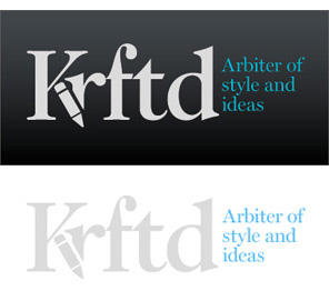
Krftd
I received this logo from Jeanette over at Krftd, an online magazine. Check it out if you haven’t already. There is some fine inspirational material over there. Anyway, Jeanette offered this bit of insight when submitting this logo,
“Defined as the arbiter of style and taste, Krftd is the clever resource for individuals with a well-dressed mind. Krftd curates the world of design, interior, art, fashion, travel, popular culture and technology through its cosmopolitan lens and celebrates the most inspiring ideas in our pages.”
Jeanette went on to say,
“Considering that Krftd is an alternative spelling to "crafted", the typeface was chosen to make it easy to read. The pencil icon on the Krftd logo adds a casual and slightly playful feel. And also because it sits nicely in a discreet manner. This overall clean and simple logo does not attach to the content and allows it to speak for itself.”
Design Principals
The Krftd logo is tastefully designed and offers a good starting point. Even so, I see some areas for improvement. First, I’m confused by your copy and messaging in conjunction with the stye and message of your logo. You mention ‘well-dressed’ and ‘cosmopolitan’ which call to mind sophistication and polish. Unfortunately, I think the logo lacks these qualities. Just as you mentioned in your message “... the Krftd logo adds a casual and slightly playful feel”. Why the juxtaposition between your brand and your messaging? I feel your website and it’s content are more similar to your copy and messaging than your logo. I just cannot make the connection from playful to sophisticated.
Functionality / Versatility
I have seen the logo used both on dark background and light backgrounds. In both cases I think it works well. The blue tagline and grey type stand out from the background. This logo would work fine without color as well. Lastly, the mark should scale pretty well, although at the smallest sizes the tagline may become problematic.
Does the Logo Work for the Audience?
I cannot speak to who your actual audience is because I don’t have that info. So I will speak to your aspirational audience based on your statement above. While I see a certain level of class or sophistication in the mark, I think more could be done with it. To me the playfulness that the pencil adds in unnecessary and distracting from the message. When I see the pencil I think editor rather than an arbiter or judge or expert. It may just be the style of the icon. On the flip side I think the serif typeface is a good choice to show sophistication.
Question for the readers
please respond in the comments below
What do you think about the pencil icon? Does it work for the audience? Does it create messaging inconsistency to you?
Uniqueness
This logo is unique and memorable by it’s use of a clever alternative spelling for ‘crafted’. The pencil icon as a part of the ‘k’ is unique as well. While I do find the mark memorable, I’m not sure it is in the way intended. Meaning I might remember the mark for it’s cleverness, but not for the company it stands for.
Typography
As mentioned earlier the serif typeface does add a level of polish and sophistication. Nevertheless, the alignment of the blue tagline doesn’t feel fully resolved to my eye.
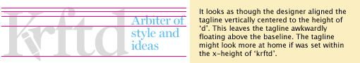
Adjusting the size and/or location of the tagline might be something to examine. The tagline could change to a smaller point size or switch to a two line version. Consider dropping the ‘and’ and using an ampersand instead to save a little space.
Possible Improvements
So what is the best way to improve the logo? Well I think have made some comments above that can certainly offer some direction. Here’s a list of actionable items.
- Consider adjusting either your messaging or the logo to bring the two parts in sync. It’s important to communicate consistently with your viewers on all levels (copy, visuals, etc.).
- Address the tagline issue by resolving the awkward alignment. Some possibilities might be fitting the tagline text within the x-height (the distance between the baseline of a line of type and tops of the main body of lower case letters) of the letters. Consider dropping the ‘and’ and using an ampersand instead to save a little space.
- Evaluate whether the pencil icon is a distraction away from the desired audience or not. Possibly try and alternate pencil icon/illustration. Something that feels more refined and less generic.
Overall, I think the current state of the logo is pretty well done, but there is room for refinement. Please know that my intention in critiquing your work is not to hurt feelings, but to offer constructive feedback. I hope it was helpful. Best of luck to you!
I appreciate and welcome your comments, and look forward to hearing from you soon. I purposely don’t cover every possible improvement that can be made to this logo, so go for it if you think I missed anything. All I ask is that you keep your comments clean and appropriate.
Like what you read here? Subscribe to the Logo Critiques News Feed.
Enjoy this post? Share it with others.


The images & logos presented on this blog are copyrighted by their respective owners. The blog itself is copyright Erik Peterson, 2008-2026 All Rights Reserved.


We enjoy your comments
36 Comments so far. Keep 'em Coming.
#1
By Chris Madden
04.08.2009 at 11:27 PM
I can see definitely replacing the ‘and’ with an ampersand, and trimming it down to two lines. That, would add (or should I say subtract?) a lot.
#2
By Marcus Blankenship
04.11.2009 at 11:02 PM
At first glance I saw the “K” and the pencil, mistook the pencil for a crayon, and thought it was a kids site.
If you keep the pencil icon, you might consider making the shaft yellow and the eraser pink, to make it more pencil-like at first glance.
Next after reading a bit more “crafted” didn’t appear in my brain, but the “crufted” did.
#3
By Erik Peterson
04.13.2009 at 11:07 AM
@chris & @marcus thanks for the insight & opinion.
@marcus, I’m not sure about adding all that color to the logo, however maybe there are other ways to reinforce the pencil idea if it remains part of the logo.
#4
By Kirsten Navin
04.14.2009 at 05:01 PM
The use of a stubby pencil and the spelling of Crafted seem kid-like to me. I’m not against the unique spelling of crafted, just paired with the stubby pencil the message is not what you are intending. It does not say cosmopolitan nor would I expect the site to cover: fashion, design, art, travel and pop culture. I would expect to see arts and crafts for kids. Perhaps instead of using a pencil use a fountain pen, that would help eliminate the Kid quality. I get that you want it to be playful but there a difference between playful and child-like. The font is ok, but with the multitude of font out there I believe you could find something more elegant.
Also the suggestions about adjustment to the tag line are good ones. The current position is disjointed and floating.
I hope I didn’t sound harsh, sometimes it’s hard on-line. It’s a good initial start I just think the logo needs a little more polish to achieve it’s goal.
#5
By Erik
04.14.2009 at 05:16 PM
@Kirsten Great comments! Good point about the fountain pen, it would most likely look more sophisticated than the pencil.
#6
By Lens
08.25.2009 at 03:10 PM
Thank you for the post.
#7
By Jill R. Gibson
09.13.2019 at 04:49 AM
In order to become successful, you should follow some successful business Leader like Arviv CLIK HERE.
#8
By Allen
01.22.2020 at 02:25 AM
This logo would work fine without color as well. Lastly, the mark should scale pretty well, although at the smallest sizes the tagline may become problematic. https://www.dumpsleader.com/AZ-301-exam-dumps.html
#9
By Ravar
04.21.2020 at 11:12 PM
Nice logo! painter in Rapid City
#10
By MateoJ
11.13.2020 at 02:22 PM
Very detailed, helpful and relevant! Thanks for the blog .
#11
By Rob Feri
06.18.2021 at 01:20 PM
It was a challenging quest for me to find a reliable academic assistance service. But then I read the review by Scamfighter and understood that there is no better expert to trust. Their base of articles is large enough to find your best writing help company in a few minutes.
#12
By ctfo gummy bears
08.09.2021 at 03:28 PM
Are you looking for a reliable, high-quality, safe company that distributed CBD products? Are ctfo gummy bears all natural? According to the cbdgummiesforpain.org, the distributor is worth giving a try.
#13
By Jackqueline Dcruz
05.27.2022 at 12:09 AM
Great I like the way of your art, I would love to about the prices and delivery criteria of your service. I would like to buy a logo for Management Homework Help Which is the leading company of writing services in the USA.
#14
By David
08.06.2022 at 02:39 AM
People who leave the reviews don’t have anything to lose or gain all they had an experience, good or bad, and they would like to share with the potential users. People who leave CV-writers.org.uk Reviews ensure that the review website is unbiased
#15
By chris224
12.12.2022 at 12:14 AM
The krftd logos are nice. you must be looking out for Santa Claus’s outfit. To fulfill your wish we have designed the elegant. Santa Claus Outfit
#16
By Darina
02.10.2023 at 07:00 PM
The long and extensive list of positive words that start with Q can be found on 365DaysofPositivity website.
#17
By Hotel Kirkland
03.21.2023 at 09:38 AM
Thank you for sharing such a well-researched Blog post, It was a pleasure to read, and I learned a lot from it!
Regards,
Lakeview Hotel Kirkland offers luxury and cozy rooms by the side of spectacular Lake Washington.
#18
By Christine John
05.20.2023 at 02:59 AM
nicw bha ajkbc
#19
By Design Fictives
06.19.2023 at 11:52 AM
Design Fictives uses cutting-edge technology to transform your web design concepts into reality. Our innovative solutions aim to generate leads and add value to your business, resulting in significant returns on investment.
Website: https://designfictives.com/website-application-design-&-development-serviceswhite
#20
By Smith
07.14.2023 at 07:13 AM
I appreciate the effort you put into researching and providing credible sources for your claims. It adds a lot of credibility to your post.
3D Logo Design Services
#21
By Roy
07.16.2023 at 02:09 PM
Interesting points raised in this post, thank you for sharing.
Cégeladás honlap, amennyiben befektetőként vagy cégvásárlóként eladó vállalkozás hirdetése iránt érdeklődik.
#22
By helen dam
08.21.2023 at 02:13 AM
The intuitive tutorial and guidance offered by only up online ensures that players can quickly grasp the game’s mechanics and navigate the initial stages with ease.
#23
By Josie Johnson
09.01.2023 at 02:22 PM
Nice and I would like to tell you that I have been working as a travel agent and I wanna tell you that I am offering you a travel insurance provided by https://traveldefend.com/ website that could be very useful source for you if you wanna get best insurance while travelling anywhere.
#24
By Jason Kitty
11.29.2024 at 05:23 AM
Moreover, tifa sexdoll offer a degree of privacy and discretion that can be appealing in a society where sexual preferences and behaviors are often scrutinized.
#25
By Sumit Guptill
06.04.2025 at 07:00 AM
The Deku Hoodie is a must-have for My Hero Academia fans—stylish, comfy, and full of hero vibes. Perfect for showing off your love for Izuku Midoriya wherever you go!
#26
By Arno
08.05.2025 at 05:16 AM
Nevertheless, Latin American media is increasingly featuring life size sex doll and artificial love in television and literature, suggesting a shift toward a more open perspective.
#27
By Ivasaf Mercier
09.10.2025 at 04:18 AM
I appreciate your insights on the Krftd logo! The contrast between the playful and sophisticated vibes could use some refinement. If the brand seeks a cosmopolitan image, aligning the logo design with that vision is crucial. Perhaps seeking inspiration from popular games like Moto X3M, which balance fun with style, might help find a cohesive approach. A brand’s identity should harmonize across all elements for maximum impact!
#28
By takoankosi
10.24.2025 at 11:44 PM
Join millions in BasketBros and prove your worth by mastering your shots, dribbles, and passes in high-speed basketball battles.
#29
By Kiera Watkins
11.11.2025 at 03:50 AM
I appreciate your insight on the Krftd logo; it’s always beneficial to seek clarity in branding. I’ve recently been using the Basketball Stars platform, and it’s been a fantastic way to engage with my love for the game. The sleek design and user-friendly interface make it enjoyable to navigate. I recommend checking it out if you’re looking for something fun and interactive!
#30
By Phillip B. Albert
12.30.2025 at 03:24 AM
Struggling with logo design? I was too! What helped me? I realized my first logo wasn’t communicating the right message, & I had to rethink the imagery. It’s all about clarity & connection. Ever played basket random ? It’s surprisingly strategic, & maybe you can find inspiration there!
#31
By Gabriel Chadwick
12.30.2025 at 10:15 PM
This is a really insightful breakdown of the logo! I agree about the functionality on different backgrounds. The scalability is key, especially these days. The playfulness versus sophistication point is interesting, too. It reminds me of some of the discussions around game design – how to balance accessibility with depth. Sometimes, a simpler, cleaner approach can be more effective, like in Snow Rider 3D, where the core mechanic is easy to grasp but offers plenty of challenge. The typeface choice definitely adds to the overall feel. Thanks for sharing your thoughts!
#32
By Fred Largent
01.01.2026 at 10:42 PM
Right off the bat, that logo feels a bit disconnected from the brand’s sophisticated claims. The pencil icon, while cute, leans a little too heavily into the “casual” side. It almost clashes with the “well-dressed mind” aspiration, doesn’t it? I recall once designing a website where the color palette fought against the imagery, creating a dissonance similar to this brand mismatch. It was such a mess, the client hated it. We had to redo the whole damn thing! sharing is caring Pips NYT so I’m hoping Krftd nails it in the next iteration. Perhaps a more stylized mark would bridge that gap?
#33
By Willie S. Picklesimer
01.07.2026 at 03:27 AM
Interesting critique! I agree that the pencil icon’s playfulness might clash with the sophisticated brand message. It’s like trying to solve a complex puzzle, similar to a challenging level in Block Blast , but with conflicting pieces. Perhaps streamlining the design and focusing on a more refined aesthetic would better align with Krftd’s stated goals. The typography suggestions are also spot on.
#34
By Charlie Hanson
01.18.2026 at 08:53 PM
I struggled with designing a website’s layout, trying to find that sweet spot between aesthetics and functionality. It felt like a never-ending puzzle. The solution lay in seeking diverse opinions from colleagues. I always find it helpful to share my experience, so I am very grateful to be Slice Master in this sharing section.
#35
By Henry Hobbs
01.31.2026 at 04:25 AM
This is an interesting analysis! I agree that the pencil icon adds a playful vibe, but I’m not sure if it aligns with the sophisticated tone they’re aiming for. It reminds me of some of the debates we have in our design group, especially when we’re trying to balance creativity with a specific brand identity. Sometimes, you just need to step back and refocus on the core message. It’s like when the Football Bros are strategizing - they have to know their strengths. The question really is, does the logo resonate with the target audience beyond just being clever?
#36
By Finlay Rice
02.04.2026 at 09:43 PM
The pencil is a subtle nod, sure. Reading their description makes me remember back when my startup needed branding. The challenge was ensuring the logo didn’t overshadow our core message. Finding that balance, being a logo Slice Master, took a lot of iterations and feedback! Krftd’s clean aesthetic is smart though.