Automagical Logo Design Critique 45
Categories: CritiquesMarketing & Design
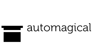
Automagical Logo Design Critique
Jacob submitted this logo for his design portfolio and freelance work website. He left the following comment about the logo.
“Since the web design I do focuses on standards compliant and simple but beautiful designs, I want a logo that represents the kind of work I do. My design philosophy is ‘Less is more’ and I tend to stay away from flashy trends with too many elements. I'm hoping that this logo helps convey some of that. I choose black for that reason, although I may experiment with other color options. The top hat icon was chosen to represent how design can often be a ‘magical process’ (automagical, if you will) with inspiration coming from anywhere. I appreciate any feedback and thank you!”
The following critique is based on one designer’s opinion and experience. I always appreciate the readers thoughts as well. So, I’ll ask a question of two in the critique, please share your perspective in the comments at the end of this logo design critique.
Design Principals
To be honest, I looked at the logo several times before reading Jacob’s commentary and never once saw the top hat. What I did see was a bed (from above), but definitely not a top hat. It seems the context makes it tough to recognize the top hat (upside down and without dimension). Perhaps the name ‘automagical’ is somewhat at fault. The two words aren’t a natural fit and the word ‘auto’ stands out and leads the mind down a path of trying to relate the unrecognizable icon to the auto industry. For me, the top hat needs to be immediately recognizable in order to start making sense of what is being communicated with the mark. I wonder about the word ‘auto’ though, why did you choose to use it in conjunction with the word ‘magical’? You explained where ‘magical’ came from, but not ‘auto’. Is there a deeper meaning that can be conveyed in the logo? Don’t get me wrong, the less is more philosophy is a good one, but the viewer still needs to be able understand the mark and make some educated guesses about what the company may do.
Question for the readers
please respond in the comments below
What did you see when you first saw this logo? Did you know what type of business the logo was for?
Functionality / Versatility
A one color logo in black is about as functional and versatile as you can get. It should work well across all mediums.
Does the Logo Work for the Audience?
As part of the creative community we get to take a bit more liberty with our business names, but you also have to weigh the consequences of an unintuitive name. I actually think that Jacob would be better off to remove the top hat from the mark if he chooses to keep the current name. It sticks to his less is more philosophy and may create less uncertainty over the interpretation of the mark.
Question for the readers
please respond in the comments below
Do you think this logo works for Jacob’s audience?
Typography
I like your typeface choice, it’s modern and unique. The curves in serifs depict a friendly and approachable feel. However, the kerning needs work. Notice how close the ‘g’ and ‘i’ are with the large gap between the ‘i’ and ‘c’. Overall, great typeface choice just refine the kerning a bit and you’ll be all set.
Possible Improvements
Designing a logo for yourself or own business is one of the hardest logo designs you’ll ever work on. So what is the best way to improve the logo? Well I think have made some comments above that can certainly offer some direction. Here’s a list of actionable items.
- Consider removing the icon of the top hat completely. It may be creating more questions that answers for the viewer.
- If you decide to keep the top hat icon, improve it so it is immediately recognizable. Perhaps some dimension and turning it right side up could help.
- Adjust the kerning of the word ‘automagical’.
- Contemplate the business name. Is it really right for you and work? Does it work for your audience?
Overall, I think you have a good start on the logo design. And with some refinement you can definitely improve it. Please know that my intention in critiquing your work is not to hurt feelings, but to offer constructive feedback. I hope it was helpful. Best of luck, to you!
I appreciate and welcome your comments, and look forward to hearing from you soon. I purposely don’t cover every possible improvement that can be made to this logo, so go for it if you think I missed anything. All I ask is that you keep your comments clean and appropriate.
Like what you read here? Subscribe to the Logo Critiques News Feed.
Enjoy this post? Share it with others.


The images & logos presented on this blog are copyrighted by their respective owners. The blog itself is copyright Erik Peterson, 2008-2026 All Rights Reserved.


We enjoy your comments
45 Comments so far. Keep 'em Coming.
#1
By Holly
07.13.2009 at 01:09 PM
When I first daw the logo, right away I wasn’t sure what I was looking at, although when I read the word automagical I did think maybe it was a top hat, but as a viewer I still wasn’t completely sure if that’s what it was. Maybe ad bunny ears coming out of the top? or a magic wand coming to tap on the hat? and make the brim a bit longer. These are just suggestions. I disagree with Erik about turning the top hat the other way, when I think of a top hat in conjunction with a magician I think of it turned upside down so that he can pull something out. The word auto does make me think cars a bit, but I think if the mark is more obviously a top hat with maybe another element to tie it together, then we can handle “auto”. I do like the initial concept though. Just work it around a bit more
#2
By Sarah Camp
07.13.2009 at 01:10 PM
In the web development industry the phrase “Automagically” is tossed around a lot. This is usually in place of the word “automatically” and used to explain something that the writer might not want to give away in detail to the reader. I think this is the phrase he was trying to use here, although it doesn’t make quite as much sense since there isn’t such a word as “automatical” for the word to parallel, which is why you think of automobiles first (in fact, there is a website called automagic.com which is for autos).
That being said, I saw the top hat before I saw anything else when I looked at the logo. However, I agree that it doesn’t really work. Just having the word would work out better.
Also, unless his audience is actually web developers / designers who know the term, I don’t think it would work. If he is trying to appeal to the common client, I don’t think they will get it, since the logo is out of context.
#3
By Steve Manatt
07.13.2009 at 01:11 PM
I saw the tophat only after looking at the name of the company and associating the term “magic” with the logo. That being said, I think it is clever and I personally like the “ah-ha” moment when I figure it out, but I know that isn’t ideal for a logo.
It might help if the text was above the logo, to one side and angled a bit like a magician’s baton. (if you use this idea - some credit please) This might help get the name out there first and help with association.
At any rate - nice work and I wouldn’t change a thing!
#4
By Larkef
07.13.2009 at 01:18 PM
I did recognise the top hat right away. It looks really nice, however, it may be a tad too abstract. Also, it felt a bit huge and unbalancing next to the name.
Nice name and nice font. Perhaps bold would suit better with the black logo?
Good luck!
#5
By JohnnyRod
07.13.2009 at 02:48 PM
I also recognized the top hat initially. I understood it being inverted to play on the magician’s hat idea.
However, I don’t feel the symbol and the name are integrated well. I don’t see the rationale for alignment (I understand its to x-height, but why?). To me they seem oddly placed in relation to one another.
Another issue I have, is the harsh, almost pixel-like rendering of the hat versus the light-hearted and playful typography. I understand they contrast in that regard, but contrast for contrast’s sake is not effective.
I do like the type choice, though. Simple, clean, not too serious… nice choice. I don’t mind the all-black either, but wouldn’t mind it if it had some color. Even perhaps bringing in a slightly lighter grey shade might help give it some depth.
I’d suggest rendering the top hat with those themes in mind. Add a bit more character to the hat, likely rounding the corners. Give it some life and interest, not whimsical but a little down that path. Lastly, take the new rendering and arrange it better with the type. Think how they relate to one another, and why.
#6
By Jacob
07.13.2009 at 04:30 PM
Thanks for the critique and suggestions. I agree, designing a logo for oneself is the most difficult design job. There are a lot of helpful comments here so thanks for those! I’ll keep playing with it.
#7
By Erik Peterson
07.13.2009 at 05:15 PM
@holly you make a great point about the hat being upside-down and like the concept of bunny ears coming out the top. That would definitely help to communicate the concept of �magic� much more quickly.
@sarah thanks for further explaining �automagically� I appreciate your thoughts on the name also.
@johnnyRod good observation on the contrast issue, I agree.
@jacob let us know when you complete your revisions. I�d love the chance to show it to the readers.
#8
By Fbanczak
07.14.2009 at 01:23 PM
Jacob,
I agree with much of the comments above but my biggest concern is the name & context around your logo. I’m a graphic designer from NJ and though I don’t do web design, I know people who do and I’ve never heard the term “automagically.”
In fact, when I first looked at your logo, before reading the description, I took the top hat literally to mean that you were branding yourself as a magician or some sort of performer. I would never have thought web design unless someone told me. Because of that, I would feel like you need to incorporate something like a mouse or an arrow/click symbol in your logo rather than the top hat. Perhaps your logo should look like a hyperlink that says Automagical and have an arrow near it as if you were navigating to your web design site.
Overall, I really like the typography, it’s modern and clean which is exactly what I would expect for a web designer who is particular about designing simple and effective sites. It almost even looks like a cleaned-up, more modern Courier with less accentuated serifs. I would just work on the name or the icon to convey a sense of web design otherwise it may be lost on your audience.
#9
By freelance project
09.19.2009 at 09:39 AM
I think many clients are cognizant of extra demands that they might occasionally place on you, especially if you already have a business relationship with them. In my experience, they are willing to increase compensation for jobs that need to be done quickly, or are outside the scope of what they normally ask for.
#10
By Pimps Out
03.03.2010 at 07:21 AM
In my experience, they are willing to increase compensation for jobs that need to be done quickly, or are outside the scope of what they normally ask for.
#11
By blogger
12.17.2010 at 03:53 PM
I planned to do web design projects at my own. I need to interact with the customer & need to collect requirements from them and I will design web pages for them. Please help me to make it well.
#12
By Latisha
04.10.2011 at 05:25 PM
zMjfgc I’m not easily impressed. . . but that’s impressing me!
#13
By Allen
09.17.2019 at 01:46 AM
The critique is based on one designer’s opinion and experience. I always appreciate the readers thoughts as well. So, I’ll ask a question of two in the critique, please share your perspective in the comments at the end of this logo design critique. 1z0-1038 dumps
#14
By Swayer Scott
11.28.2019 at 03:26 AM
This is a great place to find good logo designs. There are lots of articles are available regarding different logos like this one on Automagical. applied behavior analysis autism Also, we can create logos for the free critiques provided here. They provide better guidelines to improve our designs.
#15
By Lisa
04.23.2020 at 01:06 PM
Thank you for sharing all of these amazing articles! Check me out for stump grinding
#16
By Yejefol
06.15.2020 at 02:00 AM
Logos are a point of identification; they’re the symbol that customers use to recognize your brand.
anime heavn
#17
By tj52
01.13.2021 at 06:19 AM
in my opinion, the times when people tried to install their favorite songs, popular melodies and so on, on their phone, have sunk into oblivion. now everyone uses preset rhythms and doesn’t bother choosing and loading something special. So do I. phone is a phone - tink tink and that’s it. but as for the resume - you can learn more on zipjob, here it is more and more difficult here and individualization is required in order to stand out from the background of other candidates and at the same time adhere to generally accepted standards
#18
By Avery Smith
04.13.2021 at 08:41 AM
Few revisions and this will be perfect, since I am a concrete contractor, my eyes are fond of designs.
#19
By Chaiz
08.05.2023 at 08:37 AM
The two words aren’t a natural fit and the word ‘auto’ stands out and leads the mind down a path of trying to relate the unrecognizable icon to the auto industry. | International Center drywall contractor
#20
By Keith
08.25.2023 at 05:15 AM
With our user-friendly interface and intuitive navigation, you’ll easily find the information you need. We strive to provide detailed descriptions, helpful tips, and insider recommendations to enhance your experience. Our goal is to be your trusted companion, guiding you towards the most rewarding and enjoyable things to do in your area or any destination you’re planning to visit.
#21
By Nanisa
02.20.2024 at 11:23 PM
waffle game is a game you can play whenever you want right in the browser. The rules of the game are very simple: You just need to use the given characters. Change them so that they link together to make meaningful words. Moreover, the waffle game has suggestions for you with colors including, dark orange, light orange and original color. Use this to find out what the words mean and where they stand. From there find the keyword. Play the waffle now to be the fastest to find hidden keywords
#22
By Sanahan1
02.21.2024 at 10:01 PM
Play word games for free at waffle game. You will have comfortable moments with friends and family. Moments of relief after tiring work waffle
#23
By nancy lucy
03.11.2024 at 02:17 AM
Thanks for sharing this information driving directions. I really like your blog post very much. You have really shared a informative and interesting blog post with people.
#24
By samgfg aliyu
05.18.2024 at 12:16 AM
great. thanks.
لعبة بادل
#25
By Niko Stern
06.06.2024 at 06:43 AM
Thank you for the valuable information. Very helpful! Solar
#26
By phrazle
11.14.2024 at 02:50 AM
Consistent effort often phrazle results in significant enhancement after many weeks of committed practice.
#27
By Brook Brakus
02.22.2025 at 09:36 AM
Getting a professional critique on a logo design is so important because it helps improve branding and visual appeal. I recently came across www.streamlined.finance, and they emphasize the importance of a well-crafted logo in building a strong brand identity. A fresh perspective can highlight details that might be overlooked, making the design more effective and memorable. Constructive feedback ensures that the logo communicates the right message to the audience. Great insights can truly transform a simple design into something powerful and impactful!
#28
By Joshua Robinson
09.16.2025 at 10:45 PM
That’s a really insightful take on the logo and its potential misinterpretations! I especially agree about the “auto” part feeling a bit disconnected. It’s fascinating how context can completely change how we perceive even simple shapes. Makes you really think about branding! Basketball Stars
#29
By Davidres Garcia
09.19.2025 at 04:09 AM
Interesting concept! “Less is more” is a strong philosophy. The top hat, however, does read more “bed” than magic. Maybe a slightly different angle or adding subtle dimension could help? My Granny always said, “Clarity is key!” Why not explore minimalist abstract shapes besides the hat? Consider other visual metaphors, perhaps relating to simplicity itself? What about a single, perfectly formed square?
#30
By geometry
11.01.2025 at 02:58 AM
Geometry dash subzero is a great follow-up to the popular Geometry Dash series. It comes back with levels full of bright lights for a totally new experience. Once more, players control their geometric cube as it moves through a number of tricky stages full of traps.
#31
By duhanha
12.01.2025 at 10:24 PM
Remember this: The thrill of competition adds an exciting layer to steal a brainrot; you’ll find yourself strategizing against friends and foes alike as you work to outsmart them and claim their Brainrots.
#32
By Lillysa Winter
12.03.2025 at 03:31 AM
I completely understand your struggle with visual recognition! I’ve had similar experiences where context completely changes how we perceive shapes and symbols. It’s fascinating how our brains try to make sense of abstract forms. This reminds me of playing puzzle games like Suika Game, where recognizing patterns and shapes is crucial - sometimes what looks like one thing transforms into something completely different as pieces merge and evolve.
#33
By stevejam
12.08.2025 at 08:03 AM
The idea behind the logo is interesting, but the top hat doesn’t immediately read as such, which might confuse the audience. Maybe simplifying the design or removing the icon could help clarify the message — or as I like to say, sometimes less *automagically* works better! steal a brainrot
#34
By Christian
12.16.2025 at 11:20 PM
It reminds me a bit of playing doodle baseball. The concept is super simple - just tap to swing. But timing is everything! You can swing a hundred times and miss, but each swing teaches you a little something about the pitcher’s rhythm. Sharing your work and getting feedback is like that - you might not hit a home run every time, but you learn and adjust for the next pitch! I like the black and white simplicity, though - maybe a different icon would land better?
#35
By สมัคร lsm99
12.25.2025 at 01:59 PM
Excellent read, Positive site, where did u come up with the information on this posting?I have สมัคร lsm99 read a few of the articles on your website now, and I really like your style. Thanks a million and please keep up the effective work.
#36
By Alex Lee
12.27.2025 at 02:40 AM
Great analysis of the logo design principles! I appreciate how you break down the functional aspects and audience considerations. The discussion about simplicity versus complexity in logo design is particularly insightful. As someone who works with design tools, I find that understanding these core principles helps create more effective visual identities. The black and white approach you mentioned aligns well with minimalist design trends.
#37
By Riley Lee
12.27.2025 at 03:29 AM
This is a fantastic critique! I especially agree with your points on versatility and functionality being key aspects of a successful logo. It’s easy to get caught up in aesthetics, but the practical application of a logo across different mediums is what truly matters. Understanding these core principles is essential when using modern design tools. Great read!
#38
By Alex Smith
12.27.2025 at 06:12 AM
这篇评论非常棒!我尤其赞同您对简洁性和“少即是多”理念的强调。很有趣的是,“automagical”这个概念不仅适用于设计,也适用于我们如何简化工作流程。自动化测试和监控等工具能帮助我们专注于核心功能和美学原则。见解深刻!
#39
By SLOPE RIDER
12.28.2025 at 11:37 PM
Slope Rider right now throws you into a snowy adventure where hazards are everywhere. Play free online on sloperider.org and see how long you can survive in a very fast-paced thrill ride.
#40
By Oliver Henn
02.23.2026 at 03:54 AM
Interesting critique—before context, I can totally see how an abstract “top hat” could read as something else (the bed-from-above note is spot on). “Less is more” still needs instant recognition, so either simplifying by dropping the icon or adding subtle dimension feels right. Also agree the “auto” prefix pulls thoughts toward automotive. This kind of quick perception test reminds me of experimenting in Infinite Craft.
#41
By tagmybeat
03.07.2026 at 10:02 AM
I had the same moment you described – staring at the design and wondering where that “top hat” was supposed to hide. The way the negative space hints at a bed instead of a hat actually made me pause and think about what story the logo is trying to tell. Jacob’s take about the missed metaphor was spot‑on; it reminded me how easily our brains fill in shapes we expect. If you ever need a quick tool to add a personal audio signature to your brand, the producer tags generator is surprisingly handy.
#42
By adriannan33
04.22.2026 at 01:45 AM
Great feedback! I especially agree on the need for refinement. Maybe playing with different fonts could help? It’s like trying to guess the right letters in wordle unlimited – you need to test options to find the perfect fit. Focusing on visual hierarchy could also elevate the design. Thanks for the constructive criticism!
#43
By Lunch
04.29.2026 at 10:35 PM
Love tester invites users to express their individuality and investigate the many facets of love while making treasured memories with friends and family with its captivating UI and imaginative questions.
#44
By Drift Boss
05.14.2026 at 11:25 PM
Interesting take on the impact of automation in design! Much like mastering the precision required in Drift Boss, finding the right balance between AI tools and human creativity is key to a great logo.
#45
By kartik
06.17.2026 at 02:32 AM
Health-conscious individuals often look for Best Liver Tablets to support their daily wellness goals. Quality formulations can be a valuable addition to a balanced lifestyle focused on liver care and vitality.