e happy design 32
Categories: CritiquesMarketing & Design
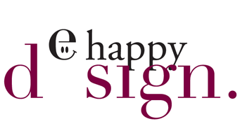
e happy design
Edu submitted this logo for a personal graphic design company called “e happy design”. Along with the logo, the following description about the company was included,
“The logo tries to describe the company’s identity: a very “happy” company, but also serious. I’ve chosen that typography because I think it’s strong, and reflects what I want, a serious but “happy” company”
The following critique is based on one designers opinion and experience. I will ask a question or two during the critique and would love to hear your thoughts in the comments section.
Design Principals
Even though the “e happy design” logo is only type, excluding the eyes within the letter ‘e’, there is an awful lot to take in and understand. The happy face in the ‘e’ reminds me of Walmart or The Watchmen. I’m not sure it’s appropriate for your design company. I think there is a more creative (not so overused) way to communicate the ‘happiness’ you want this logo to show. The descenders from the word ‘happy’ intersect the letters below in rather unpleasant and unrefined way. I also don’t see any reason for the period. What is it for?
Question for the readers
please respond in the comments below
Do you like smiley face? Do you think it’s childish?
Functionality / Versatility
The logo is simple and two color which works well for most reproduction (print, online, trinkets, etc). It should work fine in greyscale as well. Lastly, the mark should scale nicely, although at the smallest sizes the small eyes may get lost.
Does the Logo Work for the Audience?
I think the typeface does have a ‘serious’ tone to it, which achieves one of your goals. The only element that communicates ‘happy’ isn’t doing a great job at it, and like I said before is a little cliché. I think it’s worth exploring some other concepts that convey the serious but happy feel you are looking for.
Question for the readers
please respond in the comments below
Any thoughts on how Edu might be able to communicate the happy feeling without using the smiley face?
Uniqueness
The logo is unique in appearance with it’s strange choice of spacing, but the smiley face definitely is not unique. The smiley face shows up all over the place and I think a design company ought to use something more creative and original.
Typography
The typography in the logo could use some work. The intersection of the descenders from the word ‘happy’ with the letters below is visually distracting.
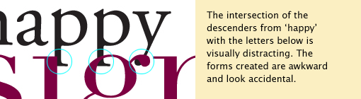
Also take a closer look at your kerning. One example is the kerning between the double ‘p’s. They should be closer together. With the strange spacing between the ‘d’ and ‘s’, the ‘e’ becomes a focal point in the logo. However the weight and scale of that ‘e’ doesn’t look or feel correct. I’ll also mention the random period at the end of the logo. It’s not needed and is a visual distraction for the viewer.
Possible Improvements
So what is the best way to improve the logo? Well I think have made some comments above that can certainly offer some direction. Here's a list of actionable items.
- Consider eliminating the happy face from the logo and explore new, more original ideas that convey a sense of happiness you are looking for.
- Remove the period from the logo. It’s not needed and is distracting.
- Once you get the logo refined. Take a close look at your kerning. The space between letters should be equal visually.
- If you decide to keep the same basic design presented here, look at the ‘e’ and experiment with its scale, weight, placement, etc until it looks and feels balanced in context with the rest of the logo.
Overall, I think you have a good start on the logo design. The logo does communicate the seriousness you intended and with some refinement you can definitely improve it. Please know that my intention in critiquing your work is not to hurt feelings, but to offer constructive feedback. I hope it was helpful. Best of luck, to you!
I appreciate and welcome your comments, and look forward to hearing from you soon. I purposely don't cover every possible improvement that can be made to this logo, so go for it if you think I missed anything. All I ask is that you keep your comments clean and appropriate.
Like what you read here? Subscribe to the Logo Critiques News Feed.
Enjoy this post? Share it with others.


The images & logos presented on this blog are copyrighted by their respective owners. The blog itself is copyright Erik Peterson, 2008-2026 All Rights Reserved.


We enjoy your comments
32 Comments so far. Keep 'em Coming.
#1
By Phil
04.20.2009 at 06:33 PM
I’m not really loving the smiley face… It reminds me of the Walmart (boo), or the movie Watchmen… I’d drop it all together.
Maybe he could adjust the colors to more ‘happy’ colors if he wants to increase the marks happy level? Or maybe make the word happy another font or italics, although that might be too obvious of a solution.
#2
By Tim Smith
04.22.2009 at 02:36 PM
I like the smiley face, but what I don’t like, are the colors and the leading. The happy and design are way too close. Sorry to be so critical but, I’m not diggin’ the font either.
#3
By Justin Moore-Brown
04.23.2009 at 06:08 AM
I see what the client is trying to do by seperating the “e” but it forces the eye to bounce around in an unnatural way. Colors are ok and convey a serious heavy tone, along with the font. Leading definitely should be addressed. The client should experiment with different formats, focusing more on simpler concepts with good colors and type.
Definitely a good start, the concept just needs refining!
#4
By Tim Schmidt
05.04.2009 at 11:29 PM
I agree with all the critiques above (intersecting type problems, smiley, etc).
There must be a reason the company has “e” in their title…so I would do something special with it. No need to try to multi-purpose it.
Ans I always believe in the “quick read”....this does not do that. Don’t be afraid to spell it out without spaces “ehappydesign”...and maybe use color to separate the words.
#5
By ann
11.23.2018 at 04:50 AM
Your blog is quicker than molasses. I’ve seen a few websites that are ludicrously moderate. I mean a sidebar filled to the overflow, blazing pictures, full blog entries on the landing page (instead of portions), a huge number of GIFs… each one of those things back off a blog. They make it take more time to look down in light of the fact that it’s slacking, and it could even make a more seasoned PC crash/solidify totally. I cherish your blog. It’s straightforward, rich, and brisk to stack.
#6
By john
11.23.2018 at 04:52 AM
We love and hate similar posts. I know it’s okay to have differing opinions, and I won’t unfollow someone because we disagree a few times. But I love blogs that mostly agree with my thoughts on posts. That’s just because I don’t want to read about someone bashing a post that I adored, or praising a post that I despised. ( https://mightyessays.com/ ) It puts me off! If it happens once in a blue moon, no biggie. But if we constantly have differing opinions, I just can’t click with the blog!
#7
By Sarah W. Wagner
09.13.2019 at 04:47 AM
Another option for investors is an online trading course called Certus Trading Reviews
.
#8
By Allen
02.01.2020 at 02:39 AM
However the weight and scale of that ‘e’ doesn’t look or feel correct. I’ll also mention the random period at the end of the logo. It’s not needed and is a visual distraction for the viewer. SPLK-1002
#9
By Fredrick
04.21.2020 at 11:10 PM
Nice concept. With a little refining it’ll be great! Info from a painter in Pasco
#10
By Nathan
11.10.2020 at 10:28 PM
I love that logo! I got a similar one for Inspecteur en batiment rive sud
#11
By Daniel North
04.13.2021 at 08:34 AM
This is nice. The color pallete is concrete. This has potential.
#12
By Werneree Granadosotte
08.22.2021 at 01:15 PM
Is this SPLK-1002 you shared here the new keyboard model of this brand? I’m a big fan of their products because they have awesome features like those anti-ghosting key that will help you play FPS game even better. I hope that they are now available for purchase here in our area so I can order one. Check this source link for the best farming games that you can play on your PC for free. https://www.emulatorpc.com/blog/matchington-mansion-tips-for-new-players/
#13
By Trantongray
11.20.2021 at 03:04 PM
F*ckin’ tremendous issues here. I am very satisfied to see your post. Thank you a lot and i’m looking ahead to contact you. Will you please drop me a e-mail? หนังออนไลน์ฟรี
#14
By trantongray
12.17.2021 at 01:51 PM
I am typically to blogging and i truly appreciate your content. This great article has truly peaks my interest. I am about to bookmark your website and maintain checking achievable details. divorce lawyer
#15
By johnyking
04.01.2022 at 05:38 AM
If more people that write articles really concerned themselves with writing great content like you, more readers would be interested in their writings. Thank you for caring about your content. sildalis 120
#16
By trantongray
05.20.2022 at 10:10 AM
you have got a fantastic blog here! do you want to earn some invite posts on my small blog? prom suits
#17
By alexandersan
09.25.2022 at 11:24 PM
I found your website the other day and after reading a handful of posts, thought I would say thank you for all the great content. Keep it coming! I will try to stop by here more often. bloxorz
#18
By Desmond Scotic
03.28.2023 at 03:44 AM
If you are a weed or mushrooms lover then visit https://buy420weeds.com and you will get the best quality indoor products. Meanwhile people who are fighting to lose weight can visit https://buysaxendapen.com and get delivery to your address and location. Then https://buypurehimalayanshilajit.com/ has the purest shilajit you can find online
#19
By akun master internasional
05.18.2023 at 06:36 AM
I would like to thank you for the efforts you’ve put in writing this web site. I am hoping the same high-grade site post from you in the upcoming also. Actually your creative writing skills has inspired me to get my own blog now. Actually the blogging is spreading its wings quickly. Your write up is a great example of it.
#20
By Snus kaufen
06.28.2023 at 08:49 AM
A cheerful design is very important for a product in my opinion. I think that Velo Snus does this really well.
#21
By Rose
08.07.2023 at 10:07 AM
It should work fine in greyscale as well.
brentwood crawl space repair
#22
By Candance S Henderson
12.22.2023 at 04:08 AM
Exceptional writing, each line radiates value. Incredible work! Your Refresh Rate Test is a must-try for all tech enthusiasts.
#23
By zetisdtisno
03.04.2024 at 02:37 AM
One of the most striking aspects infinite craft of online gaming is its ability to transcend geographical boundaries
#24
By Champagne
05.13.2024 at 06:58 AM
Gracias por ser una fuente de positividad y optimismo. ¡Tu blog me recuerda que siempre debo centrarme en el lado positivo! Experimenta la magia del conteo continuo con Contador De Clics, ¡tu compañero de conteo perfecto!
#25
By Niko Stern
06.06.2024 at 06:48 AM
Thanks for providing such useful content. Very helpful! Call
#26
By KenyettaPesso
06.07.2024 at 10:29 PM
Yoga with Adriene’s chick fil a breakfast hours 30-day challenge transformed my practice.
#27
By Partain
08.02.2024 at 09:59 AM
あなたの実践的なヒントと、あなたがもたらすポジティブなエネルギーに感謝します。あなたのブログは常に私にインスピレーションとモチベーションを与えてくれます。タイミングと精度が鍵となる、中毒性の高い 針ゲーム の世界に飛び込みましょう。 100 以上のレベルがあり、あらゆる年齢層に無限の楽しみと挑戦を提供します。
#28
By Maschinenverkauf
01.25.2025 at 07:14 AM
Gebrauchte Universal-Bearbeitungszentren schnell & einfach kaufen. Verkauf von hochwertige Universal-Bearbeitungszentren mit 3, 4 & 5 Achsen BAZ
#29
By Abdul Collins
09.09.2025 at 09:51 PM
Interesting critique! The logo feels a bit generic. Maybe explore more subtle ways to convey happiness? The ‘e’ is a bit cliché, I agree. It’s almost like stumbling upon a daily Wordle Unlimited puzzle - familiar, but lacking originality. What if you focused on the typography’s energy and flow instead? Could playful kerning or an upward slant hint at joy?
#30
By Smash Karts 76
12.04.2025 at 03:45 AM
Smash Karts 76 combines fast-paced kart racing with exciting weaponized combat, allowing you to take down your rivals while speeding toward victory.
#31
By Mary L. Hernandez
03.30.2026 at 09:47 PM
The “e happy design” logo presents a mixed bag. The serious typography clashes with the overused smiley face, which some might find childish. It reminds me a bit of the simplistic graphics you might see while playing Ragdoll archers , though perhaps less violent! Functionally sound, but creatively lacking. How can Edu convey “happy” without resorting to clichés? What are your thoughts on the smiley face’s appropriateness here? The typography needs refinement.
#32
By Ophelia
05.28.2026 at 04:57 AM
Meticulously refined in its overall design, this high-end realistic best sex dolls combines enduring durability, lifelike visual fidelity, and sophisticated styling.