Harmony Eye Care 38
Harmony Eye Care
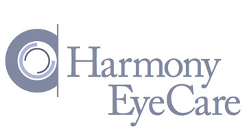
Randy submitted his logo for Harmony Eye Care. He included this message with his submission,
“Harmony EyeCare is a brand new Optometry office opening up in southern Indiana. I wanted convey harmony inside the eye itself. The graphic is meant to be a harmonious iris of an eye. I chose a serif typeface for it’s elegance... Caslon seemed to fit well.”
The following critique is based on one designer’s opinion and experience.
Design Principals
This logo is well put together. The subdued color palette and Caslon typeface give off a soothing impression, which fits well with the company name. The icon representing the eye could use some refinement. I find the weight of the outer circle is somewhat distracting to my eye, it almost makes the eye hard to distinguish. Without the text the icon comes across as a simple circular design rather than an eye. One factor contributing to this problem is the fact that the center of the eye is white as opposed to a darker color, which would be typical in a representation of an eye.
I would rather see a more defined pupil with some highlights to show the eyes reflective qualities. I believe this can done without taking away from the overall feel of the current logo.
Functionality / Versatility
The logo is built on flat colors and will reproduce quite well. At small sizes, the lines within the eye will likely blur together with the outer stroke, at least visually. If the icon remains as is, consider a minor tweak by opening up the space between the inner strokes for cleaner reproduction at small sizes.
Does the Logo Work for the Audience?
I think the logo speaks clearly to the audience. It’s pretty obvious the company deals in the eye care industry. The text is clear and easy to read. I wouldn’t say the logo is particularly memorable, but it does have a certain calmness or harmony about it. The single detractor here is that the lavender color of logo is somewhat feminine. What do the readers think? Is the color too feminine or is it okay as is?
Uniqueness
This logo isn’t incredibly unique, but that’s probably okay. The use of the eye icon is pretty common among eye care logos, as you might imagine.
Typography
The type feels a little squished. By opening the kerning up, you might portray an added level of harmony or peacefulness through the air around the letterforms. I think you could tighten up the mark by reducing the font size of ‘eye care’ and hopefully eliminate the stair step look. Again I think this could be done without altering the overall communication of the logo, since eye care is also being portrayed visually though the eye icon.
Possible Improvements
So what is the best way to enhance the logo? Well I think have made some comments above that can certainly offer some direction. Here’s a list of actionable items for improvement.
- Rework the eye icon to better reflect an eye.
- If you don’t rework the icon itself, at least consider giving the strokes inside the icon a little more air around them so that they will not visually blur together at small sizes.
- Evaluate the typography and consider opening up the kerning as well as possibly making the words ‘eye care’ smaller in scale.
- A less feminine color for the logo would be more gender neutral.
I hope you have found the above information useful. I do think the current state of the logo does accomplish the harmonious feel you were aiming for, but I also feel there is room for refinement. My intention is not to hurt feelings, but rather to offer constructive feedback and critique. Best of luck, to you.
I appreciate and welcome your comments, and look forward to hearing from you soon. I purposely don’t cover every possible improvement that can be made to this logo, so go for it if you think I missed anything. All I ask is that you keep your comments clean and appropriate.
Like what you read here? Subscribe to the Logo Critiques News Feed.
Enjoy this post? Share it with others.


The images & logos presented on this blog are copyrighted by their respective owners. The blog itself is copyright Erik Peterson, 2008-2026 All Rights Reserved.


We enjoy your comments
38 Comments so far. Keep 'em Coming.
#1
By JohnnyRod
04.01.2009 at 02:03 PM
You raise good points. However, in regards to the icon, I actually view it more of the technical equipment than a human eye. Odd since it is intended to be an actual eye, but I think it more appropriately reads as the hardware used by the optometrist. That said, I think it works as is quite well. Just my take on it, of course. Kerning for the most part seems fine, just a few odd spots, but I agree that the tracking could be let out a little to give everyone a bit more space. Cheers!
#2
By Recovery
02.28.2010 at 07:53 AM
Kerning for the most part seems fine, just a few odd spots, but I agree that the tracking could be let out a little to give everyone a bit more space. Cheers!
#3
By Keratosis
08.27.2010 at 01:25 AM
I’m a junior in High school and for a while now I have been trying to figure out exactly how going to a regular college then to a medical school works. I want to become an oncologist, but I don’t know where to start exactly, no one has been very clear to me.
#4
By medical insurance reviews
09.07.2010 at 04:57 PM
It’s a rare cancer caused by working with asbestos. Companies didn’t provide information/protective gear to employees working around this stuff, and were placed in danger without their knowledge.
#5
By ram
09.25.2010 at 10:19 AM
The logo is quite well.It seems to be human eye.Because the business is related to eye.This is the excellent creative idea..medical billing
#6
By sperm donation
01.20.2015 at 04:12 AM
MFS is the Midlands’ longest established independent fertility clinic providing fertility treatment for both NHS and private patients and dedicated to ‘building futures, transforming lives.
#7
By swimming Milton Keynes
01.20.2015 at 04:15 AM
We’re home to some of Hertfordshire and Buckinghamshire’s best equipped, most friendly and affordable health, leisure, sports and arts facilities. Our Centres are located in Milton Keynes, Rickmansworth, South Oxhey, Bushey, Potters Bar and Borehamwood.
#8
By james
02.05.2015 at 01:22 AM
WelCome to Website
#9
By website design tips
11.21.2018 at 05:07 AM
Really a very amazing post dude. As to get the good website design tips then use my link for free online.
#10
By Glenn
03.10.2019 at 12:16 PM
do you know where can I find the Best Headlamp‘s Logo?
thanks
#11
By Sophie Miller
07.28.2019 at 10:15 AM
I would like to read about it anymore. Prompt, what literature to study? burger king menu
#12
By Felix`
08.23.2019 at 11:16 AM
such an amazing post.
Thank you for sharing with us, I would like to have your take on the logo of Chloe Perfume on this perfume website. what do you think? in my opinion it looks cool
#13
By samried
09.20.2019 at 08:56 AM
Nice post. I was checking constantly this blog and I am impressed! Extremely helpful information. Thank you and good luck. Baby Trend Expedition LX Travel System, Millennium review
#14
By Pidalo
10.17.2019 at 07:25 AM
dpd tracking
#15
By jhon
10.22.2019 at 01:46 AM
I just found this blog and have high hopes for it to continue. Keep up the great work, it’s hard to find good ones. I have added to my favorites. Thank You. Graco Roomfor2 Click review
#16
By Greg B
04.21.2020 at 11:14 PM
Nice logo I really like the look and feel for it! from a roofer in Rapid City
#17
By osama shkdasd
06.01.2020 at 10:13 AM
It was a very good post indeed. I thoroughly enjoyed reading it in my lunch time. Will surely come and visit this blog more often. Thanks for sharing.
click for more
#18
By Prima Biz Listings
03.05.2021 at 07:29 AM
I like the icon on the right, it’s like an eye. The one on the left looks like a camera lens. Local Citations
#19
By Albert Barelas
04.09.2021 at 05:43 AM
The logo is great, the font fits very well with the color. Love the concrete.
#20
By Alonzo Harrison
04.13.2021 at 04:48 AM
Best urls-opener for opening multiple websites with one click.
#21
By huie
01.10.2022 at 04:40 AM
Don’t walk behind me; I may not lead. Don’t idle mining empire walk in front of me; I may not follow. Just walk beside me and be my friend.
#22
By Robert F Harmon
09.29.2022 at 05:01 AM
I believe the current state of the logo achieves the harmonious feel you were aiming for, but I also believe there is room for improvement. My intention is not to offend anyone, but rather to provide constructive feedback and criticism. Best wishes to you. Credit https://dollar6essay.com/
#23
By Trisha
08.07.2023 at 11:14 AM
The single detractor here is that the lavender color of logo is somewhat feminine.
sacramento ca drywall installation
#24
By Eric Civault
10.10.2023 at 09:21 PM
I love this content actually, the eyes are one of the significant parts of our 5
senses of our body. Let’s take care of our eyes properly.Google maps citations
#25
By David E Molinari
12.20.2023 at 02:08 AM
Thank you for making my day brighter with your positivity. Thanks for constructing a comprehensive bridge to minecraft bridge server; your insights are a game-changer.
#26
By Hannah
07.21.2025 at 06:29 AM
Thank you very much. pako highway
#27
By RyanMatthews
09.25.2025 at 09:17 PM
This critique provides some insightful feedback on the Harmony Eye Care logo. I agree that the design conveys a sense of calm, but refining the eye icon could enhance its meaning. A more defined pupil could really enhance the overall appeal. Speaking of bringing things together, I recently discovered something cool called Block Blast that promotes creativity in design—maybe it could inspire further improvements!
#28
By Wayn Peters
09.29.2025 at 10:23 PM
Interesting analysis! I agree about the potential blurring at smaller sizes. Opening up the inner strokes slightly would improve readability. The logo is straightforward, but perhaps a bolder color palette could enhance memorability without sacrificing calmness. What about a deep teal or emerald green? Speaking of games, it’s not Wordle Unlimited, but this eye-catching logo sure gets my attention!
#29
By Mayarivers
10.27.2025 at 04:17 AM
In Infinite Craft Recipes, there’s no wrong answer — every experiment reveals a new recipe, leading you to infinite creative potential.
#30
By Smash Karts 76
12.04.2025 at 03:46 AM
Master the art of kart racing and combat in Smash Karts 76, where your driving skills and ability to use power-ups effectively are key to winning the race.
#31
By Jerry Adams
01.29.2026 at 11:05 AM
The logo is clear but not memorable. The lavender feels feminine; perhaps a more neutral tone? Kerning adjustments and reducing “eye care” size could refine it. It reminds me of the focus and precision needed to navigate the levels in Moto X3M!
#32
By Medeiros
02.27.2026 at 03:25 AM
That logo is definitely clean! Does a minimalist design always translate to effective branding? In my experience, yes, often it does. A simple logo is easier to remember and apply across different media. Have you played the repo game with a complex logo? It’s rough.
#33
By subway
04.16.2026 at 02:39 AM
The competitive nature of subway surfers is well-known; play the game, test your friends’ abilities, and post your scores and distances traveled in the comments to see who can rack up the most points! Strive to surpass the 2014 world record of 2,147,483,647 points if you believe you have attained mastery of the game. Is this the kind of thing you can handle?
#34
By Ava Howells
04.28.2026 at 03:18 AM
This is a thoughtful critique! I agree that the color palette and typeface choice really nail the “harmony” aspect. The feedback on the icon is spot-on, too. Maybe experimenting with a darker pupil and a slightly thinner outer circle would help it read more immediately as an eye. It’s almost like the current design needs a little more “drift” – a subtle shift in visual weight – to guide the viewer’s focus, you know, kind of like adjusting your suspension in Drift Hunters to get the perfect angle. Overall, a solid concept with some great potential!
#35
By Wanet Juarez
05.13.2026 at 04:18 AM
I agree, the logo has potential. I also found the eye a bit ambiguous. It reminds me of when I was searching for something captivating to watch and ended up browsing obscure documentaries for hours. I think a little Steal Brainrot, maybe some old sci-fi, could have been a more entertaining choice. Perhaps making the pupil darker would instantly improve clarity and emphasize that it’s an eye. Otherwise, the overall design is clean and professional.
#36
By Heardle
06.24.2026 at 03:43 AM
This critique really takes me back! It’s fun analyzing design choices, much like playing Heardle lately. That game is a fantastic way to test my song recognition from just the first snippet - so much fun! Speaking of first impressions, do you think a logo’s initial impact is more crucial than its overall lasting impression?
#37
By Philipp Schwarz
07.15.2026 at 10:25 PM
Hey, these are some really insightful points on the logo! I especially agree about tweaking the kerning for a more harmonious feel. It’s fascinating how small adjustments can make such a big difference, almost like fine-tuning a planet in Solar Smash. What do you all think about the color suggestions?
#38
By Infinite Wordle
07.27.2026 at 01:58 AM
I like how the logo aims for a calm, trustworthy feel without overcomplicating the eye symbol. Small refinements could make it even more memorable. It reminds me of improving guesses in Wordle Unlimited—tiny adjustments in balance and clarity often make the biggest difference over repeated attempts.