Headpoint Consulting Logo Design Critique 54
Categories: CritiquesBusiness & Law Services
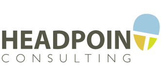
Headpoint Consulting Logo Design Critique
Jon submitted this logo for Headpoint Consulting. He left the following comment about the logo,
“A new executive coaching consultancy firm... looking to portray an image of competence but remain interesting and dynamic”
The following critique is based on one designer’s opinion and experience. I always appreciate the readers thoughts as well. So, I’ll ask a question of two in the critique, please share your perspective in the comments at the end of this logo design critique.
Design Principals
The logo for Headpoint Consulting has an intriguing start, but lacks cohesion and balance. The logo feels like two different parts. The head shaped oval with the ‘T’ inside doesn’t feel like it belongs with the rest of the mark. There are two main factors contributing to this disjointed appearance. First, the abstracted ‘T’ created by the white space within the oval shape doesn’t fit with the rest of the typography (i.e., weight, color, shape, rotation, etc.). Second, focusing all of the color on the right side within the oval shape also contributes to the disconnection.
Question for the readers
please respond in the comments below
Does this logo feel like two separate parts to you? What can be done to remedy this situation?
Functionality / Versatility
This logo should reproduce in most mediums well. The use of flat colors and simple shapes is good for reproduction. The lightweight typeface for ‘Consulting’ may become problematic (or may need to be made heavier) when used in embroidery or reduced to a small size and silk screened like you might find on a pen. There was a good article over at The Design Cubicle about how a good logo needs to be flexible. You may want to take quick read.
Does the Logo Work for the Audience?
I think one way of portraying competence is to have a professional looking logo. It shows you care and are serious about your business. If your business is truly focused solely on executive coaching I’m not sure that you’re hitting the mark there. To me, the mark feels more pedestrian and complacent instead of presenting concepts of leadership, drive, etc. Again, if executive coaching is your focus shouldn’t the company name reflect that also? Perhaps “Headpoint Executive Coaching” is a more telling business name.
Question for the readers
please respond in the comments below
How would you portray these concepts visually? Or do you think the mark is already accomplishing the messages needed?
Typography
I know Jon isn’t a designer, however I’m not sure if he designed this logo himself or if he hired someone to do it. At any rate, the kerning needs tweaking. For example, the space around the ‘A’ has a larger visual gap on the right side and should be adjusted. The letter spacing of ‘consulting’ is too open when used next to the tight letter spacing in ‘Headpoint’. Perhaps you could tighten it up and align it to the left or right of the word above. This would also create some variety in the mark which now feels so structured (at least in the type on the left). Overall, I think the type needs attention. It comes across quite sterile and uninspiring.
The abstractness of the letter ‘T’ within the oval shape not only creates the disjointed feeling I discussed earlier, it also creates a situation where the viewer will likely read the company name as ‘Headpoin Consulting’ the first time around. The combination of the rotation, negative space, color change and abstractness is just too much.
Possible Improvements
Designing a logo for yourself or own business is one of the hardest logo designs you’ll ever work on. So what is the best way to improve the logo? Well I think have made some comments above that can certainly offer some direction. Here’s a list of actionable items.
- Explore ways to communicate the concept of ‘executive coaching’ in a more digestible way.
- Consider some alternatives for the oval shape with the ‘T’ in it. Perhaps finding a way to make the ‘T’ the same color as the rest of the word it belongs to would be a step in the right direction for creating unity and legibility.
- Review the letter spacing of the word consulting.
- Utilize color to help achieve balance and unity within the mark.
Overall, I think you have a good start on the logo design. And with some refinement you can definitely improve it. Please know that my intention in critiquing your work is not to hurt feelings, but to offer constructive feedback. I hope it was helpful. Best of luck, to you!
I appreciate and welcome your comments, and look forward to hearing from you soon. I purposely don’t cover every possible improvement that can be made to this logo, so go for it if you think I missed anything. All I ask is that you keep your comments clean and appropriate.
Like what you read here? Subscribe to the Logo Critiques News Feed.
Enjoy this post? Share it with others.


The images & logos presented on this blog are copyrighted by their respective owners. The blog itself is copyright Erik Peterson, 2008-2026 All Rights Reserved.


We enjoy your comments
54 Comments so far. Keep 'em Coming.
#1
By Bullardino
07.07.2009 at 02:58 PM
First problem, in my opinion, is the “balloon” thing. It’s directed outwards (leans on the right), and it separates things.
#2
By Marlou
07.08.2009 at 11:34 AM
I really like the idea and concept of this logo; very clever!
Though, I do think it still -looks- like a concept. The logo indeed looks like it consists of two different parts. I think the logo would look much more as one logo, if the image of the head had the same colors as the text. Or, as Erik suggested, if the whitespace in the head had the same color as the text.
Be sure to make the whitespace T look like it’s part of the rest of the text. You don’t want people to read it as “Headpoin”. Did you try other fonts? Maybe the T will be more visible if it’s taken from a font.
Good luck, I think you’ve got a great start here.
#3
By Fbanczak
07.09.2009 at 02:11 PM
Jon, I think your logo is clean, modern, and overall pleasing. But when I look beyond a glance at it, what bothers my eye the most is that the colors in the balloon head icon don’t have the same value or visual weight to appear cohesive. I almost feel like the T should either be these same gray or the T should be white (negative space) and the three parts of the head should be the same gray (maybe you’ll be able to introduce one new accent color). Either way, to make the icon part of the logo, the colors probably need to be darker to match the weight of the text and perhaps the color of “Consulting” should be changed to match one of the head balloon colors.
On a side note, I did see what I think was intended by the creator of the logo as an abstracted sketch of a face. Where the top of the T represents the highlight of the check bones and the vertical line is the line from the nose to the chin. If that is the concept with the head-balloon, maybe some more shaping could help others see what I saw.
#4
By Tim
02.07.2018 at 09:14 AM
The biggest problem with the logo is that it does not read as Headpoint when you look at it, unless you already know the word. There is no reason for a person to assume that the crossing shapes must represent a T, and even if they already know that, the intent is not nearly clear enough. The T is completely disjointed from the word in shape, spacing, and contrast. There are other problems also, but until a logo actually reads, there is no point in further critique.
#5
By Max Petis
01.15.2019 at 06:42 AM
What does this company do exactly? With the name of their business I really don’t have a clue, and the Write My Assignment logo only leads to something with trees. Other than that it looks good, but if you could apply something more specific to the company I think that would work better.
#6
By Marie G. Nickel
05.21.2019 at 03:39 AM
Online universities such as Skycap Loans
, ICICI Banks, etc. offer loan to people to provide a good lending experience by as easy and fast loan application process.
#7
By MichealRobert
08.23.2019 at 03:27 AM
I also have analyzed these things before getting logo design services for the site I am promoting economics essay writing. I think it is a good thing to explain a logo service before getting work from them.
#8
By Andrew
11.05.2019 at 02:20 AM
I need help writing a hypothesis of a dissertation. Do you have any hints?
#9
By Allen
02.01.2020 at 02:36 AM
This logo should reproduce in most mediums well. The use of flat colors and simple shapes is good for reproduction. The lightweight typeface for ‘Consulting’ may become problematic (or may need to be made heavier) when used in embroidery or reduced to a small size and silk screened like you might find on a pen. https://www.dumpsleader.com/SPLK-1002-exam-dumps.html
#10
By osama shk
04.15.2020 at 04:45 PM
I’ve been searching for some decent stuff on the subject and haven’t had any luck up until this point, You just got a new biggest fan!..
<a >read more</a>
#11
By Natalia
04.21.2020 at 10:54 PM
I can’t really see the “T” at the end. I wish it was more visible. painter in Kennewick
#12
By osama shk
04.29.2020 at 01:14 PM
i am always looking for some free stuffs over the internet. there are also some companies which gives free samples.
<a >pemf therapy</a>
#13
By Investigadores privados españa
05.27.2020 at 04:12 PM
Excellent article. Very interesting to read. I really love to read such a nice article. Thanks! keep rocking.
#14
By dynomo
05.31.2020 at 12:18 PM
Awesome and interesting article. Great things you’ve always shared with us. Thanks. Just continue composing this kind of post.
microdosing mushrooms
#15
By Danielle Wat
06.03.2020 at 09:05 AM
Hello, I would like to thank you for sharing this interesting material. I will definitely use it in my https://mid-terms.com/write-my-college-term-paper task.
#16
By Pawn Shop
06.06.2020 at 06:14 AM
Nice to read your article! I am looking forward to sharing your adventures and experiences.
#17
By bestinternettips
10.17.2020 at 04:52 AM
The best logo is one which can easily read by people. Or you can use dark color for logos which easily attracts the people eyes. You can use some unique picture. Word should be clearly shown in picture.
#18
By Kaspersky coupon
10.17.2020 at 07:16 AM
Logo should have the capability to attract the people to read. As Kaspersky coupon attract the users to buy Kaspersky antivirus for huge saving. Logo will be easily understandable by the people. The logo of word “T” is not clearly shown what is written.
#19
By Bell
04.06.2021 at 07:12 PM
Really when someone doesn’t be aware of afterward its up to other users that they will help, so here it takes
place.
#20
By Riza
03.03.2022 at 09:13 PM
Glad to see this post, I like the content of this site. gazebo contractor framingham ma
#21
By David
08.06.2022 at 02:36 AM
People who leave the reviews don’t have anything to lose or gain all they had an experience, good or bad, and they would like to share with the potential users. People who leave essay writer bot ensure that the review website is unbiased
#22
By Charlie Jone
06.12.2023 at 10:45 PM
I respectfully disagree with the criticism provided regarding the logo for Headpoint Consulting. In my fnf opinion, the incorporation of the head-shaped oval with the ‘T’ inside adds a unique and memorable element to the design.
#23
By Kisya
07.03.2023 at 08:22 PM
You need to quickly adjust your joystick to avoid falling and successfully make the shot. Basket Random game is filled with hilarious moments when stickman players jump to the opponent’s side.
#24
By five
01.17.2024 at 02:54 AM
Your post is appreciated. I have read extensively on numerous related topics! In contrast to other articles, yours had a profoundly unique impact on me. I hope you continue to compose insightful posts for us and others to read, such as this one. five nights at freddy’s
#25
By Vic
04.05.2024 at 02:36 AM
Excellent content! about us
#26
By Niko Stern
06.06.2024 at 06:44 AM
Your blog posts are always so detailed. Thanks! Solar
#27
By Drift Hunters
02.12.2025 at 06:22 AM
When utilizing multiple drift hunters devices, the first device that is activated will be the one that possesses the prioritized save file.
#28
By Shawn Joseph
04.25.2025 at 09:08 AM
I want people to know The White Lotus Kate costume, how good this information is in your article. Your views are much like my own concerning this subject.
#29
By Shawn Joseph
04.25.2025 at 10:37 AM
I want people to know The White Lotus Season 3 Episode 6 kates Bikini Top, how good this information is in your article.
#30
By Shawn Joseph
04.25.2025 at 11:17 AM
Thankyou for this information, I am really glad to see this post. I also want to recommend you to try this Red Suit.
#31
By Shawn Joseph
04.25.2025 at 11:22 AM
I want people to know Mr Beast Doordash Hoodie, how good this information is in your article. Your views are much like my own concerning this subject.
#32
By Shawn Joseph
04.25.2025 at 11:54 AM
Thankyou for this information, I am really glad to see this post. I also want to recommend you to try this Leather Motorcycle Jacket.
#33
By Zane Newton
08.29.2025 at 02:37 AM
I think the critique provides valuable insights into the logo’s design. The lack of cohesion between the elements is definitely noticeable. Perhaps focusing on a unified color palette and typography can help establish a stronger identity. It’s interesting to think about how a logo can convey concepts of competence and dynamism, much like in games like Bitlife where choices shape your direction. What are some effective logo elements that reflect these themes?
#34
By Schultz
12.15.2025 at 09:30 PM
I agree, the ‘T’ in the oval does feel a bit disconnected. Maybe if the font weight matched “Headpoint” more closely, or if the oval had a slightly different color palette, it would feel more integrated. I also think the word “Consulting” looks too thin and might get lost at smaller sizes. It reminds me of when I was playing crazy cattle 3d the other day - I had to squint to read the scores sometimes! A clearer font is always better.
#35
By Samuel Foster
12.16.2025 at 01:14 AM
The ‘T’ within the oval is visually interesting, but it doesn’t quite gel with the rest of the text. Maybe a bolder, more geometric font for “Headpoint” would help tie it all together? It reminds me a little of how frustrating it is to try and keep that egg balanced in Eggy Car – you’ve got all these elements working against you, and sometimes you just have to tweak things until they click! Does anyone else think simplifying the oval and using the same color palette throughout would help?
#36
By Michael
12.17.2025 at 02:50 AM
Hey, great points! I agree, it does feel like two separate ideas mashed together. The “T” in the oval feels a bit forced and doesn’t quite mesh with the text. It’s like when you’re playing Agario and you think you’re safe, then BAM, a bigger cell you didn’t see comes out of nowhere and eats you! The logo could definitely benefit from a more unified approach to color and typography to avoid that disjointed feeling. What do you think about simplifying the “T” or ditching the oval altogether?
#37
By Warden
12.23.2025 at 10:05 PM
Okay, a disconnected logo, interesting! Shapes and colors doing the tango, but not quite in sync, eh? It’s like the designer was battling two separate ideas at once. I wonder if shifting that color balance would help. The white space T definitely seems out of place. Ah, reminds me of that time I tried to bake a cake and accidentally used salt instead of sugar. The separate flavors just fought each other. Playing Slither io then felt so much more productive.
#38
By Sulthen
01.02.2026 at 03:22 AM
Wow, that logo’s got some serious identity issues, huh? The oval-T combo seems totally lost at sea. Reminds me of that time I tried to bake a cake using a recipe from one book and frosting instructions from another – total disaster! It’s like the parts are fighting for attention. I think balance is really important like the drift hunters of old who sought out the most perfect vehicles! I hope they go back to the drawing board. What do you all think?
#39
By Jackson
01.11.2026 at 08:27 AM
I appreciate the detailed critique and agree that the logo needs more cohesion. For inspiration on dynamic and engaging design, you might want to check out the game X Trench Run, which balances complexity and clarity beautifully.
#40
By Carter
01.14.2026 at 02:35 AM
Ever feel like you’re staring at a problem for too long? Yeah, I do! I usually step away, grab a coffee, and come back with fresh eyes – often spotting the solution immediately. I once spent hours debugging code, only to realize I had a semicolon in the wrong place after a walk around the block. Now, what about surviving until 6 AM? Anyone else think that’s harder than debugging? five nights at freddy’s
#41
By Willies Picklesimer
01.16.2026 at 11:02 PM
Interesting points about the logo’s cohesion. It does feel a bit disjointed. Thinking about visual representation, maybe something more dynamic, like the thrill of encountering a rare card in Pokerogue, could translate to that sense of competence and dynamism. I wonder if simplifying the “T” might help. Or perhaps explore a Pokerogue and Pokerogue Dex inspired color palette for a more unified feel? What are your thoughts on a color revamp or a more streamlined “T”?
#42
By Hotel12
01.21.2026 at 01:18 AM
Nice read! I’d add that a logo’s versatility is key for drift boss branding across goals, from web to embroidery to pens. Flat colors and simple shapes are spot on for consistency, but test weighty secondary type for small-scale use. The Design Cubicle article on flexibility is gold; a quick skim can save replanning later. Also consider how the logo scales with different backgrounds to keep clarity, especially in limited print runs.
#43
By Matthew Howard
02.04.2026 at 01:17 AM
Interesting critique! I agree that the logo feels disjointed. The ‘T’ in the oval throws off the balance and makes it harder to read the company name. I think exploring different ways to visually represent “executive coaching” is key. It needs something to add impact. It needs to have an impact that makes the customer want to kick the buddy and make them successful. Maybe incorporating subtle upward-trending lines or a more dynamic symbol could help convey that drive and leadership. What does everyone else think?
#44
By 3d-figurines
02.09.2026 at 01:04 AM
This logo critique really highlights how disjointed design elements can weaken a brand’s message, much like how a poorly detailed 3d-figurines can break the immersive feel of a collectible.
#45
By davidrob
03.02.2026 at 10:57 PM
I just can’t get enough of slope rider! Every downhill run feels brand new, dodging trees, leaping over cliffs, and collecting red gift boxes to unlock that sleek Metal Sled is pure joy.
#46
By Yasmin Morgan
03.08.2026 at 10:04 PM
This is a helpful critique! I agree that the logo feels a bit disjointed. Maybe simplifying the “T” and using a consistent color palette would help. It needs something to bring it together and give it some energy. It’s like the design needs a little… dreadhead parkour! Some unexpected movement or connection to really make it pop and feel more dynamic. What if the “T” were integrated differently, almost leaping into the word? Just brainstorming!
#47
By Michelle
03.09.2026 at 02:40 AM
It reminds me of playing Eggy Car sometimes! You think you’ve got everything balanced, then BAM, one wrong move and the egg goes flying. This logo has the same precarious feeling - close to something great, but needs a little nudge to find its balance. What do you all think? Is it fixable, or does it need a complete overhaul?
#48
By Veronia
03.12.2026 at 11:37 PM
The oval with the ‘T’ feels disconnected from the rest. Perhaps unifying the color palette, bringing the blue to the “Headpoint” text, could create a stronger connection. As for portraying leadership, maybe bolder fonts or incorporating upward-pointing elements could help. Funny enough, sometimes when I’m stuck on design problems, I’ll switch to Sudoku for a break. The logical thinking required in sudoku somehow helps me clear my head and approach the design with fresh eyes.
#49
By Declan Abbie
03.23.2026 at 09:56 PM
Interesting points about the logo’s disjointed feel! It’s true, the T element feels separate. It’s almost like the logo is trying too hard to be clever, like a love tester at an arcade – flashy, but ultimately doesn’t deliver a deep connection or understanding. Perhaps simplifying the T, or integrating it more organically, would help create a more unified and professional image, reflecting the consultancy’s competence.
#50
By Maddison Hanson
03.24.2026 at 09:29 PM
Interesting points! I see what you mean about the disconnect. It reminds me a little of how “Monkey Mart” started – a simple monkey collecting bananas. But later updates added so much new stuff that it almost feels like different games mashed together. A little more cohesion would definitely make it feel more polished! What do you think about the font choice specifically?
#51
By Rachel Coates
03.24.2026 at 10:30 PM
Yeah, that disconnect rings true. Like Omegle, right? It started as a super simple text chat, but then video came along and suddenly it felt like a completely different, sometimes much weirder, place. Adding features isn’t always a good thing if it messes with the original vibe, I guess! What about the moderation? That definitely changed things too.
#52
By Townsend
03.25.2026 at 02:32 AM
I definitely agree that the logo feels like two separate parts stuck together. That “T” inside the oval, yeah, it doesn’t gel at all with the “Headpoint” font. It’s like they’re from totally different design families. Honestly, it reminds me a bit of those really amateur horror games logos, where you have a cool, edgy icon and then some super basic, default font slapped underneath. They just don’t fit. Maybe unifying the fonts, or even getting rid of the oval altogether, would make it feel more cohesive? I’m not a designer though, just my initial reaction.
#53
By Robin Reeves
04.14.2026 at 09:23 PM
Hey, thanks for the insightful critique! I totally get what you mean about the logo feeling disjointed. It’s like trying to hit a home run in doodle baseball – you think you’ve got the timing right, but sometimes the elements just don’t sync up. Learning to balance those visual elements is tough, isn’t it? Each attempt, whether it’s a logo iteration or another swing at the plate, is a lesson though. What do you find is the trickiest part about achieving visual harmony in logo design?
#54
By drift boss
04.16.2026 at 02:37 AM
Since its release, drift boss has become one of the most popular free online drifting games. Players of all ages love its simple yet challenging gameplay.