Jen Blume Logo Design Critique 32
Categories: CritiquesMarketing & Design
Jen Blume Logo Design Critique
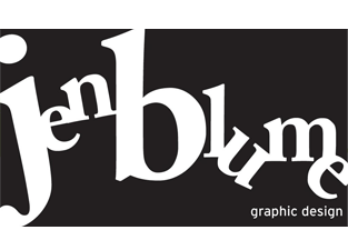
Jen submitted this her company logo for critique and left the following comment about her goals for the logo design,
“This is a logo for my own design firm. I was going for a very graphic design using playful and creative typography.”
The following critique is based on one designer’s opinion and experience. I always appreciate the readers thoughts as well. So, I’ll ask a question of two in the critique, please share your perspective in the comments at the end of this logo design critique.
Design Principals
I like that Jen is trying to communicate something about herself and possibly her design style through this logo. As I have said in the past, a good logo should make a statement about the company it represents, which is what you’re trying to do here. However, there are some areas that can be improved. In general, I feel like the logo looks more messy than it does playful. In particular, the ‘u’ and ‘e’ appear like they are about to fall to the ground. It also feels very constrained in its bounding box. Is there a reason for the containing rectangle?
Functionality / Versatility
With its containing rectangle, I’m not sure the logo would work well in reverse. If the type were black and cutoff where the rectangle currently defines the space it would seem awkward. I suppose you could put a stroke around the rectangle to help redefine the space. Other than that, the boldness and single color of the logo make it easy to reproduce in a variety of mediums.
Does the Logo Work for the Audience?
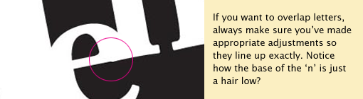
The immediate audience for this logo would be your clients, existing and prospective. You’ve gotta put your best foot forward with your logo since it is often the first piece of your work they will see. Spend the time and refine this logo make it as perfect as possible. Cleanup the spots where the letters overlap and be sure everything is spot on.
It’s often those small details that can make or break a design. If your goal is to show creativity through your logo, I think you could do more to adequately communicate it. Just keep in mind not to get too complicated. Sometimes a lot can be said with simple wordmark.
Uniqueness
The typeface selection is boring and uncreative. If you want to portray yourself as playful and creative, you may do better to choose a typeface that is more unique or better yet, create your own typeface. I would also caution that there is a delicate balance to making type look playful versus accidental or messy.
Question for the readers
please respond in the comments below
Do you have any playful and/or creative logos that you can share with Jen for inspiration? If so just link to them below with a comment about what she could get from it.
Typography
The phrase ‘graphic design’ in the bottom right corner of the design feels totally put of place. Currently it has no relationship with the rest of the design. Both the placement and typeface selection are at fault. Explore some other typefaces and placement in order to achieve balance and consistency.
The serif typeface choice for ‘Jen Blume’ doesn’t feel creative and as I mentioned earlier, and can be improved. What is the reason the ‘j’ and ‘b’ being so much larger than the other letters? If you want people to remember your initials, consider a monogram style logo. Otherwise they should be much closer in scale and visual weight to the rest of the letters. The change in weight of letters is distracting to the eye.
Possible Improvements
Designing a logo for yourself or own business is one of the hardest logo designs you’ll ever work on. So what is the best way to improve the logo? Well I think have made some comments above that can certainly offer some direction. Here’s a list of actionable items.
- Watch the details. Go over the design and tweak all those areas where things overlap and be sure everything is exactly as it should be.
- Consider an alternate typeface that can showcase ‘playful’ and ‘creative’ more effectively.
- Possibly remove the containing box since it is somewhat restrictive and leaves the mark feeling cramped.
- Rework the placement and typeface selection of the phrase ‘graphic design’ to make it feel more integrated into the design.
Overall, I think you have a good start on the logo design. And with some refinement you can definitely improve it. Please know that my intention in critiquing your work is not to hurt feelings, but to offer constructive feedback. I hope it was helpful. Best of luck, to you!
I appreciate and welcome your comments, and look forward to hearing from you soon. I purposely don’t cover every possible improvement that can be made to this logo, so go for it if you think I missed anything. All I ask is that you keep your comments clean and appropriate.
Like what you read here? Subscribe to the Logo Critiques News Feed.
Enjoy this post? Share it with others.


The images & logos presented on this blog are copyrighted by their respective owners. The blog itself is copyright Erik Peterson, 2008-2026 All Rights Reserved.


We enjoy your comments
32 Comments so far. Keep 'em Coming.
#1
By Mark Daum
06.05.2009 at 09:04 PM
I like the idea of the jumbled type though it seems a little heavy. Might I suggest the words graphic design shoot upwards from the ‘u’ at about a 20 percent angle? It would better marry your name and what you do within the design. And although I am staunch believer that a logo must first work in black & white before color (or anything else is added), I encourage you to explore color. Since the text is land locked across the card, maybe even two colors? Keep working. You’re onto something here.
#2
By Chris Madden
06.05.2009 at 09:17 PM
Good post Erik. I agree with the points you made. Kind of a funny logo, because it’s not bad, and I can feel what Jen’s trying to accomplish with it. But still *something* is just off.
To answer the Question for the Readers:
Here’s a beautiful monogram style logo that’s I’d say hits the ‘playful’ and ‘creative typography’ mark.
http://logopond.com/gallery/detail/60034
#3
By Yael K. Miller
06.05.2009 at 09:54 PM
I find the logo hard to read. I have to stop a concentrate on each letter and then put it together to comprehend it says: Jen Blume. Puzzling out the meaning is not “playful.”
The “b” is what catches the eye and all I can think is that Jen Blume must like to be referred to as B or Blume.
#4
By Dave Sutula
06.08.2009 at 10:42 AM
I can agree with the messy remarks and certainly agree with the remark about lining up the ‘ligatures ’ for lack of a better term. What I take exception with is the idea that it’s hard to ‘puzzle’ out what the logo says. if you’ve just landed in an English speaking country and have no idea what sounds letters make in our language, then perhaps (or if you’re three years old or really, really dumb). I can read it just fine and I would submit that if your clients can’t read it , they will be unable to puzzle out the line items on your invoice and therefore should not be your clients to begin with.
#5
By Jen Blume
06.13.2009 at 05:49 AM
Thanks for everyone’s comments. This logo was a design project that I did for a class. The assignment was to design a black and white only logo for yourself with a 15 minute time limit. I received good feedback in class and wanted to get more input on the idea which is why I submitted it. There is something about the idea that still appeals to me so I do plan on working with it more, cleaning it up and trying some different things based on everyone’s comments. What Erik has said about designing your own logo being very difficult is so true. I’ve have several completely different ideas that I am working on and just haven’t found the “right” idea yet. When I get closer, I will definitely post it to get feedback. Thanks again.
#6
By bumper stickers
03.24.2011 at 02:43 AM
A logo is a graphic mark or emblem commonly used by commercial enterprises, organizations and even individuals to aid and promote instant public recognition. Logos are either purely graphic symbols/icons or are composed of the name of the organization a logotype or wordmark
#7
By Kimberly A. Joyce
05.21.2019 at 03:42 AM
Richard Warke Augusta also has businesses in the aviation and hospitality industries.Emergency conditions become more critical the longer the situation continues.
#8
By Allen
09.17.2019 at 01:48 AM
Possibly remove the containing box since it is somewhat restrictive and leaves the mark feeling cramped. 1z0-1064 dumps
#9
By Swayer Scott
10.29.2019 at 02:03 AM
There are lots of articles are available here regarding different logos like this one on Jen Blume importance of intermediaries in distribution channel . Also, we can create logos for the free critiques provided. They provide better guidelines to improve our designs. I liked this site very much.
#10
By Andrew
04.21.2020 at 10:59 PM
Simple, but effective. I’ll borrow the style for my logo for a fencing company in Missoula
#11
By Yejefol
06.29.2020 at 03:00 AM
Typography in logos, if utilized wisely, can bring the desired balance between the two. Typographic logos seem to be the simplest logo designs and the least creative.
Money heist costume
#12
By Jonathan Durham
04.13.2021 at 08:39 AM
This is nice and helpful. I’ll be having an easy time to craft a logo for a fencing services.
#13
By Bigvalue shop
05.07.2021 at 04:13 AM
sodium hypochlorite price
sodium hypochlorite price per litre
buy sodium hypochlorite
sodium hypochlorite solution price
sodium hypochlorite online
sodium hypochlorite powder price
sodium hypochlorite buy online
#14
By Riverman
05.07.2021 at 04:14 AM
job recruitment
manpower consultancy
manpower services
placement agency
placement consultancy
placement services
employment agencies near me
employment agencies
employment agency
#15
By My Sweet Elegance
06.01.2021 at 08:06 AM
At the point when the utilization of Natural Antibiotic is made utilizing colloidal Silver the viability of the Natural Antibiotic is more fruitful <a href=“https://mysweetelegance.com/”>Colloidal silver for sale Oregon/a> We offer the best colloidal silver available to be purchased in Oregon and different provinces of USA.
#16
By wernereegranad75
08.22.2021 at 08:52 AM
Dude, I’m a new member of this site and I wanted to say thank you creating this article on “what is the best way to improve your logo design skills”. I know that more people or graphic designer are having some trouble on creating a unique but awesome logo for their clients because this design needs to be perfect. It represents your brand, company or business and it will be use for a long time! get stellaris: galaxy command for pc if you are looking for some action-packed game to play. view details about the game on their official website.
#17
By peter shawn
12.21.2021 at 12:10 AM
Extremely go through this article. I have never seen such beautiful article. Learn many things from this I hope you continue to have high-quality articles like this to share with everyone! Princess Diana Black Sheep Sweater
https://www.nyjacket.com/product/princess-diana-black-sheep-sweater/
#18
By virgina
04.18.2022 at 01:34 AM
Magnificent blog entry. This is outright sorcery from you! I have never seen a more magnificent post than this one. You’ve truly filled my heart with joy today with this. I genuinely want to believe that you keep this up. | https://truckpartsuperstore.ca/
#19
By Jhon Micheal
05.11.2022 at 11:36 AM
I constantly read the smaller articles as well as clarify their motives, and that also happens with this article!Yellowstone John Dutton Black Vest
#20
By Aaron jose
05.12.2022 at 08:15 AM
The blog is enlightening and consistently delivers astonishing things. Are u keen on sending letters or messengers? What’s more, found it troublesome as a <ahref=“https://www.outclassjackets.com/kira-king-jacket”>Underwood pink bomber jacket</a>result of the ZIP code then here is my site check here the ZIP code of any area.
#21
By Angel17
07.30.2023 at 08:18 AM
The logo looks so simple but, Very nice. www.google.com/maps?cid=9978264769461111706
#22
By Alessandra
08.07.2023 at 01:09 AM
If you want people to remember your initials, consider a monogram style logo.
waterproofing company in washington dc
#23
By Matt
11.30.2023 at 11:21 AM
Thanks for sharing this information which useful and provides an insight.
Eladó cégek tulajdonosai számára nélkülözhetetlen szakértők igénybe vétele, beleértve vállalatfelvásárlás ügyvéd közreműködését.
#24
By cegeladas
11.30.2023 at 11:24 AM
Interesting points raised in this post, thank you for sharing.
Adequit cégeladás honlap áll a rendelkezésére, amennyiben befektetőként vagy cégvásárlóként adequit cégeladás titoktartási megállapodás iránt érdeklődik.
#25
By Chelsea S Padgett
12.27.2023 at 02:12 AM
Terima kasih atas energi positif dari tulisan Anda. Klik Tes membuat belajar untuk tes menjadi lebih menyenangkan, terimakasih!
#26
By Giovanni
02.28.2024 at 11:16 AM
Thank you for your feedback! If you have any specific topics or questions you’d like to discuss or explore further, please feel free to let me know. I’m here to help provide valuable information and assistance.
Ensuring the personal protection and safety of high-profile individuals, such as celebrities, politicians, and executives, is paramount given the risks they face from potential threats of violence, stalking, and harassment. VIP bodyguards play a crucial role in providing personalized security services to mitigate these risks and enable their clients to conduct their daily activities without fear for their safety.
In New York City, where high-profile individuals are often in the public eye and exposed to heightened security risks, VIP bodyguards employ a range of protective measures to ensure the safety of their clients. These measures may include:vip bodyguard services
#27
By Niko Stern
06.06.2024 at 06:45 AM
I can’t tell you how helpful this was. Thank you! Call
#28
By emeraldchat
01.31.2025 at 05:27 PM
Way cool! Some super valid points! I appreciate you penning this article and the rest of the webpage
is also extremely good.
#29
By Kane strac
06.02.2025 at 08:45 AM
xtremely go through this article. I have never seen such beautiful article. Learn many things from this I hope you continue to have high-quality articles like this to share with everyone. The Librarians The Next Chapter Callum Mcgowan Coat
#30
By Anna Hathaway
12.19.2025 at 02:19 AM
Jen’s logo shows creative intent, but the execution needs refinement. The typography, while playful, feels unbalanced, like a precarious Block Blast game about to topple. The rectangular container seems restrictive. Consider how it reverses and impacts versatility. Ensuring clarity and visual stability is vital, as this logo represents your firm. Refine overlapping elements for a polished first impression. Does this logo truly represent the professional image Jen desires?
#31
By hunter
12.26.2025 at 11:59 AM
The serif typeface feels uncreative, and the oversized “J” and “B” disrupt balance. Unless aiming for a monogram, letter sizes and weights should be consistent, hansi hinterseer syg as the current contrast distracts and weakens visual harmony.
#32
By Katherine Butler
03.16.2026 at 01:55 AM
This is a great starting point! I agree that the ‘u’ and ‘e’ do feel a bit unstable. Maybe exploring some variations where those letters are more grounded would help. Perhaps adjusting the angle or using a slight, almost imperceptible, Slope to give them more of a foundation? Also, releasing the design from the rigid rectangle might give it more breathing room and enhance the playful feeling Jen is aiming for. What are your thoughts on using negative space to create a more dynamic composition?