William Dyrcz Attorney at Law 37
Categories: CritiquesBusiness & Law Services
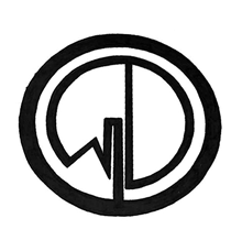
William Dyrcz Attorney at Law
Andy submitted this logo he is working on for “William Dyrcz Attorney at Law”. As I understand it, this law firm specializes in real estate planning and tax laws.
This logo falls under the monogram category, meaning it’s only the initials of the company. In most cases, the monogram would show all the initials of the company (WDAL). In this case we are just looking at the ‘W’ & ‘D’. There is also no other text displayed with this monogram, which hurts this implementation greatly.
Design Principals
I’m going to assume this is only a rough version of what Andy intends the logo to be. It is obvious the mark was drawn by hand and colored with marker. This would never suffice as final art. I also want to mention, the version that was submitted isn't an exact circle (close but not quite). Either make the mark within an exact circle or make it obvious that it wasn’t supposed to be a circle. As it stands now, it looks like a mistake.
Overall the concept is creative and interesting to look at, however it’s nearly impossible to get an idea of who the company is, or what they do by only seeing this mark. After some looking, the viewer might make the connection to real estate and possibly decipher the ‘W’ & ‘D’. On it’s own, comprehension of this mark is just too much of a stretch for a viewer. Something as simple as adding the full company name in text below, next to, or around the monogram would be a vast improvement. I would also say, it’s important that the full name be part of the logo so that it gets used consistently across all media.
Functionality / Versatility
This monogram is fairly functional, in the sense that it will scale up or down relatively well. The actual letters in the monogram could get a little thin at small sizes though, since they are narrower than the exterior circle. As mentioned previously, the mark is not functional from a comprehension/legibility standpoint.
Does the Logo Work for the Audience?
At this point of the design process, I don’t see the logo really working for the audience. The obvious major issue gets back to the interpretation of the mark from the viewers perspective. If the viewer can’t understand what business the logo represents we have a major problem. The whole idea of a logo is to communicate with the viewer and create something that resonates and is memorable. One thing Andy has done to try and speak to the audience, is to bring the concept of real estate through shape of a house reflected in the ‘W’. This area needs some work because the ‘W’ becomes rather tough to decipher.
Uniqueness
This mark is a deviation from what I’m used to seeing form law firms, which is good if the company wants to be set apart from the competition. It might be nice to bring some color into the mark when refining it.
I would recommend deeper, more saturated colors to show sophistication and class.

Take the color palette above for example. These greys, browns, red and yellow feel sophisticated and established. While I'm not recommending these exact colors, they are merely and example of what I'm suggesting you think about.
The color palette you choose can also help to set the company apart from the competition. For example, if your main competitor is UPS, you wouldn't want to choose brown as your main brand color.
Typography
In the way of typography, there’s not much to look at. The hand drawn letters definitely thirst for refinement and consistency which will come, I assume, when the mark is refined further on the computer.
Possible Improvements
So what is the best way to improve the logo? Well I think have made some comments above that can certainly offer some direction. So, here’s a list of actionable items.
- First and foremost, clean up the mark. Get it into Illustrator and redraw it with consistent line weights and exact shapes. When doing so, look at the weight of the exterior circle as compared to the weight of the letters in the monogram. Currently, the outer circle is heavier than the letterforms giving it more emphasis instead of the letters.
- Consider adding the full company name to the logo for consistency and legibility reasons.
- Refine the form and shape of the monogram to better communicate the letters ‘W’ & ‘D’.
- Play with variations on how to bring the iconography into the mark, since it seems to be making the ‘W’ hard to decipher.
- Experiment with color. Develop a palette for the brand and use it to help build the brand and to set it apart from the competition.
I hope you have found the above information useful. My intention is not to hurt feelings, but rather to offer constructive feedback and critique. Best of luck, to you Andy.
I appreciate and welcome your comments, and look forward to hearing from you soon. I purposely don't cover every possible improvement that can be made to this logo, so go for it if you think I missed anything. All I ask is that you keep your comments clean and appropriate.
Like what you read here? Subscribe to the Logo Critiques News Feed.
Enjoy this post? Share it with others.


The images & logos presented on this blog are copyrighted by their respective owners. The blog itself is copyright Erik Peterson, 2008-2026 All Rights Reserved.


We enjoy your comments
37 Comments so far. Keep 'em Coming.
#1
By Andy Dyrcz
03.17.2009 at 07:51 PM
Hello Erik,
I thank you for taking the time to look at this logo and tell me what you think. I appreciate you actually going into detail and describing what issues need to be addressed to make this a better logo. Nothing you said was hurtful, if anything I’m glad you said what you did and not say something to the effect of “its nice” and only give one tip. This has been very helpful.
This was actually hand drawn and is missing the text that I have put underneath the logo. I have also recently purchased Adobe Illustrator with the hope that I can learn the program and take this logo and clean it up. I hope, once completed, I can resubmit this logo.
Thanks again Erik. This is they type of critiques that more people need to hear.
#2
By Shanky- massachusets personal injury lawyer
04.01.2009 at 11:16 AM
Great posting regarding health and informative also. its help to all people who are seeking for this regard.Thanks for the post.
#3
By immobilien schweiz
09.10.2010 at 04:23 AM
In recent years, many economists have recognized that the lack of effective real estate laws can be a significant barrier to investment in many developing countries. In most societies, rich and poor, a significant fraction of the total wealth is in the form of land and buildings.
#4
By Barcelona apartment rentals
10.25.2010 at 04:13 AM
Hi,
Hi, I’m planning to invest in real estate field and found uni-tech as a good option. what do u say about it. I’m investing for the first time in real estate sector so, I’d be thankful if u suggest me ..
#5
By Andy Dyrcz
03.01.2013 at 01:48 PM
Thanks again Erik.
We decided to keep the Black & White for the logo, but have cleaned it up using Illustrator.
Thanks again for the critique.
To see it live, go to http://www.dyrczlaw.com or https://www.facebook.com/WilliamDyrczAttorney
#6
By agc
03.22.2019 at 06:29 AM
Engineering as a subject combines mathematics, logic and science to find solutions to our daily life problems. Over the last few
decades, engineering as a profession has seen vast expansion.
Best Civil Engineering college in Punjab
best engineering college in chandigarh
B tech in north india
Online cgc
mechanical engineering college in punjab
#7
By vote
03.28.2019 at 06:45 AM
Our academic pursuits, along with a range of extracurricular activities, help in honing a child’s skills and ensuring that he/she grows to be a mature and responsible citizen.
best cbse school in greater noida
admission 2019 top school in greater noida
#8
By Dona
09.19.2019 at 03:02 AM
This is a good site for logo designs. There are lots of articles are available Check This Out regarding different logos like this one on William Dyrcz Attorney at Law. Also, we can create logos for the free critiques provided here. They provide better guidelines to improve our designs. I liked this site very much.
#9
By test22
10.01.2019 at 06:16 AM
Our approach brings together best-in-class virtualized compute, storage, and networking infrastructure.
network security partner in uae
fortinet partner in uae
it managed services in uae
mimecast partner in uae
#10
By test22
10.01.2019 at 06:17 AM
Welcome to the world of gaming, where life is fast paced and interesting. There is always an adventure waiting for you online.
csgo smurf accounts
csgo vip accounts
#11
By selfie
10.01.2019 at 06:18 AM
Provides multiple learning environment of International standard with holistic system of education at an affordable cost for the successful life of young generation.
top paramedical college india
agriculture college in dehradun
best B.Ed. college in dehradun
#12
By HaileyB
10.09.2019 at 11:41 PM
Logos are an inevitabvle part of every business now. Like any other marketing plans Logo is also important and get to be done by best. This logo is going to be the face of your business. It is not recommended to change your logo often. So plan your design wisely and elegantly. Thanks foir sharing the tips.
virtual music club
#13
By Rich
04.21.2020 at 11:17 PM
Not sure how to interpret this one. I’m a roofer in Richland so not very educated.
#14
By Daniel Cerritos
04.09.2021 at 06:06 AM
This is so nice. I am now inspired to create a logo for myfamily law services.
#15
By Owen Theodore
09.21.2022 at 11:28 PM
A great topic I just found. I found this to be a perfect choice. Geometry dash is a 2D game with a simple theme of controlling a geometric block to overcome the challenges included in this game.
#16
By Roy
07.16.2023 at 02:06 PM
Nice post with informative content. I appreciate this website.
Az eladó vállalkozás tulajdonosát tranzakciós tanácsadással kísérik a cég eladás folyamatán.
#17
By Rose
08.05.2023 at 05:34 AM
The color palette you choose can also help to set the company apart from the competition.
sheetrock drywall in atlanta ga
#18
By Matt
11.30.2023 at 11:38 AM
Great post, interesting points raised. Thanks for sharing.
Amennyiben befektető, vagy szakmai vevőként cégfelvásárláson gondolkodik, akkor ingatlan vállalkozás eladó a dealmarket oldalán széles választékban állnak rendelkezésre.
#19
By Nanasi
01.03.2024 at 02:30 AM
dino game is a simple running game where you control a T-Rex and try to avoid obstacles for as long as you can. This Dino Game was first built into Google Chrome in 2014, where it could be played without an internet link dinosaur game
#20
By Marie K Wolfe
03.11.2024 at 02:10 AM
Este artículo me dejó alucinado, ¡qué ideas tan valiosas! Sigue tu progreso y mejora tu velocidad con Clics Por Segundo: ¡cambia las reglas del juego!
#21
By Susan S Elliott
04.10.2024 at 05:09 AM
あなたのブログは洞察力に富んだ内容でいつもインスピレーションを与えてくれます。 まち針 は、懐かしさと革新性の完璧なブレンドを提供し、古典的なアーケード要素と現代的なひねりを組み合わせて、中毒性のゲーム体験を提供します。
#22
By Sila12
04.11.2024 at 05:07 AM
Why do you like to play puzzles? Being able to play octordle will make you feel comfortable, Show your intelligence and quick judgment. If you have solved all the puzzles and want to play a puzzle game with puzzle difficulty. Then try playing Octordle.
#23
By Collette
08.02.2024 at 04:31 AM
あなたのブログは、貴重な洞察と気分を高揚させるメッセージを常に提供しています。知識を共有し、励ましの言葉をかけていただきありがとうございます。 針ゲーム は、プレイヤーが動きのタイミングを完璧に決めなければならない中毒性の高いアーケード ゲームです。レベルがますます難しくなり、忍耐力と精度が試される素晴らしいテストです。
#24
By Intakes in Canada
08.31.2024 at 05:39 AM
There are three major intakes in Canada i.e. Fall, Winter, and Summer. The majority of international students apply for the Fall intake in Canada. In this article, we have given details about Canadian colleges open for September Intake 2025 (also known as Fall Intake). Fall Intake in Canada has its own benefits.
#25
By selpinka
09.26.2024 at 04:30 AM
Drive Mad 2 keeps you mentally active, providing an engaging challenge for your brain.
#26
By Micheal Dollard
10.03.2024 at 03:06 AM
That sounds amazing. Besides, geometry dash lite is a must-try game with 15 intriguing levels.
#27
By Quiz zur Farbpersönlichkeit
11.21.2024 at 09:27 PM
Der Farbpersönlichkeitstest ist ein fünfminütiger Test, der auf der Grundlage jahrzehntelanger Forschung von Farbpsychologen weltweit entscheidet, welche Farbe Ihre Persönlichkeit beschreibt.
#28
By irene jane
11.25.2024 at 06:56 AM
hurdle is a popular sport, particularly among athletes. The game challenges participants to overcome a series of hurdles put at regular intervals along a running track.
#29
By Michael Robles
03.26.2025 at 09:42 AM
William Dyrcz Attorney at Law provides great advice, and it is good to find such professionals who know their work and provide reasonable advice when we are required. While using Kaneohe and surrounding areas I got the ideas that are providing us the right solution I want.
#30
By Adhya
07.24.2025 at 09:12 AM
Thanks for your authenticity—it’s rare and refreshing.
Traditional Salwar Kameez
#31
By geometry
11.01.2025 at 02:56 AM
Ragdoll hit is prepared to captivate your screen with its mind-blowing physics and exhilarating action sequences! Prepare yourself for intense combat in which each punch, kick, and assault has its own chaotic signature and your own distinctive fighting style.
#32
By Ava Taylor
11.13.2025 at 02:53 AM
This is an interesting take on a monogram logo for a law firm. I agree that including all initials or adding the full name underneath would significantly improve it. Right now, it feels a little abstract. Thinking outside the box, maybe the “W” and “D” could be stylized to subtly evoke real estate or tax concepts? It would be like finding a hidden detail, similar to discovering all the awesome cars in Drift Hunters. It definitely needs some polishing in terms of execution to feel professional.
#33
By Tindy
11.23.2025 at 09:32 PM
Thank you for sharing spanish dictionary
#34
By Masonryder
12.04.2025 at 03:49 AM
Kart Bros IO offers intense multiplayer races with colorful tracks, fun characters, and powerful boosts that help you outsmart your toughest competitors.
#35
By alexeyto
03.31.2026 at 04:28 PM
Ej ziomki, jak wam się dłuży wieczór i macie ochotę na trochę emocji przy meczach albo szybkich zwrotach kasy, to Mostbet to jest petarda. Rejestrujesz się w minutę, wrzucasz hajs i od razu dostajesz bonusik na start, wypłaty lecą błyskawicznie przez Blika czy krypto. Apka na telefonie działa jak marzenie, wszystko po polsku i bez żadnych pierdół.
Serio, masa chłopaków już tam siedzi i nie narzeka.
Sprawdź sam: https://mostbetxpl.ink/
#36
By drift boss 3
04.16.2026 at 02:36 AM
Drift Boss is a simple but super‑fun game where you steer your car past sharp curves, ramps, and bumps.
#37
By Brandon Carter
04.16.2026 at 09:39 PM
Interesting feedback on the logo! I agree that while the concept is visually appealing, it’s a bit too abstract for a law firm specializing in real estate and tax law. It needs something more to immediately convey the company’s purpose. It reminds me of the simple, yet very evocative design of papa’s freezeria, a game with strong brand recognition, but even it has its name as part of the logo! Maybe adding the full name in a clean, professional font would really ground it and make it more effective for the target audience.